 Words by Michael Willoughby
When Michael Willoughby went to visit marketing firm Dunhumby’s Ealing HQ, fitted out by London based architecture practice Jestico + Whiles, he was dazzled by LEDs but somewhat kept in the dark…
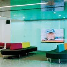
Corporate visitors to Dunhumby’s Ealing headquarters can expect a sparkly multimedia welcome with their firm’s corporate colours lit up in LEDs on the reception desk and projected onto the back wall. Comforting videos of their exploits will show on a plasma screen above tulip chairs and Boundary seating by Orangebox.
No such cordiality was offered to your roving reporter. The firm’s property manager, Doug Good, had gone without warning to Ireland and in his place appeared two rather alarmed marketing women. They had attempted to cancel the meeting when I was already on my way. But there I was and for the first time I have been doing these project profiles, a room had not been found for the architect and me to talk in. We perched in the cafe until Stefano Manuelli of Jestico + Whiles was stopped in his tracks trying to describe – in rather flattering terms, I thought – what Dunhumby was all about, and I was told that I would have to talk to the “right people”. Ironically, as Good (later) told me, Jestico + Whiles was chosen for its intimate knowledge of a company for whom it had been working for six years.
Things got really difficult when I asked if I could speak to office inhabitants – I was told they would have to be “told what to say”. This defeats our objective of always trying to find out how successful the work has been from a user perspective. Yet no explanation of the firm’s purpose was offered by the ladies from marketing. Eventually I was offered an unenthralling company boilerplate. The architect had gone “over the top”, I was later informed.
Has Dunhumby got something to hide? Had I stumbled into a front for a military research establishment, like the dry cleaning shop in the Man from Uncle? I’m sure I will never know, but I am aware that they are at the sharp end of customer “management and analysis”, having invented the Tesco Club Card. They specialise in “customer behaviour”, or the dark art of analysing how we shop, so they can tell their customers how to get us to shop more.
Perhaps I should be flattered that they think our magazine could make such a difference to their reputation. Dunhumby, with 400 employees, is growing by 40 per cent per annum and the company’s main area of growth is overseas. “International,” said one marketing lady; “global,” the other one corrected her.
Despite this mean experience, there was a fair amount to enjoy in the building. Manuelli has gone all out to pack the HQ with the latest gadgets and gizmos. It was a dark and dingy build that now sparkled and shone. He has packed it out with light – coloured lighting, LEDs, up lighting, down lighting and daylight.
“It should make you think of James Bond; that anything is possible,” he says, in his Genovese accent using self-taught English. The aforementioned welcome lights in the foyer and atrium naturally shuffle through Dunhumby’s corporate colours on a half-hourly basis, but they can be programmed to show whatever colours are required. In the middle of the atrium space is projected light – a projector hangs, like a spider in its web, on tensile steel stabilised by rods. “It was a big challenge to keep it floating there,” Manuelli says, “to keep it steady and ’angin’ there.”
Lights in meeting rooms can be shuttled through four settings, depending on the level of intimacy required. Sometimes they have been used for customer interviews. More LEDS – in the corporate colours – are planned for the exterior to increase the visibility of the company, on a humdrum strip of road, and to improve security.
But it was natural light that was needed most, both in the atrium and in the office spaces. The former, now a charming, colourful space with Eames wire frame cafe chairs, a clear glass drop-in workstation and coffee bar, was originally crowded with rather sinister-looking plants. The ground floor had plastic cladding all the way down, and contained, says, Manuelli, “an ’orrible water feature.” From photographs, it seems like “stagnant pond” was the look they were going for. In the centre of the impinging greenery sat a lonely foosball table. “It wasn’t used much,” Manuelli adds of the space. “It was almost redundant.”
But now, the plastic cladding at ground floor level has gone and halogen lights and whiteness abound. The practice has made the best of the rather dated building design, clarifying the edges of the internal windows from floor one up. Light from the upper floors is allowed to enter through the banishment of meeting areas to the four corners of the building. One disappointment is the fact that the architect originally wanted the atrium totally open, without glass. The landlord was not happy with the idea, however, since Dunhumby was only on a ten-year lease.
At ground floor-level, behind the cafe, depth has been added through the building of a corridor linking to the toilets and the gym. On the north-facing wall, major client meeting rooms with automatic blinds sit with training rooms stretching back from this. The final doors of the training area can be swung open into the atrium to create a grand space for entertaining or for other kinds of corporate events. And although very large, the atrium is a surprisingly intimate space, due to the timber used on the floor and the acoustic ceiling in the coffee bar.
Good explains that the atrium can be used for all types of welcome: “Clients suppliers and external agents can be received in the ground floor meeting space where our cafe is, with a five-room meeting suite. It caters for the informal chat in the open area to meetings with clients and suppliers in formal meeting room space.”
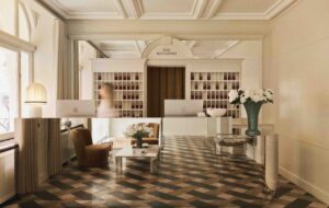
Once one of three tenants inside the building occupying the first and second floors, Dunhumby has now expanded to a position where it fully occupies the building. The reception desk, previously a gloomy affair, shared between the lawyers and the police on floors three and four respectively, is now fully the company’s own. Contrasting with the bright welcome lights, it has a wrap-over plane of dark polished plaster, which projects over the seating area keeping the light reflected in the glossy grey tiles and indicating that the welcome desk “takes care” of its guests. The polished plaster theme is carried through to the coffee bar – also, of course, a sign of hospitality.
The plane is just one of many that interlock on the ground floor, where the tile spills out from the reception area and the timber floor of the atrium is bounded by Teflon carpet, which has “escaped” from the meeting rooms. This effectively destabilises the over-square height of the atrium – a fine build by Elsworth Sykes but rather dated and topped with that Nineties cliche, the high-tech-style PVC canopy.
Surrounding the atrium on work floors three and four are common areas, which include break-out stations – with Duna chairs in company colours – along with sophisticated copiers that obviate the need for fax machines, and kitchens with smoked-glass splash backs. IT, HR, marketing and other departments that don’t travel light have made big gains through the addition of a great deal of storage. Factor 39 desking systems in rows of four to six people allow Dunhumby employees to collaborate on projects – or client projects – without having to move so much. If there is a requirement to move, rolling pedestal drawers and VOIP make it easy to do so. “We can get up to four to six people working at one bench looking at a particular piece of work and delivering ideas on a project,” says Good. “Before that it wasn’t really terribly feasible to do, so they had to take up a meeting area or an office.”
The benches have ice-blue modesty screens and panels, which, added to the glass kitchen splash backs, manage to change the interior from “accountant grey” to cool. It reminds one that it’s the details that often make the difference. There are white screens on some of the floors where graphics can be attached and there’s a suggestion that the team’s client logos and products might form part of the display. Not much decoration has gone on up to this point, however.
It’s not that the staff don’t get to relax. The gym has a masseur, and the addition of an extra room to the gym means that it does not have to be taken out of action the three afternoons a week she is in attendance.
Good is certainly laid back about the outcome. “The consultant team and the construction team worked pretty well. That’s reflected in the fact that the building was handed back to us within three weeks of completion date and it was right on budget.” He says he would have refurbished the toilets completely instead of giving them the once over, but apart from that all is to his liking.
Unfortunately, I never did get to speak to any of the users of the space since one of the marketing ladies missed a conference call, failed to return calls about setting up an interview and then went on holiday. From my eyes’ evidence, however, employees looked comfy enough as they worked out how to increase the hold that Tesco has over our buying habits.

