 Words by Michael Willoughby
What does a successful company do when it grows too big for its surroundings? Michael Willoughby found out how architecture practice Brinkworth managed the expansion of London-based branding consultancy VentureThree
Sometimes a company is so successful that managing change becomes its chief challenge. VentureThree – founded in 2001 as the “next generation of brand identity firm – faster, braver, deeper and more collaborative,” according to co-founder Philip Orwell – was quite happily building quality rather than expanding and then, he adds, companies began “knocking on the door”.
VentureThree won pitches against such huge brand consultancies as Landor, Interbrand and Wolff Olins. Big clients like Adecco, Comet, Sky and Teletext have entrusted identity revamps to the firm’s care. It is about to announce a top-to-toe revamp of ailing retailer HMV’s brand. In five years, the company went from 12 to 25 people and grew by 60 per cent in revenues during 2006 alone.
Key to VentureThree’s success was its home in Mayfair, designed by London-based practice Brinkworth. It was the essence of “intimacy”, an attribute that VentureThree claims as one of its most important. Everyone enjoyed the simple, open space with triple-height ceilings, skylights, Habitat sofas and off-the-shelf Acorn lamps from J&G Coughtrie. The beech tree-sized fly agaric mushroom lowering over the landing added to the charm.
Employees loved being on the one floor where true collaboration was possible. The great sound helped – Brinkworth design director Keith Brennan, a former acoustic engineer, did wonders with a pegboard, which deadens the sound. Ideas bounced off each other but did not echo from the walls. “People make careers out of reducing echoes,” says Brennan. “But it is simple: pegboard – 25 per cent perforation – rockwool, green or black board job and it’s done!”
Senior employee Graham Jones liked the fact that one person could alter the mood of the open space. Everything was changeable. Boards and images for current campaigns leant against walls, also inspiring a mood suitable for the moment. “You are aware of the transitions,” says Jones. “You get bored of your own space really quickly unless there’s some sort of transition all the time.”
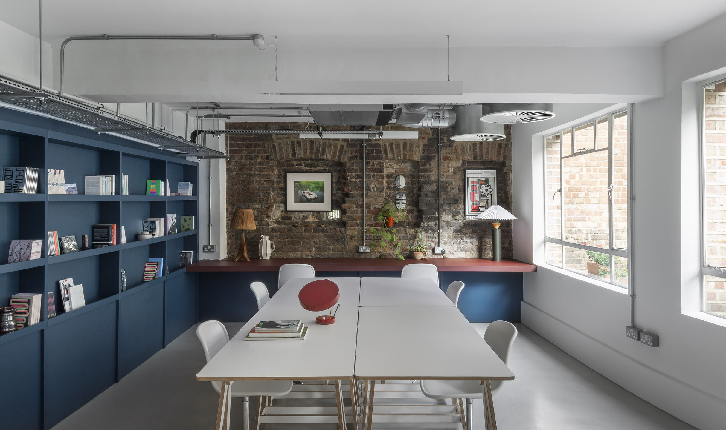
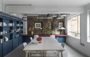
Many clients also loved the space, especially the oversized kitchen table and chairs at the end of the room. They and the team could gather around it and people could come and go without feeling they had to ask for an excuse to leave or permission to enter anywhere. The day that I visit, the firm’s main client, HMV, is “mucking in” in the area like a happy – if unruly – family.
Everything in the original space was simple, mobile, functional and stylish. It was honest. The pegboard really was used for pegging things on. Drawers on wheels could be moved around between teams; print, post and tea areas were of a clean but bespoke MDF, with sliding doors that open or conceal; even decorative and witty touches, like glow-in-the-dark laminated desk tops, had a function – if a bit fanciful – of showing the work that had been done on them throughout the day.
But no one can stay resident in Eden forever. Staff were three to a desk in the single-floor office. “The old space had become unworkable,” says Orwell. Meeting space was a real problem. One imagines not all clients would like to hunker around the table. “Before it always felt we were improvising and squeezing them into a busy studio,” Orwell says.
Not everyone was completely behind the move though. VentureThree employee Paul Townsin says he rather liked the fact that the desks were jam packed with people talking – it was fitting for a creative firm. But others, such as Jones, said they couldn’t think straight anymore. In the end, there were more Jones than Townsins. Using Brennan once more, the firm decided to expand into the floor below – a former garage. Some of the VentureThree folks were going to have to be cast out of the family nest of (what was to become) the upstairs. Or, “evicted to the lower level,” as Brennan puts it.
But another challenge was to create an environment that allowed people downstairs to feel part of the upstairs. Not only was upstairs “upstairs” as opposed to “downstairs”, long a euphemism for both the unmentionable and the inferior, but it also came first. Additionally, downstairs was lower-quality property stock. It was single height versus upstairs’ triple-height loftiness.
The downstairs was also grounded in a parking area and a gaze – a Mayfair gaze, but a gaze nonetheless – pierced the building. “We had to use every trick in the psychological book to make it acceptable,” says Brennan. “The consequences of one small change were quite large. Each move had a knock on effect. It took a long time to plan.”
To raise the apparent height, he shone uplighting on the downstairs ceiling. To create an actual link, he removed a piece of floor above the staircase to allow for the noise of upstairs to come downstairs. The same Acorn lamps were able to hang “through” the floor, “beckoning” people upstairs, and the same vibrant red paint can be seen from either room.
Brennan also used “echoes” – the same pegboard, the same sofa – to remind people of the former space.
People were encouraged to circulate: the idea of a downstairs kitchen was jettisoned to make sure people still felt integrated and welcomed upstairs.
It wasn’t easy. Some at Brinkworth have said that VentureThree “really weren’t sure what they wanted”. Perhaps it would be better to say they were particular.
Ideas which seemed good at first such as a pod, which was intended to float above the stairs, came unstuck because of concerns, says Jones, about the firm being perceived as having secrets. The doors on the downstairs meeting room, which was going to be glass but with no roof, met the same fate. “The idea of putting doors on indicates secrecy,” says Jones. “It wasn’t us. But now you can’t have a quiet meeting in there because there’s music blaring from the other side that you have to turn down.”
So has it been a success? It’s hard to say. The first thing Jones tells me is: “I haven’t learned to live with it.” And he was on the project team along with Townsin. Orwell is more positive – but I think that’s one of his main strengths. “The bigger space gives you more flexibility to have different moods and noise/disruption levels in different areas. People like having the ability to move around during the day and work in different parts of the space.”
Ultimately, the joke is on the Adam and Eves: nothing – apart from the desk phone and a certain feeling of ownership – is really keeping anyone anywhere after the move. There’s enough space for everyone to have two places to be. Most of the crew have laptops.
Instead there’s the problem of being in a team-based environment. When a bunch of people goes to a meeting, those left behind are stranded in a cavernous space. On the Friday of my visit, downstairs is empty apart from two people, one of whom is playing air guitar to Nirvana (Unplugged). There is definitely a feeling that the cats are away. That’s liberating, of course, but also dispiriting.
VentureThree seems to be, in a very real and honest sense, struggling with its new situation of a split family; of being cast out of Eden. Townsin says he feels that the energy has gone out of the room.
There’s something about the set up of the office – the air of mid-thirties studied insouciance, the sloganed T-shirts in pink and green, the vintage trainers, the world weary laid backness that somehow seems a little on-edge, the day-to-day postmodern recycling of brand heritage – that suggests that the company benefits from this kind of instability.
I put this to Jones. “It’s not unstable,” he says, sharply. After a pause, he laughs. “Kevin’s keeping wisely quiet.” “I think he’s got a point,” says Brennan about my comment.
I add that I thought instability had been proven to be a good thing in creative companies; that a survey had found that when employees got used to their surroundings, no matter how “crazy”, then the surroundings lost their idea-generating effect. I expect VentureThree has gotten used to the magic mushroom. But Jones is not convinced.
I suspect the project was difficult to finalise, maybe a bit painful and possibly not totally successful. But this seems to be because the company cared so much about the outcome. I feel an absolutely convincing link between the directors’ belief in the space as a generator of product. Perhaps it is the vestige of the “studio” ethic.
Further questioning of the planning process is not rewarded with answers. I am unable to discover why Jones and Townsin were chosen (if they were chosen) to liaise with Brennan or how they liaised with the rest of the staff.
“Not everyone can get involved,” Jones says. So why did they lead the project? “I guess we had more of an opinion,” he says. How did they canvas other peoples’ opinions? Were there disagreements? “Not really.” Instead, I am told, ideas “got back” to Brennan. Did they use forms? No. “If you use forms you might have people saying, ‘I want to have a fluffy cat next to me,’” says Jones, smiling at the bizarre image.
So VentureThree is a domain without divisions, disagreements or doors. And for all the things you could say about a company that seems uncomfortable with facing the realities of power, hierarchy and internal competition – for fear it might lose some of the magic that made it great – Jones affirms that the perfect office/studio is a journey rather than a destination, which is refreshingly non-corporate.
By the time I leave, Jones has decided: “We’re not unstable but there is a casualness in our way of carrying out business.” And we exchange business cards, casually, like mates, and I leave the space that was once Eden but is not quite Utopia.

