 walker
 Walker & Martin’s headquarters for British car-leasing company Lex is a refurbished building in Stockport that celebrates interaction in the workplace, and it’s making people very happy
The building chosen for the new headquarters of car-leasing firm Lex was a former training base for police dogs in Stockport, outside Manchester. Not the most auspicious of surroundings for an HBOS-owned company vying for “world-class” status. But David Walker, of London-based architecture practice Walker & Martin, had a vision to convert the neglected, 8,360sq m building into a dynamic and colourful workplace promoting communication and well-being.
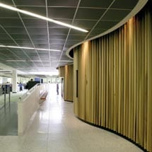
The centre of the two-storey, square building is an organic blob structure (originally heart-shaped in the first sketches) – “irrational, not of the office,” says Walker – which is demarcated by rounded wooden batons that are lit at intervals by ceiling-mounted spotlights. Strip lights on the ceiling radiate outwards from the structure (like a “sacred heart” icon). It contains a coffee machine, bike and coat stores, a first aid room, showers, bathrooms and a massage room that even offers hot stone therapy. Inside the central hub, there is proof that the company has started to take care of its people. Walker says he wanted to make every one of the nearly 900 employees in the building feel special in some way. “Even if they aren’t near the window they have something nice to look at.”
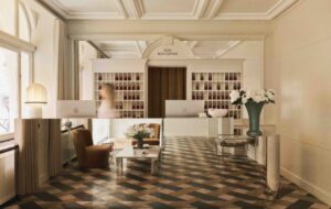
The shape of the central structure is echoed in the column that supports the parapet over the main entrance. Walker thinks his decision to put the entrance at the corner was a key reason his firm was chosen for the project. Everyone else put it dead centre. But he decided that this would lead visitors and employees too quickly into the core of things. The entrance foyer also had to be large enough to drive a car in and park it. With corporate accounts for several hundred cars at a time in the offing, manufacturers vie to have their vehicle parked next to the receptionist.
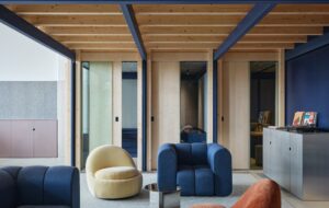
Moving away from the central area on the ground floor are the informal shared spaces, in what Walker calls the “hotel lobby” section. These are themed and differentiated by types of chairs, given pet names by the staff. A table surrounded by 16 white Panton chairs is known as the “breakfast briefing table”; two low, glass tables with four, two-seater Aalvar Alto chairs are known as the “zebra chairs”. A tall, non-prickly cactus completes the scene: Vegas comes to Stockport.
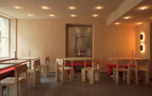
People can quite easily grab a coffee from the cafe on the ground floor – which also has seating in the form of Bombo stools – and then sit in one of these areas. “The space flows,” says Walker. Full floor-height windows give views out to the surrounding trees. At the periphery of the ground floor next to the cafe are more formal meeting rooms for the clients that form the basis of the firm’s business. There are also dedicated training rooms.
Interim facilities manager Carol Edwards confirms that the change has worked well for the business. At the previous site, the company was spread over seven wings, and some departments were split down the middle. “There were areas you just didn’t go to,” she says. The business’ rapid growth had overfilled the building – lunchrooms were converted into office space, followed by, more damagingly, the disappearance of all the meeting rooms. “People were very unhappy about it,” she adds.
It sounds like the wellbeing of Lex’s employees was not a high priority at the time. And in a company like this – where large sections of the office are, in effect, a customer care call centre, huge swathes are engaged in claims solutions, and banks of others support these people’s IT, HR and other needs – staff satisfaction was never likely to be very high. But it is clear that Lex has made a decision, helped and inspired by Walker, to treat its employees as valued and irreplaceable individuals.
“When we arrived, it’s fair to say their design pedigree was zero,” says Walker. The coup that he achieved was to convince the company that people circulating and drinking coffee in designer chairs was a good thing. “We wanted to celebrate random interactions. We wanted people to be able to sit by the coffee machine and not feel naughty.”
Occupants are enthusiastic about their new home. HR administrator Kate Malcolmson says the location is a great selling point for hiring and maintaining the right people. “The building is colourful and bright, and the open-plan office and good layout improves communication. It’s ten times better than our last place.”
Even the more demanding residents are converts. Dianne Haskins, who works in telecommunications support, says that although at first she was happier in the older building – as someone who spends her life being pursued by people to fix problems, she feels a bit exposed in the middle of the room and “doesn’t get any peace” – she “can’t fault the building itself”, and particularly likes the break-out and cafe areas.
The project came in pretty much on budget, according to Walker, at around £5 million. With furniture, fees and alterations to the roof, the sum reached £7m. Since the building was a shell when they moved in, £3m of that was spent on mechanical and electrical engineering. It was tight though – the light housings in the coffers were intended to be sharp, black squares floating in the recess, but the budget didn’t stretch to these lights and contractors were charged with making something similar from scratch. The design they came up with achieved the desired effect anyway, says Walker. The coffers in which they are set also have a magical effect on the potentially disastrous acoustics, meaning that administrative staff can work next to call centre staff without being disturbed by the noise.
Walker believes passionately in the mission to connect people within a workplace – work, he feels, is as vital to our spiritual wellbeing as anything else in our lives. So he has connected the ground and first floors with two hugely wide spiral staircases with concrete steps. In this sandwich-shaped space, there is a real visual connection between upper and lower floors. At the top of these staircases, there are light cones with double-lined clear polythene skylights, enabling light to reach every part of the building. The conical section and the lightweight skylight material actually prevent the ceiling from caving in.
So is Lex a convert to the Walker & Martin way? Apparently so. Extra tables have been placed in the ground floor cafe and the upper floor meeting room is to be converted into a less formal brainstorming area. Thanks
to the new vision, communication and interaction have
won the day.

