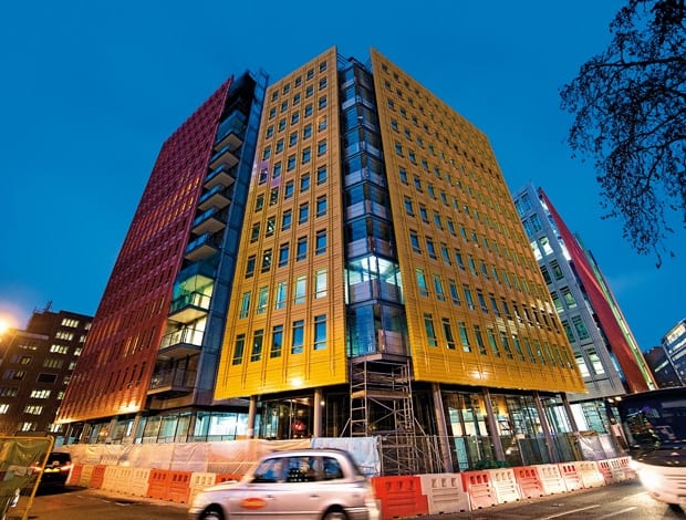
 Central St Giles: A palette of six shades were inspired by surrounding shop fronts and red-brick buildings||
From primary-coloured facades and walls with eyes in the heart of London to the pigeon-repelling surface of a “jewellery box” building in Birmingham, we discover the thinking behind some of the UK’s most striking cladding
Central St Giles
 Architect Renzo Piano Building Workshop
Client Legal and General Property and Mitsubishi Estate
Location London, UK
Cost £75m
Duration May 2007 – May 2010
Floor space 34,800 sq m
How do you hide two huge buildings containing 34,800 sq m of office space, over 100 homes and numerous shops and restaurants surrounding a major public piazza in St Giles (in the Bloomsbury area of central London)? If you are Renzo Piano’s practice, you cover them in green, orange, yellow, grey and red ceramic tiles. The strategy certainly doesn’t conceal the behemoth, but the 21 different planes of varying sizes and heights – ranging from ten to 14 storeys – do break up the bulk of the two buildings.
Simon Wilkes, head of development at Legal & General Property, says he worried whether Camden Council would approve such a large building on the site, but he had former London mayor Ken Livingstone telling him that he would overrule anything that wasn’t sufficiently dense because the site stood next to the new Crossrail transport system.
“The challenge was making a large building look small,” says Wilkes. In other words, the architect and the developer hope that a visitor to the neighbourhood will read Central St Giles as a series of coloured buildings or suspended planes – of various sizes and at various angles to the street.
But the bright terracotta tiles and the buildings they covered served another purpose: brightening up this much-ignored part of central London, which, apart from being dominated by Centre Point, mostly figures as a route between Covent Garden and the British Museum. However, until Central St Giles this had been blocked by a vacated brute of a building once used by the Ministry of Defence, which had ghostly bombproof curtains flapping mournfully in the windows.
The appearance of colour at this scale should give new visitors to the area a “joyful surprise”, according to project architect Maurits van der Staay. To keep the frontages pleasing rather than jarring, Piano’s team selected a palette of six shades (including two shades of grey) that were natural in inspiration but also found in the surrounding urban area, such as Covent Garden shop fronts and Edwardian red-brick buildings.
The facades were assembled from 18 basic tile-unit styles, which included built-in “fins” fitted to 1.5m-by-3.9m panels on an aluminium frame. The fins control the amount of shade the building receives and the depth of colour.
Piano spent 18 months fine-tuning the balance between colour depth, shadow and angle, creating three full-scale mock ups in Genoa and London in the process.
Terracotta was chosen for the tiles because it is very resistant to chemicals, acids and alkali. Van der Staay said he expected the tiles to look almost exactly the same in ten years and to need cleaning just once a year.
Special robots were needed to handle the sections, which weigh up to 800kg each. The bespoke “manipulator” from German firm Schneider “leant” out of the windows, flipped the panels around and pulled them back towards the building. But humans were still needed to completely align each panel to within a tolerance of 2mm. The building contains more than 115,000 tiles in all.
Central St Giles’s facade is not all dazzling colour though. Behind and between the planes and at street level, the building is faced in super-see-through low-iron glass. By making this lower section transparent, the architects hope that visitors understand they can pass through the plaza and enter the building. The landlord no doubt would like them to stop awhile and spend some cash in cafes, restaurants and shops as they travel a route between top West End tourist attractions that had been blocked for too long.
10 Hills Place
 Architect Amanda Levete Architects
Client Clarendon Properties
Location London, UK
Cost Undisclosed
Duration February 2007 – September 2009
Floor space 1,321 sq m
Amanda Levete Architects’ 10 Hills Place was inspired by conceptual art and built with technology used to create speed at sea. The building, created by refurbishing and adding three new floors to an existing Victorian space, features four “eyes” that peer upwards from the aluminium cladding, quoting the notorious slashed canvases of Argentine-born artist Lucio Fontana. Here the slits serve a very practical purpose: getting as much overhead light as possible into the building, sitting on one of Oxford Street’s absurdly dark and narrow side streets. Project architect Ho-Yin Ng turned to Austrian ship builder Pinnacle, which made the curving form out of planks of aluminium in the same manner as the hull of a ship, coating it with a clear resin to make it watertight.
To retain its glossy finish, the architect used a type of paint that coats the underside of super-yachts. To make good on the illumination strategy, the team hired a stage-set designer to create bespoke sills that could bounce life into the office. The plan worked: the building across the street may have floor-to-ceiling glass, but its blinds are nearly always down, Ng points out. And the light bouncing from the aluminium planks bounces back into the street, brightening the surrounding area.
The Cube
 Architect Make Architects
Client Birmingham Development Company*
Location Birmingham, UK
Cost £100m
Start date Spring 2007
Completion Summer 2010
Floor space 10,358 sq m
*As we went to press, it was announced that the client has gone into administration
Make Architect’s mixed-use Cube building exhibits two different characters through its interior and exterior cladding: regular and “metal-bashed” on the outside and irregular, colourful and glassy on the inside. This has led practice owner Ken Shuttleworth to dub it a “jewellery box”. The outward face of the building features anodised aluminium boxes of three separate depths, becoming a thick metal screen covering the open side of the cube. These boxes may look like they have been randomly arranged, but in fact they are carefully placed to prevent solar gain and repel nesting pigeons. Engineering firm Hoare Lea and the architect worked hard to ensure that less light was let in on the south side than the north, while maximising daylight. And project architect Frances Gannon worked with a consultant ornithologist who told her that birds don’t nest on ledges smaller than 75mm. After that, the panel types had to be reconfigured so that a slim box didn’t sit above a fat box. “We hope the pigeons got the memo,” she says.
If the outside of the Cube is brassy, the inside is delicate. While mainly made of white and clear glass, the horizontal ledges are to be brightly coloured. Meanwhile, powder-coated aluminium surfaces are shaded from pink at the bottom through purple to blue at the top. The glass will help to reflect this colour around the courtyard. But Gannon said it was “incredibly difficult” to create the unitised (pre-fabricated) cladding system, whose junctions would meet happily in such a geometrically contorted environment – but the contractor was insistent. On the plus side, the unitised choice meant that scaffolding was not needed, saving money and hassle about pedestrian access.


