 Words by Michael Willoughby
Michael Willoughby met British architect Matt Yeoman, partner at east London-based practice Buckley Gray Yeoman, to discuss carving up buildings, complex simplicity and feeling brilliant
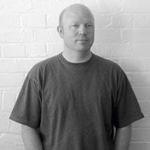
It is no surprise that Matt Yeoman is popular with such property big boys as British Land, Land Securities and Great Portland Estates: he has the mind of a speculator combined with the skill of a developer. He does a mean PowerPoint presentation and has coined not just one but two taglines for his firm – namely “complex simplicity” and “poetic pragmatism”. Yeoman is relentlessly positive and will answer a question with a “Yeah!” even before he has thought about what the rest of the response will consist of. London, he says, is brilliant. Being in the country is brilliant. Hell, even the train ride joining the two is brilliant, since you can work on it. Yeoman must be the most enthusiastic person about mass transit since Isambard Kingdom Brunel.
Yeoman also likes the train because it allows him to flit through the suburbs about which he is less keen. A former Torquay boy, who had turned down a career in competitive sailing, Yeoman wanted to live right in the centre of town, not on the edge. And so, following the departure of artist vanguards from Clerkenwell in the early Nineties, he became one of the first people to convert one of the neighbourhood’s warehouses into his own liveable space – the Ingersoll building on St John Street. He now spends three days a week working nearby at the edgy Tea Building in Shoreditch, home to a number of contemporary art galleries. For the rest of his time he is based in Exeter, where his family live, although he’s on the road a lot of the time.
“Both my wife and I were from the West Country, so there was a tremendous pressure to return there,” says Yeoman as we overlook the site of the future Shoreditch station. “She and the kids used to follow me about wherever I went. But when they got to school age, I decided it was the wrong way round. I should run about as my job takes me, and they should have a base. It’s brilliant, absolutely brilliant!”
But despite his upbeat nature and his numbering developers such as British Land’s Paul Burgess among his pals, Yeoman is not your usual corporate, glass-box architect. Instead, as befits a person who lives in one pioneering conversion and works in another, he is keen, above all, to retain as much of the fabric of existing buildings as possible. This is as much a matter of common sense for him as it is a matter of environmental urgency.
“Take this building” – he waves his hand around – “They’ve [Derwent Valley, another Buckley Gray Yeoman client] done a fairly low-cost refurb on it and it’s packed. It’s full. Three years on, when you get a cab, they know the Tea Building.”
“British Land and people like that are very confident, talking through the [new build] schemes they have. There’s clearly still a market there. But for SMEs we are finding that existing stock is where those gaps are being plugged. I think this is for several reasons.
“Firstly, they don’t need the large floor plate or to meet the certain criteria that the leasing agents are asking new builders to meet. But also, more and more, people are saying, ‘Why are we knocking this down?’”
The answer is, on the one hand, because few people have the visionary approach to existing – historic – buildings as BGY does. And on the other, it’s because most buildings aren’t just shells like the Tea Building or Yeoman’s Clerkenwell warehouse home. Most have additional complications such as walls and rooms and existing staircases.
However, Yeoman prides himself on being able to see the bigger picture, beyond the original structure. He seems to regard the limitations imposed by last century’s architects as a challenge and sees their buildings as worthwhile but sometimes irrational, or as having become irrational.
“This complex simplicity idea,” he says, “it’s about looking at the existing stock and at first it looks like being complex – something that people can’t get their heads around – so they knock it down. It doesn’t take much effort, but some intensity of thought, to rationalise it; to bring the building up to where they want it to be.”
Take for example BGY’s plans for Derwent London’s nearby Rosebery Avenue development, currently in final stage of planning. A late Victorian or early Edwardian building, it was put up as a series of workshops and had been divided into three separate buildings.
“There are three labyrinthine staircases,” Yeoman says. “It’s difficult to find your way up the building. And it’s difficult to find your way across the building without going down to the ground floor and back up again. The lifts aren’t really up to the current standard. It’s just a tired building that has been broken down over the years.”
But that doesn’t mean it should be knocked down or, since it is Grade II listed, left in its current state.
“They wanted us to see how we could add some additional space and how we could rationalise it and put it back on the market,” says Yeoman. “It needs flexibility and so we took the innards of the building out – giving it a new core, new staircases and up-to-date lifts.” Space was found for these in a formerly disused alleyway. “We like to grab space back,” he adds. “The front of the building will be given a new central entrance and you can see all the way through to the back.”
This is almost the signature style of BGY – the cutting away of existing structures to reveal a new, more poetic space and the radical introduction of light.
Another signature is the installation of upper floors on the roof of the building, a plan that necessitates constant diplomacy with local planning authorities. The glass spaces – rooms of light – give the over-familiar buildings an almost François Mansart-like air. They add a lot to the value, too. Yeoman reckons that, with a good view, these upper floors can be let for ten to 15 per cent more than their lower counterparts.
At a 1960s block in Hatton Garden’s Kirby Street, for an eponymous investment firm, BGY has pushed its “phototechnics” even further. As part of the land grab for space, BGY convinced the developer to bring the basement space into usage – hitherto priced at three pounds a square foot. But there was a cost.
“We said actually what you need to do is to cut back a big portion of your ground floor space and let the big light in and make the basement and the ground floor one true space.”
“It’s hard for clients to swallow that,” he continues. “They say, ‘Hang on! You are taking that away. I am not sure I’m getting that back yet.’”
The architects created a bridge over which you walk and look to the basement from the ground floor. “Thankfully they went with us and the Conran restaurants took the whole space,” Yeoman concludes.
Other light effects are more subtle – Yeoman transformed the back of the same building, which housed a light well that gradually filled up with pigeon droppings. “We added some glazing at the top and created a space which collects light for the whole office,” says Yeoman.
Another noteworthy feature of this project involved making the long, front windows flush with the exterior of the building and the elimination of some columns, sending the building back to the 1930s with the creation of a Corbusian picture window.
Yeoman agrees with my assessment that he sometimes uses light like the early Flemish painters, drawing one’s eye through a building. “It’s like the shaft of light that comes through a cloud,” he says, “pulling your view into the distance.”
Some light effects are more straightforward. For example, for a boardroom for asset management firm Ziv Gani, BGY simply sliced off the top of the building in north-west London.
There is something deeply appealing about BGY’s methods. Perhaps it is that they possess the true artist’s realisation that rules – pre-existing buildings, in this case – sometimes make the best art, or perhaps it is my susceptibility to the aforementioned light effects. Yeoman likes to talk about it in terms of sustainability – the energy saved by converting a pre-existing building, and that’s all very worthy. But he seems to me to sometimes reach the qualities of Italian architect Carlo Scarpa, whose renovation of the Castelvecchio Museum, completed in 1964, set new standards for the meeting of old and new.
It is, truly, brilliant.

