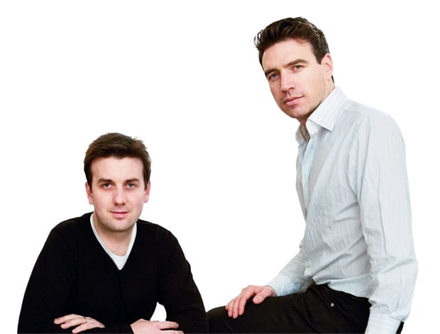
 Kevin Carmody and Andrew Groarke|The glowing Regent’s Place Pavilion offers a place of respite to nearby office workers|Bespoke shelving units clad the walls of the Architecture Foundation’s offices in London Bridge|Light-footed intervention: the use of plywood echoes the practice’s own office|The industrial columns of the Edwardian building were retained|The practice’s proposed plans for the Festival Centre in Sheffield|Understated: this office fit out in Limerick has the feel of a gallery, while the sculptural staircase takes centre stage||
Creating stylish havens for stressed-out office workers, London-based architecture duo Carmody Groarke has the last word in understated confidence
There’s a lot spin being, well, spun about how the economic downturn of the last 18 months or so will give rise to a more considered, less gimmicky approach to design – workplaces included. In the case of architecture studio Carmody Groarke, it’s what they’ve always done, and with the completion of the headquarters of the Architecture Foundation last year and the unveiling of a stunning pavilion in central London, their time really is now.
“Workspace environments react to the particular economic and social requirements,” they say. “Following a period of prosperity over the past couple of years, where architecture was sprinkled into the office environment as a ‘nice to have’, the current circumstances require us to find situations where architecture is a ‘need to have’.”
Strong words from Kevin Carmody and Andrew Groarke, who studied at the Royal Melbourne Institute of Technology and Sheffield University respectively. They met in 2000, when both were working at David Chipperfield Architects.
“We had the chance to build a studio for Antony Gormley and we realised that we were very interested in building,” says Carmody. “We came from very different backgrounds and professional training experiences before deciding to form a practice.”
This they did back in 2006. In November of that year they completed a fit out in Limerick, Ireland, with a brief to create a workplace more akin to a gallery space rather than a conventional office, in what was an usually thin site.
They responded by keeping materials to a minimum: white plaster walls, white glass cantilevered screens and a staircase that takes centre stage, linking the three levels and framing the views of the city and the River Shannon estuary. In workplace design terms, confident understatement may as well be their middle names: you won’t find any Red Bull-style chutes or the wacky slides of Google’s offices here.
Just 18 months into its existence, the studio scooped the 2007 Building Design Young Architect of the Year Award (YAYA). What did this mean at the time? “It was an opportunity for us to review the very diverse range of work that we were involved in,” says Carmody. “In turn, this developed a confidence to approach new clients, knowing what we were about as architects.”
Indeed 2007 proved to be Carmody Groarke’s annus mirabilis. They won the competition to design Sheffield’s Festival Centre – which includes high-spec offices, event space, public terraces and a cafe bar – as well as another run by the Architecture Foundation to come up with a new pavilion for British Land’s Regent’s Place, a mixed-use site just off London’s Euston Road, which will eventually contain 35,800 sq m of office space. While the former project is currently in consultation with funding partners, the latter was unveiled in January this year.
“You won’t find any Red Bull-style chutes or the wacky slides of Google’s offices here”
Have you ever had to take an important work call when on the move and found yourself ducking into a skanky alleyway? Well the Regent’s Place Pavilion is the solution to that particular dilemma, offering a place of contemplation to nearby office workers too. Its field of slender columns sits beneath a lozenge-shaped canopy, which shimmers in the sunlight by day and projects a gold light by night. It’s a truly classy piece of urban escapism, a big improvement on your average bench, fountain or concrete blob within a new development.
“We are very interested in the effect of public space on the fabric of the city,” says Groarke.
Context is all for the studio, which has five full-time staff. Theirs is not a cookie-cutter approach. Their back catalogue ranges from a Hyde Park memorial to the victims of the 7 July London bombings to Camden’s Electric Ballroom nightclub.
“We search for architectural ideas for projects that explore the particular space, light and material,” says Carmody.
In their own offices – in central London’s Denmark Street, once home to the British Tin Pan Alley and which today has guitar shops aplenty and a certain down-at-heel glamour – you won’t find acres of Corian and over-engineered task chairs. Instead, the plywood used on the shelves and desks still bears the pencil marks from suppliers.
“By investigating detail in this way, the material is presented in a simple and raw way,” says Carmody. “We are not particularly interested in detail for the sake of highlighting technical solutions, but prefer to explore the bigger architectural or spatial ideas of the project.”
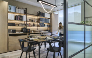
This raw aesthetic in their own workspace informed their work for the Architecture Foundation’s offices in London Bridge, completed last year. The brief called for a low-cost fit out that would house the organisation’s dozen staff and its ongoing series of events. Groarke explains how they responded: “It’s essentially using wood and white plaster. The timber gives the structure a robust function as well as a soft warmth of character.”
The space is part office, part exhibition space, hence the need for what Carmody describes as a “light-footed intervention”: it needs to constantly adapt to whatever the event programme calls for.
“It’s almost a temporary installation of joinery,” continues Groarke.
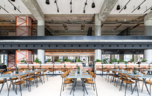
The scheme works with original features of the shop-fronted former Edwardian warehouse such as the industrial columns; mixing in sustainably sourced bird’s eye maple and Douglas fir ply, with birch-face ply for the furniture. A grid pattern of fluorescent lighting connects the open-plan workplace and event space elements. Given that they now have a few office projects in their portfolio, I ask the pair what their main inspiration is.
“We approach the design of workspace as any other commission,” they say. “We begin with bringing quality to the everyday, creating an environment that offers a diversity of places for concentration as well as social interaction and exchange of ideas.”


