 Bearing fruit: Zupanc and her Cherry lights|ompon light, part of Zupanc’s Selfdiscipline show for Milan this year|Homework desk and chair, also part of the Selfdiscipline collection|Blown-glass Cherry light, on show at Tent for the London Design Festival|Boris cradle, from 2009|One of 2005’s Voodoo Dolls|Mrs Dalloway mini hotplate, for Gorenje|Unfaithful feather duster|Modesty bench|Maid chair|5 O’clock Chair, for Moooi|honique, part of the Sofas in C Minor collection|The Lolita lamp, also for Moooi|Feminine form: Moroso’s Tailored chair (2009)||
Provocative in every sense of the word, the work of Slovenian designer Nika Zupanc takes femininity as its starting point, and ends up subverting the norm
“I’m kind of a rebel,” announces Nika Zupanc, slowly stirring her coffee. “Even in school, I always tried to make a point or subvert things – to give new meaning to the ordinary parts of life.”
It seems the Slovenian designer, 37, has used the same motto to carve out her niche in the contemporary design world. A world that, by her account, is still a boys’ club where rational utilitarianism reigns supreme. An object or piece of furniture has to offer more than that, Zupanc feels, and she confronts the challenge head on with a dose of exaggerated, tongue-in-cheek femininity.
“There are a lot of successful women in design but then again there is just one major path that is appreciated,” she says. “We’re stuck in a modernist phantasm of ‘form follows function’, but I think it’s too easy.”
And too masculine, one presumes.
A dizzying array of girly flourishes – including bows, lace, flowers, corsetry and cherries – makes up Zupanc’s design DNA, though in the end it reads more femme fatale than girl-next-door. The pieces have attitude; they taunt and provoke.
“I deal with the everyday themes that personify boredom, mediocrity and the cliched role of women in society,” Zupanc explains. “My tools are the visual elements that are taboo in the design world – elements that are normally considered naive and not very serious. But I like to use them in a restrained and smart way, to give them a completely new meaning.”
We are sitting in a small cafe in central Ljubljana, where Zupanc lives and works.
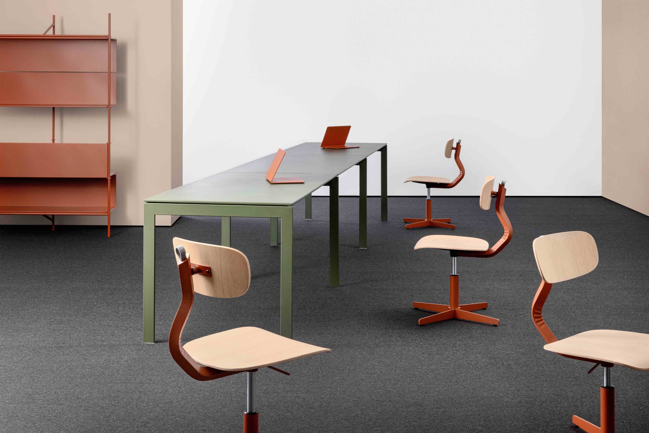
She’s fresh from a successful run with her Selfdiscipline show (a limited edition writing desk, wardrobe, chair and pendant light) at Spazio Rossana Orlandi earlier this year in Milan – her first foray into workplace furniture.
“Selfdiscipline really started with the office chair. I didn’t want to create something as huge and technical as we normally see, but instead a chair that can move and be adjusted while remaining elegant and beautiful,” says Zupanc.
With its gleaming brass castors and concertina of black leather, the resulting Homework chair clearly does not share the same rational design origins as the average task chair – and yet it ends up being no less functional.
The designer is also slotted in to headline the upcoming exhibition of Slovenian design at Tent London during the capital’s big design extravaganza this month.
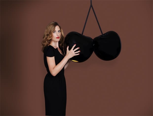
Her Cherry lamp, a flirty pendant of blown glass, will be on display alongside the work of other stand-out Slovenian designers selected by one of the country’s prominent curators. Needless to say it’s been a great year.
.The triumph for Zupanc, it would seem, is that she’s managed to captivate the industry without conforming to it. Doing things on her own terms is the designer’s modus operandi – whether it’s refusing to move to London or Paris from Ljubljana (she says that all her creative ideas come while she’s up one of the hills in the surrounding countryside), or daring to challenge what she calls the “modernistic perimeters” of the design world.
“My tools are the visual elements that are taboo in the design world”
The idea of making a political statement or telling a story through design came to Zupanc early on, during her studies at the Academy of Fine Arts and Design in Ljubljana.
“I was always a creative person, so I was interested in things like photography, stenography, film-making and literature. But it was always the same ideas I was exploring, it was the same story I wanted to tell. In the end, I realised that product design is the way in which I could tell it.”
Zupanc’s direction took shape in 2005 when she produced a series of quite chilling voodoo baby dolls, replete with steel pins, and then the following year a range of stylised Perspex cradles for SaloneSatellite in Milan. It was poignant, affecting material and it got the industry’s attention.
“I tried to use the cradles to change some typical perceptions of new parents,” she says. At the time she was looking for baby furniture herself and found that the market was “really, really conservative. I saw that as a challenge to create an object that is innovative but also beautiful, which brings another emotion connected to the role of a woman who has just become a mother.”
Fittingly, Zupanc defines her approach as “emotional ergonomics” – in other words getting to the heart of why people are attached to the things they choose to buy. She’s most interested in the first ten seconds someone claps eyes on an object, the instinctive reaction before the rational dissection begins.
Although function is central to a project, in her view elegance and provocation are just as crucial. “I think as designers we have a responsibility to bring something of new value, something that could enlighten people or start them to think. It’s not that I think these are revolutionary ideas, far from it, but they wake up certain things in people.”
Certainly after the endless supply of Scandinavian and Italian products at the average trade fair, Zupanc’s work comes as a pleasant shock.
In 2009, the designer exhibited at Superstudio Più in a gigantic, surreal doll’s house with pearlescent smoke coming out of the chimney. Called I Will Buy Flowers Myself, the installation was inspired by the first line of Virginia Woolf’s novel Mrs Dalloway and showcased a collection produced in large part by Zupanc’s own design label, La Femme et la Maison.
The products shown included a mini hotplate in the shape of a lady’s compact (for Slovenian kitchen appliance company Gorenje), a children’s toy car and a range of seating called Sofas in C Minor. They all play with the “feminine archetypal elements” that have become the designer’s trademark, together with attendant themes of duty, control, desire and longing. In 2010 Zupanc returned to Superstudio Più with a similar doll’s house structure: this time she called it Gone With The Wind, evoking another doomed literary heroine.
“If people see S&M in it, that says more about the person than the furniture. There are a lot of different interpretations”
What saves Zupanc’s work from being frivolous is that it’s restrained to the point of severity – it is femininity noir.
The materials and the shapes manage to be quite stern despite the girly embellishments, and perhaps because of this it has a touch of eroticism about it – her Modesty bench’s black satin upholstery and bows waiting to be untied, or the cinched-in suggestion of corsetry in the Tailored chair (launched in 2009 for Moroso).
But Zupanc dismisses the idea: “This wasn’t intentional. It evokes different things in different people, so if somebody sees S&M in it, that says more about the person than the furniture. There are a lot of different interpretations.”
The statement does seem slightly disingenuous with product names like the Unfaithful feather duster (La Femme et la Maison, 2007) or the Lolita lamp (Moooi, 2008), which explicitly reference illicit encounters. But the main thing is that Zupanc’s pieces are trying to say something about feminine values like strength and determination, and the struggles of being a woman, albeit in a slightly twisted way.
It’s dangerous territory in a design industry where emotion and politics are more or less off limits. Is this something she thinks about?
“I am aware of this danger of being misunderstood. But then again I believe in and feel so strongly about what I do that it isn’t something that could stop me,” Zupanc says.
Surely working with companies like Moroso and Moooi (the designer’s “second home”) has been a huge validation of her design impulses. The Maid chair, a prototype echoing the contours of a French maid’s apron, was what first caught both companies’ attention back in 2007. It was too expensive to produce in the end but her Tailored chair followed shortly after, as did pieces commissioned by Marcel Wanders for Moooi – the bell-shaped Lolita lamp, with its lace-like trim, and later the 5 O’Clock table and chairs, based on the floral patterns of English china.
Not surprisingly Zupanc’s defiance carries through to her own image, which she uses prominently in press materials and the storytelling of her products.
“I never wanted to deny that I’m a woman and that I like beautiful clothes or high heels,” she explains. “As soon as I felt that to be taken seriously in the design industry I had to wear flat shoes, cut my hair and create some very intellectual or masculine image – I rebelled. I want to do it my way.”
And so she does.
In the past Zupanc has shied away from the label “feminist”, a curious thing considering the seething message in so much of her work. Eventually she concedes that perhaps she is a feminist, but not in the bra-burning, down-with-the- patriarchy sense of the word: “It’s a very Nika, post-feminist way of telling the story.”


