 Localised design offers an edge in the fiercely competitive Gulf market|Abu Dhabi’s vast central plaza: every detail is designed to capture local flavour|Angular, cave-like interior’s distinguish Wellington’s The Rock|Low-slung seating makes the interior “loungey, but not groovy loungey”|The Rock’s stratified exterior takes its cues from Wellington’s rugged coastline|Breath of fresh air: Maurice Mentjens’ overhauled waiting area at Schiphol|”Recognisably Dutch, but still surprising”: Tjep’s Schiphol retail unit||
Local identity is never harder to find than inside an international airport, but emphasis is shifting away from the generic towards something more distinctive. Which could apparently see Gatwick reworked as a giant pub…
There was a time when air travel promised adventure. Jet-age optimism was crystalised in Eero Saarinen’s swooping TWA terminal at JFK International, completed in 1962. Although no one knew it at the time, it was to prove a high-water mark. Catching a flight in the 21st century is banality incarnate, a foul soup of queues, excess baggage fees and endless retail. In the air, free drinks and nibbles have morphed into a nerve-steadying brandy poured from a sachet.
As the flight experience has plummeted, however, airport architecture has taken off. The incremental sheds of the 1970s and 80s have given way to superstructures of glass and steel that hark back to grand Victorian rail stations. Still the UK’s most significant project is Rogers Stirk Harbour’s Heathrow Terminal 5, completed in 2008 (onoffice 17). But however impressive it is there is nothing about it that says “London” or “England”. Like airports the world over, it remains weirdly detached from the culture and quirks of the country it serves.
But things are changing. In line with other areas of design, most comparably hotels, architects designing the new wave of airports are searching for a local identity in a globalised world. Economics dictate that most of these projects are happening either in the Middle East or China, and the former in particular is embroiled in an expensive game of one-upmanship to design bigger and more sophisticated airports. Major players Doha, Kuwait, Abu Dhabi and Dubai are bidding to attract the most transfer passengers, because, despite their vast wealth and the array of iconic architecture this has spawned, these are still countries that people stop in on their way to somewhere else.
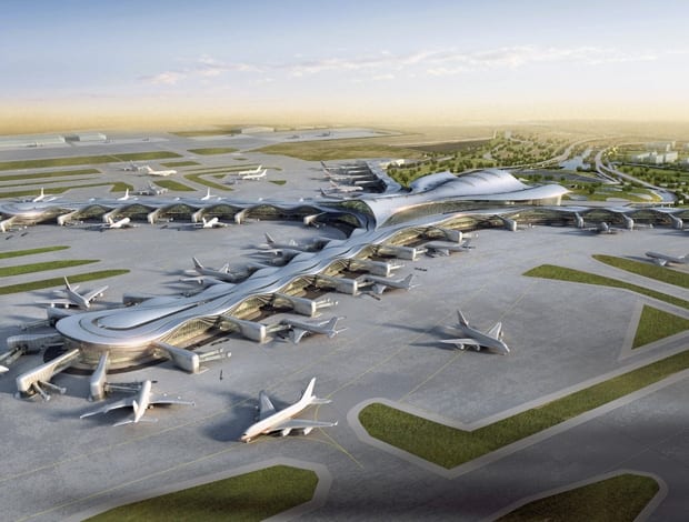
Late last year Foster + Partners released images of its design for Kuwait airport, a kind of futuristic Frisbee comprising three symmetrical wings of departure gates with a 25-metre-high central space at its heart. The initial plan is capable of handling 13m passengers a year and further expansions will increase capacity to 25m. Meanwhile KPF is building a gargantuan cross-shaped structure in Abu Dhabi intended to transform the desert into the “Garden of the Gulf”.
“Abu Dhabi and Dubai are about an hour apart so the competition is intense to try and take business away from each other,” says Mustafa Chehabeddine, KPF’s design principal working on the new passenger terminal. Accordingly the giant cross will house a hotel, offices, a gallery/museum and a central plaza underneath a soaring 50-metre-high arch that will ensure the enormous civic space is virtually column free. “It is so high the feeling of having a roof on top of you almost disappears,” says Chehabeddine. “You feel like you are under the sky.”
KPF has drawn on classical Arabic patterns and colours to create a sense of familiarity throughout the interior. Kiosks, check-in desks, even planters all had to be recognisable as the same family of objects. “It was a way to break down the scale and capture the local spirit, but not in a kitsch way. It gives a flavour of what the city itself would be like,” says Chehabeddine. The same goes for the museum: “If there was an exhibition visiting the Abu Dhabi Louvre then you would get an annex of it in the airport. Passengers travelling through might be tempted to visit the real thing.”
The movement to create a sense of place is perhaps a reaction to globalism and the resulting hegemony, or maybe a realisation that good design is necessary to stay competitive. Either way, every new airport is desperate to establish its local identity. New Zealand architects Studio Pacific pulled off this manoeuvre in unique style with The Rock, a 1,000sq m extension to Wellington airport. Taking cues from the island’s rugged coast, the practice worked with fellow architects Warren and Mahoney to build a craggy, copper-finished edifice that falls halfway between geological specimen and a sheep’s turd.
Eschewing the standard architectural language of flight (transparency, lots of glass, ceilings that soar up to the gods), Studio Pacific experimented with ramps and split-level lounges, creating a nuggety space that invites exploration. “The concept is of a haven, a sheltering form anchored to the land is a direct contrast to the typical open glassy light airport,” explains Studio Pacific’s director Nick Barratt-Boyes. “A lot of that is about creating a sense of place and uniqueness and using the natural landscape of the airport and the terrain around it, which is pretty wild.” (Anyone who has visited Wellington will agree – when the wind blows, even the seagulls walk.)With that in mind the architects sought a calming interior by using local timber, low-slung soft modular seating and warm natural light that penetrates the crusty exterior through fissures carved from the ceilings. A single staircase chisels its way up to a mezzanine floor and a window overlooking the runway. “It has a real presence – loungey, but not groovy loungey,” says Barratt-Boyes. Most of the retail was housed in the original brutalist structure, which is stitched to the Rock by a glazed link. This allowed Studio Pacific to keep the new building shop-free, satiating the commercial appetites with a cafe instead, although sightlines back to the retail units were carefully crafted.
This kind of radical design is impossible without a visionary client. In this case it was the airport’s then-CEO Steve Fitzgerald who urged the architects to be bolder. The result is a true original that locals and architecture juries are still grappling to get to grips with. “It’s a struggle, but it’s a good struggle,” says Barratt-Boyes. “I saw a survey that placed it at number four or something in the best airports in the world. They were still trying to work out if it was the best or the worst airport.”
The Rock is anomaly, occupying a pocket of space between the runway and the original terminal, with no scope for further development, which leaves a question about whether a building like this would be possible on a grander scale. It’s a question that Studio Pacific may soon be called upon to answer, since it is in the running for the next phase of Wellington’s development, a project Barratt-Boyes says is five times the size of The Rock. “I think a lot of those airports extrude their form as they need to expand, but having done what we have done, what do you do next?” What indeed?
The problem facing more established airports in the US and Europe is how to improve on structures that have expanded piecemeal to meet demand. In the 1970s and 80s, Schiphol in Amsterdam was regarded as one of the best airports in the world. Today, this crown has been usurped by Hong Kong, with Schiphol slipping to a still-respectable sixth place (Heathrow was 99th). Keen to re-establish itself as a world leader, the airport has undergone two separate revamps carried out by Dutch design studios Maurice Mentjens Design and Tjep.
Around half of airport revenue comes from shopping. Unfortunately, retail contributes to the sense of non-place that blights the airport environment. To counter this Tjep was called in to redesign three shops in Schiphol’s third terminal, which sold traditional Dutch fare: cheese, bread and, of course, tulips. “The challenge was to be recognisably Dutch, but still be surprising and still have a sense of sophistication,” says Tjep’s Frank Tjepkema. “So we tried to use the kitsch elements to our advantage.” Most conspicuous is the House of Tulips, modelled on traditional Dutch canal houses, whose entire structure is hoisted up to the rafters when the shop is open. The gesture might seem extravagant, but for Tjepkema it was the easiest way of maintaining sightlines through the terminal. “They [the architects] wanted to leave out as much as possible so you can see the planes wherever you are in the airport.” The project’s success has won Tjep the commission to design a further 2,000sq m of retail space. Tjepkema says the plan is to make it feel more like a village, but concedes that for it to be flexible it must also be more generic.
Maurice Mentjens Design has a deserved reputation for inventive projects, often on a shoestring budget. In 2008, it was commissioned to overhaul a small waiting area in a forgotten part of Schiphol. Under the direction of the airport’s concept developer Maryan Brouwer, the studio designed a park-themed lounge complete with fake trees, simulated lawns and fluttering digital butterflies. “The idea was to get some feeling of nature into the building,” says Mentjens, who has mixed feelings about the results. “It was interesting at the start, but the ceilings are very low. In a normal airport with six- or seven-metre ceilings it would have been better.”
Mentjens’ problems were compounded by various bodies with vested interests in the design. The retailers proved to be the most demanding. Despite a customer survey that showed the majority of passengers were against shops being included in the lounge, commercial pressures trumped the desire for peace and quiet. “People wanted to be left alone, but what do you have in there? Three retail booths!” he chuckles. Still, Mentjens’ creative flair is in evidence. Improving on the blandly efficient benches favoured by most airports, he designed inviting soft seating that sweeps through one corner of the lounge. The space has the air of a corporate office trying to funk up its breakout space, but despite Mentjens’ misgivings the airport park looks a more relaxing space than most.
Mentjens’ experience highlights the difficulties of dealing with so many different stakeholders. International practice HOK is currently picking its way through this minefield as it overhauls Gatwick. Despite speculation surrounding “Boris Island”, the almost-mythical plan for a new airport in the Thames estuary, this £1bn revamp of the world’s busiest single runway airport is the UK’s biggest “live” project. Much of the work will focus on heaving Gatwick’s creaking South Terminal from the 1950s into the 21st century. The North Terminal will also to be extended to handle an extra 10m passengers a year.
Barry Hughes is HOK’s vice-president. A charismatic Texan, he believes Gatwick, like Abu Dhabi, needs to find its local identity. “We wanted to introduce this idea
of the richness of the countryside that Gatwick sits in and the idea of the English pub and combine that with something aerodynamic and very forward.” The mix of nostalgia with the futuristic is a curious one. It is difficult to think of anything less aerodynamic that an English boozer. It’s the amalgamation of two separate concepts (the client liked both the pub and aerodynamic ideas) and constitutes a kit of parts that can be added as different areas are renovated. Shop fronts, kiosks and seating will be redesigned and the ticket hall and waiting area ceilings replaced. “We are trying to maintain a grand space, but at the same time break down the scale so it feels a little bit more intimate and relaxing.”
Outside of the business-class lounge, it is virtually impossible to find somewhere to plug in a laptop. It’s heartening to hear Hughes extol the virtues of more soft seating and casual workspaces. “I’ve been there, using the cleaners’ outlet leaning against the wall,” says Hughes. “Airports need to make sure that customers feel comfortable using the space without being obligated to buy a business-class ticket … but it does cost valuable space.” And here lies the crux. The pressure to commercialise every square metre of an airport is intense. Consequently, shops and blandly efficient beam seating win out most times. For his part, Hughes seems genuinely interested in recapturing air travel’s lost glamour, or at least making it less mind-deadening. “A step in the wrong direction would be to build airports as just pragmatic buildings, and not build grand spaces. At that point it becomes even more depressing. I still think that communal space represents a civic aspect of society.”

