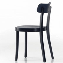
 It might seem strange, but in the riot of competing egos and jostling brands that constituted this year’s Milan furniture fair, it wasn’t an aeroplane made from mosaic tiles by Jaime Hayon or Marijn van der Poll’s office desk that looked like a jet-fighter that stood out for me, but an undemonstrative 1950s-style cafe chair. Rather unusually during a week in which one feels the need to be in perpetual motion, moving from launch to launch, cocktail party to cocktail party, Vitra’s Basel chair made me stop and think.
Designed by Jasper Morrison, it is hugely elegant and surprisingly comfortable. But it also raised a couple of questions about the industry as a whole. If it hadn’t been on the Vitra stand and if Morrison hadn’t designed it, would I have even seen it? Should one expect more from a cutting-edge manufacturer and a world-renowned designer than a simple cafe chair? And what exactly is the role of the designer in a piece as familiar as this?
I have to confess to chewing it over for several weeks before finally concluding that this is exactly what design should be doing. It doesn’t need to ostentatiously reinvent form, or be laced with wit, and it certainly isn’t required to work in the same manner as the fashion world. It can just make familiar objects a little better. “It was partly a correction on my part, having done the Air Chair for Magis in plastic in occasionally fairly strong colours without really considering what the effect would be if a cafe put 40 of them on the pavement,” explains Morrison in his quiet, deliberate way, as we chat in his east London studio. “It coincided with the Super Normal project and just looking at what design does these days – in a lot of cases it pollutes our environment. And projects such as the Air Chair in the colours I originally chose were part of that problem. They may be helping the restaurant to get noticed, but that is completely wrong. It is the wrong function for design.”
As a mea culpa goes, this is fairly extraordinary. But, it transpires, Morrison is not finished quite yet. “I would much rather sit in a cafe that had lots of old wooden chairs than in a designer cafe,” he adds. “And I don’t know many designers who would disagree with that.” So does he regret designing the Air Chair in the first place? “I regret the colours,” he replies. And what about the rest of his extensive portfolio? Are there pieces he wishes he hadn’t created? “Well, in some cases, yes. But I didn’t have that realisation then. Now I see much more clearly what my role should be. It doesn’t mean objects have to become boring, but it means we should consider where they are likely to end up.”
Now it’s probably worth pointing out at this stage that these revelations come towards the end of an interview notable for its Pinter-esque pauses. Morrison is famously shy – so much so he has been known to deliver lectures in silence – meaning everything he says is measured and cuts straight to the point. Rather like his work, he is not someone to indulge in verbal flourishes, and until you get used to his style, it is ever-so-slightly disconcerting.
Born in London in 1959, Morrison wasn’t surrounded by contemporary design as a child. “There was Habitat,” he says. “To see a modern interior was pretty rare, but there were some. My grandfather had one modern interior in his house that was filled with Danish furniture, so there were influences like that.” Tinkering with becoming an architect or an engineer, it was a visit to an Eileen Gray exhibition at the V&A that opened his eyes to design, leading him to study first at Kingston and subsequently, in 1982, at the Royal College of Art. It wasn’t an obvious career decision, as modern design at that time didn’t enjoy the profile it does now. The fact that he succeeded so spectacularly suggests there is plenty of steel behind Morrison’s reticent exterior. He was certainly aware that to make a go of running his own studio, his horizons had to extend beyond the UK. “Whatever there was in England, I wasn’t looking at it,” recalls Morrison. “I was much more concerned with what was happening in Italy. To me, that made much more sense.” Picked up by manufacturers such as SCP in the UK, the ironmongery firm FSB in Germany and, importantly, Cappellini in Italy, Morrison’s profile grew to such an extent that he was even invited to design the Hanover tram in 1995. Other products he has been behind include kitchen appliances for Rowenta, a bathroom range for Ideal Standard, lighting for Flos and a host of products for Vitra, including the ATM desk system. Most have been characterised by a sense of reduction, boiling the object in question down to its bare, but usually beautiful, essentials.
The results of his recent “realisation” can be seen at the Vitra Store in New York, having also made stops in Tokyo and London. The Super Normal exhibition that Morrison curated with Japanese product designer Naoto Fukasawa is probably best viewed as a reaction against the current bloated state of the design industry and its obsession with superstar designers. “From my point of view, it is a product of who we are designing for,” he says. “Are we designing for the media or are we designing for the user? I think designers have lost sight of who they are designing for and the media seeks out the more sensational aspects of design. They are, in a way, distorting the profession. The emphasis is too much on the visual and the sensational. That is not what makes a good object – you want the whole story.”
The exhibition seeks to redress the balance by showing 200 everyday products – ranging from a plastic bucket to a potato peeler to Dieter Rams’ 606 shelving system – that aren’t attempting to reinvent the wheel, but instead do their job quietly and effectively, while being a pleasure to have around. This isn’t about design trying to ape art or act as some kind of crutch to a company’s marketing department – it is a celebration of industrial design for industrial design’s sake and, as a result, is rather refreshing.
The idea for Super Normal germinated as Morrison was designing a set of cutlery for Alessi. “I have been designing things for a long time and looking with an eye as to what works in real life, rather than just trying to make things that look good,” he says. “In the course of looking, I started to realise that a lot of objects probably best described as ordinary worked better than most designed objects. And that kind of intrigued me. I started to learn a lot from more ordinary objects and I tried to use them as a gauge of what I was doing.”
This new outlook has proved more than a little controversial. In 2006, the Crate – a bedside table Morrison designed for British manufacturer Established & Sons that looked, well, just like a crate – drew stinging criticism. Did he realise it would cause such a storm? “Not at all,” he says. “No, that was a surprise, but a good one, I think. I have never really looked to cause controversy, but I have to say I quite enjoyed it.”
The idea came because Morrison had been using an old wine crate next to his bed when Established came to him. “I just looked at it and thought it was a great solution to a bedside table – I’d be happy with that.” However, even he admits to initial reservations. “Before I showed it to them, I was anxious that they might think I was joking,” he says. “But I explained my thinking and they liked it. What astonished me was that in the same year, someone [Ron Arad and Issey Miyake, if we’re naming names] designed a chair that could be worn as clothes and people weren’t outraged by that. I think it was a really big misunderstanding on most people’s part. They thought it was a cynical project, but it wasn’t at all. It was just my way of showing that design can come from anywhere. It can come from experience, it can come from chance, it can come from observation, or it can come from just plain good luck.”
Part of the reason it attracted such barbs, I proffer, was down to his choice of manufacturer. Established & Sons, after all, is acutely aware of the value of good marketing. It’s a company that throws the biggest and most glamorous parties and, arguably, pioneered the hugely lucrative and wildly over-hyped design/art market. The thinking behind the Crate was always likely to get lost in the surrounding hyperbole, wasn’t it? “I don’t think that the size of the party makes the object controversial,” he rebuts politely. “At that point, it was just part of an exhibition. People didn’t read the story. If they had read the pamphlet, they would have understood the project.” Maybe.
Whatever, the following year, he exhibited a stubborn streak and came up with a bunch of products based on the Crate’s original concept, to a much warmer critical response. “I decided to be annoying,” he says with a half-smile. “Again as a project, I think it’s interesting. Part of design is being economical with every aspect. Economical with materials, economical with process but also conceptually economical.”
Ah yes, but what about when the manufacturer decides to turn your economical crate into a one-off marble sculpture and stick it on a 20-foot plinth as Established & Sons did at the London Design Festival last year? “Well, that was a bit more them than me,” he answers with a bit of a shrug, before adding: “I thought it looked quite nice, actually.” But this is hardly Super Normal. Didn’t he feel a little awkward seeing it up there?. “Not really,” says Morrison. “I think that if it’s a limited edition, or in the case of the marble piece, a one-off, then it is pretty harmless. They wanted to do a show where they did everything in marble. It would have been mean spirited of me if I had said no. I don’t like being uptight about things. It is very easy to be over-protective of your work, or your way of working, and I think that’s a mistake.”
Morrison is certainly not above dabbling in the editions market, making pieces for the likes of Vitra and Galerie Kreo in Paris. “It is pretty different,” he confesses. “It’s design for a different situation, really, not for everyone, for sure. I like doing it because it’s a freedom from all the constraints that you have as a designer when you are considering how to make something in volume, and that is really nice.” That said, he admits he resisted dipping his toe in for a long time, “because as a young designer, your goal is manufacturing and volume, and I focused on that. When you achieve that, I think that is reasonable.” You get the distinct impression that having done the hard slog, the art market becomes, in effect, the designer’s pension plan – a lucrative opportunity to have some fun. This is absolutely understandable, although it would be remiss not to point out that design/art bears some responsibility for distorting the industry, encouraging the established star system, celebrating form over content and providing students with a model that, one suspects, will prove to be unsustainable. In fact, all the stuff Super Normal is supposed to stand against.
But then I get the impression that Morrison is too open-minded – too polite, even – to be a true zealot. As he points out: “Having spent many years constraining myself and rejecting everything apart from what I thought design should be, I think I am much more open than I used to be. I am quite interested in contradictions as a way of keeping my work alive. If you refuse to consider things, you end up running out of steam on what you’re doing.” Certainly the Basel chair suggests that he has enough steam to quietly rattle a few cages for years to come.

