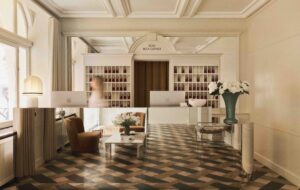
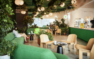
 Ilse Crawford keeps it real for London office fitout|The art of mixing up colour, texture and pattern at Soho House New York|Restrained rustic for “modern coaching inn” The Olde Bell in Berkshire|The Arts and Crafts Kranzbach Spa Hotel, deep in the Bavarian Alps|Blanket-clad walls and Matthew Hilton’s Fin chairs for The Olde Bell’s dining room|Grand Hotel Stockholm’s opulent dining room, more formal in style…|…and the same hotel’s more laid-back Food Bar, all timber and tiling|Ad agency Rapier gets the Studioilse treatment, including a moody boardroom|A seriously heavy-duty desk at Rapier contrasts with white room-dividing shelving|A-frames in castors used as moveable inboards – or to barricade yourself in|Custom-made oak and leather tables and industrial pendant lighting||
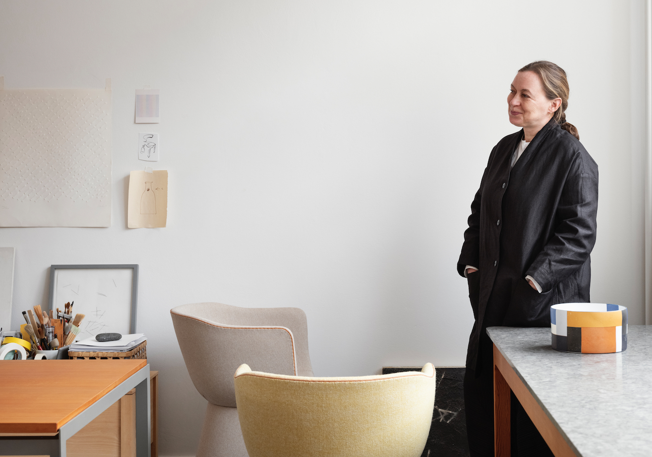
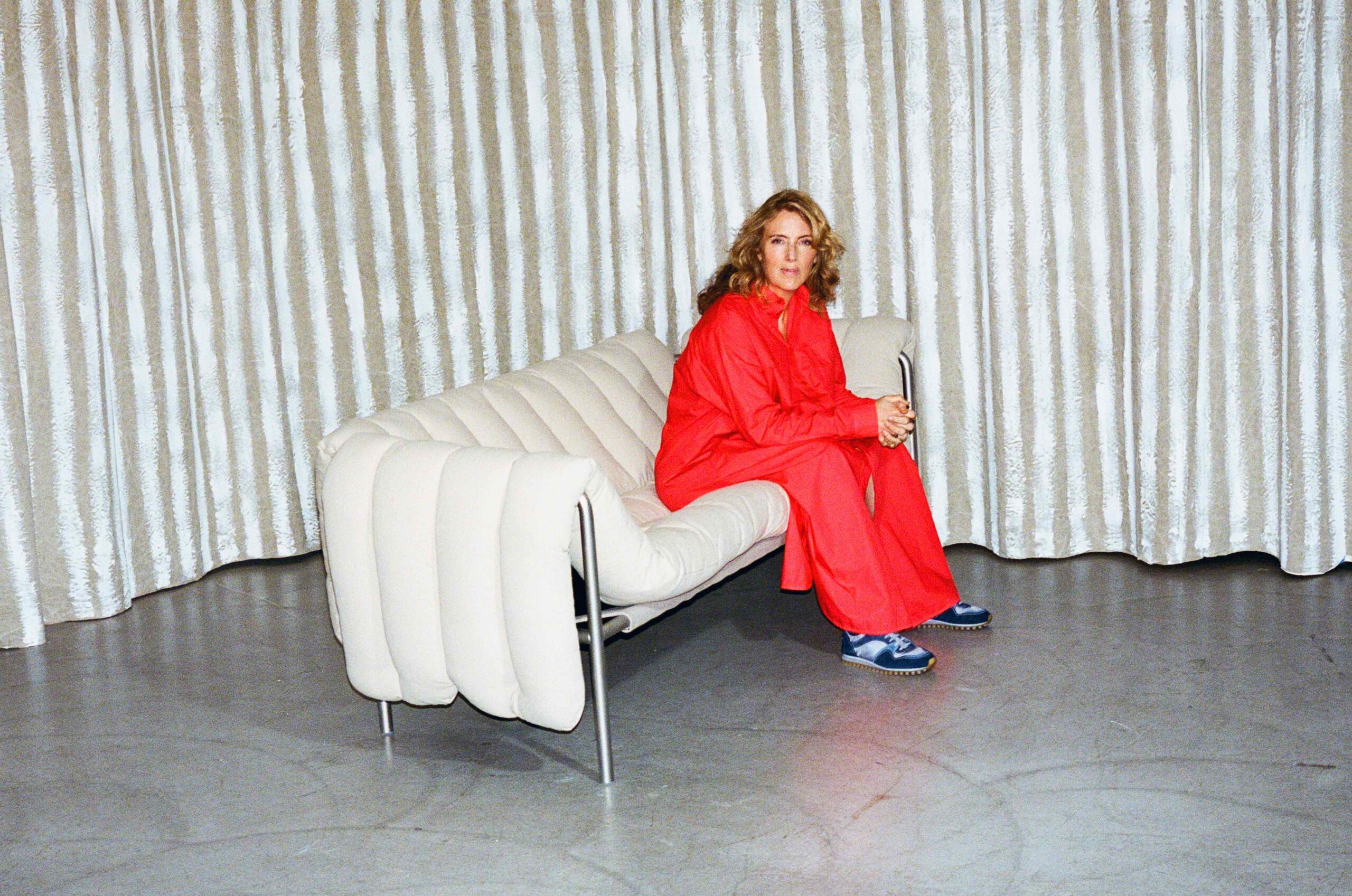
Via her design and branding firm Studioilse, Ilse Crawford applies an intuitive approach to places and objects – which can work just as well in the workplace, as her newest project demonstrates
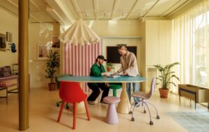
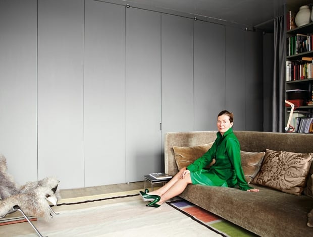
Ilse Crawford’s loft apartment near London’s Borough Market has the lingering aroma of last night’s cooking – something cumin-y and exotic.
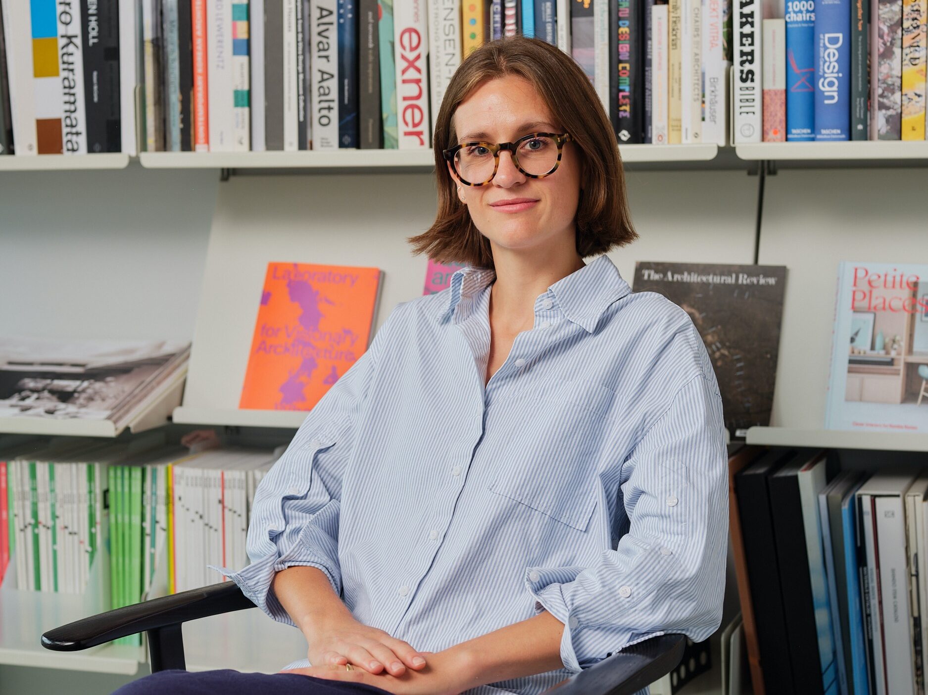
Floor-to-ceiling shelves are heaving with architecture books and trinkets, among them a phrenology bust and a collection of glass teapots twinkling in the warehouse window. Sheepskin throws and feel-me fabrics have been strewn over the backs of chairs and the sofa, and the designer herself has managed to clear a spot for her laptop at a cluttered table in the middle of it all.
The effect is classic Crawford: enchanting, though much less obsessively perfect than might be expected of one of Britain’s most celebrated interior designers.
It feels like a real, lived-in home – and so much the better for it. The space also doubles as an impromptu meeting room and canteen for the 12 staff of Studioilse, Crawford’s multidisciplinary design practice, which resides on the floor above.
“I’ve always liked the idea that you can cook and have a civilised existence when you’re working in a studio,” she says. “It feels human. I like the idea that you can keep some sense of the normal in daily working life.”
Crawford’s fascination with the humanistic aspect of design – “the things human beings respond to” – is well documented. From Bath’s Babington House hotel through to a recent office fit out for London advertising firm Rapier, the experience of people – what they feel, smell, hear and see – eclipses how a space will look.
As it happens, Studioilse’s projects never seem to disappoint visually, as Soho House, Grand Hôtel Stockholm and London eateries Cecconi’s or Kettners can attest.
“For all the physical and emotional connection you need a formal way of manifesting it,” says Crawford. “So the goal is to try to bring the two together – not for the sake of it but because it connects us to ourselves and to the world we live in, to other people. That’s when design starts to get interesting.”
Over the last ten years Studioilse has built up an impressive client base (including Swarovski, Cowshed, Waterford and Aesop) using a self-titled recipe of “modern and emotional design”.
The work is a heady mix of hospitality, domestic and workplace interiors and architecture, furniture and products, with the most recent pieces for De La Espada and Wästberg launched during this year’s London Design Festival.
“We learn through all of our senses, rather more quickly than through the eyes”
Crawford reckons her design sensibilities stem from her Danish mother, artist Jill Tendall, who ran her childhood home with a Scandinavian sense of “hygge” (pronounced hoo-ha), which roughly translates to bringing intimacy and soul into a building.
“It’s that idea that you can bring people together, that space is a dynamic sociable thing,” says Crawford. “That was very much practiced in our family. There were five children but everybody from around would hang out at our house because ours was the one with the big kitchen table, and the games in what was usually the stiff sitting room of other people’s houses. We had fun.”
It goes without saying that Crawford has mastered the art of low-key luxury interiors – but her route into design wasn’t straightforward.
Born in 1962, she grew up with her four siblings near Portobello Market in Notting Hill and later Kent, with sights set on a career in architecture.
“It’s the usual story, creative parents without much money, so we were allowed a lot of freedom,” she explains. Eventually the architecture idea was abandoned for a career in magazines – namely, as an office manager and sub-editor on The Architects’ Journal, then as an editor at The World of Interiors.
But it was after launching British design bible Elle Decoration in 1989, and subsequently seeing four or five thousand interiors over the course of a decade, that Crawford properly began to question things and form her own ethos.
The problem, apparently, was that all of the spaces looked fabulous but very few genuinely felt good to be in.
“I started to realise that I actually felt very uncomfortable with things that were so visually driven. And it’s going back to that hygge thing again. I was interested in what made a space habitable but also contemporary.” This line of enquiry has been the basis for Studioilse, which launched after the designer returned to London following a stint in New York at Donna Karan Home at the end of the 1990s. “It wasn’t my ambition to move up the corporate ladder,” she says of her reasons to move back to Europe. “I wanted to be where the creative ideas start. I didn’t want to be doing Excel spreadsheets.”
After returning from New York Crawford launched a “wellbeing” title, Bare, for John Brown Publishing, which only lasted a year and took a bit of a hammering in the press. But it was an important endeavour, she says, because it allowed her to research ideas and hone her design approach: “I think ultimately we respond to our environment from a physical perspective. We learn a lot through all of our senses, rather more quickly than through the eyes. They all have different functions.”
These themes are explored at length in Crawford’s bestselling books, Home is Where the Heart Is and Sensual Home, but it’s as the head of Design Academy Eindhoven’s Man and Wellbeing department, which she launched 15 years ago, that the ideas are fully explored.
Crawford lights up when talking about recent student work; a de-mining device designed by an Afghan refugee, a project aimed at bringing humour into hospital waiting rooms and a coffin designed to “tuck” a person in, to name a few.
“It’s a funny word, ‘wellbeing’, and a bit soppy in the sense that you can say ‘Ah, wellbeing. Fa lalalala’,” she muses. “But the wellbeing that I’m interested in is Teddy Roosevelt’s Second Bill of Rights wellbeing – the one that basically says that along with economic growth you need to look at the individual’s wellbeing. That’s essentially what the department is about.”
“The trouble with those old-school offices is that they’re quite detrimental to human communication of any sort”
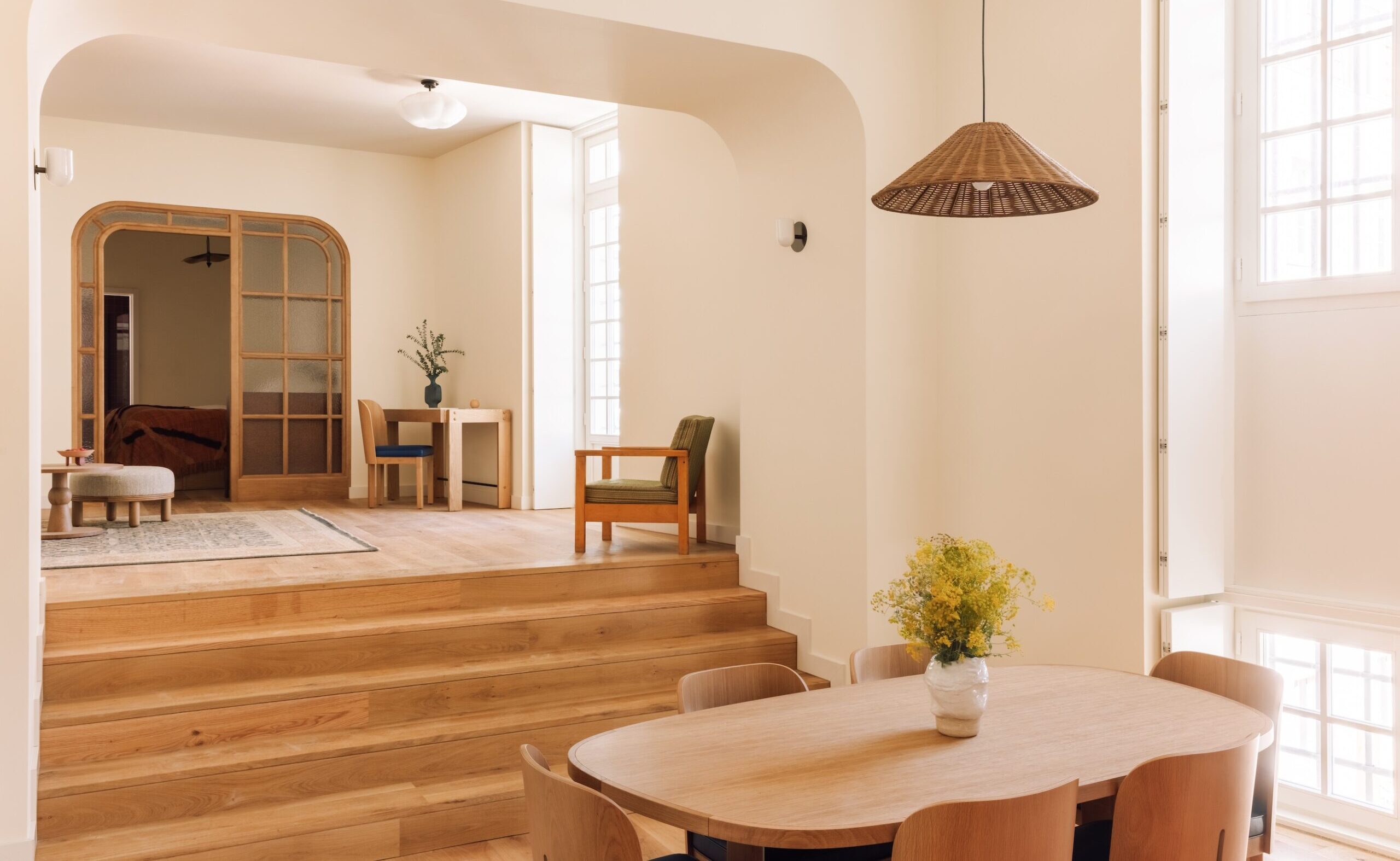
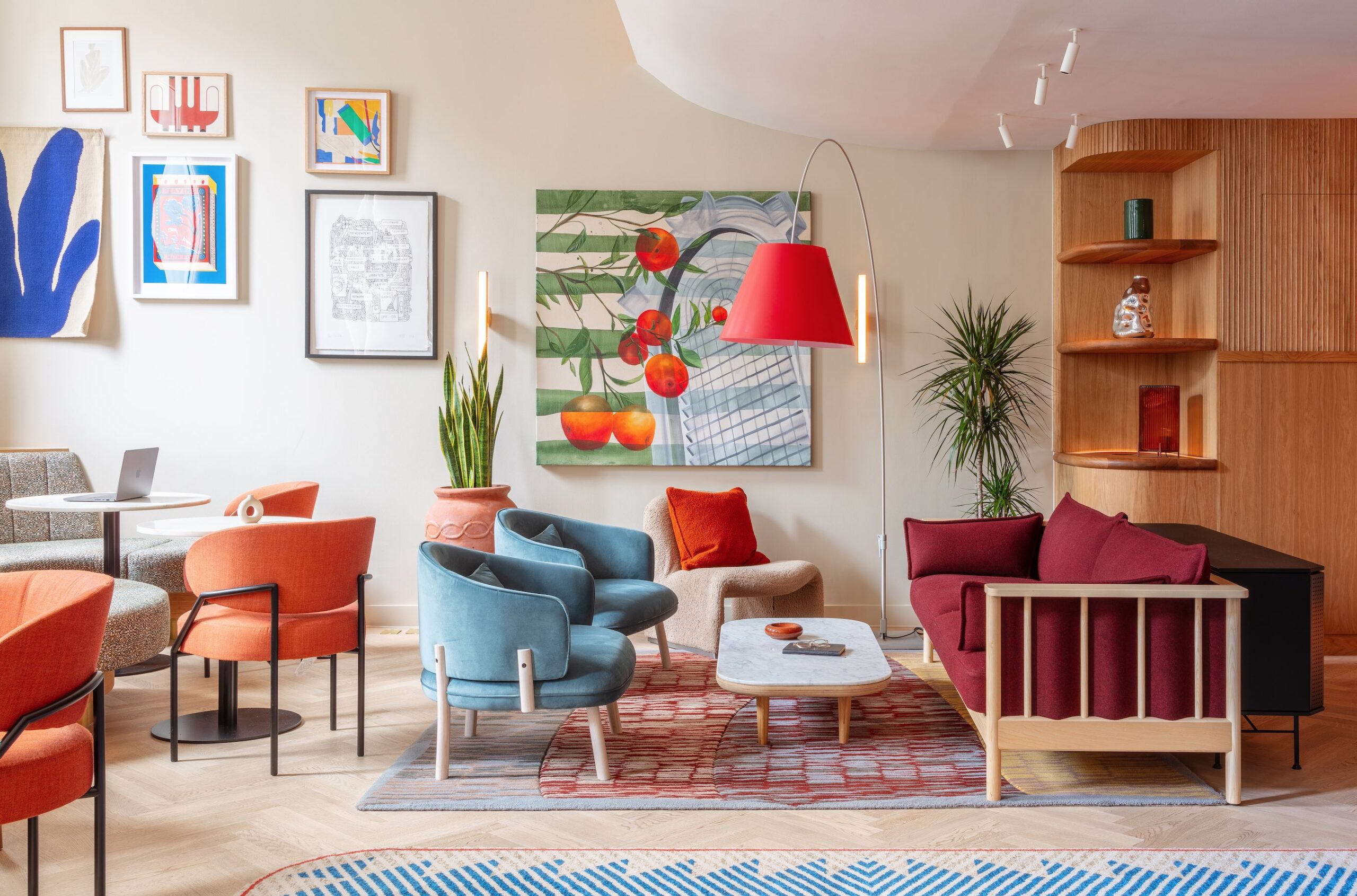
It’s hard to pin a signature style on Studioilse, but there do seem to be some common threads, such as the use of simple, high-quality (or what Crawford calls “real”) materials. There is a tendency towards warm colours, texture and a mix of traditional and modern forms, although the designer hesitates to define things in this way.
“What I think is important is the total idea. I think you can mix different ingredients, which might be different periods, but not necessarily,” she says.
More than anything there is an acute sense of the whole experience, down to minute details.
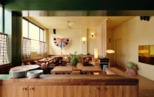
She references the two “modern coaching inns” that Studioilse completed in 2008, The Olde Bell and The Crown: “You can’t use real materials like oak, felt and brass, and serve real food, and then use chemical cleaners. It just destroys the whole world that has been made.”
The place has to have authentic smells, whatever they are, otherwise a person will quickly read the whole environment as a fake, says Crawford. “I think that’s because we’re actually highly intuitive beings and intuition is basically all of the senses added together. That’s how we survive and how we make up our mind about things.”
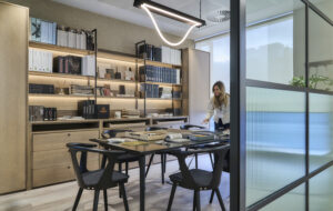
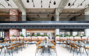
One can see where the boundaries of hospitality and workplace design blur in Crawford’s office for Rapier’s 150 staff, created in collaboration with architects APA and completed this year (with work still ongoing).
Perched above London’s Westway in the legendary Battleship Building (designed as a British Rail maintenance depot in the 1960s by Paul Hamilton), the three-floor space abandons everything from the firm’s previous home near Tottenham Court Road.
“They’d got to a point where the owner could see it was damaging relationships between people. The trouble with those old-school offices is that they’re quite detrimental to human communication of any sort. There is nothing like lots of little cells to create dodgy office politics,” she says. “And through the furniture you felt uncared for, basically.”
For budgetary reasons the infrastructure of the building was kept as is, with the money spent on things people would sit on, touch, and see. Bulky desking systems and storage were replaced with an eclectic mix of timber tables and a perimeter desk with views out, oriental rugs and lots of plants. Moving away from a Taylorist, factory-driven approach, new and vintage furniture gives shape to zones where staff can work individually or be together.
The difference here is that instead of clinical breakout furniture, Crawford has used everything from light industrial machinery to the sort of stuff you might find at home or a hotel.
Wooden A-frames on wheels have been designed for creative brainstorming, but crucially, they can also be moved around to build barricades. “There is one guy who is obviously less social than the others because he’s arranged four A-frames around his desk. But that’s fine,” she says. “That’s the point. I’m a big believer in that sort of Herman Hertzberger thing of just let people do what they need to do, and it’ll all work out.”
Crawford also took on the issue of lighting – abandoning the rigid “on-off” scenario found in most offices for a series of industrial-style pendant lights and desk lamps.
“The fact of the matter is that a lot of the existing lighting regulation in offices is very old fashioned. It came in at a time when people were badly in need of regulation because spaces were under-lit, but now we’ve gone the other way and we’ve got light pollution, frankly,” she says. “It was so interesting to see the difference in atmosphere when we made that change. People were more relaxed, more jolly – it just became a more pleasant place to be. And I think that if people are happy and comfortable then good things happen.”

