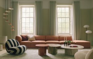
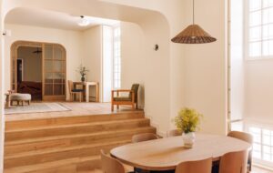
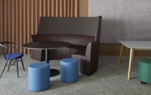
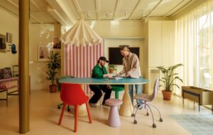
 At 95 Wigmore Street, the stepped walls and ceiling draw visitors inside|Bespoke furniture includes Corian and leather seating by Benchnmark|Multi-tenant offices like 10 Brock Street need receptions with brand appeal|Materials such as oak, stone and bronze aim to express the building’s quality|Single tenants can stamp their brand: Acrylicise created this art for Heinz|For Investream, Acrylicize mounted a spiral of dominoes on the wall||
Reception areas are a building’s chance to make a lasting first impression on its visitors, and construe subtle messages about the companies that inhabit them. Not so long ago, this fact instigated glossy and imposing spaces, with heels clomping across a vast expanse of marble floor (with the sound echoing off the marble walls), but now they are a little more welcoming. Online fashion store ASOS’s entrance (onoffice 80), for example, is done out in reclaimed scaffold board and eclectic vintage furniture, with a bustling cafe to boot, while Rochdale Council’s new HQ (onoffice 81) did away with the ominous reception desk altogether, opting for movable booths and so-called ‘floor-walkers’ to greet visitors instead of receptionists.
“Receptions have always been important because they’re the front door to your house,” says John McRae, director at architecture practice Orms, describing 95 Wigmore Street, the firm’s new multi-tenant office development in London’s West End, for Great Wigmore Partnership. “What I’ve seen change is that they have become more human. Look back 15 years, and receptions were quite prestigious; they had the expensive materials and durability, but they were impersonal. They are used in a different way now.”
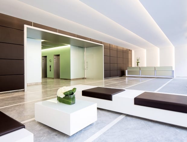
Orms’ reception design for 95 Wigmore Street is still impressive, but in a softer way. Working with a single-height space but aiming to create the illusion of depth, the firm drew inspiration from the forced perspective courtyard in Rome’s Palazzo Spada. The ceiling and walls form a series of angled ‘sleeves’ that decrease in size deeper into the space. Lights embedded on the inside edge of each fin keep the ceiling minimal and lead people into the building, creating a sense of entrance and drama. Polished plaster surfaces are spray-painted white, to absorb light, giving the space its diffused glow.
“You’re always looking towards an illuminated space; there are no dark grey ceilings or downlit areas,” says McRae. “We still have the marble floors and mirror-backed glass, but there’s a human aspect. Tenants don’t want a cold space – it needs to be warm and welcoming, to feel like it’s their building.” McRae also points out that there is a stark juxtaposition between designing a reception for a single-tenant office and a multi-let. The first is branded from the get-go and often used as an extended meeting/breakout area, whereas the latter needs anonymity while still making an impression on prospective tenants. “It’s a delicate balance,” he says. “This [reception] intentionally didn’t have high-backed chairs and chandeliers and rugs, because it’s more of a transitional or holding space between the street and the end user. We looked at Apple Stores for their use of materials and clarity, but also for their legibility; they’re not for having meetings and drinking coffee – you move through them.”
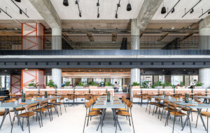
Similar in intention but very different in scale is the reception at Wilkinson Eyre Architects’ (WEA) recently completed 10 Brock Street, part of British Land’s Regent’s Place development. Tenants including Facebook, Debenhams and Manchester City FC will share its enormous 1,200sq m lobby, which connects front and back entrances, a restaurant and coffee shop, meeting areas and lift lobbies. It’s an intermediary space that Giles Martin, director at WEA, describes as a forum. “We do a lot of large volume spaces like this but they’re generally train stations or convention centres,” he says. “British Land wanted warm colours and high quality materials; a clubbable atmosphere.”
The walls are clad in 7m-high oak planks in various widths, creating a sense of movement, and the floor is sandstone with marble inlay, with a huge bespoke bronze reception desk at the centre, surrounded by clusters of colourful leather furniture. Geometric fins form a dynamic roof over the front half of the lobby that, like the ones at Wigmore Street, are designed to draw people into the space. “It’s such a large space that it needed visual devices to bring people in, like these shark’s tooth ribbons. They open up and let out more light towards the centre of the space, so they get brighter as you move into the building.”
Beyond this lies a full-height glazed atrium with lift lobbies to the offices above, giving workers a view to the bustling indoor plaza below. According to Martin, this busy, multifunctional lobby area is a common evolution in reception design, as is size and impact. “Receptions are certainly getting bigger,” he says. “Ten years ago they were a corner of the building hived out, but now they are double, triple height spaces, with plenty of different things going on. Also, as an architect for a shared office building, the richness of design is in the reception. The offices have to be as anodyne and plain as possible, so prospective tenants can imagine themselves there, so for architects, the reception is the main attractor.”
Lauren Geremia, interviewed in onoffice 77 and workplace designer to Dropbox, Instagram and other Silicon Valley start-ups, spoke about the increasing amount of developers commissioning her to design reception spaces that would entice design magpies. London-based art collective Acrylicize has seen the same trend. “Developers are wanting to give their communal spaces an edge or a differential,” says creative director James Burke. “Often the reception is visible from the street and they want artwork that will stop people in their tracks.” Likewise, most new large-scale commercial developments in London are expected to feature public art, to interact with the public and bring more to the community.
A recent Acrylicize piece for an Investream multi-tenant building features a spiral of dominoes, conveying the idea of connectivity. Another, far larger, piece for the Heinz Innovation Centre in the Netherlands is a 30m-long collage of imagery exhibiting the brand’s history of innovation. Comparison shows how designing for a single client is an entirely different kettle of fish. With a developer, Burke says, it’s more up to the artist, whereas with a brand, there’s a story to tell, to encourage you engage with the company. Across both spheres is a concurrent theme, though, for reception areas imbued with more personality.
“People are embracing art and environment a lot more than they were,” says Burke. “There’s a reaction to standard fit outs, stemming from a desire for identity. Businesses are looking to define themselves, stand out from the crowd, and art is an impactful way of doing that. When you walk into a space, it’s going to be one of the first things that hits you.”
See 360° panoramas of the Heinz Innovation Centre reception here: http://nikreations.co.uk/indie360/heinzwall57/ and Investream’s offices here: http://nikreations.co.uk/indie360/investream/

