 London Met Students
 Echo
EchoThere was never any doubt. Team Echo stood out as the clear winner on every level: space planning, design, visual presentation and team effort. The eclectic mix of the team members – Polish, Hungarian, Lithuanian and British – ensured an international approach to designing the press working area and a strong group dynamic, especially after having two laptops stolen just days before the deadline.
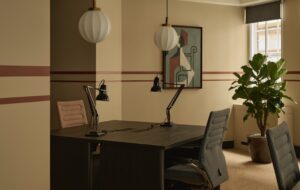
“We decided to integrate the context of the building – the Olympic Village – into the interior by encouraging the visitors to look out of the windows,” says Olga Jaszewska. This “bringing the outside in” theme echoes throughout the floorplate – hence the team name. What won the judges over more than anything was the high level of consistency that shone through the design as well as the presentation. The colour coding created clarity and when Jaszewska walked the judges though the space it really came alive. Peter Williams says: ‘‘We simply kept asking, ‘How would we like to deal with the space?’ If we all like and get it, then it will work.”
The break-out areas and cafes are tranquil and soft, while the office areas have various flexible desking solutions. The use of touchscreen technology lends the sophisticated design a 2012 feeling. The students told us about how Enrico Caruso, one of Gensler’s principals and a tutor/ judge on the competition, helped by taking their initial ideas to another level. All in all it’s a stylish, user-friendly space.
ID
The close second was team ID, which evidently put a lot of hard work into its project – but its ambitions somewhat diluted its presentation’s transparency. The team’s concept idea, however, was strong. The theme was photosynthesis, incorporating the current buzzwords associated with the Olympic project – environmental issues and the regeneration of east London – into the mission statement.
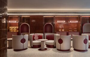
The space plan is broken down into the studio space, the press work area and relaxation spaces, and each room is highly designed. Adopting aesthetics from clubs, the break-out areas have a loungey feel. The colours and fabrics suggest luxury, with deep purple, bright reds and pinks. Details such as guidance for the visually impaired and disabled access demonstrate how well thought through the entire project is. Clever design solutions like soundproof pods and fibre optic chambers present an innovative approach to working realities.
The studio space from where the interviews with the athletes would be broadcast includes a make-up room and wardrobe. The most striking feature of ID’s design is the bold, powerful use of light. Different coloured beams add ambience while a wide range of lighting solutions make the space a visual experience. We’re not sure how that ties in with the environmental mission, as it would surely use a lot of energy! Anyhow, the detail is outstanding and while the space feels more like a club then a workplace, we don’t think we’d mind mingling there with our journo pals.
Vision Design
If rhetoric is anything to go by, this group’s presentation had the eloquence and flow of a professional pitch. The judges were taken on a journey through the space that focused on tackling possible challenges of the future workplace. Creating a space that incorporates a healthy work/life balance was key to the concept. The sources quoted as inspiration for the project suggested an unparalleled level of research, which made every element an educated choice supported by industry facts and figures.
Vision Design were one of the few groups that presented possible product specifications and with that connected this virtual brief to the real-life industry. In addition, the students themselves had a go at designing furniture, developing two curved screens that could be arranged into private spaces for one-to-one meetings. Even less attractive aspects (to aspiring design students at least) such as flooring were addressed and solved with sustainable and acoustic benefits in mind.
The convincing aspect from a workplace perspective was that the Vision Design group developed different kinds of working environments catering for the international press – facilitating the cultural differences by designing both working booths, open-plan hot-desking space and leisurely break-out areas. But what impressed the judges most was the fact that the floorplan was broken down into the macro and micro levels, which is exactly what architects do.
Design Direction
Both the architects on the judging panel, Tom Jones from HOK Sports and Enrico Caruso from Gensler, fought for the inclusion of this project among the winning teams because Design Direction was the only group that built an actual model indicating what its plans were with the space. It showed how the team took the building’s features, such as the many columns, into account when fitting out the space.
“Our main aim was to create a futuristic space with futuristic furniture solutions,” says Narmin Shawais. “That is why we have touchscreens everywhere because we don’t believe there will be a person manning the reception desk in 2012. And technology will facilitate the multilingual needs of the journalists.” The team went to the BBC broadcasting station and found that even filming the news no longer required a cameraman – the presenter also operates the machine. Other inspirational sources for the project included the sculptural architecture of Zaha Hadid and Will Alsop.
The strongest visual element was the incorporation of the much-scrutinised London Olympic 2012 logo. The team decided to interpret the 2012 logo inside the space to visually connect the journalists to the event. The individual elements of the logo would be made into freestanding transparent pieces with spotlight colour shining through them. The bathrooms have a sculptural unisex washbasin designed to be a unifying feature. The spherical form has the coloured Olympic rings running around it and would work as a centralised social hub.

