 The New School: students on the staircase animate the facade|In academic buildings, everyone tends to move at once|The LSE’s irregular brickwork student union, by O’Donnell + Tuomey|A complex plan produces lots of social nooks and crannies|Morphosis’ interdependent buildings for Emerson College|The structures are connected by bridges, tunnels and terraces||
The urban student experience can be disjointed, with work, rest and play located miles apart, but new university buildings are boosting community values
Attending university in a major city like London, New York or LA has its pros and cons; on the upside there’s plenty of scope for cultural activities (read: pubs), but on the flip side, university facilities are often so spread out that it can make for a disjointed student experience. Unlike a campus university, where the halls of residence, lecture hall, group study areas, library and social spaces are all lumped into one big student utopia, urban institutions are dotted about a city, with students often living and socialising miles away from where they study. To combat this, and nurture a more united student body, a growing number of city universities are investing in new campus buildings that give more of a sense of destination and community.
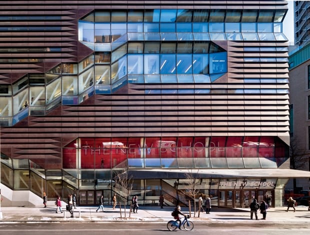
SOM’s design for The New School University Centre in New York City responded to a brief for “a more university-centred building that would unite the schools and create a heart to the university,” says senior design architect Jon Cicconi. The new 16-storey structure on 5th Avenue brings together the university’s main library, cafeteria and auditorium, a range of learning spaces and social areas, plus nine floors of student residences. According to Cicconi, the centre was designed from the inside out, with a primary objective of moving people fluidly through the building and enhancing social interaction. “Vertical academic buildings are challenging because the building’s entire population has to change floors in a ten-minute window. So instead of having loads of elevators, this challenged us to rethink the fire stairway as something that could move people intuitively around the building, intersect the social spaces, and become a catalyst for chance meetings.”
The circulation route and open spaces are raw and monochrome, with more brightly coloured corridors deeper into the structure. In a similar fashion to Paris’ Centre Pompidou, the stairs are exposed to the outside world, cutting across the front of the building as its focal graphic. This puts the students at the forefront of the design, animating the facade with their comings and goings, or as Cicconi puts it, “the students become the iconography of the building.” It simultaneously gives outsiders a glimpse into the building’s beating heart, and reminds those inside of their surroundings. “Compared with other education buildings in New York, I think ours has most successfully paired the social spaces with the experience of the city,” says Cicconi. “You have an intimate relationship with the context from inside that I don’t think you get elsewhere.”
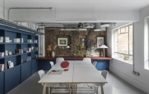
In London, the LSE’s new Saw Swee Hock Student Centre by O’Donnell + Tuomey has similar intentions. Its multi-faceted brick exterior is a result of the architects’ desire to create “meaningful vistas” inside, despite its awkward setting in narrow streets behind Aldwych, so its shape is defined by sightlines down surrounding streets. Cloaked in brick, but with a contemporary angular shape, it feels at once familiar and unusual. “We wanted to tie in the language of the surrounding buildings, so it feels bedded in,” says Willie Carey, associate at the Irish firm, “but it’s also important to make it feel unique and tailor made, so it’s identifiable to the students.”
It too consolidates numerous student facilities under one roof, making it a base for students from different campuses. Inside is an event venue, pub, cafe, gym, prayer space, studios, offices and social spaces – a myriad of functions for a relatively compact seven-storey building. “It would be easy to create a warren of isolated rooms,” says Carey, “so as a democratic move, we tried to make the internal spaces as open and connected as possible.” To create definition without putting up walls, the firm delineated space using a collage of materials and colours. The main public route is laid with terrazzo, while individual functions such as the cafe have a timber floor, to subtly divide the space. Each faculty is also colour coded – the cafe is yellow, the gym is green – with each colour also represented on a geometric patchwork mural on the lift shaft. “We thought the building might have some of the complexity of the city it’s in,” explains Carey. “So the plan is complex, but it opens into little nooks with seating or a balcony, where groups or individuals can peel off outside the bustle of the main areas. Students can discover these spaces and get to know the building; there’s a social life within the campus.”
Morphosis’ new building for Emerson College in Los Angeles applies these principles of student experience and community, but in its own visually fantastic way. Student residences exist in two rectangular ten-storey blocks connected at the top by a helipad, framing a more curvy internal building, which houses teaching and administrative facilities. The two abruptly contrasting forms have been designed independently according to their needs, then linked together by bridges, tunnels, terraces and a large outdoor plaza, creating an enclosed, tightly woven campus within the sprawl of Hollywood.
“It’s common in mixed-use projects for the destination points to be isolated, without consideration of the journey from A to B,” says project architect Aaron Ragan. “Our concern was that the dorms would be buried in a housing block and disjointed from the rest of the programme. So here, the circulation space plays a significant role in the social make-up of the building.”
According to Ragan, photography of the building overemphasises it as two discrete objects, but from within, the feeling is much more intimate and connected. The academic and residential spaces are closely linked, and the outdoor spaces and glazed exterior means there are consistent panoramic views out to the city; much like both the New School and LSE projects, Emerson College aims to associate with its environment. As the LSE building reflects the low-rise brick buildings of London, this rather more dramatic edifice, clad in glistening metal and glass, also reflects its location. “Many of these spaces remind you of accidental but potent spots found in the city,” says Ragan. “They have an urban feel, connecting students back to the city.”

