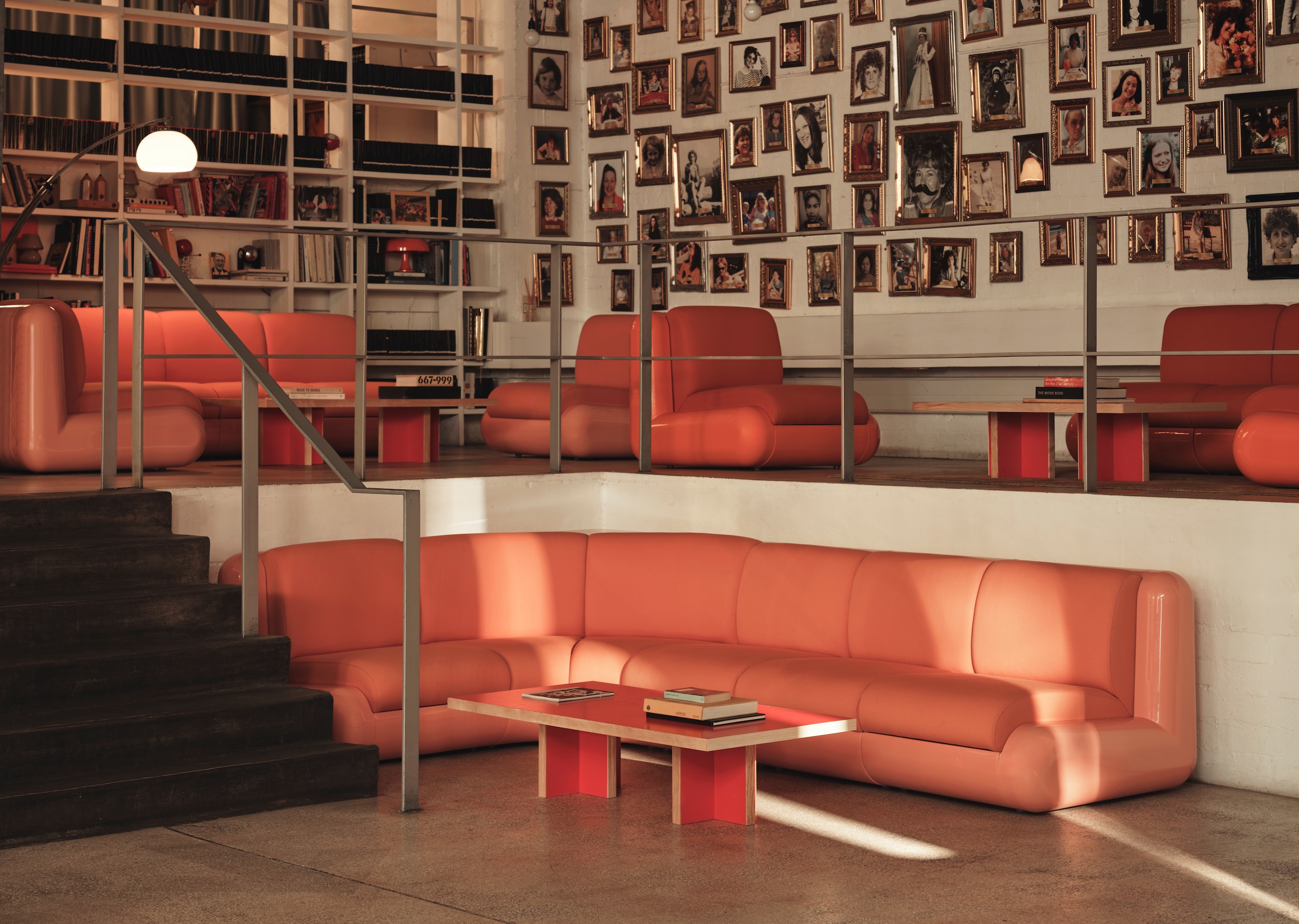
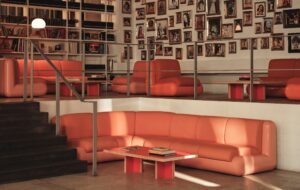
 The mezzanine corridor leads to editing suites, a resource library and two small work pods|A bright red staircase leads up to the mezzanine level, and a bespoke plywood shelving system sits just beyond it|Floor-level LED lighting lends some dramatic flair|The second floor has open event space and a multicoloured kitchen running along the back wall|The fire staircase, or ‘stair to nowhere’: its stepped ceiling will be used to display objects|The loos on both floors have been treated with blackboard paint for impromptu messages||
Faced with outgrowing its beloved East End office, creative agency Wieden+Kennedy opted to expand to an industrial site across the road
London advertising agency Wieden+Kennedy has spent the last ten years cultivating a reputation as one of the coolest independent advertising agencies around, and arguably a small part of that is down to its office. Tucked away on Hanbury Street, near the trendy junction of The Old Truman Brewery and Spitalfields Market, the firm’s gaping ground floor window shows off a collection of colourful knick-knacks, drawings and curiosities.
The reception area is filled with the slick racers and Dutch bikes of staff. It’s a casual, bright and lively atmosphere – and undoubtedly the odd member of the public has been struck with office envy when passing by. It would have been a shame, then, if W+K had been forced to move out of this cosy, lived-in building as the company expanded to take on new business. But after winning a substantial account with Nokia and doubling in size in one year, a move seemed inevitable.
“We didn’t want to have to walk away from our environment,” says Sam Cooke, managing director of W+K. “Originally, there were a lot of desks and a lot of breakout areas. It’s important for us to have that mix, but because we grew so quickly after Nokia we lost all of that – desks were literally encroaching on every area. We were starting to get snarky with each other because there was a lot of space for work and no space for play.”
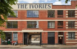
The company looked for a suitable new home but didn’t immediately find one until, in a stroke of good fortune, an industrial building directly across the road became available to rent – meaning that they could bin the idea of moving and instead shuttle back and forth between two offices. It was decided that two floors of the new building would provide the flexible work and event space that had been absorbed by W+K’s mushrooming numbers in the original building.
Architects Featherstone Young, previously Featherstone Associates, were brought in to do the job.
The new building was “a mess”, says director Jeremy Young, but everyone was quite excited about linking the two offices and creating a workable solution that retained W+K’s charm. “We couldn’t have laundry lines, passing messages across as we initially wanted,” he jokes. “The idea was that we’d have this window where you’d pass your messages off, kind of like a Huguenot house window, but planning weren’t that keen. There is obviously still that very strong link though, you can look out of the windows of both buildings and into the others very clearly.”
“We wanted to give these spaces some kind of design quirkiness and identity without monopolising and telling people where to work”
In the new office, Featherstone Young opted to create open-plan workspace and mezzanine levels with breakout areas, meeting rooms, editing suites and resource libraries. There is a huge flexibility in what W+K can do as a company, and the aim was to reflect that.
“We wanted to give these spaces some kind of design quirkiness and identity without monopolising and telling people where to work,” says Young. “They do like customising space – across the road they’ve really made it their own – and we didn’t want to stand in the way of that, so it was a case of treading a very fine line between how much we did and didn’t do.”
Both floors have been cleaned up and painted white, with bold splashes of colour and lime green vinyl cushioned flooring. There is plenty of room for workstations, but the project really stands out for the customised details of the mezzanines, loos and kitchens.
Entering the first floor, visitors can be taken up the stairs of a new mezzanine – a steel and plasterboard structure with MDF panels spray-lacquered fire-engine red. A short corridor, which with its bright red hue looks kind of like a mouth, is underlit by LEDs and has doors leading to a DVD library, two state-of-the-art editing suites and two smaller meeting spaces that are visible to the workstations below through glazed balustrades.
“It’s quite a maze really, but it maximizes the space as we had these high ceilings to work with,” Young says. “You get the benefit of efficiency but also, for creatives, the opportunity to work in a variety of interesting spaces.”
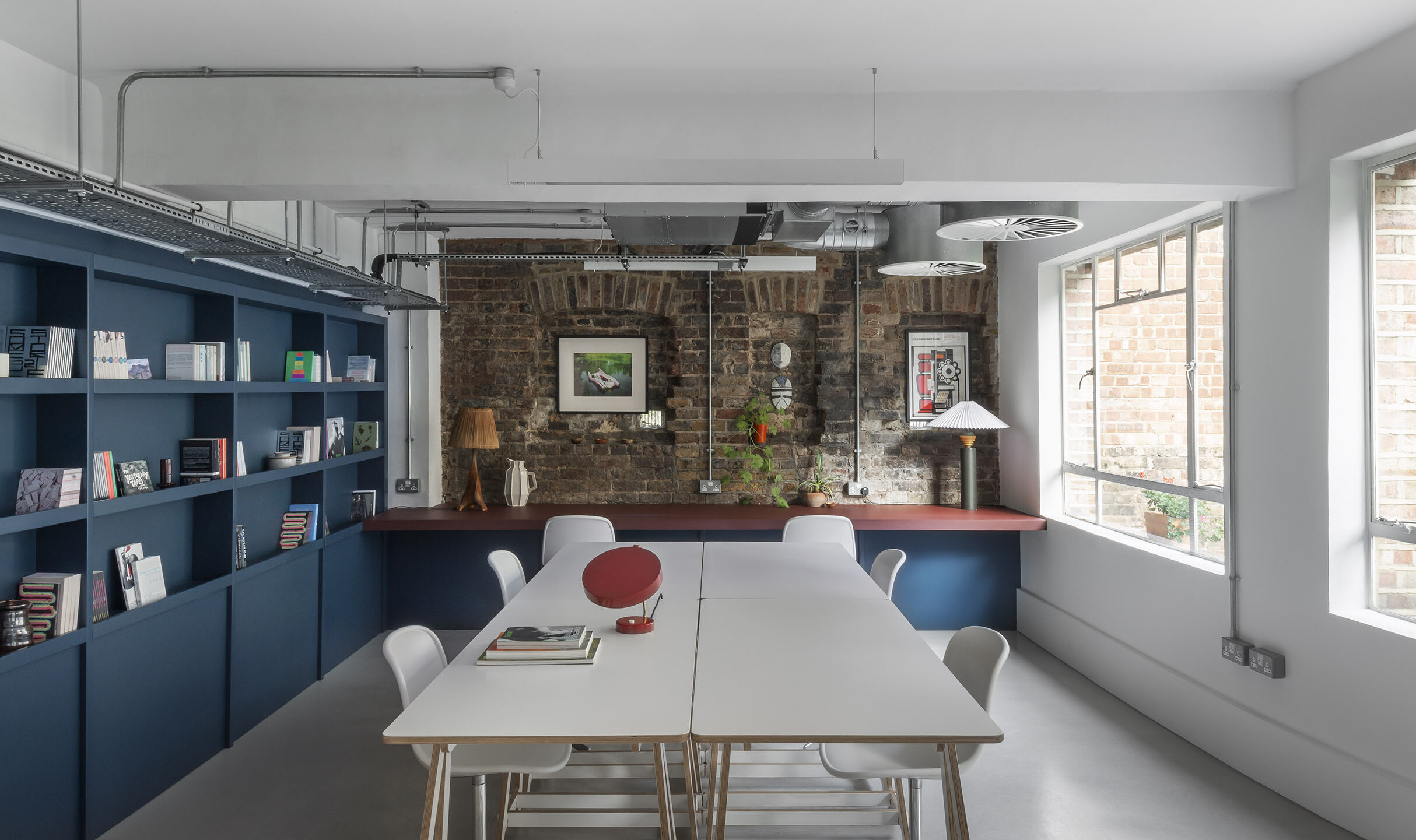
Materials are fairly tough and basic. Industrial steel railings lead up to the second level and the architects were keen to use plywood at every possible opportunity. A bespoke plywood shelving system weaves its way over the door and part-way into the kitchen, and will eventually be filled with W+K treasures as a further connection to the main office across the street.
Through the back service hallway are staff lockers and a set of loos that have been treated with blackboard paint for spontaneous musings. Up on the second floor, the same aesthetic continues.
There is a great open area for social gatherings and office meetings, a smaller area for workstations and an open mezzanine with two client meeting rooms and informal work areas with tables, chairs and couches. Underneath this mezzanine are three small rooms with garage doors and bean bags for meetings, solo working or storage.
At the other end of the open space is a kitchen, with bespoke joinery in coloured MDF, accessorised with knobs collected from junk shops – all of which can be sectioned off from the main area by folding panels. These kinds of details make it look and feel a bit like a really fun school – an appropriate look, since the agency hosts a series of workshops, Platform, for aspiring young creatives.
Other quirky features include clusters of the kind of industrial lights more usually seen on building sites, and the bright yellow boxed-in fire stairs: “That’s what we call the ‘stair to nowhere’, but there really is a staircase in there,” Young chuckles.
Featherstone Young designed the staircase’s ‘ceiling’ to be step-shape as well, with the aim that it will eventually be used as a kind of shelving system, filled with objects for display.
Downstairs, Young takes in the mysterious art installation that W+K have placed in the ground floor window.
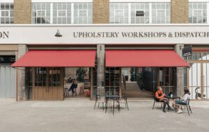
“They have a street identity, which is nice,” he says. “Its kind of like a shop. It’s very much treating the building not just as an office but also as an extension of their brand and what they do.”

