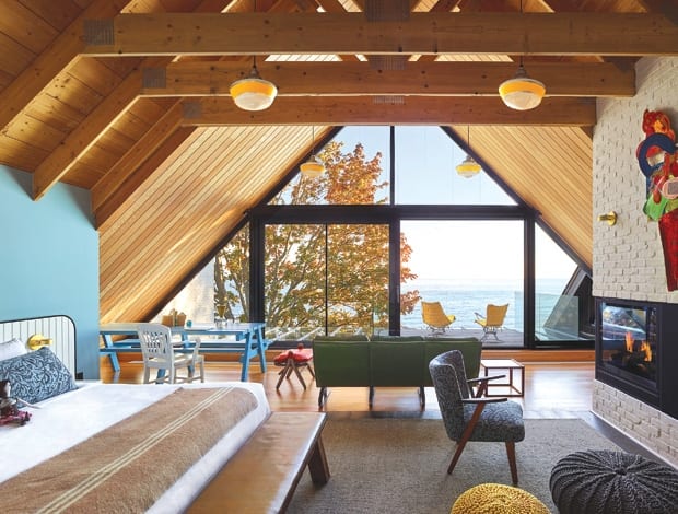
 High in the eaves, the Owner’s Suite has the best views in the house|Brightly coloured feature walls and original artwork add character to the bedrooms|Kirsten Hassenfeld’s paper installation is part of the art collection|Bright floral wallpaper plays to Tong’s design concept of an eclectic cottage|Framed in steel and fir, the restaurant has views over the creek|Ping pong for the more sporting guests|Tong adds colour through mismatched tiles, wallpaper and textiles|The 13-room hotel in the small town of Wellington overlooks Lake Ontario||
The sister establishment to a well-loved Toronto art hotel, the Drake Devonshire has the same ambitions to be a laid-back hub for hip culture-lovers – only with a country slant
The mounting tide of world-class design from Canada has recently washed up this beauty – the Drake Devonshire, a 13-room hotel in the small town of Wellington overlooking Lake Ontario. The country cousin to Toronto hotspot The Drake Hotel, it was built as a foundry in the late 19th century, and until recently was a tired B&B. Designer John Tong of +tong-tong, who designed the original Drake with previous firm 3rd Uncle – worked with hotelier Jeff Stober and conservation architects ERA to reinstate the building’s original charm from a modern perspective.
Old hodge-podge additions were stripped out and new extensions added to create communal spaces such as the barn-like cafe space, a glass-box games room, a cosy lounge, and a large dining area. The dining room exemplifies Tong’s overall design concept for an eclectic cottage, with its A-frame Douglas fir and steel ceiling, one beam wrapped in multi-coloured netting, and vibrant upholstery and lighting, set against whitewashed timber floors.
“The spaces are intentionally very architectural, with articulations reinforced by using neutral colours and contrasting materials,” says Tong. By creating this base, he says, the layers on top can be organic and ad hoc, like a patchwork.
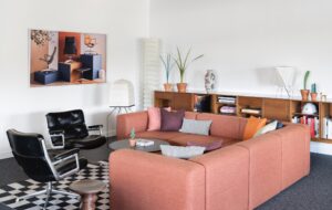
Continuing this theme, throughout the hotel there is a heavy use of exposed and painted timber and painted brick, with injections of colour provided by mismatching tiles and wallpaper.
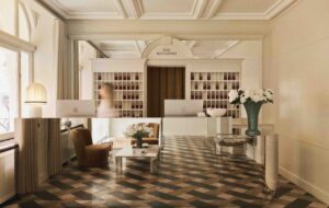
An installation of folded paper ‘jewels’ by artist Kirsten Hassenfeld hangs in the atrium, and a myriad of colours and motifs are deployed on the surfaces of the lobby below, but somehow this kaleidoscopic visual cocktail works. The bedrooms, however, are more pared-back pattern-wise, but make up for this with brightly coloured feature walls, and more original artwork.
For owner Stober, like a pop star’s all-important second album, this follow-up Drake had to feel like an evolution of the first, but with a distinct identity. “There is a connection between the properties,” he says.”All of [them] celebrate old and new, juxtapose antique pieces with modern designs, have a sense of nostalgia. It’s a purposeful collision of form and texture.”
His, and probably everyone else’s, favourite space is the Owner’s Suite, a huge room in the eaves of the A-frame roof. Wrapped in timber and dotted with furniture in primary colours, it feels like a cabin in the woods – and with its own private patio overlooking the lake, it also has the best views in the house.

