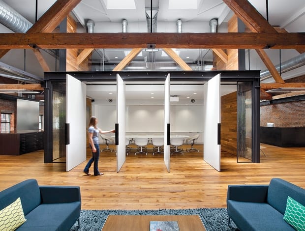
 Pivoting doors close off the box-like conference room to the rest of the space|The early-20th-century dancehall was taken back to brick and timber|Open-tread stairs clad in reclaimed timber lead up to the new mezzanine|Up on the mezzanine, the steel-mesh balustrade matches the desk partitions|The desk and other furniture are from Coalesse, a client of Tolleson’s|Skylights and glass walls help light to penetrate|Flos’s Skygarden pendant gangs in the kitchen|The kitchen table is used as extra meeting space||
In its third collaboration with Tolleson, Huntsman Architectural Group has reimagined the creative agency’s workspace to reflect the evolution of the company.
It’s been 15 years since Huntsman Architectural Group last designed an office for Tolleson, and its latest project for the San Francisco creative agency is the third fit out it has done for the firm. Since the last one, not only had the company expanded – the new office is three times the size of the old one – but the way it worked had changed, too. “With each iteration of the office, the space has evolved,” says Bill Puetz, principal designer on the project. “The projects and solutions that it has undertaken have grown, and the space has grown to allow for that.
“The brief was very much to support the agency in meeting much broader design requirements, and in turn broadening their impact. Although a lot of the features in this office space reflect design characteristics of the original Tolleson fit out, we approached this as a new generation of office space.” The extra space has allowed the company to accommodate new specialist functions such as video and audio editing, and photography. It also allowed Tolleson to enlarge the studio space, and introduce a suite of rooms dedicated to client engagement. “Clients were a large focus of the project, but there are also more facilities to make staff feel at home, and to encourage collaborative and creative processes,” says Puetz.
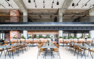
The two-storey masonry and timber warehouse was built in the early 20th century as a dancehall, but was more recently occupied by flooring company Amtico. “It was painted all white inside, and one of the first things we wanted to do was to strip this back to reveal the building’s basic materials,” says Puetz. As well as lending integrity and honesty to the project, the exposed brickwork, skylights, wooden trusses and wood floors all reflect Tolleson’s previous office space, providing a comfortable sense of familiarity.
The building’s owners, Birmingham Development, specialise in the redevelopment of historic properties, and came on board to do the structural renovation, working from Huntsman’s architectural plans. “They were both the client and the developer, so it was a good working relationship,” says Puetz. A mezzanine floor, and a new staircase with open timber treads and forged-steel railings, were added. Puetz says that the addition of the mezzanine floor, where the project management and accountancy side of the business work overlooking the main studio area, “really refreshed the space”. The desking is by Coalesse (a client of Tolleson’s), and Puetz adds that the lighter, more mobile workstations were “a big part of the refresh”.
“Clients were a large focus, but there is also more to make staff feel at home now”
The computer monitors are all much larger, too. “Typically a design company’s office is buried in paper, but in this office work is done 100% on people’s computer screens. Output is pinned straight up on to the walls for group critique,” says Puetz. A magnetic whiteboard made of back-painted glass is used to display work, and most of the studio walls have been designed to double as pin-up space, so that ideas can be shared both with clients and the rest of the studio.
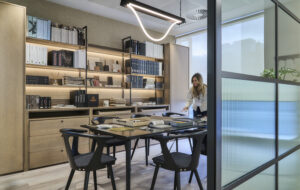
The steel-framed conference room, like the rest of the office space, has been upgraded to meet the demand for more client interaction and engagement. Fully fitted out with AV equipment, including a large screen for digital presentations, the room can be closed off to create a separate, box-like volume within the office space. Four white, individually pivoting doors close it off from the studio area, but when they’re open, the room feels immediately connected again with its surroundings. Reclaimed barn timber clads two of the inside walls of the conference room, lending a rustic air that fits with the salvaged wood flooring used throughout the ground floor and on the staircase.
Although the space brings in natural daylight through the skylights, the building has a rectangular, shoebox-shaped footprint, so glass walls are important to maintain flow throughout, and to prevent closing off central areas. In the conference room the rippled, cast glass provides both transparency and privacy at the same time: “The poured glass we used for the walls shows up imperfections; it adds texture and complements the existing palette of wood, steel and brickwork,” says Puetz.
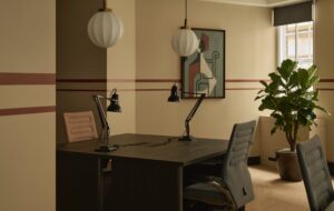
“Tolleson definitely wanted the project to have a classic and timeless feel, but they also called for very high-end technology,” he continues. The rough-and-ready brick and timber envelope is countered by these hi-tech elements, and also by the design-statement furniture and lighting: Louis Poulsen AJ table lamps on the desks, for example, or an arrangement of Tom Dixon pendant lights. In the kitchen are Flos’ Skygarden oversized pendant and white, green and blue Eames chairs, alongside bar stools from Coalesse, which also supplied much of the furniture in the occasional spaces. The reception desk, custom made from hot-rolled steel, also evokes both the industrial nature of the building and the modern aesthetic.
“Tolleson definitely wanted the project to have a classic and timeless feel, but they also called for very high-end technology”
There are plenty of areas to encourage informal gatherings, including a library with sofas, placed adjacent to the conference room. As so much of the office space is designed to be client-facing, a non-disclosure area, referred to as the War Room, sits behind a discreet panelled door. This small but purposeful room ensures that there is always space for confidential work to take place. The directors’ office is also in a separate room, and a library and gallery space on the mezzanine floor provide room for more private meetings and independent research.
Puetz sums up San Francisco’s Barbary Coast as “characterised by its large brick and timber buildings, its community of design firms, and its many technologically minded people.” In that case, Tolleson’s new office couldn’t sum up its location any better.

