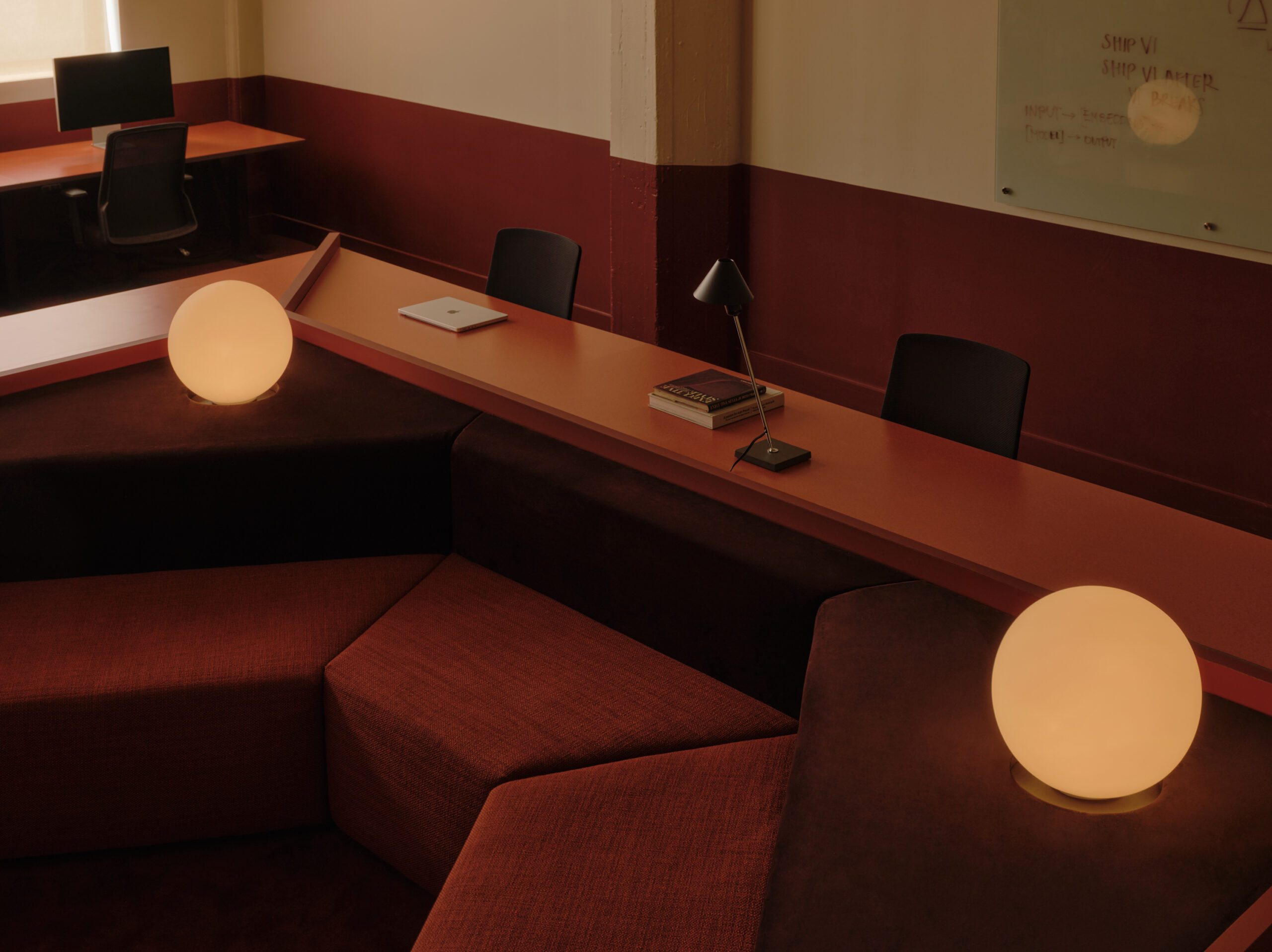
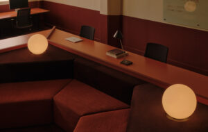
 Employees sit diagonally opposite one another, so they can talk without screens getting in the way|A 3m-long aquarium hs been built into the wall of the reception area|Informal meetings can be held in the custom-designed seating area|The desk modules combine to make one continous surface. Desk lamps help to create a more intimate feel|A CGI of a single desk|Select walls have been painted to focus the eye on distant points|The sleek white boardroom table with its contrasting bright chairs|The floor plan, showing the main work area and adjacent smaller offices||
Curvaceous desks encourage a collaborative approach to work at Hamburg marketing agency Syzygy
With its amorphous ceiling, cocooning sculpted desks and brightly coloured upholstery, Syzygy marketing agency in downtown Hamburg is the clearly realised design vision of German architects Christoph Roselius and Julian Hillenkamp.
Roselius and Hillenkamp met in Hamburg where they both worked as architects and in 2005 joined forces to create the agency eins:eins architekten (or ‘eins zu eins’ – ‘one on one’).
eins:eins has four members, and this small constellation ensures the owners of the company are always directly involved in their projects – something that happens less and less in larger architectural firms, according to Roselius.
“For this project, Syzygy came to us with the idea of the whole creative team sitting around one table,” he says. “They wanted to create a creative pool, where people interact with their ideas.
“We looked at this idea, but having employees all at one table puts everybody on the rim on the table, and in the pedestrian pathway.
This is not an ideal working situation, with people walking and brushing past you all day. It was an interesting idea that didn’t work within the space. We looked into some different configurations, and decided to look at putting people in, instead of at, the same table.”
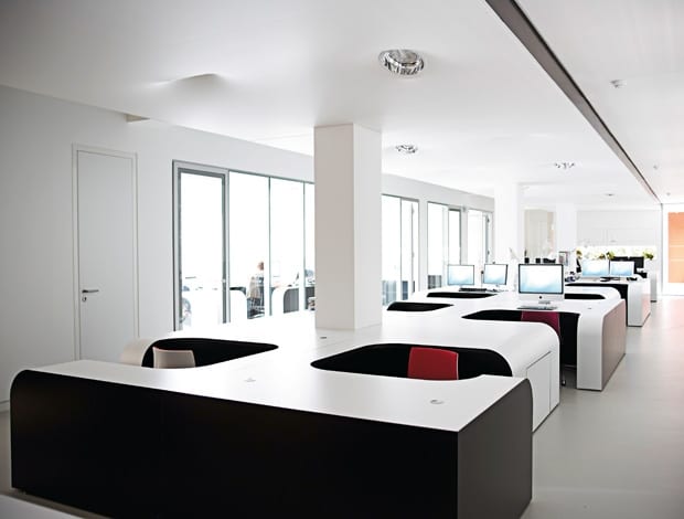
The working environment they proposed was still driven by the idea of creating communicative space. The core creative team of 12 sit in the main space, with account departments in office spaces to the side. In the main space, the person sitting next to you faces the other way, so you are diagonally opposite them and can talk without your computer screen obstructing conversation. In addition, there is no one behind you looking at your screen: “Nobody wants that feeling of people looking at your back,” Roselius explains.
“We do tend to blur the distinction between interior architecture, architecture and furniture. It’s because furniture defines space”
Of course, there is anxiety attached to the idea of being seated within a desk, Roselius says. “People think it will be too much, and they will feel trapped in the table, so we built a mock-up. Workers all sat and checked it out; once they realised you can lean back, stretch your legs, and roll a chair in and out easily, there was no psychological fear around the issue of space.”
On one hand, the desks are a modular concept, but once put together they blend into a continuous surface and become a coherent sculptural structure. “Often with modular furniture you can easily see where one unit ends and another begins,” says Roselius. Here, the white veneer surfaces of the desks create a nice line, with the dark brown body creating a rich contrast; it is a sleek and cost-effective collaborative solution in an odd-sized space – and although they don’t have the resources or distribution channels, theoretically eins:eins would be interested in launching it as a product.
Designing furniture is an integral part of a fit out, and something the agency is used to proposing, Roselius explains. “We do tend to blur the distinction between interior architecture, architecture and furniture. It’s because furniture defines space.” He refers to another workplace project where they designed a desk system and a reception desk that morphs into a sofa, plus some seating booths they created for a restaurant fit out in Hamburg.
Above the bespoke desking system is a stretch ceiling that undulates to accommodate individual lighting fixtures, adding to the sculptural feel of the office. Roselius explains how it was installed: “You mount the lights first. Then they heat the room up while they are fitting the ceiling, until it feels like a sauna, and then as the room cools the material tightens to shape.”
The ceiling lights are tilted towards individual workstations, and additional desk lights also help create an intimate feel in the open-plan set-up.
“The ceiling has dual purpose,” explains Roselius. “It has a micro-perforated surface – tiny holes that all the acoustics go through. The concrete ceiling above is lined with sound-absorbent foam, the sort used in sound recording studios. As a result, you have quiet concentrated working space in a big open plan area.”
To break up the simple white and brown colour scheme, some of the upholstery and furniture is fused with bright colour, as are a few select walls, to focus the eye on distant points.
The side of the ceiling shares the same curvaceous line as the side of the desks, making the furniture appear locked in to its surroundings: it’s snug and enveloping. In the same slick design vein, a 3m-long aquarium is built into the reception wall, and elsewhere glass doors are used to maximise the open feel within the narrow floor plan.
Beside the workstations of two bosses is a fabric-covered moveable wall, made from soft board. “It can be fully closed off to seclude these desks, or pulled back to make them part of the creative process; they were ambivalent as to whether they belonged in the space or not,” Roselius jokes. The wall is actually a practical measure, made unobtrusive by its double purpose as a huge pin board, used for the exchange of ideas.
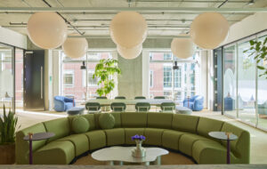
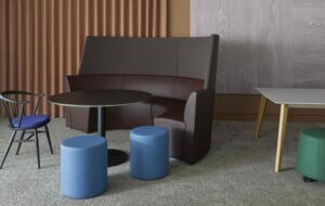
The conference area of the office is also flexible; meetings can be held at the main table, or in a nearby lounge area with a large circular sofa and kitchen.
Although this is not Syzygy’s main office, which lies in Bad Homburg close to Frankfurt’s financial district, this is not entirely unusual for a creative agency in Germany, as Roselius explains: “They have a slightly different approach, a bit more casual, and unusual, not so by the book.”

