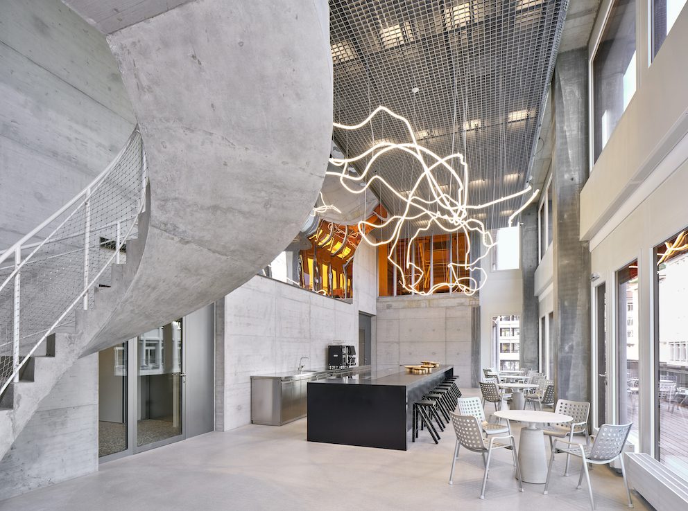
The new On HQ and flagship retail space in Zurich is playfully conceived as a mountain with a hiking trail leading up through the 17-storey building – celebrating the sportswear brand’s active values and encouraging a healthy workplace
Swiss sportswear brand On was first envisioned by three founders hiking in the Engadin region of Switzerland – so it’s only fitting that the brand’s new Zurich headquarters and flagship retail space evokes a similar mountainous landscape.
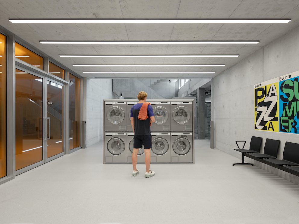
Designed by architectural firms Specific Generic and Spillmann Echsle, together with Vitra and the On team, the fit out features a running trail ascending through the 17-storey building, a conference zone connected to an in-house gym and a laundromat for washing dirty training gear at the entrance to the building – all leaving little doubt that the company champions physical fitness and employee wellbeing.
Over the past decade, On has evolved from a startup into a global brand – and one of the challenges of the new headquarters was that its size tripled during the process due to rapid growth. “At On, everything is always in flux and constantly changing,” says co-founder David Allemann. “We therefore wanted an office that embraces this spirit and can change and adapt.”
It was also essential that the space attract the right talent by clearly communicating the brand’s ethos. “Based on On’s identity, we set up three values that were a mantra throughout the project: nature, technology and human spirit,” says Maja Bernvill, creative director at Specific Generic.
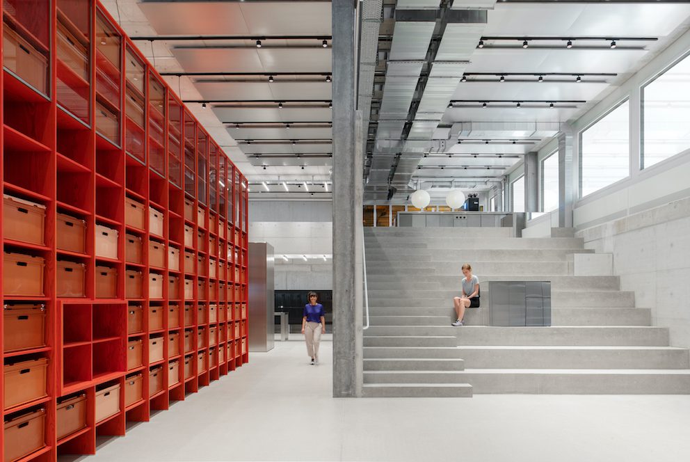
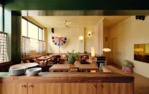
The headquarters are set atop the brand’s flagship retail space, and the various functions are designed as “experiences along the mountain trail” that leads up through the 17 storeys, encouraging movement throughout the day. The colour and material palette is also informed by this conceptual approach, with earthy tones and heavy shapes characterising the lower floors and forest, lake, Alpine and cloud themes emerging as you rise through the building.
Rocks have been used in shower areas and a rock garden on the third floor, and even the stairs themselves are a physical manifestation of the mountain trail concept, being wider on the lower floors and becoming narrower and steeper as they rise upward.
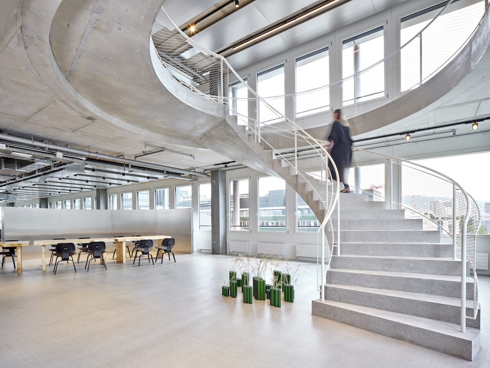
In less skilled hands, this kind of approach might feel gimmicky or kitsch – but what sets the fit out apart is the way it embraces and elevates its functional necessities in a way that is both playful and sophisticated.
Take, for example, the strikingly utilitarian washing machines in the entrance that might conventionally be relegated to a utility room. Here, they are proudly celebrated, making a statement about the intentions of the organisation within. Likewise, water stations and sit-stand tables in 95% of all meeting rooms make a clear proclamation of the company values.
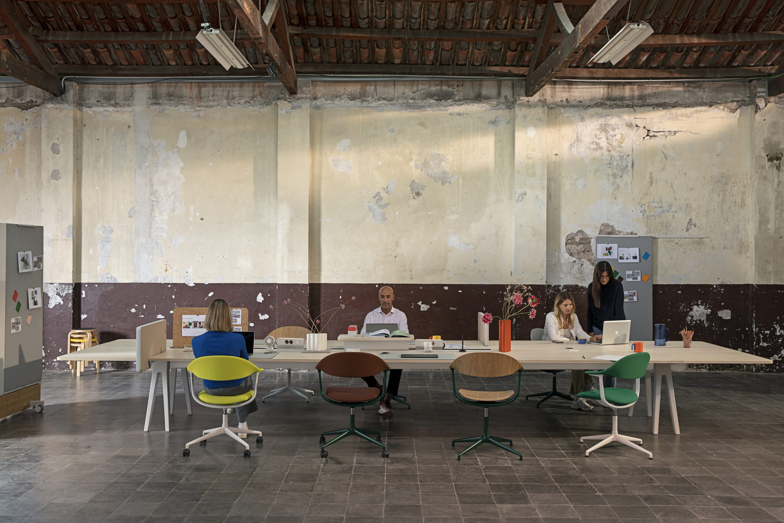
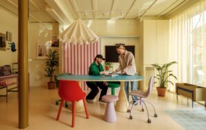
The fit out is also designed to encourage accidental collaboration – unintentional meetings and knowledge-sharing between colleagues who would not otherwise interact. The workplace is broken down into neighbourhoods that span three floors. While each employee is associated with a particular neighbourhood, they are able to choose where they want to work – focused, social or collaborative zones.
“Sooner or later, everyone will head to the micro-kitchen on the social floor to grab a coffee,” explains Bernvill. “In that way, we also make people move and meet.”
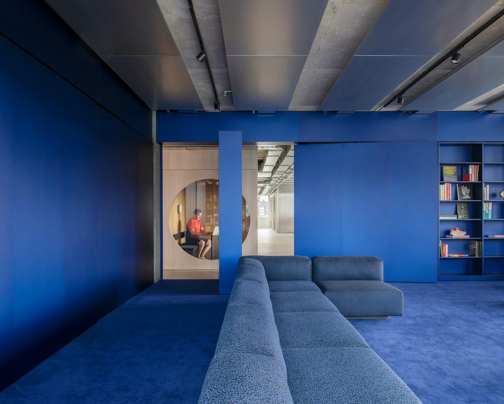
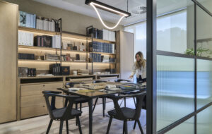
Within each neighbourhood are spaces that encourage a flexible approach to working – think a studio space with height-adjustable furniture and a garage door that can be flipped open to dissolve the room; a jungle-like meeting room filled with plants designed to refresh and energise in the ‘green’ neighbourhood; and a vibrant blue-hued library filled with books that celebrate the interests of employees in the ‘water’ neighbourhood.
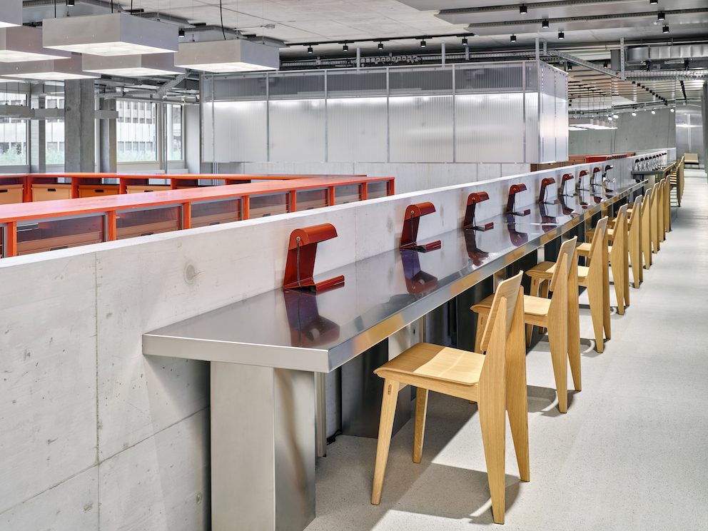
For these neighbourhoods to succeed, carefully considered furnishings were just as important as the design of the spaces. On co-founder Allemann was previously head of marketing at iconic Swiss furniture brand Vitra – and the two companies have maintained a close partnership.
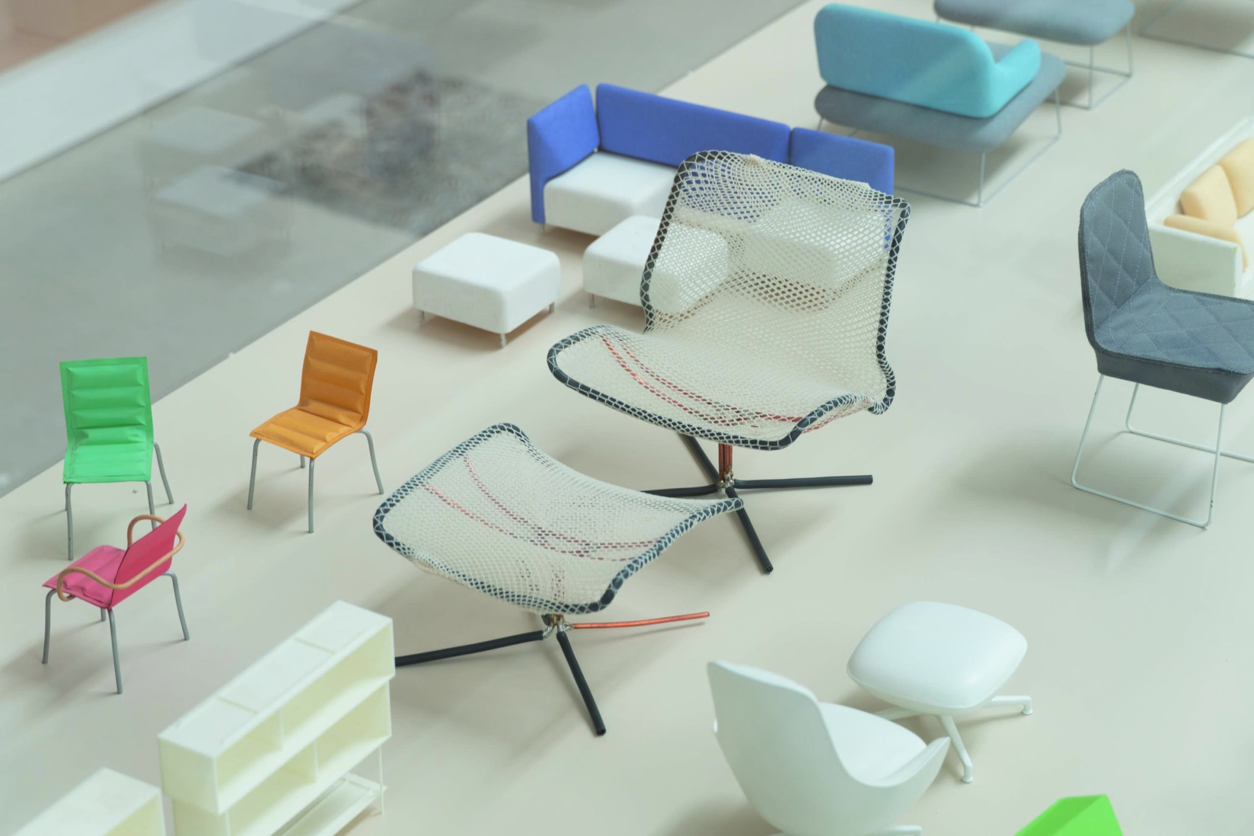
This collaboration has seen the development of new products – including a stool crafted from used running shoes that is currently in its prototype phase – but also the use of Vitra products throughout the workplace.
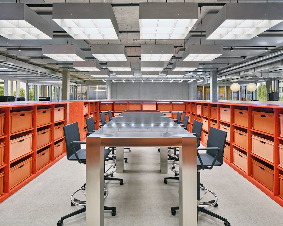
“It was very important to us that the furnishings function in a similar way to a running shoe,” explains Philipp Bapst, sales director at Vitra. “They had to be extremely ergonomic, of exceptional quality and fun.”
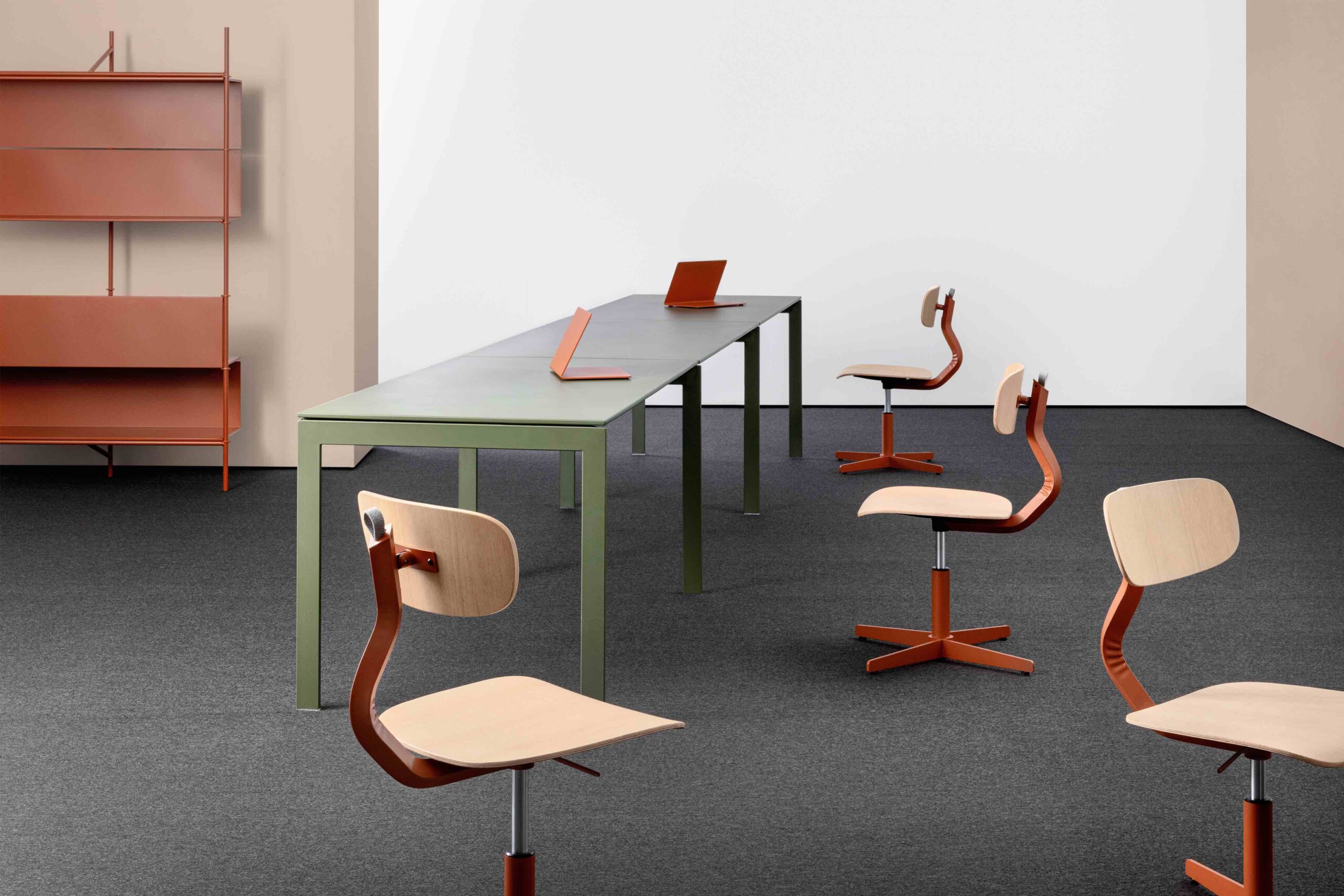
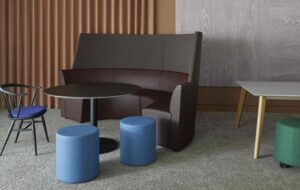
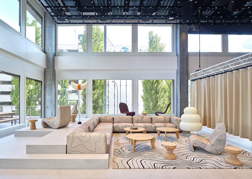
As a result of this approach, playful classic designs such as the Landi Chair by Hans Coray, Eames chairs and Jasper Morrison’s Cork stools offer spots to sit and relax while ‘hiking’ through the building, and Joyn Platform workbenches and Tyde sit-stand meeting tables create dynamic, active workspaces.
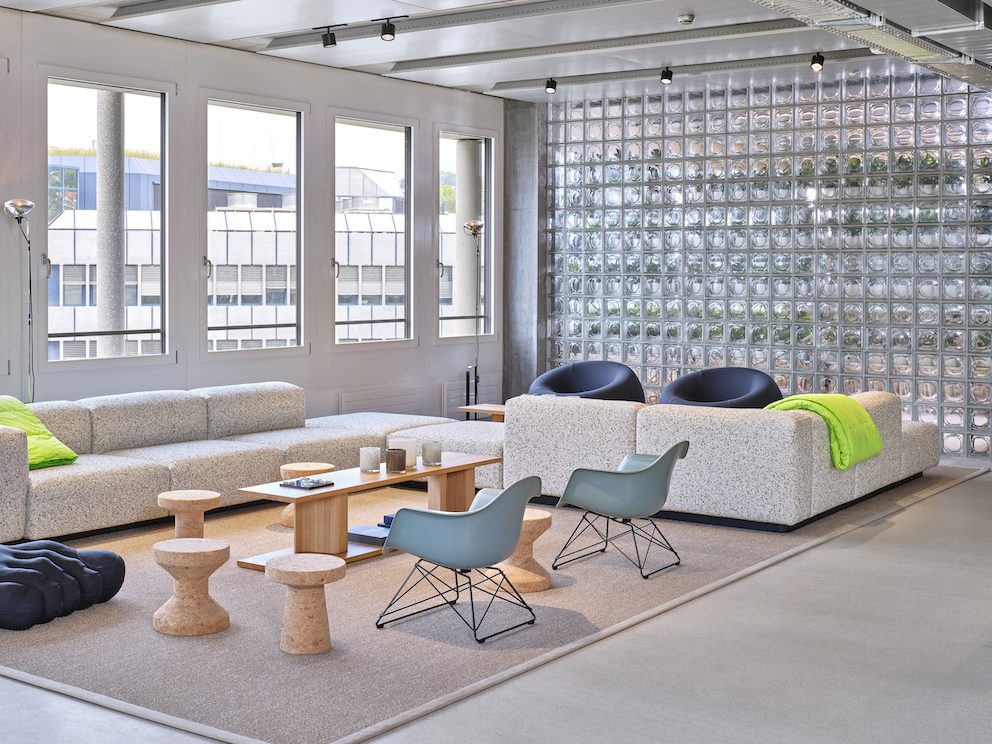
The Soft Modular Sofa by Jasper Morrison is another key piece and has been used to create soft landscapes throughout – including a custom version on the first floor upholstered in a bespoke fabric adorned with a topographical map of the Engadin mountains where the three founders first drew up the business plan.
It’s this kind of sensitivity to the details behind On and its mission that brings the fit out to life, creating a physical manifestation of the brand DNA in both the retail space and the workplace. The resulting space sets a valuable precedent for what an active workplace can be – and is a study in how to elevate a brand’s underlying ethos to attract and retain staff who share these values.
Images by Mikael Olsson and Eduardo Perez
As featured in OnOffice 161, Winter 2022. Read a digital version of the issue for free here


