Studio Tate’s communal spaces for a prestigious Australian school set out to rework elements of the traditional village square into something quite new
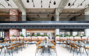
Co-working spaces are a lot like village squares – they cater to different types of workers and their needs by design, while allowing inspiration and productivity to flow. In any town, village or bustling neighbourhood, the central square is the beating heart of business life and social activity. That was the mission interior architecture practice Studio Tate received when tasked with redesigning the offices and communal areas of a prestigious school in Melbourne.
The Melbourne-based studio was approached by the new head at Caulfield Grammar School, who was eager to transform part of its heritage-listed building into a co-working area for teachers, students, parents and visitors. The guiding inspiration behind the development was the idea it should feel and act as a village square.
“Given the principal’s brief of bringing together and strengthening community ties, we felt that the idea of a village was a great place to start for the narrative,” explains Alex Hopkins, design director at Studio Tate.
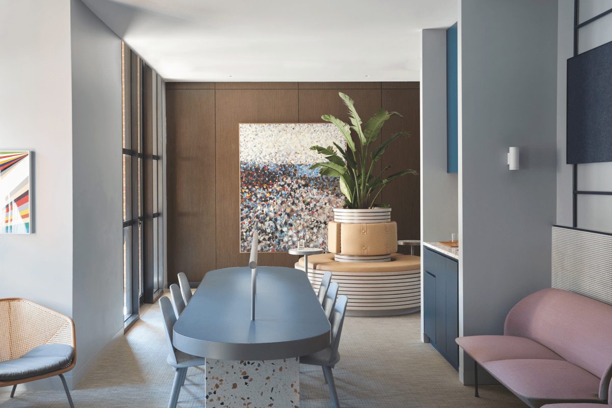
“We used that to help with the space planning within the heritage building. Generally, in the village, there’s something to congregate around, there’s a central element – it might be a piazza or a church. In this instance, we actually brought in a tree, and we built a planter around this tree internally in the space and made it the centrepiece for the idea of planning for the village.”
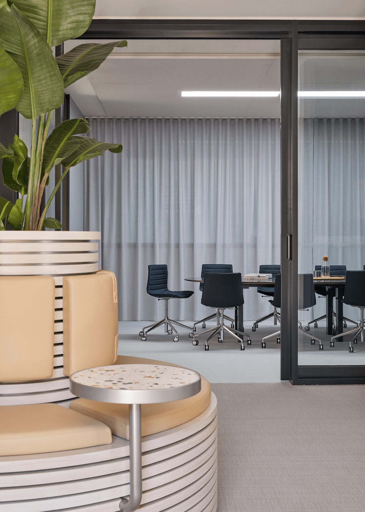
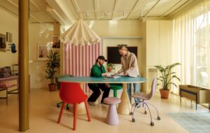
Beyond refreshing the space, Studio Tate had to cater to quite specific needs from the teachers and students using the area. A school is quite unlike other workplaces – students need an inspiring and nurturing environment, teachers need a thriving and functioning office, and visitors need to walk away with a positive impression. True to the spirit of the agora that guided the project, Studio Tate heard directly from students and teachers and developed a series of cleverly zoned insertions within the limited footprint.
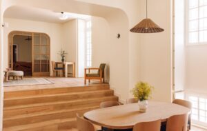
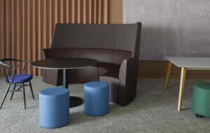
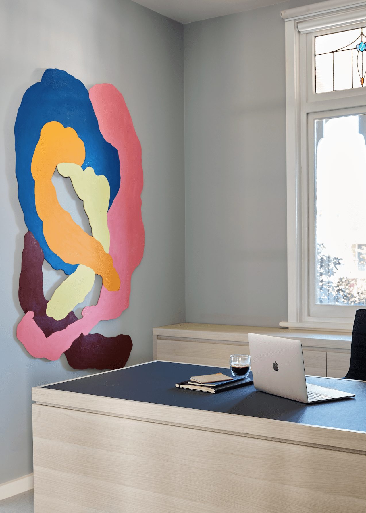
The result is an office with plenty of breakout spaces, meeting rooms and informal gathering points to allow for, and encourage, all types of interaction. The heritage nature of the building limited structural changes, so Studio Tate relied on aesthetic fixes and invested heavily in colour to bring light into the space. On-trend pastels, terrazzo patterns and a strong lead blue rejuvenated the interior and offer a welcome contrast to the original lead-light glass and heritage bay windows.

The idea of a village square also permeates the aesthetics of the space. Terrazzo surfaces emulate cobblestones and are the visual unifier of the whole space. The bespoke formula with specs of gold and blue was developed to reflect Caulfield Grammar School’s colours.
Co-working space, school office, or village square – call it what you will – Studio Tate’s proposition is a very adult and polished space. Ultimately, it has succeeded in providing an inspiring, social, and functional space for users that brings the school community together.
All images by Sean Fennessy
As featured in OnOffice 149, November 2019


