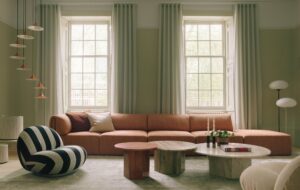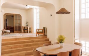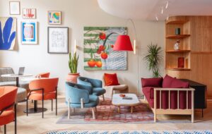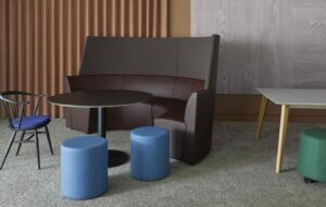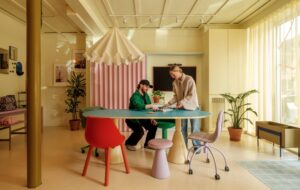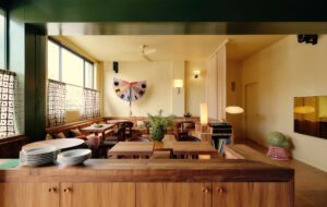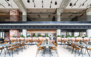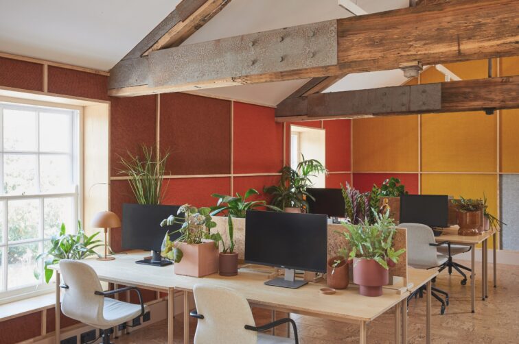
The new Omlet HQ by Studio Rhonda is a masterful study in how colour and embracing natural elements can be used to transform an industrial space into an inviting workplace
The pandemic was a pivotal moment in time. Not only did the way we work rapidly transform, but the way that we spend our free time underwent something of a revolution. People embraced sourdough starters, indoor gardening and demand for keeping chickens at home exploded. For UK pet brand Omlet, which is best known for its award-winning modern chicken coops, playfully called “Eglus”, this translated into a booming business and the need for a new HQ.
From a 10-person company headquartered in an industrial estate, Omlet quickly grew to more than 45 employees, mostly working remotely. Post-lockdown, management decided to bring the team together in a more inspiring space and they turned to Studio Rhonda to shape the vision for the interiors.
“Omlet knew how they wanted the space to work, but there was huge concern about acoustics as they wanted it to be very open,” says Rhonda Drakeford, founder of Studio Rhonda. “It also needed to be a space that felt caring, calming and comfortable – that’s why I started looking at the principles of biophilic design.”
The new HQ is housed in a 19th-century Palladian malt house in Banbury, Oxfordshire, that was used for storing grain, and the industrial character of the building has been carefully preserved. The open-plan interior, however, has undergone a complete transformation to make it welcoming for the team and functional as a workplace for a rapidly growing 21st-century brand that is embracing a hybrid approach. As a result, the historic elements of the interior – think dramatic triple- height vaulted ceilings with timber beams and cast-iron columns – have been restored and paired with a playful new identity with a focus on biophilic principles and colour.
“I was aware of the sense of playfulness and humour in the Omlet products and I wanted this to be the personality of the space, rather than taking inspiration directly from the aesthetic of the brand,” explains Drakeford. “It became about using natural materials and connecting with nature.”
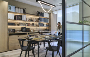
The main office is located beneath a central mezzanine, with a full-height space running around the perimeter of the building. This edge zone has been divided into various meeting rooms and quiet areas using glazed steel partitions and latte-coloured doors that complement the tones of the original timber trusses. The glazed partitions not only create acoustic separation, but allow for visual connection across the enormous space and for daylight to flood the plant-filled interior.
Biophilic design principles underpin the design, with abundant planting in enormous terracotta and Corten steel planters throughout, which soften the space both visually and acoustically. This idea of integrating the natural world into the interior complements Omlet’s own approach to the workplace – the company has office cats, chickens and even rabbits.
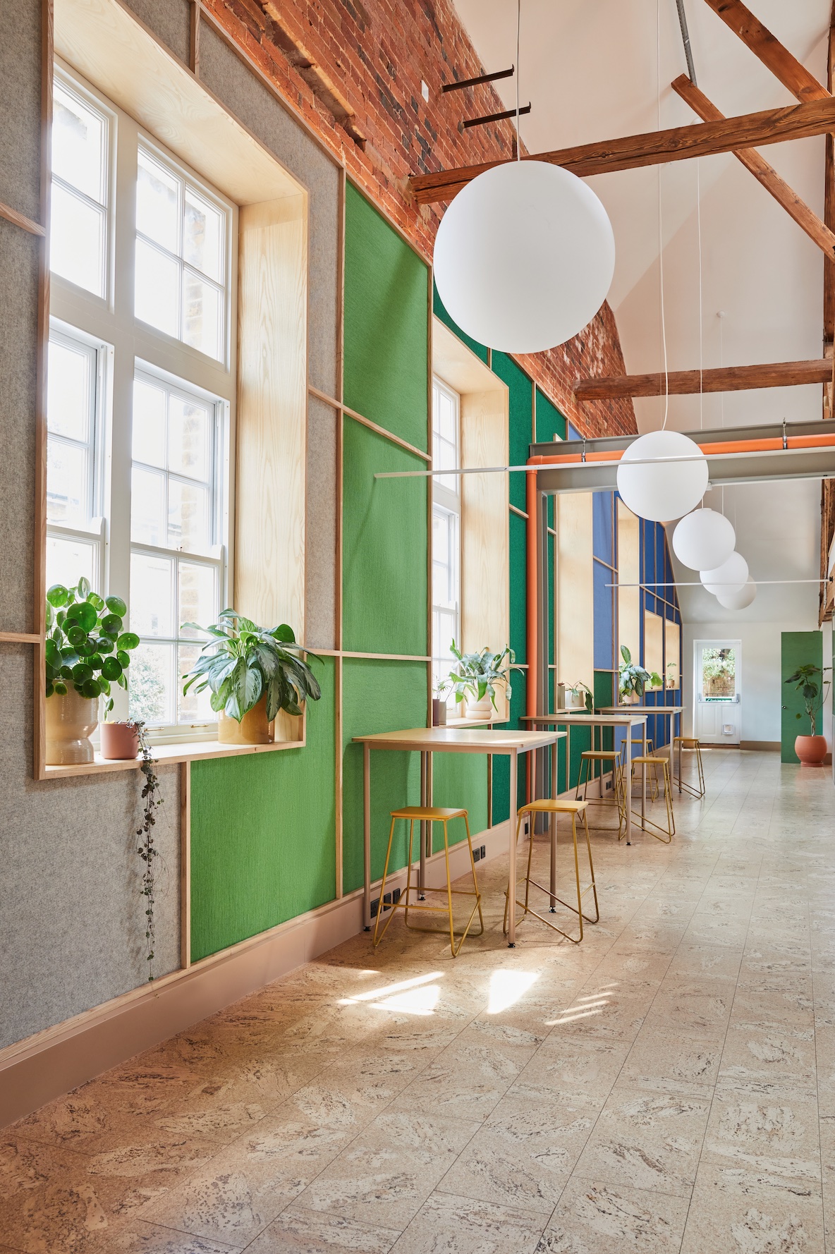
The various spaces in the Omlet HQ are unified through the use of cork flooring, which was chosen for its acoustic and thermal properties. “The colour also talks to the exposed brickwork and creates a natural foundation for the palette,” says Drakeford. In a playful flipping of conventions, the walls are clad in patterned carpeted panels to create soft, textural vistas that dampen noise in the cavernous space and also help to zone the interior using colour.
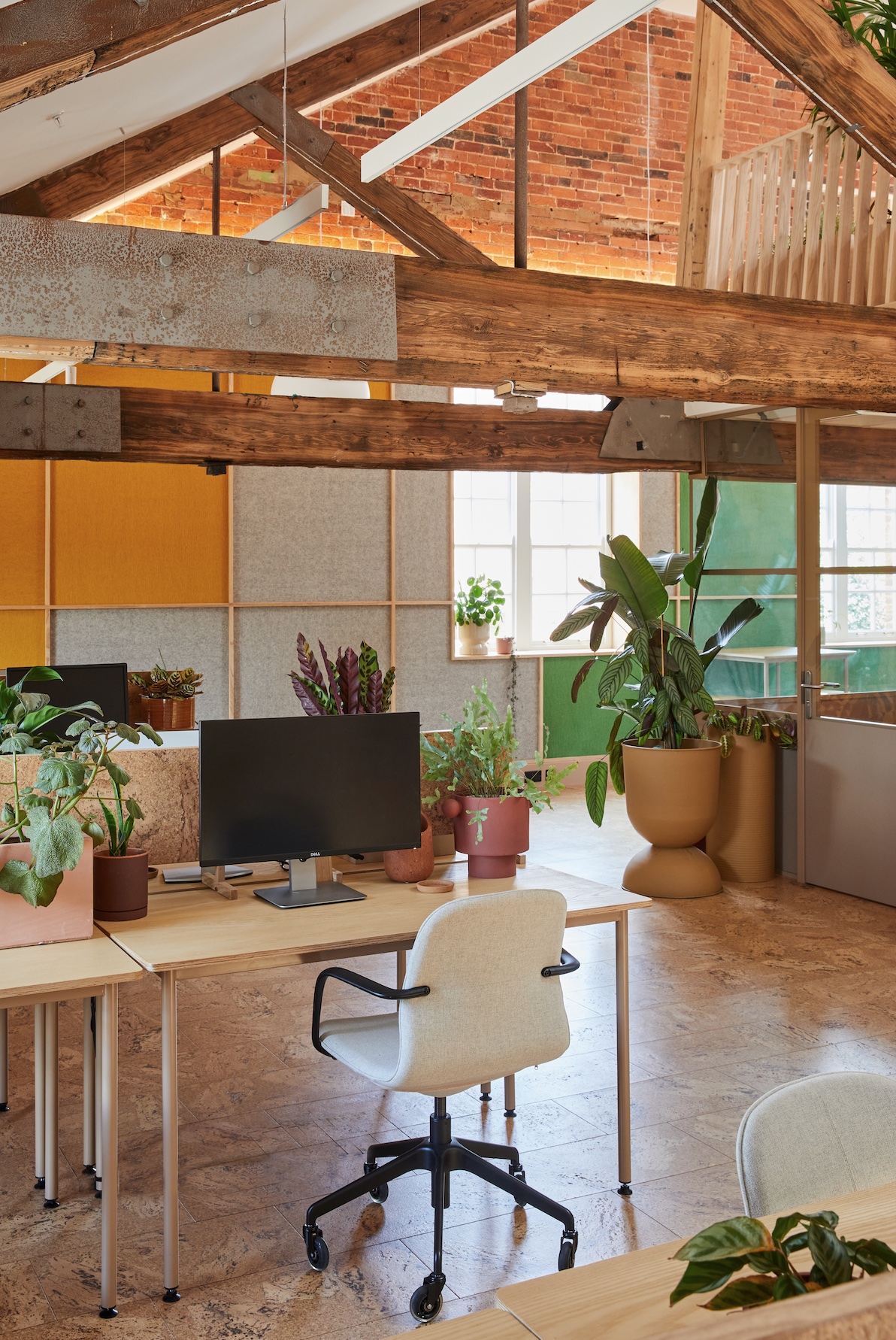
Additional cork panels, decorated with freehand Indian ink murals by Drakeford, also feature on the walls, creating a dialogue between the different interior surfaces and again signposting the different areas through colour. These panels are framed in ash timber, which is also used to frame the windows, on the mezzanine stairs and in integrate hidden storage to create a cohesive visual language throughout. “Ash is a lovely, lively wood,” says Drakeford. “The graphic grid of solid ash that we used through the interior helps to unify all the different elements and complements the brickwork.”
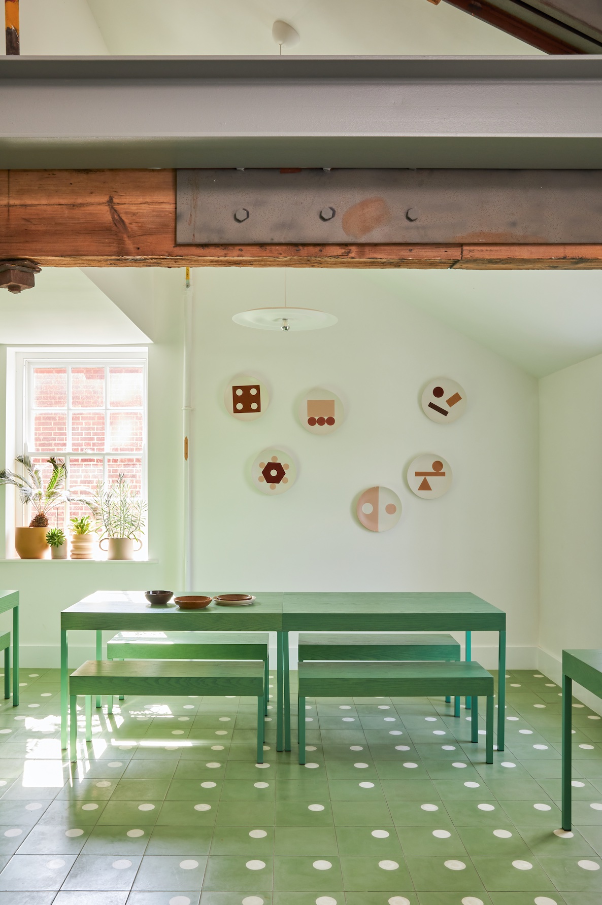
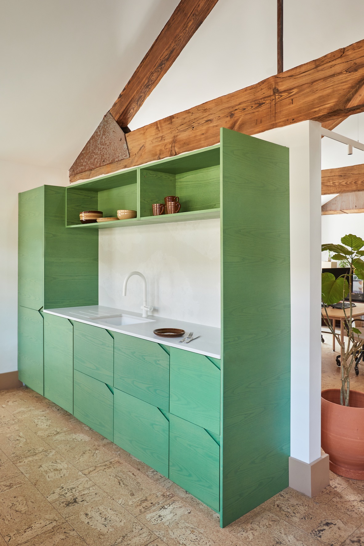
The idea of zoning the space using colour is a constant driver of the design and is particularly evident in the four different kitchen spaces, each of which is a different colour. Drakeford collaborated with kitchen manufacturer HØLTE to transform Ikea carcasses into colourful bespoke kitchens crafted from stained ash. Three smaller kitchens, in red, yellow and blue, are scattered throughout the space, while a larger green canteen offers a space for staff to gather. It also provides a playful backdrop for Omlet to film social-media content.
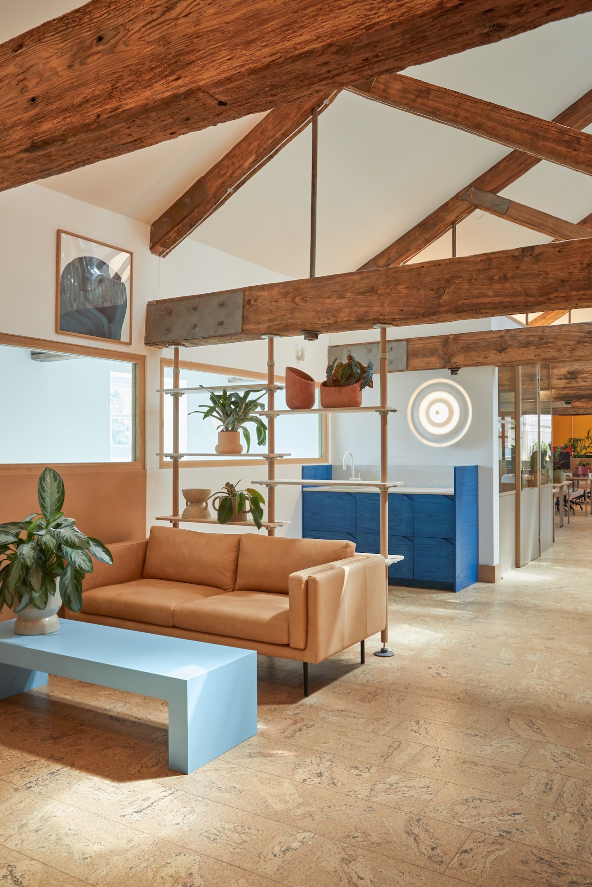
“I was keen to create a layered effect of textures in both their natural and pigmented forms,” says Drakeford of the use of ash in the kitchens. “It’s intended to be cosy, comfortable and also playful, which I feel directly talks about the kinds of products that Omlet designs and sells.”
As a social space, the canteen celebrates a bolder use of colour than the general work space. The green and white floor tiles playfully evoke the shape of eggs, subtly alluding to the Omlet brand, and flexible tables and seating in the same stained ash as the kitchen can be rearranged as needed. Similarly, the bathroom is a bold splash of green, with a microcement floor, green tiles designed by Drakeford through her brand Darkroom and colour-matched paint creating an immersive space.
“I haven’t done a lot of commercial work before, so I came to the project with a fresh perspective,” says Drakeford. “It just felt natural to create spaces that had a residential familiarity to them. It’s an inviting space and the new fit-out feels like it’s always been there. The Omlet team loves it and there’s nothing nicer than people enjoying what you’ve created for them.”
Images by Veerle Evens
This story was originally featured in OnOffice 165, Winter 2023. Discover similar stories by subscribing to our weekly newsletter here


