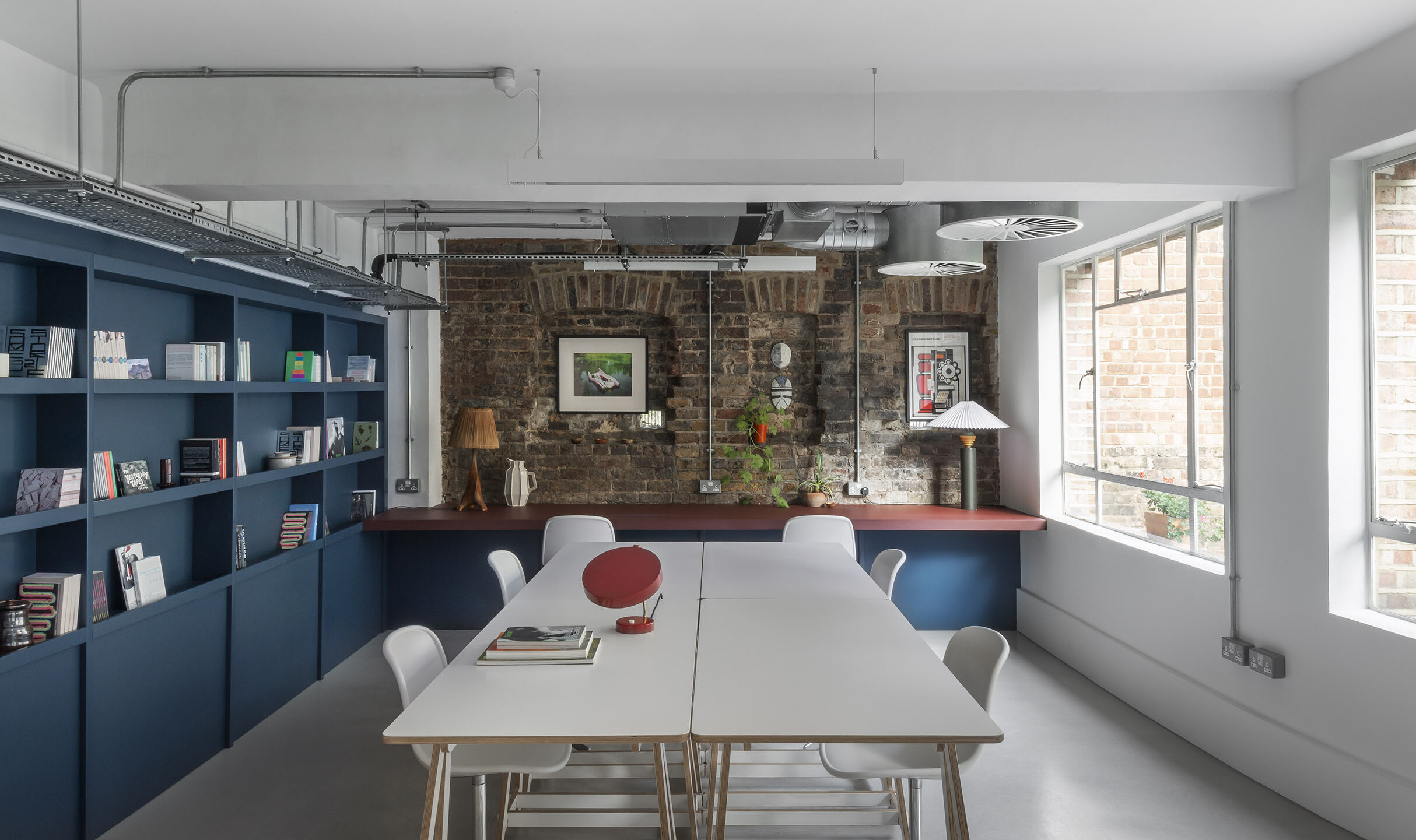
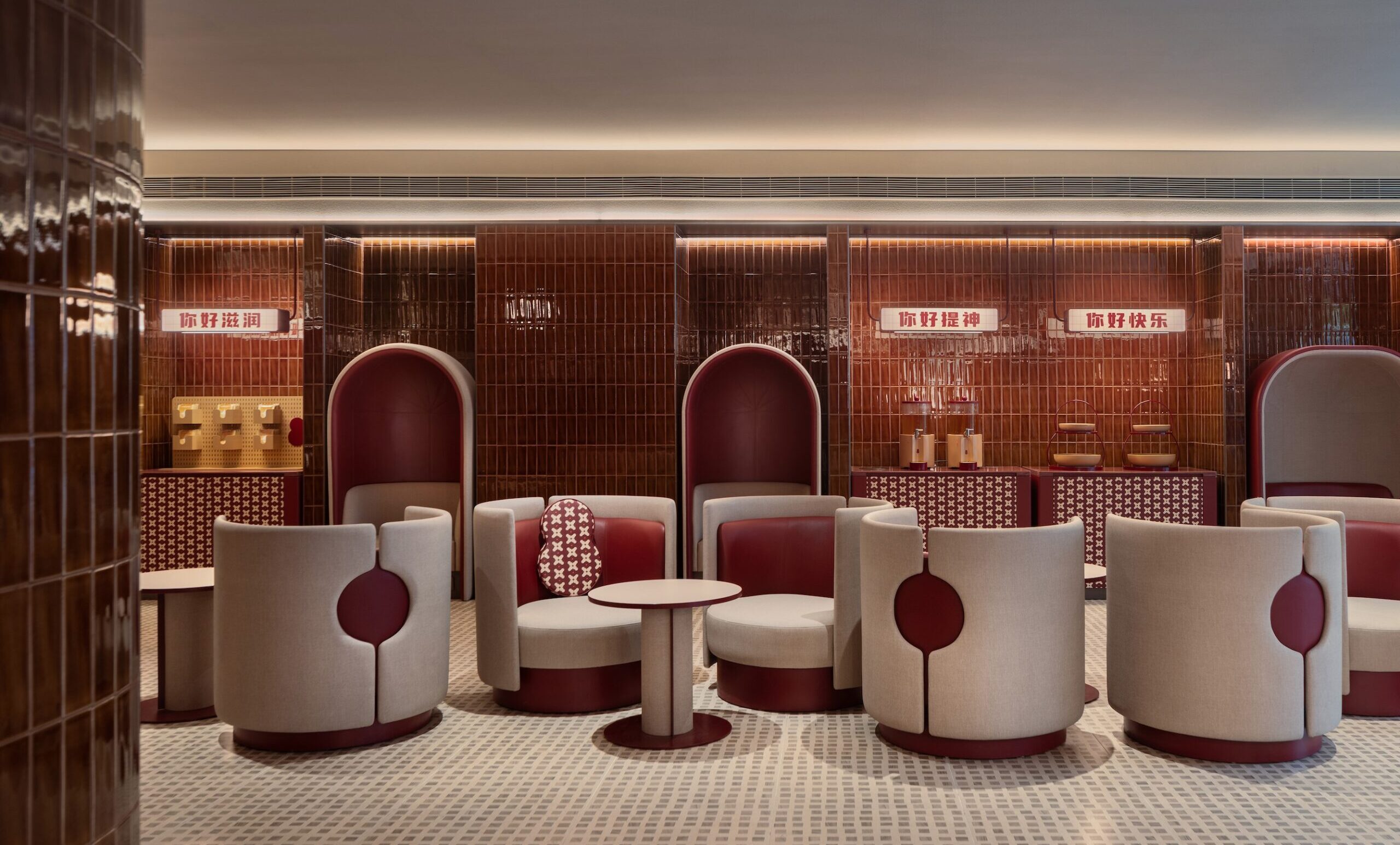
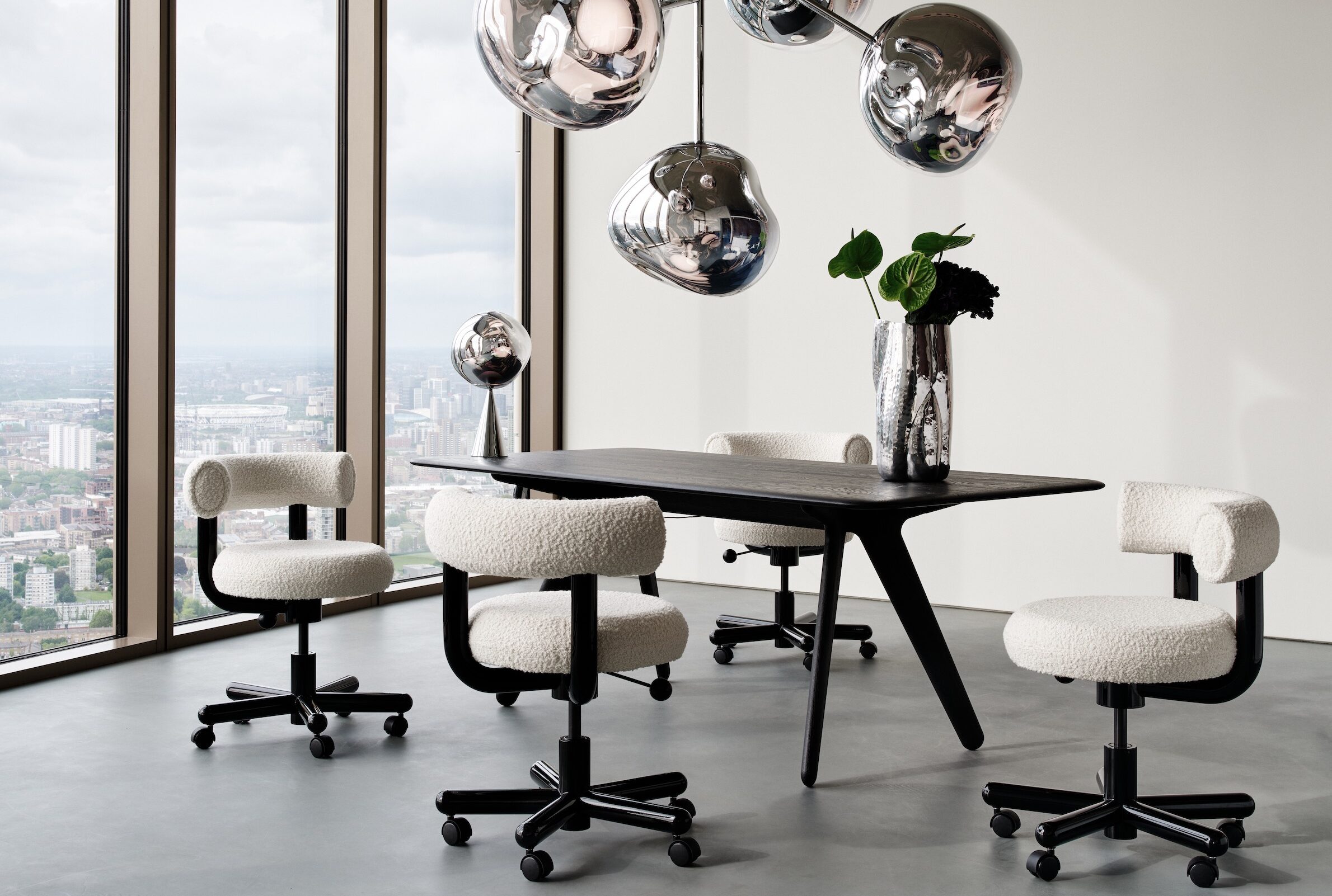
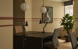
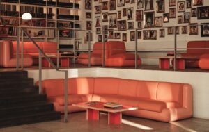
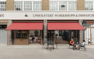
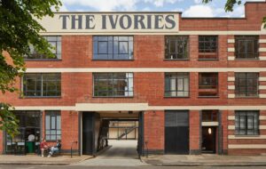
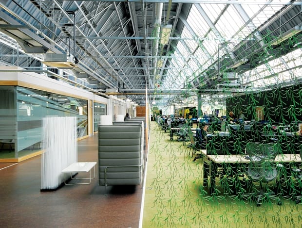
 Plenty of natural light floods in to the open plan work areas and informal meeting spaces|Bespoke joinery made of sterling board sections off the space|A new glazed façade helps give more openness to the industrial structure|A computer bar sits toward the back of the building|The scheme uses an abundance of Vitra furniture in the informal work areas|Tables and chairs provide local meeting options within separate zones|An example of where more joinery could have broken up the vast open plan space|A spiral staircase in the canteen leads up to a TV room with table football facilities||
An industrial building in Darlington is revamped and glammed up as the offices of the ever-growing Student Loans Company
The Student Loans Company needed a colossal space to accommodate its’ mushrooming staff of 650, which is what they got in the ‘Memphis’ building – originally a Patons & Baldwins thread-making factory in Darlington. The gargantuan structure had been lying dormant for years and was only a shell of its former self, but Scottish architects 3FOLD saw an opportunity to add some pizzazz to the Student Loans Company profile.
“A few people with more imagination than me had a look at it and said it might work as an office space. We weren’t totally sure in the beginning but we’ve ended up with something a lot better than expected,” says Derek Ross, deputy chief executive of SLC.
He says several things were essential for the new space: comfort, plenty of communal areas for teamwork, energy efficiency, the use of recycled materials and finally, recognition of the industrial heritage of the site. “It’s a monument to Darlington’s industrial past,” says 3FOLD director Jack Robertson.
Other than carving out a full height glazed façade, the original rawness of the building has been retained and accentuated. Meeting rooms have been wallpapered with digitally printed photographs of the initial construction. Original factory windows in the ceiling flood light across the space, which is set up as a big square of semi-open plan space with a central hub for the canteen and meeting rooms.
One of the key elements of the brief was that there was potential for very significant fluctuation in staff numbers across the academic year, so the furniture selection and the design had to accommodate that considerable change in density,” says Robertson. At certain points of the year, the Faram workbench system can take on 30% more staff – keeping facility management costs down.
One of the dangers, though, is having a vast sea of open plan bench desks – very much like a call centre. “One of the worst criticisms you could level at a piece of office planning is that it looks or feels like a call centre,” says Robertson. “We really tried to avoid that.”
To counter this possibility, the space is broken up into different departments and zones for the company’s various functions: customer service and fielding telephone calls or processing applications. The zones are created, and the ‘call centre effect’ lessened, by the use of bespoke joinery made of black-stained sterling board. These elements are used to break up the space and identify certain teams with coloured graphic stensils. They hold coats, files, printers, storage – and they do help define the office so that it doesn’t feel like a football pitch with desks. There are certain perspectives where a few more of these cabinets could have been put to good use, where the density of staff does seem a bit much, but for the most part the design succeeds in creating an intimate feeling in a potentially vacuous building.
“One of the key elements of the brief was that there was potential for very significant fluctuation in staff numbers across the academic year, so the furniture selection and the design had to accommodate that considerable change in density”
In addition to the central meeting rooms and canteen, there are informal meeting areas (several in structures very much like skateboard ramps) dotted within the work areas. “You can’t just have open plan space, you have to support it with other kinds of spaces.
There are opportunities to sit down with your local team, if you like. So it’s a kind of city,” Robertson explains. “There are local communities with local infrastructures and their own mini spaces.”
The entire office is warmed up by moss-coloured carpet, which obviously helps with acoustics, and an array of furniture from Vitra and Nought One up the style stakes. “It was important to funnel resources towards furniture that made the space seem extra special”, Robertson says.
“Especially within an organisation like this, staffed by largely quite young people, its essential that the environment they’re working in means something to them and isn’t just something that their dad has chosen,” he jokes. “The social space is the glue that keeps the whole project together. I think if you try and furnish those from catalogues of systems furniture suppliers then you’ll get a very poor selection of inappropriate stuff.”
The result is a corporate environment that doesn’t feel all that corporate. The building has won a regional BCO award and the buzz around it has meant that recruitment is easier and staff retention levels are kept high.
“We’re delighted because we’ve got something now that has become a bit of a selling point for us. People come and say that it looks like a great place to work,” says Ross. “They can’t help but be impressed even before they know what we’re doing here. That’s been very useful to us.”
Robertson agrees: “The basis for 3FOLD’s thinking when we first formed was an understanding that most organisations will let their brands down very badly when it comes to their environments. But it makes a whole lot of sense to let the bricks and mortar become part of the brand communication.”

