Taking inspiration from 17th-century weaving workshops, architects Bureau de Change have created a richly textured space for the new HQ of Somesuch films in London
Creativity breeds creativity – so it goes without saying that the workplace for award-winning film production company Somesuch needed a fit-out that would fuel the imagination. The company’s first studio in London’s Shoreditch, which was designed by Katerina Dionysopoulou and Billy Mavropoulos of architecture practice Bureau de Change in 2017, fit the bill perfectly. So, when the team outgrew its studio last year, Somesuch co-founder Sally Campbell once again approached the duo to craft a space to inspire.
Campbell had found and fallen in love with a derelict warehouse in Spitalfields – and thought it perfect for the new studio. It was built in the 1960s to replace a demolished 17th-century townhouse, part of a row of similar homes that once served as residences and weaving workshops for the Huguenots, a group who fled religious persecution in the major silk-weaving cities in southern France in the 1600s. It was this fascinating history that inspired the look of Somesuch 2.0.
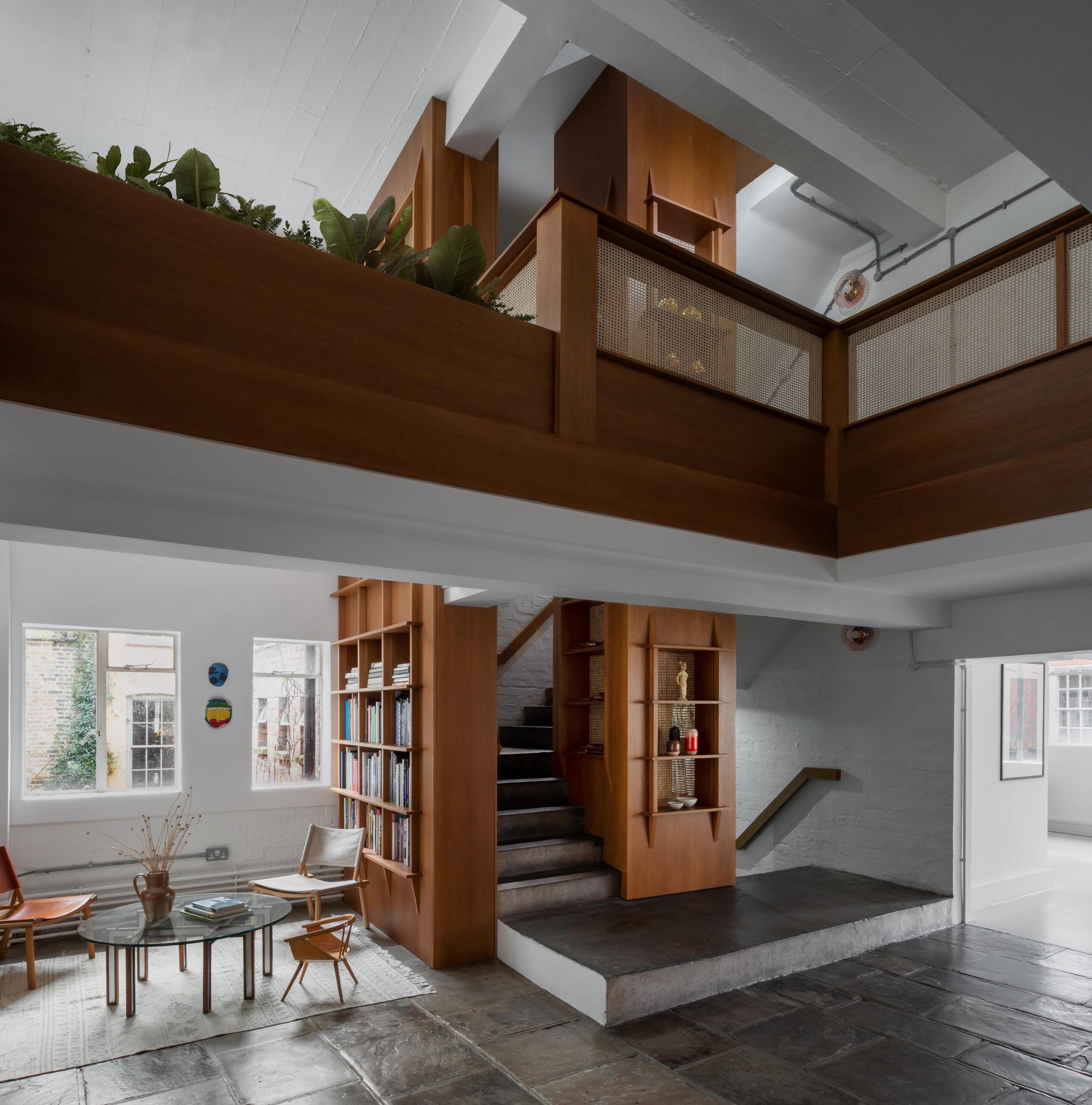
“The building is sandwiched between these stunning old houses, and we wanted to celebrate that history,” says Mavropoulos. “We became fascinated by the tools and looms that the Huguenots used, and this sparked the design.”
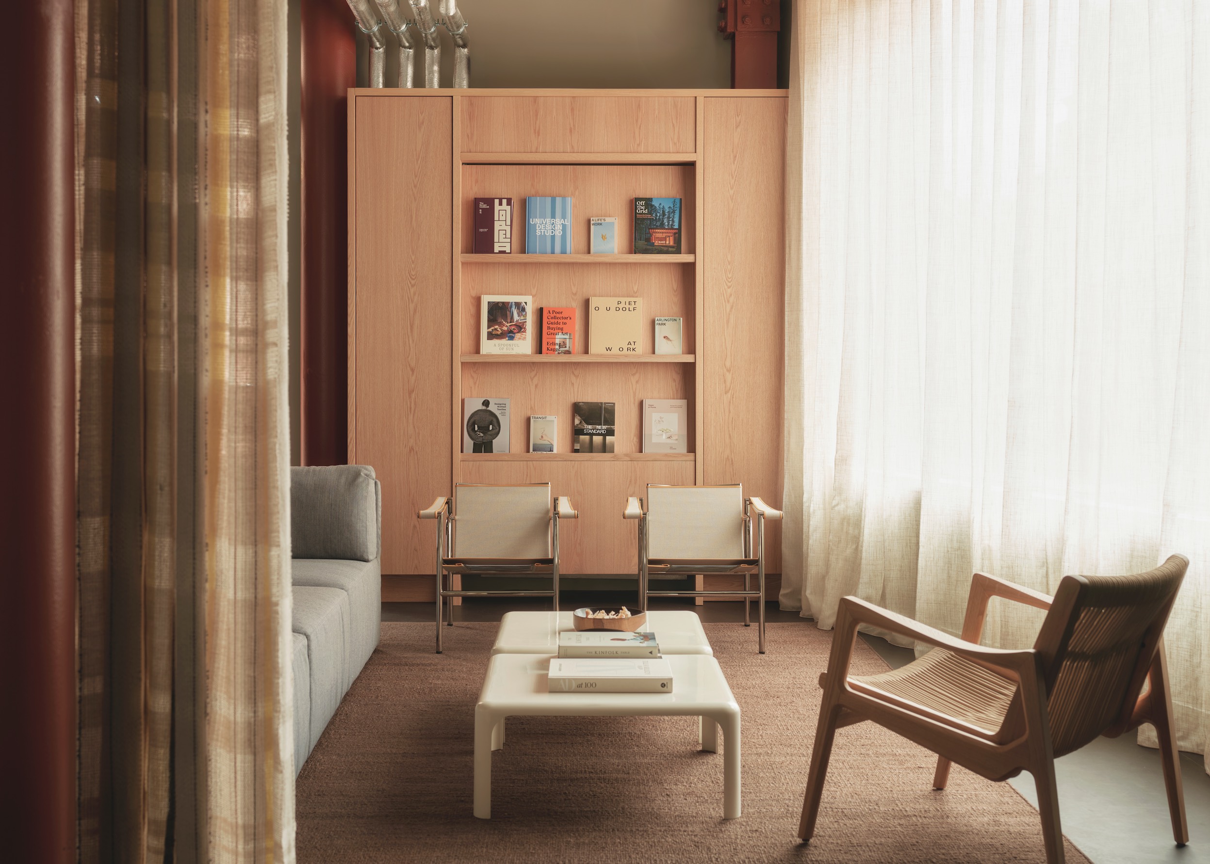
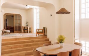
This inspiration finds form in an impressive central core crafted entirely from natural oak and rattan. The timber joinery wraps around a double-height light well and an existing concrete staircase, and acts not only as a balustrade, but also shelving, a garden, workbench and seating. Rattan panels add texture and enclose the space while allowing light to come through, and timber fins define the shelving units and evoke the form of the shuttle – the tool used by weavers to carry the weft yarn through the warp threads.
“The previous Somesuch HQ was set over one floor, and they were worried they would lose connectivity in a space set across three,” says Dionysopoulou. “The cutouts in the timber-clad core played a big role in allowing more visibility in the new space.”
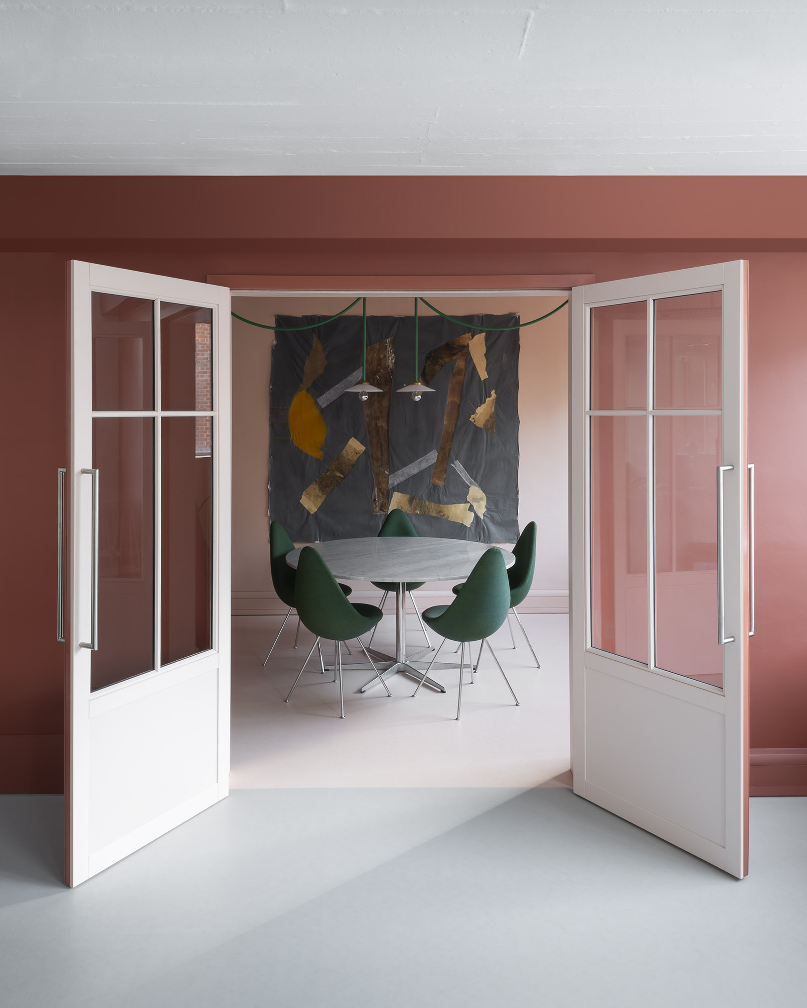
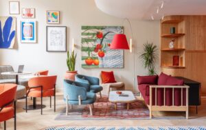
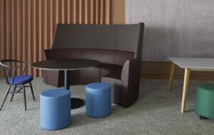
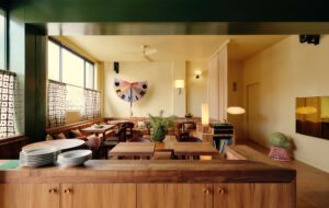
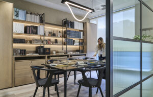
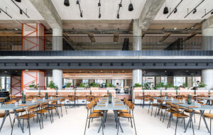
Thoughtfully arranged around the central core are a variety of meeting rooms, offices, boardrooms and break-out spaces, designed to introduce a diversity of work environments at different scales. Rather than simple rows of desks, employees can choose to work from the library, bar seating, armchairs or meeting rooms. There’s also a large kitchen for team lunches situated prominently on the lower floor, a feature that echoes one of the most-loved aspects of the previous Somesuch space.
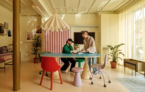
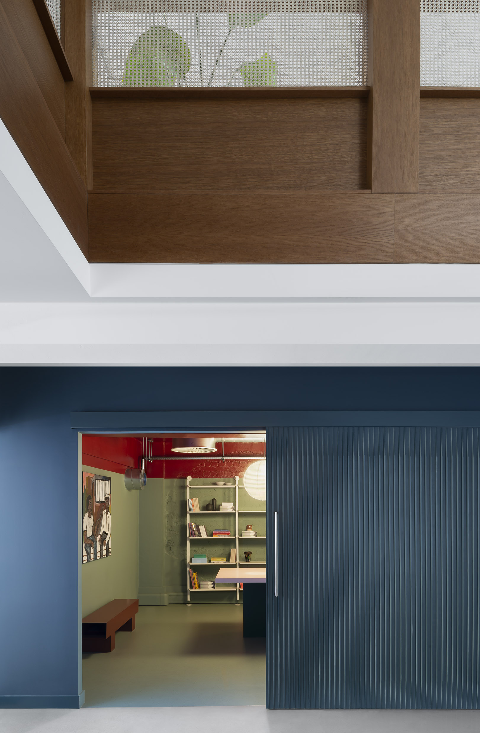
These work areas feature a bolder colour palette that offers dramatic contrast to the more organic colourway of the central core. Take, for example, the meeting room located within a teal blue structure, with light green interior walls, a blood-red ceiling and a pink and yellow meeting table. While it might sound overwhelming, the muted tones give these spaces a feeling of sophisticated residential interiors.
“We wanted it to feel more like a house than an office, and there’s a bit of playfulness in the palette,” explains Dionysopoulou. “Likewise, the scale is not of a big floor plan and the rooms all feel proportionally more domestic. We’ve interrupted the space by placing volumes within it to create nooks and different scenarios, so you don’t find yourself feeling small within the workplace.” This is a particularly important concern in a post-Covid world, in which companies face the challenge of attracting employees back to the physical workplace.
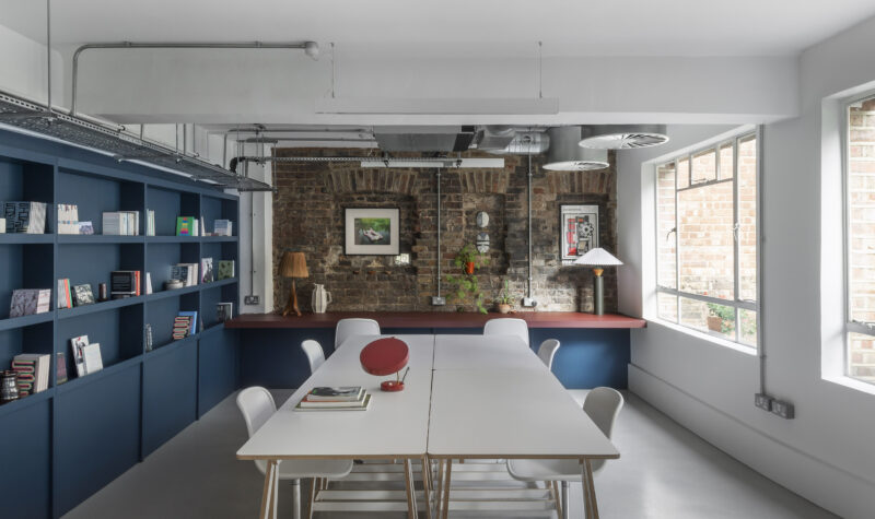
Texture was another key factor in bringing a softer, more residential feeling to the space, from the large papier-mâché pendants in the kitchen to a pre-existing section of slate flooring and a 17th-century brick wall that was uncovered during construction. Adding even more interest to the fabric of the interior are the eclectic objets d’art collected by Somesuch over the years, which are proudly displayed throughout.
“We’ve visited Somesuch several times and the feedback has been super positive,” says Mavropoulos. “People are using every single corner of the workplace and creating pockets for communication, collaboration and socialising. It’s exactly what they were hoping to achieve – and the best part is that it’s all happening naturally. Somesuch is interested in a quirky, eccentric aesthetic, and so we knew from the beginning that we had to think very specifically about the project. There was no simple recipe we could apply.”
Images by Gilbert McCarragher
Enjoyed this article? Subscribe to our weekly newsletter here

