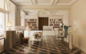
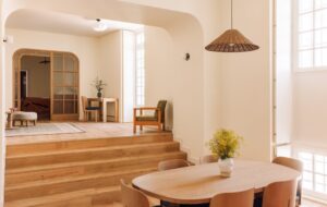
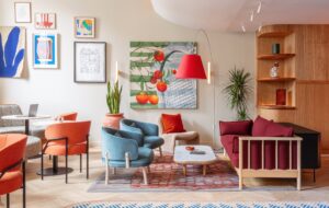
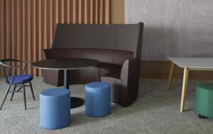
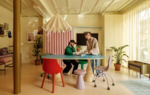
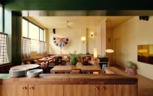
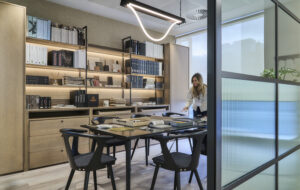
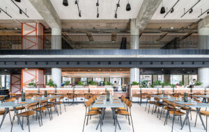
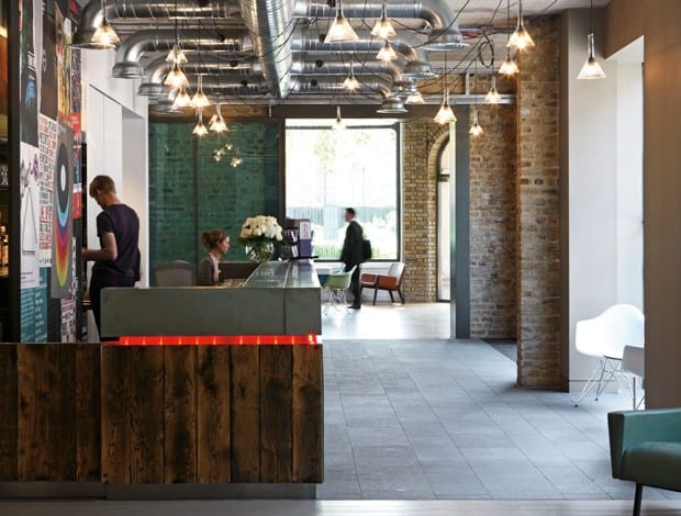
 View from reception into the sun-drenched lounge. The bespoke reception desk and bar is made of reclaimed timber and polished concrete|Street view of the three buildings that have been connected to form Red Bull’s new HQ|Openings between the ground-floor lounge (with a communal table by Naughtone) and reception give connection and buzz at street level|Staircases with glass balustrades now connect the office floors to each other and to the meeting rooms in the south-east corner|A newly formed atrium breaks up the office floors and ensures a light, airy feeling in the ground-floor lounge|Swirling skater manifestations decorate the glass walls of meeting rooms on the upper floors||
Energy drink firm Red Bull sharpens its image with a move to more grown-up offices in London Bridge
Red Bull, the super-caffeinated energy drink used (and abused) by long-distance drivers and students everywhere has moved to new digs in London. It might come as a surprise that the company opted to leave its previous office, which famously incorporated metal slides for “accelerated connection” between floors and which seemed to jive perfectly with the Red Bull ethos.
The website’s “Holy Shit” section is dedicated to adrenaline-fuelled athletics, after all. But health and safety regulations were ruining the fun (it turns out employees had to wear helmets and elbow pads), and more pressingly, Cross Rail was moving in. The powers that be decided to scoot Red Bull over to a new space and give it a more grown-up image.
With this in mind, London-based design practice MoreySmith was a logical choice for the project.
Its penchant for contemporary classic spaces and use of natural materials was a necessary step away from gimmickry towards a more subtle work environment. It wasn’t straightforward, however, with the design team needing to do a bit of coaxing along the way. Initially, Red Bull was after a location in Soho before settling on a series of south-facing, mid-19th-century buildings in Tooley Street.
“Luckily we were narrowly able to avoid having a Buddha statue in reception”
“It was a real rush – they had to get out of their old space and they had a shortlist of ten buildings,” explains MoreySmith founder Linda Morey Smith, who heads up the practice with creative director Andrew McCann. “Quite often we’re appointed way before the building is selected and we can help choose the right one.”
It wasn’t obvious at first. At the start, the three buildings that make up the new HQ were not connected, with varying floor levels and two solid walls between them.
“It was quite difficult to explain it [to the client] because we kept saying, ‘We’re going to open this up here’ and ‘You’ll be able to see that there’… and we were standing there looking at brick walls trying to help them visualise,” Morey Smith says. “As a business, they wanted to have more visibility and collaboration – that was the whole point – so even when we were on site, until we opened everything up it was still quite difficult for them to see how it was going to work.” The structures also needed to be checked over by a Feng Shui consultant, she adds, but “luckily we were narrowly able to avoid having a Buddha statue in the reception”. Phew.
Eventually, the office began to take shape. The obvious architectural job was to connect the buildings, which meant creating large openings between them at ground level and carving out an atrium and staircase to connect and open up the three office floors. Before, the only way to travel between the floors was to use the emergency staircase or lift.
The ground floor on either side of what is now the reception had been originally allocated for retail, so planning permission was dependent on proposals that maintained an animated, buzzy feeling. This worked with Red Bull’s vision, which included a hub for its 150 employees to come together (now the lounge in the south-east corner), and a bar and rotating exhibition space, which is on display to passersby at the other end.
“The main thing was to keep animation at street level,” says MoreySmith associate and project architect Nicola Osborn. “Meeting the planners was Red Bull’s opportunity to say what their aspirations were for the ground floor and how it would integrate with the community. They wanted life – they didn’t want desks down here.”
The upper three office floors have been re-jigged to create open-plan work space, break-out areas, tea points and glass-fronted meeting rooms. Exposed duct work and bare bulbs might be a nod to the original desire for a Soho warehouse, and existing concrete columns were cleaned up and left intact.
It must be said, kudos is due to MoreySmith for maintaining the feeling of a building that has only been touched up. The practice has carried out quite complicated structural work to provide what Red Bull needed in its office without losing the integrity of the building.
“There are so many briefs where you get a 1970s building and they’ll say they want high ceilings and big windows. So with this building we thought, ‘Let’s not ruin it, let’s make sure we just open it up’,” says Morey Smith.
Jagged concrete around the lip of the stairs, eclectic furniture and picture frame detailing across the atrium add character. In the end, Morey Smith hits the nail on the head: “The more creative the company and more successful the brand, the more challenging they are to work with. It’s easy to surprise a financial institution but to surprise and delight a company like Red Bull was a major achievement.”


