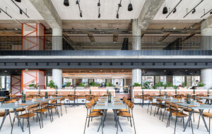
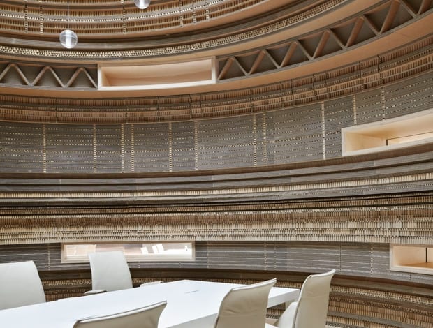
 Everyone can be chairman of the board in Rabobank’s meeting pavilions|Cardboard, paper lighting and timber furniture unite the square’s woody theme|Chinese-style metal structure frames a piece of art made from blue porcelain||
You could say that using cardboard for the interior of a European financial services institution befits the times. It’s a bold move by Sander Architecten, the Amsterdam firm responsible for the interiors of the new headquarters of Rabobank in Utrecht, The Netherlands. Cylindrical meeting pavilions made of the material now sit in the company’s 6,000sq m communal “square”, which forms the hub of a new 25-storey building by Urbis Architects. But instead of sending a message of impermanence, the cardboard is part of a wider scheme that demonstrates a new way of thinking about materials and working patterns.
“I thought the cardboard was a nice way to turn everything upside down, give a new feeling, another way of looking at things,” says Ellen Sander. “It’s good if
you are a little bit amazed. Maybe it will inspire people when they go in and have a meeting, put a twinkle in their mind.”
Located on the plinth of the office building, the newly completed square is now in use by staff, with the floors of the tower to follow at the end of the year. Sander won the job to do the interiors of the entire 56,000sq m space in 2007, and despite the very different banking landscape in which we find ourselves in 2011, her impulses have been right. “I said to them, ‘give me four months to think it over,’ and then I wrote a vision for the whole building because I wanted to merge Rabobank as one strong design,” she says.
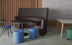
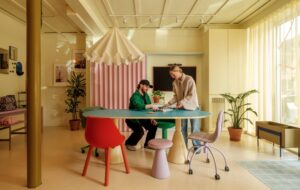
The overall concept is based on the metaphor of a city with neighbourhoods, open squares and streets. This made sense for the style of work the company wanted to adopt, which is about freedom, trust and taking responsibility. “In the client’s view, its employees are all entrepreneurs, responsible for their own performance in an environment free of fixed rules, times and locations,” explains Sander. The workspaces, including a series of 15 meeting pavilions in the square, are tailored to support specific activities – mainly group or one-on-one meetings and concentrated work.
The initial proposal asked “contributing designers”, such as former onoffice cover star Ineke Hans, to design five floors (each) of the tower as well as meeting pavilions in the square. “The scale of the building was really a challenge, and we wanted to have a variety of design handwriting,” says Sander.
Sander’s vision had to do with what she calls “flow and intuition” and the way people naturally find their way. “When you go to a new city, you know you have to go to the centre of town, and I thought about this flow and also how animals find their way – they always take the shortest way between a and b, and human beings always see the shortcuts as well,” she says.
A further metaphor compares the space planning to the movement of a river: “You have different bends: the outside ones are more leisurely, and the inside ones are quicker,” Sander says. “Flow is psychological – it’s the need and ability come together in optimum moments. It increases a sense of happiness and a better production. And I thought, if I can understand this state of mind, then I can get this environment right.”
The building has two cores, Sander continues, so the busiest area is between them, meaning that the outside is the quietest. It was therefore most logical for the outside to make up the concentrated work areas. “That way we didn’t need walls or vertical partitions,” the designer adds.
In the square, the grid of the skylights, 6m in diameter, dictated the grid of the “city” and its meeting pavilions – 15 in all. For cohesion, Sander gave the designers a sharp set of rules including the types of materials that could be used. “In a way it was really restricted because we told them all to use the colour white and wood, but on the other hand it gave a rich diversity because they could use all kinds of white and all kinds of wood.”
Sander designed the three show stopping cardboard pavilions herself – the material was chosen because it is derived from wood. Thin Japanese washi paper was specified for the skylights for the same reason. Narrow, horizontal windows pierce the cardboard towers (“so you feel connected, you can peep through”) although the pavilions themselves are completely soundproof.
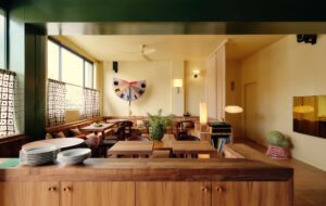
Sander also designed a set of tables and chairs for eating and socialising, situated around the pavilions, while the terrazzo flooring gives the space an additional feeling of warmth. An imposing blue porcelain piece of art from Rabobank’s extensive collection sits as a centrepiece. It was made by a Chinese artist, so Sander designed a metal structure based on the haphazard pattern of a traditional Chinese bookshelf to accompany the work.
Sander is very pleased with the square: “The place gives everyone a special feeling,” she enthuses. “There is so much light coming from above, so it’s a very nice atmosphere. When staff first started using the space, it was as if they were always there. It feels natural. It’s still human in scale, and that was one of the challenges, to make people feel comfortable.” The rest of the building will be finished in December, hopefully with just as pleasing a result.


