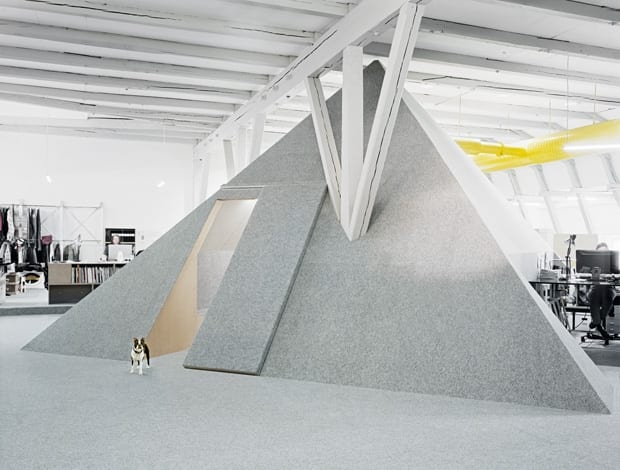
 Boston terrier Beverly is as protective as you would expect of the distinctive pyramid-shaped room – her owner is part of the Cheap Monday team|Inside the meeting room, discussions take place from benches in the walls rather than around a table|Recesses in the pyramid provides space for storage, Xerox machines and desks for transient workers|The upstairs showrooms retain many of the features of the brewery the building was previously home to|Yellow ducts are a striking feature of the store – and provide an arresting contrast to the untreated ceiling|Floors and walls are covered in a grey needle punch carpet, which is helpful for acoustics||
With a name like Uglycute, what could possibly go wrong? Fortunately, Swedish fashion brand Cheap Monday knew from experience that the design firm’s moniker is not necessarily a reflection of its work.
Uglycute (one architect, two artists) made a rousing success of fitting out the company’s Copenhagen flagship store the previous year, so it was a no-brainer to enlist them to design a new studio and showroom on the business’s home turf of Stockholm.
Whether the result is ugly, cute or otherwise is in the eye of the beholder – but there can be no doubt this office carries the mark of a distinctive brand. Plus, it boasts a pyramid-shaped meeting room – a feature we have never seen before, and one that is extraordinary in itself. More conventional than pyramid-shaped meeting rooms is Cheap Monday’s desire for its 25 employees to be inspired by their new home and work more efficiently there.
“The client was moving from a cramped space where the staff was scattered out in different rooms,” says project architect Fredrik Stenberg. “So for the new office we wanted to create something a bit more open and fluid, where the staff could interact more easily.”
The natural starting point for the design was with the building, he says. In another stroke of good judgement, Cheap Monday managed to secure 900 sq m over two floors in a lovely old brewery – the sort of raw material that designers salivate over: lots of light, open space and well-preserved original features.
“It’s good to be present onsite. If you have all the drawings done in advance and fax them away you can’t really turn back”
Uglycute’s concept took shape as one semi-public upper floor, which would have two showrooms and a reception, and a lower floor for offices and the design team.
As it happened, the design and construction took place simultaneously onsite during a speedy four-week turnaround, meaning that some of the building’s original details were uncovered during the process like little treats, and the ideas for the main work floor took shape as the project progressed. Despite the stress, this is the way Uglycute prefers to do things.
“We had a starting point with the general layout and designed the details as we went along. That’s something we learned works well from our previous projects,” Stenberg says. “It’s very good to be present onsite because you run into problems or you discover possibilities and so on, and if you have all of the drawings done in advance and fax them away to someone you can’t really turn back. So we’re very fond of this site-specific architecture.”
Each floor required a different approach. On the showroom floor, the job was about “subtraction and reduction”, Stenberg adds. Paint was stripped back to reveal existing tiled walls, black linoleum floors and the vaulted ceilings of the brewery’s ventilation drums in near pristine condition. This level was kept quite raw on purpose, he says, and nearly nothing was done architecturally except to tear down a wall next to the showroom to open up the space. Galvanised steel and chain-link fencing is suspended from the ceiling as a display fixture – and as a connection with the Copenhagen retail outlet, pyramid light fixtures mimic their counterparts originally designed by Uglycute for the Danish shop.
On the lower level, the designers added elements instead of stripping down.
This is where the pyramid meeting room of wood and steel was created around one of the building’s original grey beams. The shape of the structure isn’t an arbitrary aesthetic decision, however. It makes absolute sense in a cavernous room with double-height ceilings because it allows as much light as possible to filter in.
“It has these dramatic lines and we wanted to interact with those – but then you have a practical reason as well,” Stenberg says. “Plus you don’t want it to be a shelf – if you have a box-shaped room, the top of the box will be an unused area to gather a lot of dust.”
The same logic is applied to the three small offices and the kitchen/services area behind sloped walls along the periphery. “It creates the notion of an open landscape or terrain where you can sit and work or just take a stroll,” muses Stenberg. Indentations in the sides of the sloped structures make space for Xerox machines and desks for transient workers. He adds: “Otherwise we would’ve just created a lot of lost space.”
“It has these dramatic lines and we wanted to interact with those – but then you have a practical reason as well”
The pyramid’s interior (gypsum boards held in place by black screws) was inspired by a project Uglycute stumbled across from the 1970s.
“The meeting room has this kind of squared shape where you don’t have a centre meeting table, but you sit along the edges on benches. We wanted to try something new to get away from the meeting table, but the measure of distance is important so you don’t sit too far away or too close from everybody,” Stenberg continues.
Floors and walls are covered with grey needle punch carpet (as they are throughout the whole office floor, every single inch, it appears) – helpful for acoustics and presumably a material that is easy on the pocket.
In fact, it seems all materials and furniture have been kept at low cost. Cheap Monday brought their old tables and spherical lights with them and the customised box storage elements dotted around the floor are made of chipboard, as are the benches and small coffee tables in the pyramid.
The biggest expense by far was the new ventilation system, with its bright yellow ducts made as big as possible for a punchy feature against the untreated ceiling. Bigger ducts mean less noise, Stenberg explains. So, there you have it. In the hippest area of Stockhom, Södermalm, a fashion company named Cheap Monday has a new office by Uglycute. Make of it what you will, but we think that pyramid is pretty darn neato.


