 Pinterest needed new digs after its popular saw staff go from 12 to 300|Wheeled worktables in the main atrium can quickly be reconfigured|A cuboid ‘war room’ where staff members can get some intense work done|The four large white cubes create various private spaces over two levels|Workstations are spread throughout the building|A relatively stripped-back approach is intended to encourage customisation||
Schwartz and Architecture, All of the Above and First Office have worked together to transform a large warehouse in San Francisco to fit Pinterest’s ever-growing staff
Where the concept of “getting employees involved the design process” is concerned, I always have a vision of it being a bit too much like enforced fun, like a company away day or seasonal party. I’m thinking staff grappling passive aggressively with pipe cleaners to indicate they would quite like a corner office, thank you. At Pinterest, they really mean it. Unsurprisingly, really, for a California-based image-sharing service that has a strong design, DIY and craft bent.
“We talked extensively with engineers, designers and others,” says Janette Kim, concept designer from All of the Above, which co-designed the space with Anna Neimark and Andrew Atwood from First Office, and executive architect Neal Schwartz of Schwartz and Architecture (SaA). “Brand manager Everett Katigbak has been very involved in the space, both before and after move-in, working with artists and staff to create a space that is unique to Pinterest culture.”
Kim was a tutor of Evan Sharp, one of Pinterest’s founders, while he was at Columbia University’s Graduate School of Architecture, Planning and Preservation. “We’ve kept in close contact since,” she says. “We have had an ongoing conversation about design, information, visual culture and architecture.”
Pinterest, for the uninitiated, is an American tech start-up that has grown exponentially since its launch in 2010, to the point where it has 70 million users and its perky ‘P’ logo is almost as ubiquitous as Facebook’s ‘F’ or Twitter’s bird. (Naturally, onoffice has a Pinterest page.) This scheme is not so much the next chapter for Pinterest but rather the plot, the characters and the vocabulary for them to evolve as they see fit.
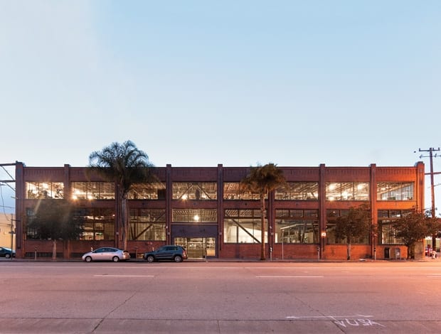
When the first discussions were held to discuss the office, then in Palo Alto, there were a dozen people working for Pinterest. After a spell at a smaller warehouse in the SoMa neighbourhood of San Francisco, its current home is an adjacent 4,180sq m site that could easily cope with 300 people. The building’s construction is typically industrial, with large windows, wood beams and a steel structure. There are two full floors, a partially finished basement and a mezzanine level.
“The idea was to create a domestic-like interior transformed by people into a workplace”
The next step after these initial meetings was a quote. Not a budgetary quote, you’ll understand, but an extract from the 1917 short formalist essay Art as Technique by literary theorist Viktor Shklovsky, which All of the Above/First Office brought to the table. It runs thus: “Habitualization devours work, clothes, furniture, one’s wife, and the fear of war. If the whole complex lives of many people go unconsciously, then such lives are as if they had never been.” Which is a rather more interesting way of saying that it’s not enough to just declare that it’s a collaborative space – it also needs to creatively counteract the boredom that sets in from routine. Certainly more Pinter-esque than one might expect from Pinterest.
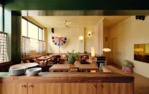
“There was a desire to strip back the space to reveal its raw potential,” explains Neal Schwartz. “A 1980s remodel had covered up much of this feeling and was therefore removed. Given the tight budget, many basic elements such as the elevator and main stair and railings could not be removed.” The 1980s soffit was taken out to expose the skylights above, while the architects worked with the structural engineer on a new stairway to increase connections between the three levels of work areas. “The value of overt architectural moves was questioned in favour of a looser, more ‘hacked’ space as an expression of their culture and working style,” says Schwartz. And so, Pinterest employees’ hanging art lanterns bob next to the lift while a DIY speakeasy space was an area left relatively untouched by the architecture and design professionals, being somewhat leftover from the main scheme. It evolved organically into an attractive, informal seating arrangement.
One side of a custom-built shelving system displays the staff’s personal objets trouvés. On the other side of this shelving is the reception, where a simple system of film on glass creates varying levels of opacity. As well as affording the main workplace behind it some privacy, the overall pattern created is designed to look like the cataloguing system on Pinterest’s website. Otherwise, there is no statement desk or lighting installation here; instead, the first impression visitors have of the main entrance is one of a fairly unassuming place to work.
“There was a desire to strip back the space to reveal its raw potential”
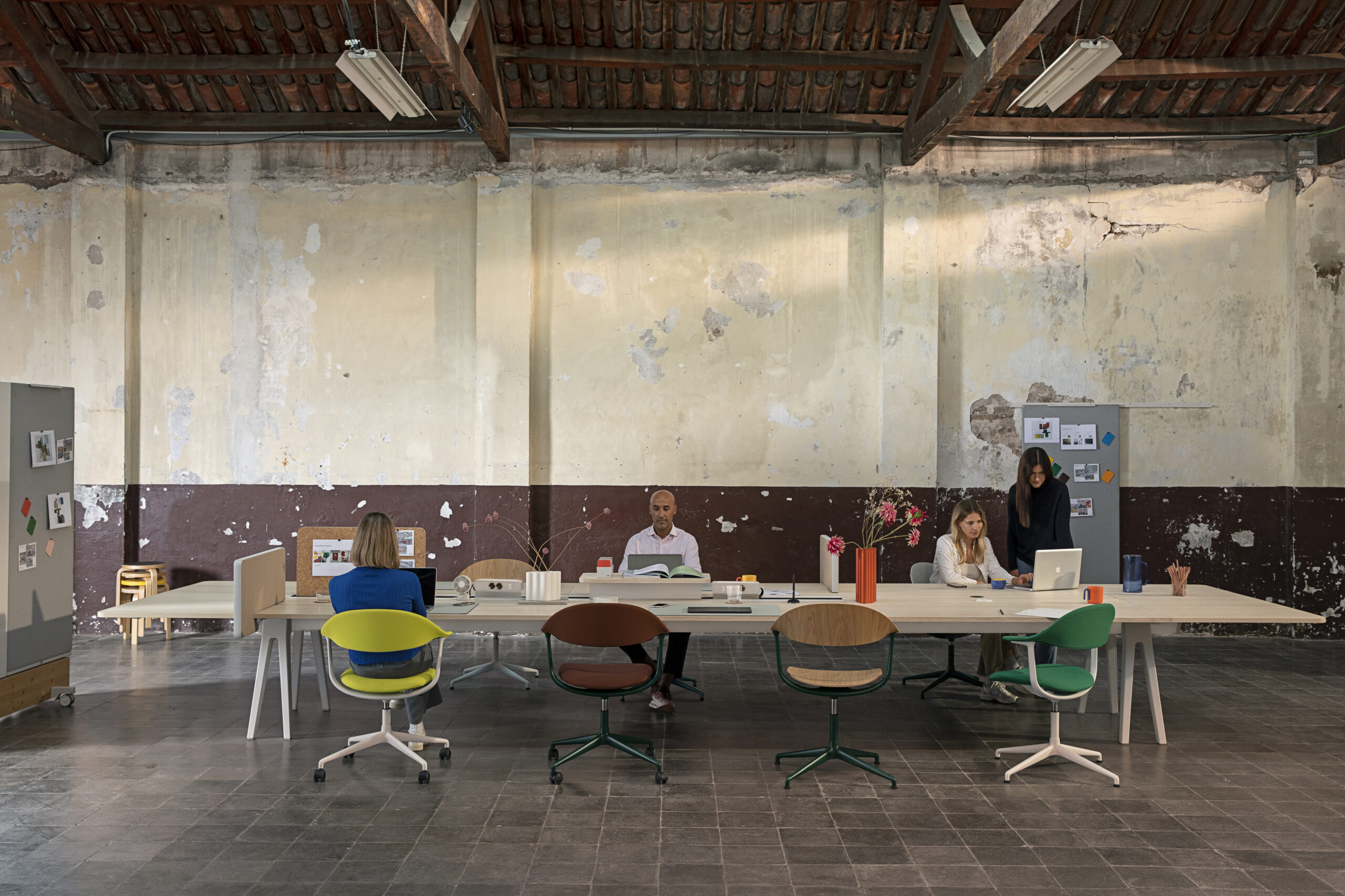
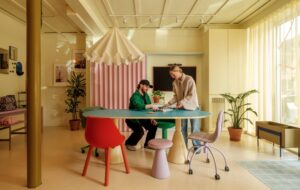
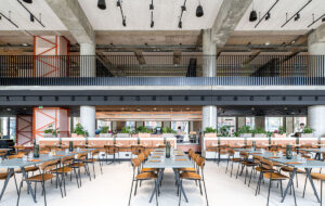
Workstations are distributed everywhere throughout the open floor plates. The main atrium features simple movable wooden tables on metal frames, which can serve as both a place to dine and an extra place to work when all hands are on deck. This area is complemented by decorative lettered signage designed by Pinterest. There are no cubicles and no hierarchies: the idea was to create a domestic-like interior transformed by tech-loving people into a workplace. With this in mind, there are four large volumes or ‘houses’, each six metres high, which create pockets of activity within the vast warehouse space. They are made from gypsum board with steel stud framing, and house various kinds of activity from quiet working to a kitchen cum dining area, where again the results of the employees’ curation skills can clearly be seen.
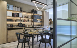
The ‘war rooms’, meanwhile, are big square rooms where people sit at the centre of the space and chat with one another as they work at tables surrounding them in order to lockdown to meet tight deadlines. The idea is that the white and glass surfaces of the volumes should become whiteboards, pin boards and graffiti as the social contact between employees generates ideas and sketches. A large gathering space is created where the four volumes meet in the centre.
If the Facebook-inspired film The Social Network is anything to go by – and frankly this is my only point of reference for working in social media – then the temptation to go from Ivy League dorm room to full-on poured-resin-and-fireman’s-pole workplace decadence is a strong one. But it’s one that Pinterest’s founders have resisted. Anna Niemark of First Office says finally: “They didn’t want to create a sense of complacency. As the project designers, we believe that if the space feels unfinished – even humble – then all workers will feel they have had a hand in the company’s creation.”


