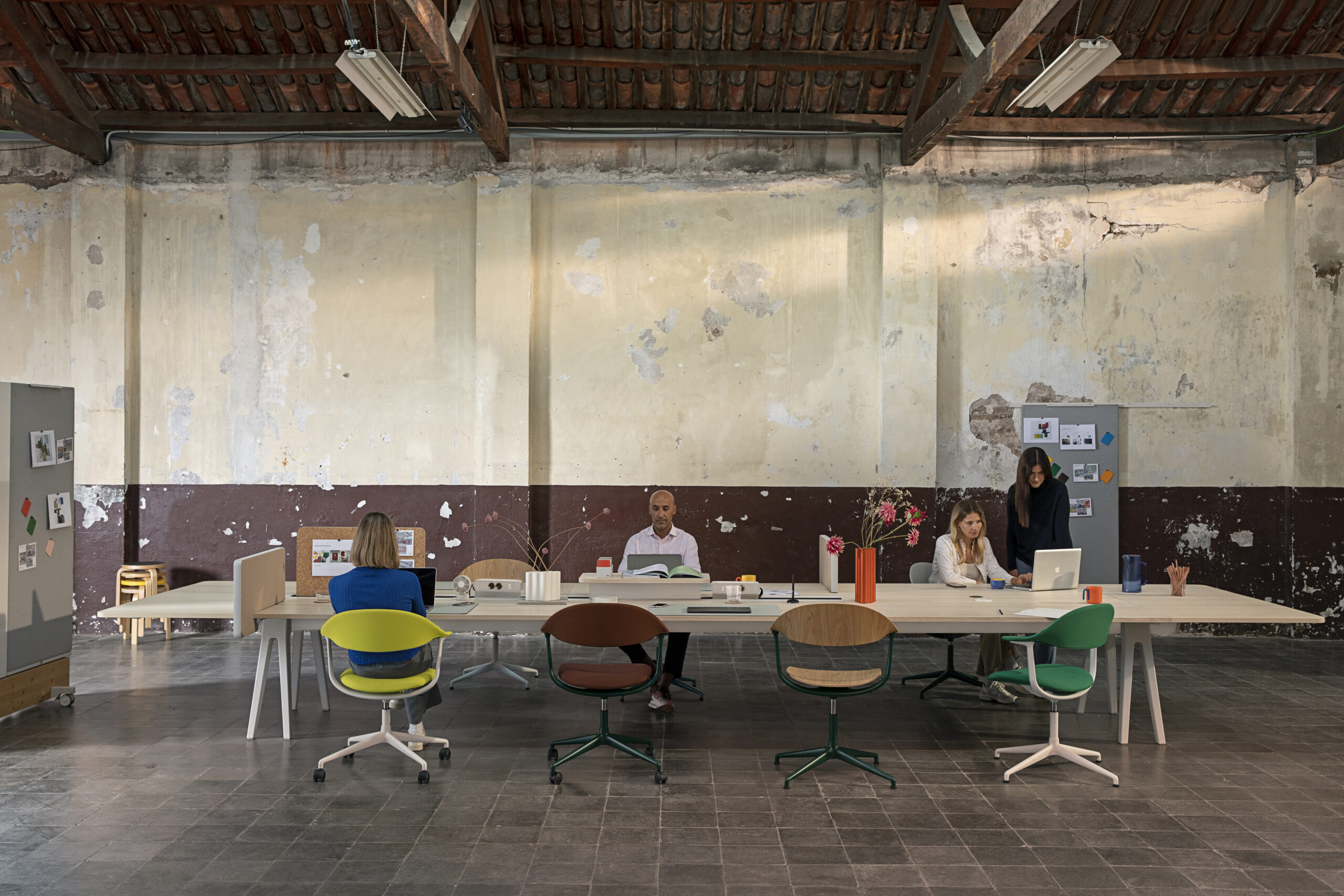
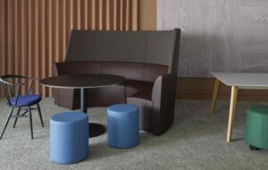
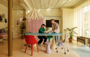
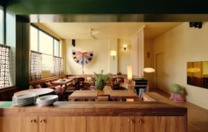
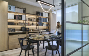
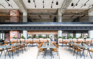
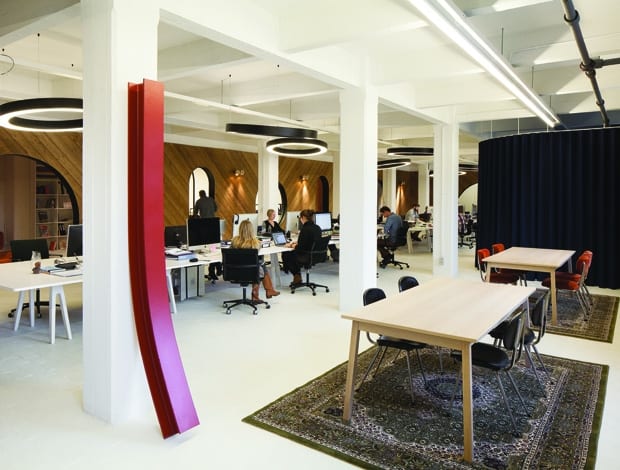
 The design firm’s office is based around a central spine of Vitra tables|Untreated pine walls separate the desks from the breakout space|Arched openings lead to loosely themed seating areas, like this retro hangout|A tongue-in-cheek order to the workers||
Pinkeye Studio used unfinished materials, bold graphics and ambient lighting for its Antwerp office.
Pinkeye Studio is a multi-disciplinary agency in Antwerp, Belgium, made up of product developers, graphic designers, interior architects and marketeers. Seven years ago, it set out with two product designers, and has gradually expanded to 19 people, plus interns, outgrowing its office space in a converted warehouse building in the centre of Antwerp. Fortuitously, the fashion label next door recently vacated the space, making way for an expansion.
The studio includes an environment department, producing interiors; an identity department, dreaming up packaging and graphics; and a product department. It focuses on bringing different specialisms together to produce functional and innovative concepts. The new studio, then, provided the perfect grounds on which to deploy its crossover working practice, with a single spine of desks – Vitra’s Joyn table – providing space for 18 creative heads to sit together, with a variety of breakout spaces surrounding this central spine.
The studio space also had to be carefully planned out to facilitate this way of working, Pinkeye’s creative director, Ruud Belmans explains. “You need time behind a computer being focused, looking at the problem, the project, the design. Then you need time where you are not that focused, where you walk about, welcome a different point of view. Those two different ways of thinking are essential in order to really be able to create.”
As if to demonstrate these two counterpart ways of working, a bespoke graphic sign in a round window spells out the slogan You Work Harder! (presumably a tongue-in-cheek command) while nearby, in a breakout space, a cosy area with a 1970s rug and sofa invites studio members to sit back and step away from the problem.
“A single spine of desks provides space for 18 creative heads to sit together”
The central element in the design of the studio is a dividing wall that runs the length of the workspace, clad in diagonally framed wooden beams.
“It is raw, untreated wood; quite literally, you could get a splinter off it,” says Belmans. To him, this rough and ready appearance is an important feature: ‘Wood is a warm material, and gives the project a natural feel. The building is an old warehouse made of concrete and steel so we wanted to introduce something natural.”
It is also a reminder of the treehouses of Belmans’ childhood, an important emblem of ideas, escapism, creativity, and self-building. “You build treehouses to get away from the everyday, to hide out, to have dreams,” he says. “It brings an aspect of play to the workplace.”
Despite the unfinished materials, and the mix of creative inputs, the overall feel of the office space is calm and uncomplicated. Belmans spent a lot of time examining the layout.
In conclusion, four chapel-like arched openings are cut out of the central wall, either side of a circular window. They give way to a variety of different workspaces, marked apart by eclectic arrangements of vintage furniture. At the end of the main room are two spaces set behind glass doors: a vibrant and creative hangout and a more sober-looking conference room.
The arches and the glass allow for discreet working areas but essentially the space is well connected, and open in feel. Keeping the company integrated at the same time as allowing it to flourish and grow was a key concern for Belmans when considering how the new space should best be allocated.
“Wood is a warm material, and gives the project a natural feel”
A solution to this is the fully stocked bar, raised up but integrated into the studio space. Clad in gold and surrounded by high stools with a row of pendant lights lined up uniformly overhead, it creates a highly informal out-of-work environment within the office. “I think it is important to share,” says Belmans, “and when it is four to five people working together you always know everything about one another. When it is 20 it is hard to know what everyone is doing, but it is a shame not to know, as what your neighbour is doing might be inspiring to you. I tried to introduce ‘official’ moments of sharing, which never work, and so I decided to do it in a more unofficial way. Sharing outside of work just happens. You tell one another about your week, your clients, your project. Through this you can inspire.”
Lighting is a key feature throughout the project, with pendant lights in a medley of designs offering intimacy and ambience as required.
For example, smart black and white lights hover above the central work table like halos (they were customised with matt black paint to match the inside edge of the archways) while in the cafe-like space adjacent to the bar, cardboard cocoon-like lights hang down in different sizes and at different levels. There are also some practical features of note, such as the whiteboard walls, which can be masked by petrol-blue curtains to keep any information on them confidential from visitors, and a presentation area, where employees can write on the white wall via a projector.
Both the design and build were arranged in-house, and the latter involved demolishing existing parts of the previous studio, as well as constructing the new layout. “It was quite exciting, but because it happened over a matter of months, for us, it was more of a gradual transformation than a grand unveiling,” says Belmans. “But once a month we have clients, other creatives and other studios invited to the bar. For them the impact was greater. People really like it.”


