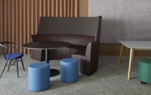
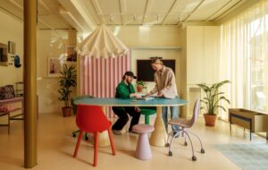
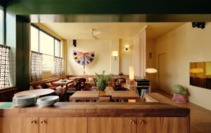
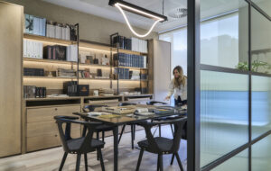
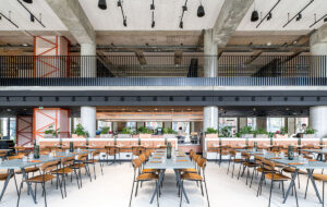
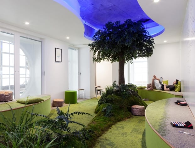
 Despite its lush appearance, this ‘meditation space’ is maintenance-free|Bleachers and high stools offer lots of options for gatherings|Piaggio three-wheelers dose out caffeine hits to staff|Aged doors add to the secret-garden air of the ‘meditation space’|Staff social space – originally conceived as a pub, but toned down|Booths with writable walls are handy for concentrated thinking|Chesterfield and Eames chairs present a mix of old and new|Exposed ducts and steelwork introduce a bit of urban grittiness|A pair of high-backed sofas create the perfect spot for a huddle||
From leafy Primrose Hill to the edgy East End, Peldon Rose has taken London’s districts as the inspiration for digital agency Essence’s HQ
Treading the line between idiosyncrasy and sincerity is tricky in modern workplace design, as it involves balancing creativity with business. For the London office of digital agency Essence, Peldon Rose has navigated both sides of office culture by offering a fair share of fun – including acontemplative/creative space complete with petrified tree, and the requisite ping-pong table – alongside functional work environments, while (just)avoiding the trap of ‘over-designing.’
“It shouldn’t be down to us to always be clever and creative with the space,” says project director Steve Taylor. If you give people a blank canvas, he says, it can adapt to reflect a firm’s individual DNA. “They are creators; they know their business. If you build a space that has such a strong design language that it can never change, you’re stifling their creativity.”
The single-storey office on Oxford Street is imagined as a new London district, planned around two huge central lightwells. A pathway, starting in reception, circumnavigates these lightwells and connects to all areas of the workspace, where the 300 or so desks are rarely positioned in straight lines but instead sit at jaunty angles, so the floorplan looks akin to a map of sprawling London streets. “I can’t stand that regimented, linear layout. This creates a lot more interest when you walk around the office,” says Taylor.
The bulk of the core workspace is fairly standard, with raised-access metal floors and suspended ceilings, interspersed with breakout areas and Piaggio three-wheeled mini-vans kitted out with hot drink machines. This aligns with the London theme, Taylor says, because employees are never far from a coffee.
The true personality of the office, therefore, comes through in the shared space. One particular congregation spot is coined Primrose Hill as it features park benches, green carpet and enveloping walls clad in a full-size landscape photograph. If this is the village green, then the aforementioned meditation and ideas space are like the city park. Accessed via 2.5m-tall, distressed green-painted arched doors (salvaged from a Bethnal Green reclamation yard), this room is intended as an oasis from the day-to-day, a place to be calm or bounce ideas around.
It has moss walls in the entranceway and a central island formed of plants, more moss, and an actual tree, all petrified, so they’re low maintenance. This is one of the tricks Taylor says the practice picked up while designing offices for Friends of the Earth – a handy list of materials and products for bringing the outside world indoors without the mess and upkeep of living walls.
The flooring (Interface’s Urban Retreat carpet collection), is used to link seamlessly from the grey ‘pavement’ around the office to the patchy green grass in here, stretching up on to the curved bench seating. These curves are mirrored by a cutaway section of ceiling, which adds height to the room and creates an indoor ‘sky’, enhanced by colour-change lighting. This can be set to a serene tone for meditation, or a more invigorating lux level for brainstorming sessions. For its latter guise, all the walls are also writable.
In contrast, the other communal spaces are hives of activity and more urban in their design. Beyond the entrance and lift lobby is the reception area and events space, which has concrete floors, exposed ceilings and a set of wooden bleachers at its centre. Used for presentations, training and large meetings, these were inspired by Shoreditch’s shipping container shopping mall, Boxpark, since Peldon Rose conceived this area as the office equivalent of the buzzy East End.
“As you walk in, you feel you’re in a public space,” says Taylor. “It almost has the feeling of the [Tate’s] Turbine Hall. The whole thing is transient and has a sense of energy and flow.”
The original concept, Taylor admits, was “too Shoreditchy” and was later refined. “We removed some of the graffiti and the corrugated steel, and fine-tuned it, to make it more honest, to have more integrity and future-proof it. People quickly get bored of things that are too edgy. I think we got the right balance, in that the form is cool, but it has a need and function as well.”
The bleachers initially had a more industrial look, but the finished article is more sophisticated, in warm timber with charcoal grey bench cushions. Cleverly maximising space, they hide a cosy nook on top for small, relaxed meetings on beanbags, and a kitchenette and two private work/phone booths underneath. These booths also have writable walls, and with high bench seating.
Nearby, in reception, are more benches and stools, and a group of Chesterfield sofas, offering a range of open spaces and ‘pockets’ for people to meet. Off the reception space is an area for eating and socialising, which again started life on the drawing board as something more heavily themed – a pub – but evolved into more of a gastropub-cum-cafe.
Many pub-like details remain though, in the brick walls, wooden picnic benches, industrial lighting, leather armchairs and stainless steel cabinets, while Vitra Eames DSW chairs and cafe tables lend a domestic scale. However, like the rest of the office, it’s not overdone. The charcoal grey wall encasing the cafe is clean-lined and sophisticated, not rough and ready, a smart decision on the part of the designers to move away from cliched industrial start-up office design.
As Taylor explains, the inspiration behind creating Essence’s ‘new London district’ was to emulate the pattern for tech industry regenerating gritty areas of cities – but since it’s amid the Portland Stone buildings of Oxford Street, it’s also sympathetic to its environs. Drawing on both identities, Peldon Rose’s pared-back approach mixes the quirky and the corporate.


