Material Drama: Office S&M has transformed a blank space in a former paint factory in London into a vibrant and social architecture studio that celebrates its true colours
Colour is a powerful tool in design – and for London-based architecture studio Office S&M, it is as much of a building material as brick, concrete and timber. So, it’s no surprise that its new office in Dalston, east London, is a vibrant space defined by bold pops of colour, innovative materiality and an abundance of lush greenery.
“Pops of colour make us smile,” says Hugh McEwen, who co-founded Office S&M in 2013 with Catrina Stewart. “The building itself was originally an artists’ paint manufacturer – which is apt for our interest in colour.”
The new studio is located within a building run by Bootstrap, a charity that creates a community network between charities and business as well as offering valuable training to young people. Office S&M has previously inhabited the building for eight years and donates part of its turnover to charitable organisations and offers pro bono services when it can.
The recent move has seen Office S&M transform an existing ‘white box’ space into a plant-filled ‘laboratory’ for the studio’s practice, much of which is focused on affordable and playful material experimentation. “We love to think about innovative ways to use materials that are both practical and fun,” reveals McEwen.
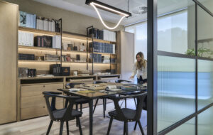
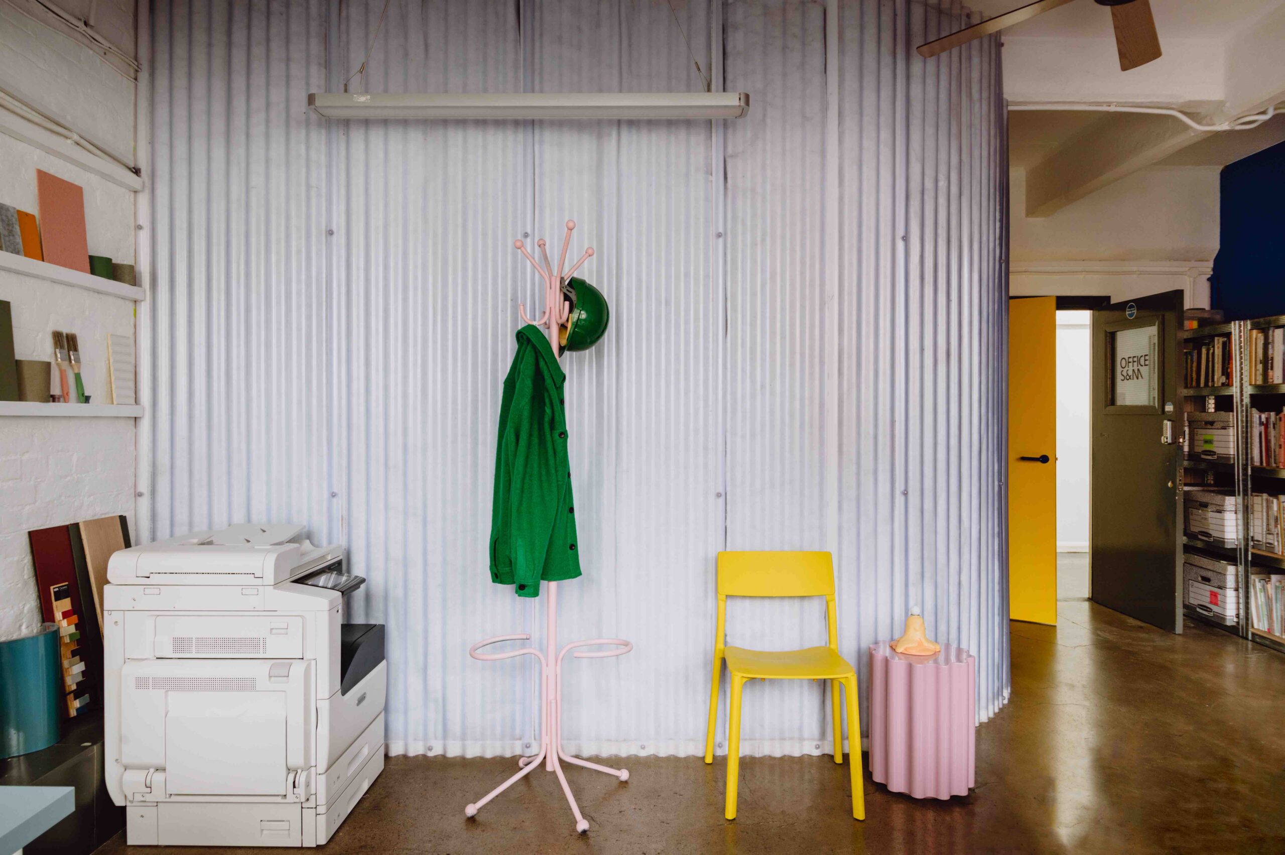
Take, for example, the striking curved translucent wall that separates the meeting room. Ingeniously crafted from sheets of recycled plastic loft insulation, it provides excellent acoustic separation for the meeting room and glows from within, like a lightbox, thanks to the bulbs integrated into the wall. The corrugated sheets are supported on a simple timber frame and made from recycled plastic bottles – all of which is not only a sustainable approach, but one that evokes the studio’s ethos of ‘do more with less’.
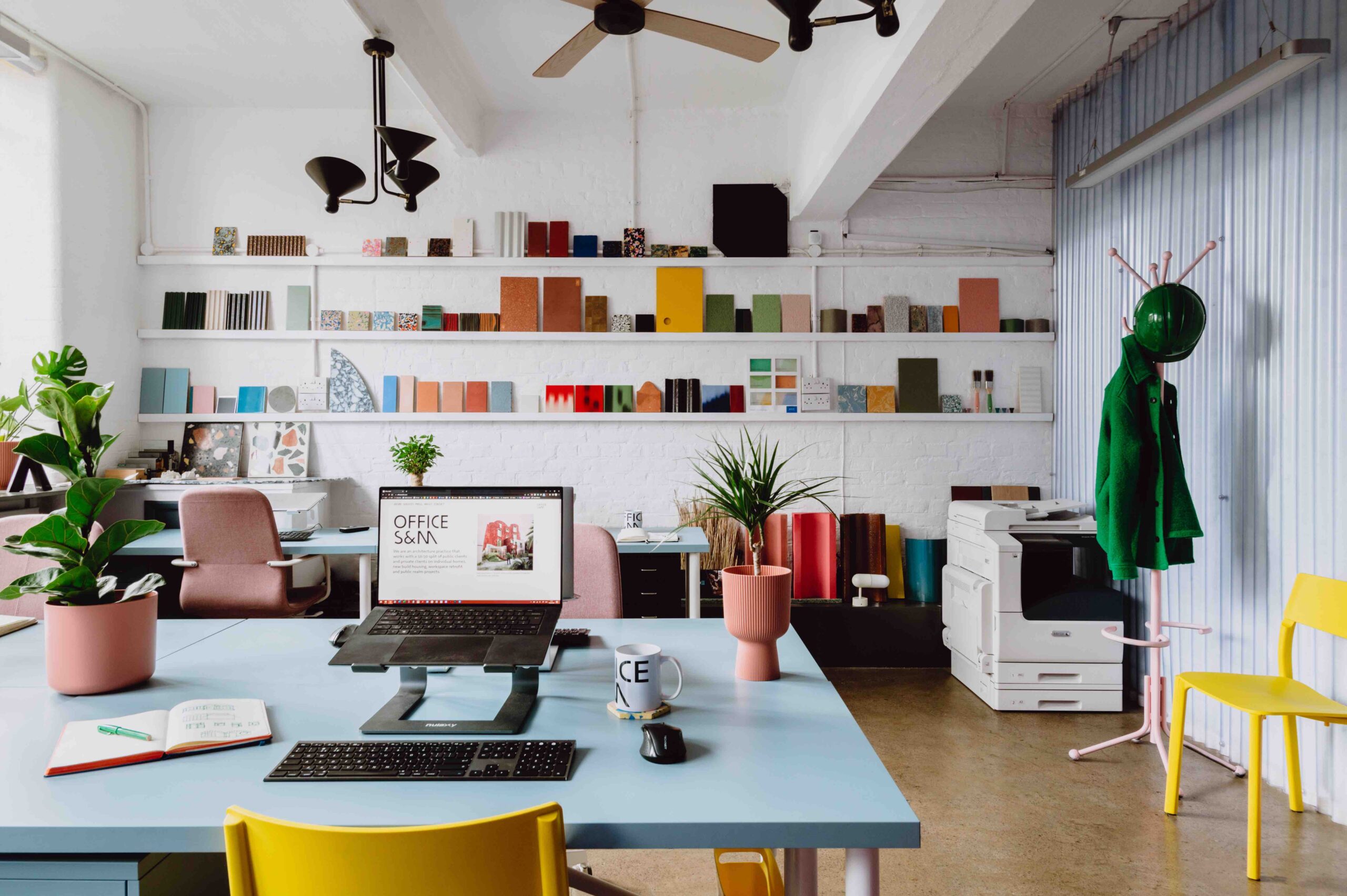
This motto is further evident in the way the fabric of the existing building has been celebrated, from the exposed concrete beams that lend an industrial heft to the interior, to the wall of windows that allows natural light to fill the studio.
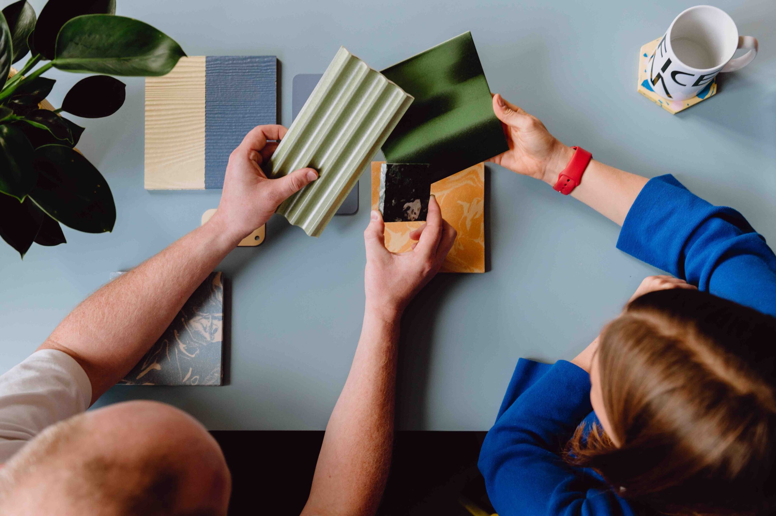
An ever-changing, colourful sample wall that runs the full width of the space is further testament to Office S&M’s dedication to material innovation. Filled with swatches of colour and unusual materials – such as a plastic surface crafted from recycled milk bottles and chopping boards that was used to great effect in the studio’s award-winning Mo-tel House – it’s a constant source of inspiration. “It keeps pertinent ideas at the top of our minds, while allowing for individual personalisation within the office,” says McEwen.
True sustainability is, of course, about more than thoughtful materiality – it also encompasses wellbeing. McEwen and Stewart have a firm belief that design is a social act, an ethos that underpins all of the work by Office S&M, whether designing commercial spaces or collaborating with private homeowners. Driven by this ‘human-centric’ approach, the studio’s new workspace celebrates and encourages community.
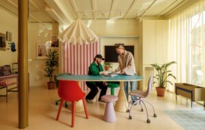
“Wellbeing, for us, is about people-centric design – and the main space is geared around communal activity, with sofas for discussion, breakout sketching areas and places to make and display models,” says McEwen. “This is our response to hybrid working. The team needs a balance of flexibility and studio atmosphere.”
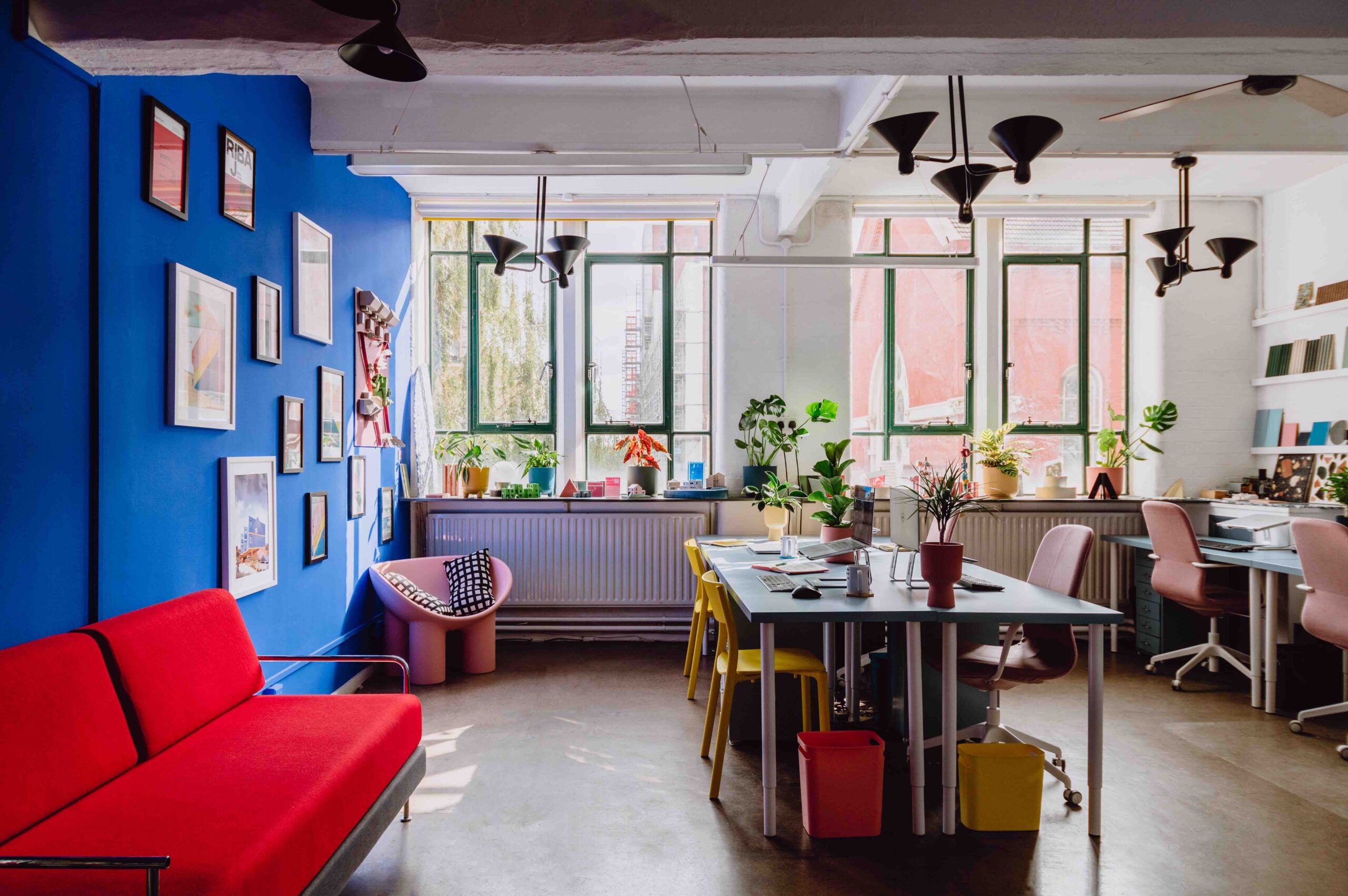
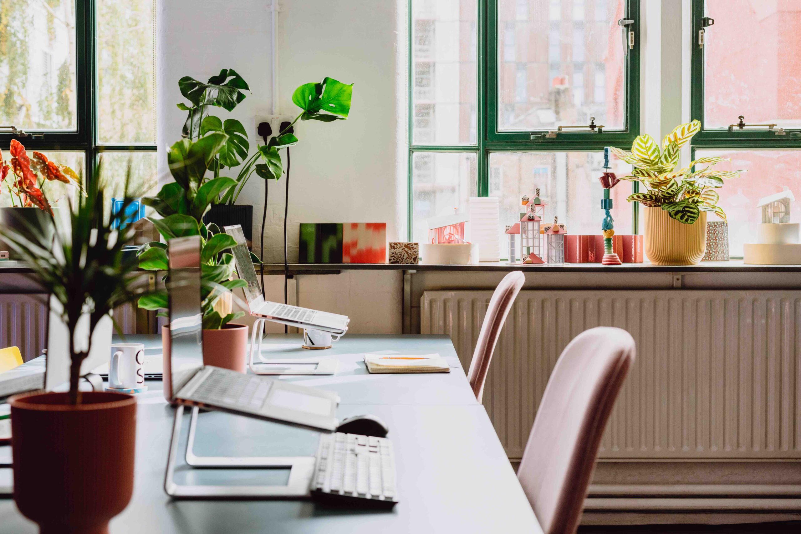
The result is a calming space filled with greenery – there are more plants than people – air purifiers and ergonomic workstations positioned around the south-facing windows for natural ventilation and light. The spacing of the workstations invites easy conversation and collaboration, and the space is lit with a balance of different temperature bulbs for even light.
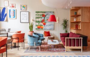
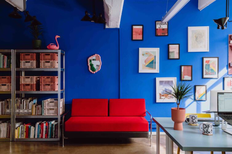
Colour – in the form of an electric blue wall adorned with graphic abstract artwork – is also cleverly used to balance the warmth of the natural light in the south-facing studio. Informed by the studio’s detailed understanding of colour theory, bright yellow furniture and doors complement the blue wall and work to make the space appear wider to the human eye. A red sofa offers another bold visual element, while pastel-hued workstations, task chairs, storage crates and a pink Roly Poly chair by British designer Faye Toogood soften the palette. This kind of intelligent and expressive approach to colour has become something of a hallmark of Office S&M’s work.
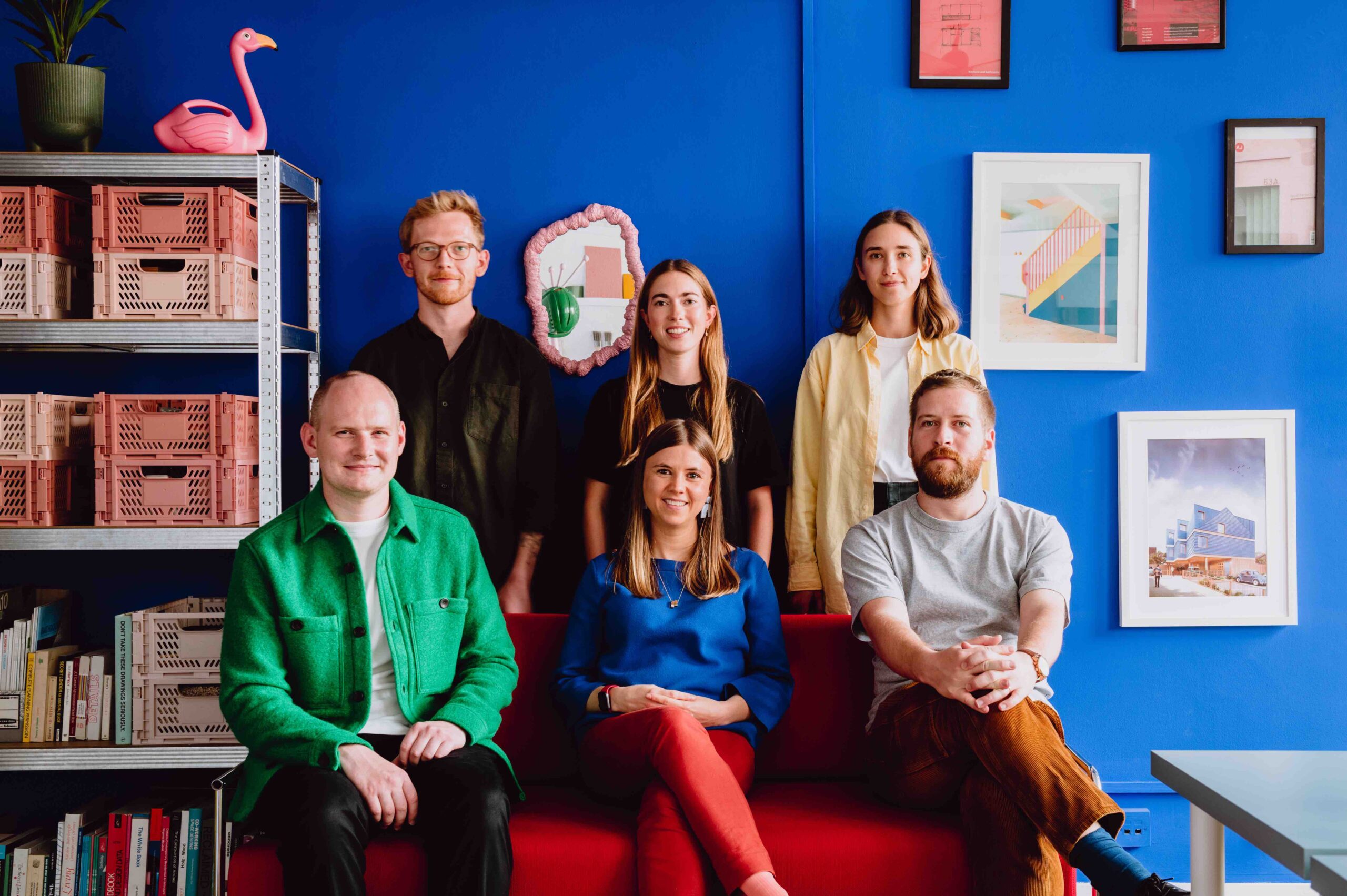
Timing was of the essence with this project, as there was a tight timescale between moving offices and no rent-free period – and the solution lay in carefully orchestrating everything from purchases and deliveries, to contractors and fit out. The budget was similarly optimised, primarily through a balanced approach to specifying that playfully mixes high-end and affordable. IKEA furniture, for example, is juxtaposed with notable pieces from Vitra and Kartell throughout.
“The most rewarding thing about this project is that we get to work here,” says McEwen. “Personally, I enjoy the ‘internal landscape’ we’ve created with the sample wall, blue backdrop and plants. We need to make the office a place that offers social, wellbeing and collaborative benefits compared to working from home.”
Images by Ellen Christina Hancock
As featured in OnOffice 163, Summer 2023. Read a digital version of the issue for free.


