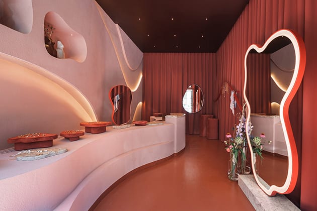
This shop interior captures accessories brand KOPI’s design spirit in form and material.
Irregular, sinuous forms are part of designer Natalia Kopiszka’s design language for her brand KOPI – a jewellery store that has now recently out into handmade home accessories.
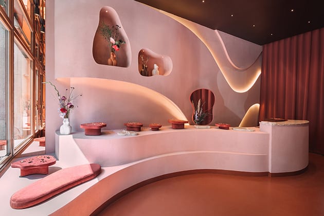
Working with Karol Pasternak and Piotr Maciaszek of design studio Noke Architects, a new interior has been created for the brand’s boutique in Oleandrów Street in Warsaw, exploring this language bolstered by references Kopiszka brought to the table from Morocco and the French Riviera.
The colour palette appears undoubtedly Moroccan – terracotta parquet floors and a muted pink used for the curvaceous feature wall and counter that appears to be made from desert sand and forms a backdrop that highlights the glittering jewellery on display.
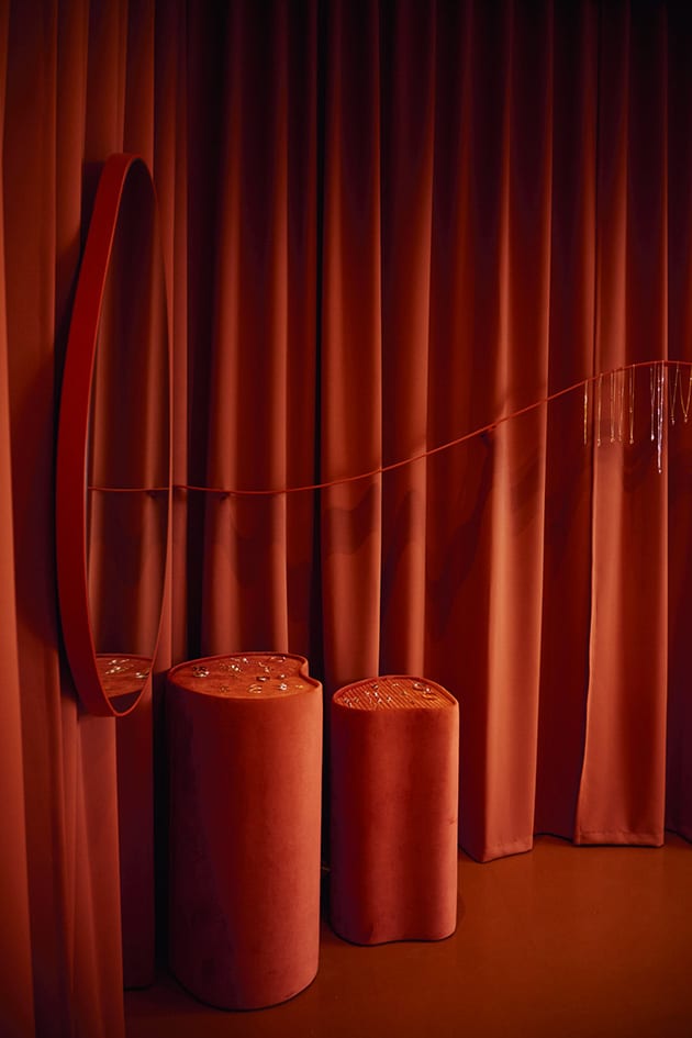
In contrast to these earthy tones and textures, Noke has brought in other materials to add the sense of luxury appropriate for such a high-end brand. Heavy curtains and upholstered seats bring a grand softness to the design, while pink marble offers an equally natural yet hyper luxurious contrast to the rougher stone textures of the boutique.
Lighting too serves to highlight the products and engage with the brand’s aesthetic signature. While spotlights are embedded star-like into a black ceiling, diffused strip lighting has been incorporated into the curves of the main display wall, bringing focus to the meandering lines in spite of its monochromatic nature.
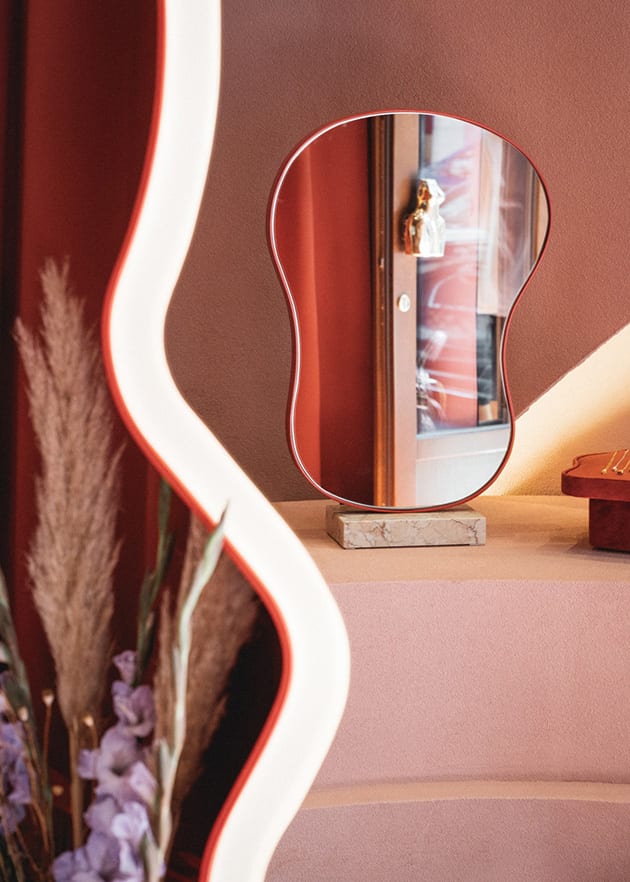
Lighting has also been incorporated into a statement mirrors, offering task lighting for customers without resorting to bright, overhead lights. In combination with the other design elements, the resulting atmosphere invites you into the brand’s own magical world, even if just while you browse their designs for a few moments.
Images by Nate Cook & Piotr Maciaszek


