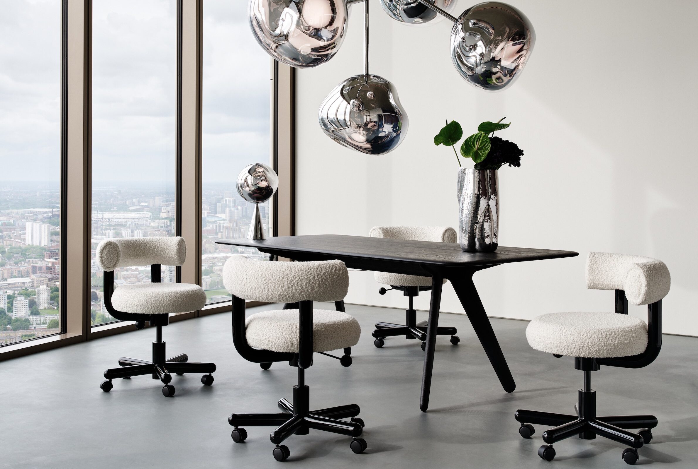
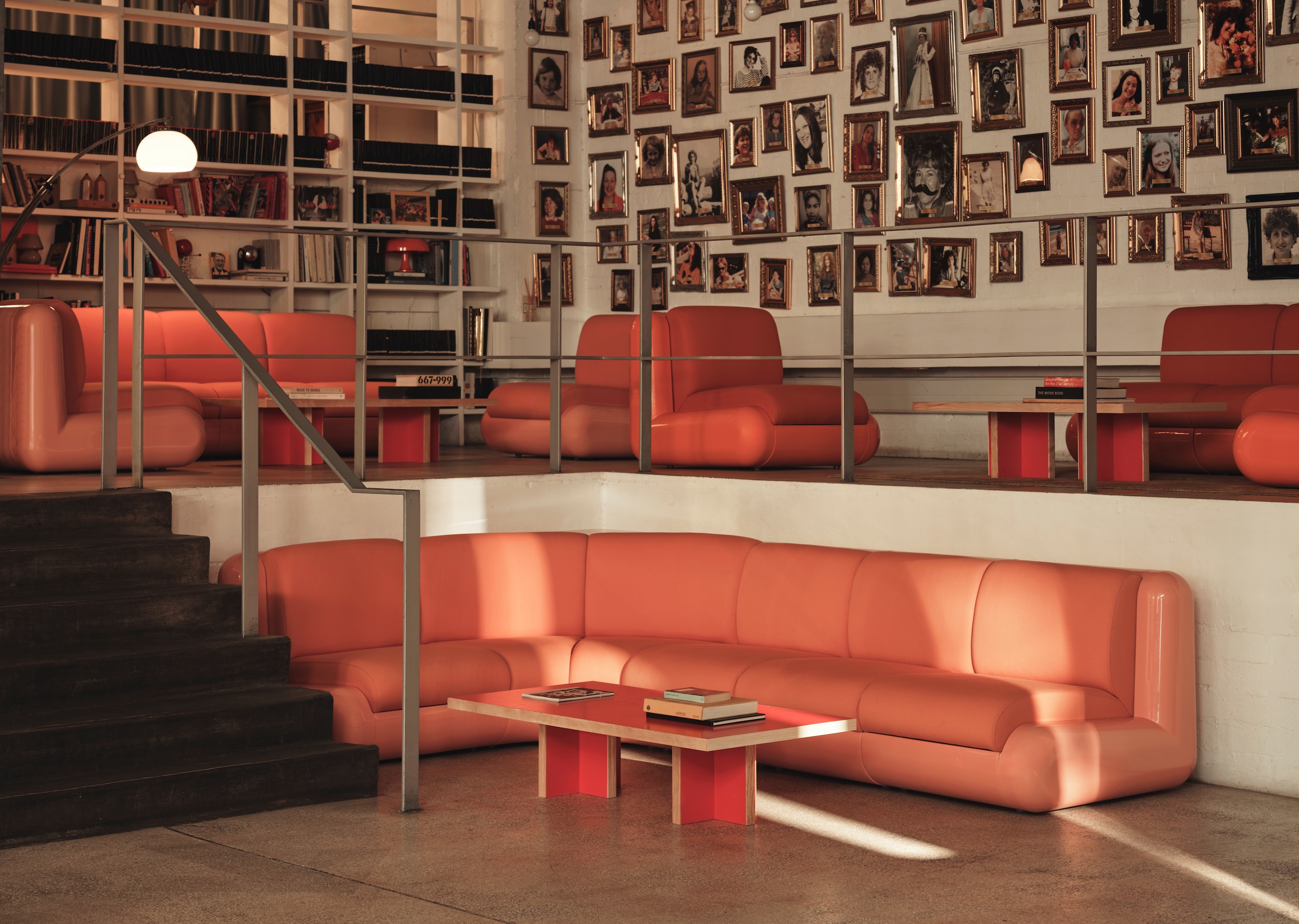
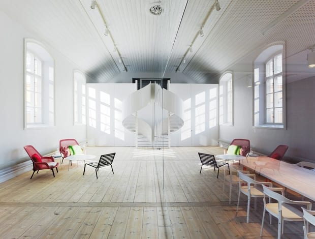
 Split personality: a mirrored wall cuts in half this former military exercise hall|Trick of the eye: the wall of mirrors has glass panels, allowing views through to meeting areas|Elding Oscarson took the protected building back to basics|The main workspace, lined with customised panels to combat the “nightmare” acoustics|Tom Dixon’s Offcut stools give a kick to the dining area||
As a rule, mirrored walls are a no-no. Exceptions apply to aerobics studios, police interrogation rooms and 1970s discotheques, but otherwise this design feature has no place in civilised society. Or so we thought. Every now and then onoffice receives a scheme in its inbox that prompts a collective sigh of admiration (and longing) from the entire team. Elding Oscarson’s space for Stockholm design firm No Picnic is one of those. It’s a brainy beauty – making the most of awkward space, strict planning regulations and a very picky, though open-minded, client. All of this is done through the crafty employ of, you guessed it, a mirrored wall. It wasn’t an easy job, mirror notwithstanding, but architects Jonas Elding and Johan Oscarson didn’t baulk at the challenges that came with the 19th-century buildings No Picnic acquired in central Stockholm. The two volumes – one an old exercise hall for military troops and the other a former stable for police horses – held the highest level of protection for a building in Sweden. “We needed permission for every last screw hole,” says the pair. This made it doubly difficult to work with an existing mezzanine level (added when the building was used as a showroom in the 1980s) that could not be moved. Elding Oscarson clearly had its work cut out, and the eventual solution – an ethereal, mirrored entrance hall – would also require a leap of faith on the part of the client.
No Picnic has a history of trailblazing new territory however. Twenty years ago the internationally known firm set up its office “in an area that was not even up and coming – it was just pretty awful,” says Elding.“It was a very ambitious project, though, and it was probably their breakthrough,” he says. A familiar story followed – when the space became too small for the company, a move to bigger premises in the city centre possibly signalled a new level of success. This was paired with the knowledge that an inventive studio/office space had become a cornerstone of No Picnic’s business. Being a creative company, part of the new brief was that clients should be wowed when they walk through the front door: they needed an immediate sense of No Picnic’s design prowess.
With in-house architects already working for No Picnic, at first Elding and Oscarson wondered why it didn’t opt to design its own space. “I think they didn’t in the end because this is a very large company,” explains Elding. “All of them are very interested in design but with your own office, it’s not like doing a repair for a client. Everybody wants to have a say and the founders are not architects, they are industrial designers. They think it’s interesting to find somebody else to do it, and also to keep it separated from their own business.”
With the job in the bag, Elding Oscarson began to unravel some of the problems of the space. “At first we were very sad,” says Oscarson – the unmovable mezzanine was a huge issue to contend with, since it cut the space in half. “Functionally, it was great, but for the first impression, not so,” he says.
The idea of using a reflective aluminium wall came along quite early, as it turns out. Because the ground floor entrance area is the only part of the office for clients, for secrecy reasons, meeting rooms were needed without going further into the office. This is where the mirrored wall comes in. By dividing the space in half with the reflective material, three meeting rooms have been created on one side, while on the other side, the entrance area gives the extraordinary effect of a space that looks double its actual size. Large windows into two of the meeting rooms sit flush with the aluminium cladding, playing little tricks on the eyes.
The ceiling was one of the most interesting parts of the building that had to be preserved, says Elding. “We took away a lot of trashy installations that were fixed to the ceilings – vent ducts and fixtures,” he says. “We wanted to make the space very clear and naked, in a way. The new elements we put in need to be very sharp and very different from the original parts.” Aside from the wall, other additions include the timber flooring and furniture specially designed by Elding Oscarson. At the end of the room sits a small area to show prototypes as well as a workshop where the prototypes are made.
A gestural spiral staircase at the far end leads to the top of the mezzanine where three project rooms are situated. Each of those rooms has a specific job attached to it, explains Elding, so the design was kept simple. The middle section of the building houses the kitchenette and the dining room, replete with a 6m-long table, also constructed by the architects, and a newly poured concrete floor. A recurring theme for the project is the mixing of simple, cheap solutions such as plywood (used for the mirrored wall and some of the furniture) with more pointed expenditures like the brightly coloured Tom Dixon stools. But the overall feeling throughout the office is one of stripping things back. “It’s pretty basic. The project is a lot about taking away things that shouldn’t be there. The building had several alterations throughout the years, so we needed to clarify its original quality,” says Oscarson. One of the challenges with that, he adds, is that the client really wanted to move in after three months (a target later deemed unrealistic). This meant a lot of the design decisions were happening on-site, which was undoubtedly nerve-wracking. “Everything was happening so fast, we didn’t know what was underneath all the layers,” he adds.
The main workspace now sits in the former stable, with its original cast iron columns. Acoustics were a nightmare here, say Elding and Oscarson, because it was a key goal not to add anything to the ceilings and to keep the concrete floors bare. As an answer to the problem a wall treatment was created to absorb noise – a sort of customised acoustic panel, covered with felt and a scale mesh to make it more “hard looking”, says Elding. The cabinetry running down the middle of the space acts as a sound barrier as well. This area, plus the narrower level above it, means that the building is equipped for up to 60 employees. The construction period was an unnerving process, but the architects give off a deserved air of pride at creating an office that meets the exacting standardswhat they describe as a “very demanding client”. “Sometimes they were not certain about the materials we proposed, but they wanted to give it a go, and we wanted the responsibility for the result,” says Elding. “They are designers themselves so they are very picky, of course. We are happy that they are so happy…because they really are picky.”

