Locke’s exquisite new Berlin East Side Gallery aparthotel, designed by Matthew Grzywinski of Grzywinski+Pons, takes the rough with the smooth
Taking on a design project in an area of historical significance will always come with certain constraints. And when Matthew Grzywinski of Grzywinski+Pons was tasked with envisioning Locke’s third German aparthotel – situated right near the East Side Gallery on the remnants of the Berlin Wall – he knew that paying appropriate homage to the area’s complex past while creating an inviting space was going to be an interesting challenge.
“I think sometimes people conflate reverence with being really conservative, and Berlin is a very free, expressive city,” he says. Grzywinski wanted to try and reflect Berlin’s vibrant and creative side while also paying respect to the building’s surroundings.
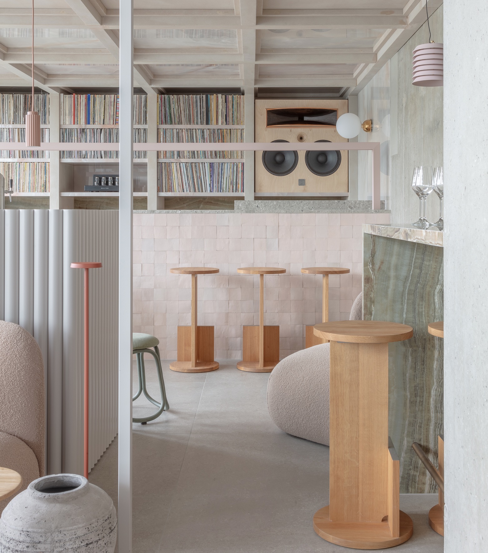
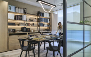
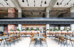
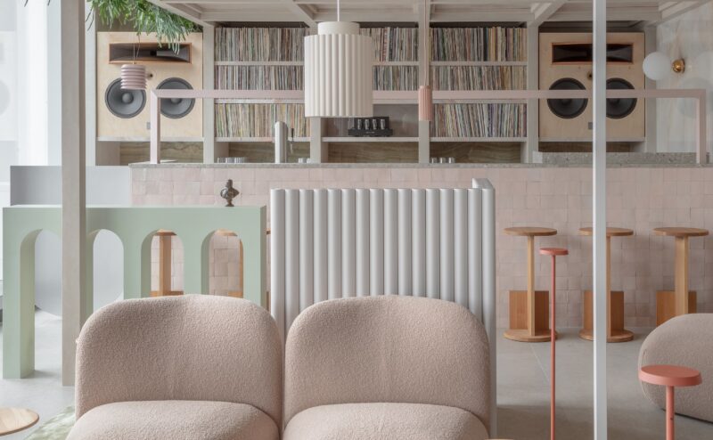
Locke’s main brief was that the finished building should have the same features as its other aparthotels: studio apartments (there are 176 in total) with kitchenettes, bathrooms and living areas; a co-working space; a restaurant, café and audio bar; a meeting and event space and a 24-hour gym.
Apart from that, Grzywinski was free to take the design in whichever direction he felt appropriate. While doing extensive research on the area’s history, the duality of the repressive nature of the Berlin Wall and the free-spirited city that the German capital is known for being today became a rich source of inspiration for the architect. The building itself, which was constructed in 2000 and hadn’t yet been used, became the ideal canvas on which to explore this theme.
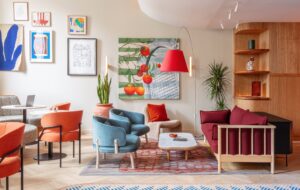
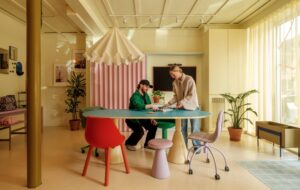
“Some of Berlin looks very rough and kind of foreboding,” says Grzywinski. “But there are moments of real beauty and people leading a really joyful existence.” So, he leaned into this dual nature, stripping the building down to expose its raw concrete and metal frame, then adding layers of rich textured fabrics in sea greens and blush pinks to create a warm contrast to the elemental backdrop.
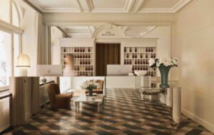
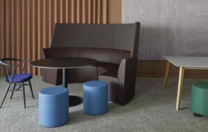
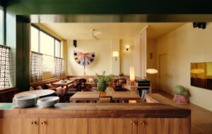
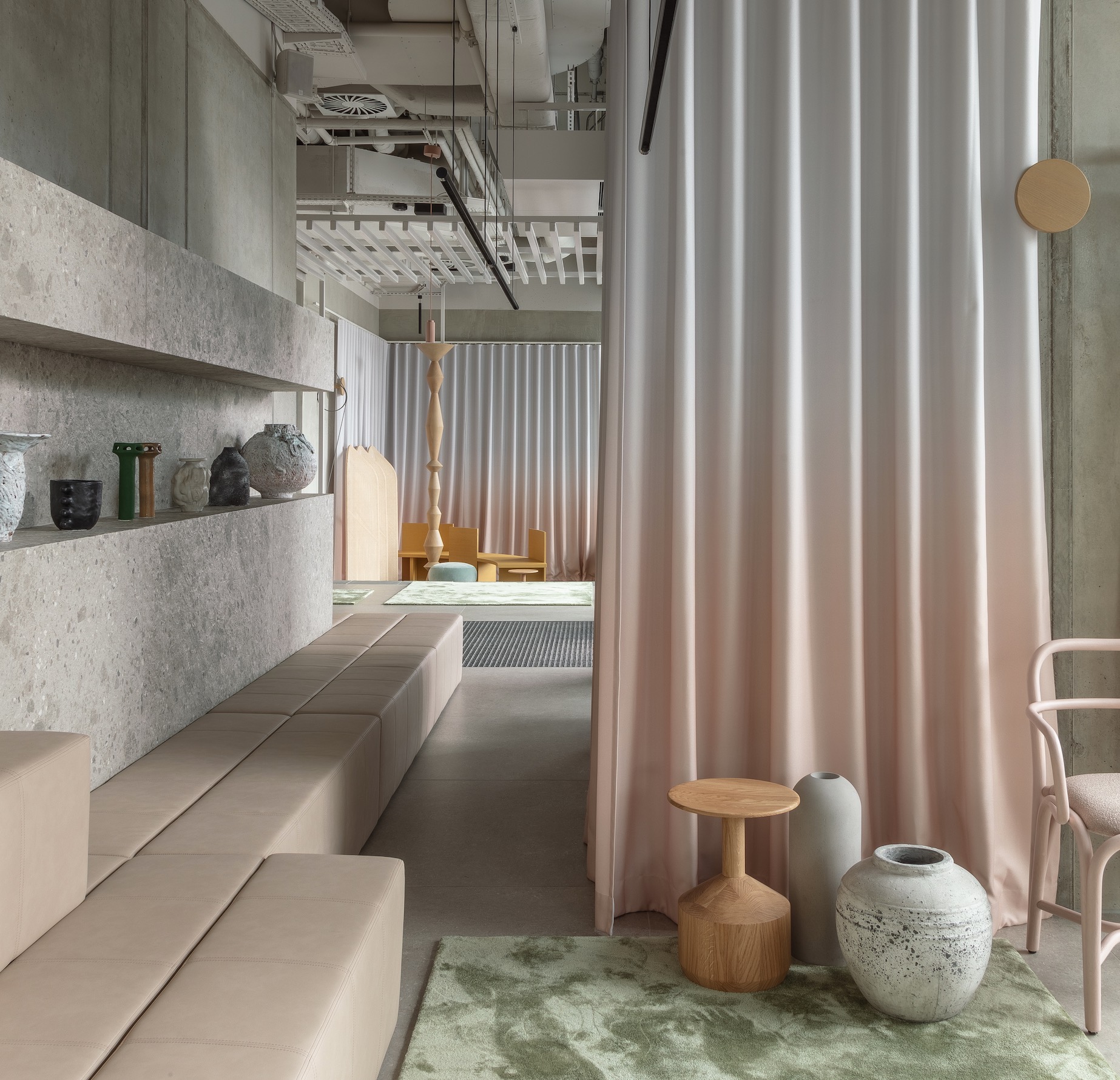
The ground-floor communal spaces are Grzywinski’s favourite examples of this approach. The space was originally separated by block walls, which he took out in order to give a feeling of expansiveness, installing a glass front looking over the nearby River Spree. Porcelain tiles were added to the floor and contrasted with seating areas in rich velvet fabrics as well as plush rugs and wall curtains in a custom grey-to-blush ombre. Intermittent walls separate the lobby, co-working space and restaurant, giving a nod to the remnants of the Wall that can be found dotted around Berlin.
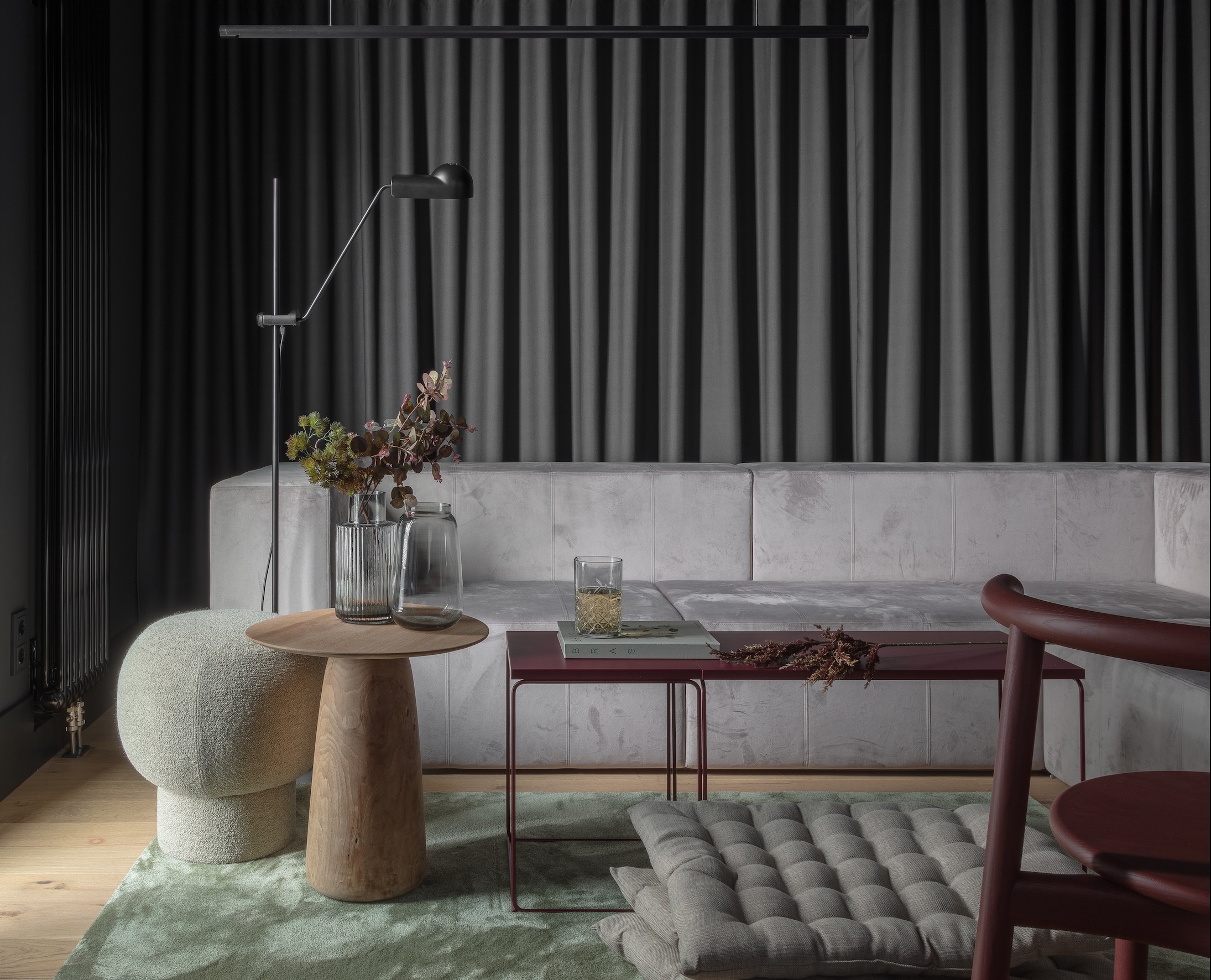
Germany has a plethora of building and safety regulations that often present design challenges. Grzywinski tried to keep his theme of duality in mind whenever accommodating these. For example, the country’s strict fire regulations mean that nothing combustible is allowed in the lobby. “I left the concrete, then added a chainmail curtain in the same ombre pattern,” he says. A black ceiling created further contrast without introducing any combustible elements. “In a weird way, metal on concrete ended up feeling kind of warm.”
The bedrooms themselves also feature exposed concrete ceilings, which contrast with natural, textured materials such as timber, rattan, upholstery and thick braided rugs. Grzywinski envisioned guests looking up at the concrete while feeling ensconced in warmth and softness. “I wanted something that at first glance feels dramatic, but is also very cosy to be in,” he says. “I think I was successful. I’ve had a lot of feedback from people saying they feel very comfortable here.”
Images by Nicholas Worley
Enjoyed this article? Subscribe to our weekly newsletter here

