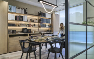
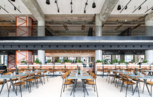
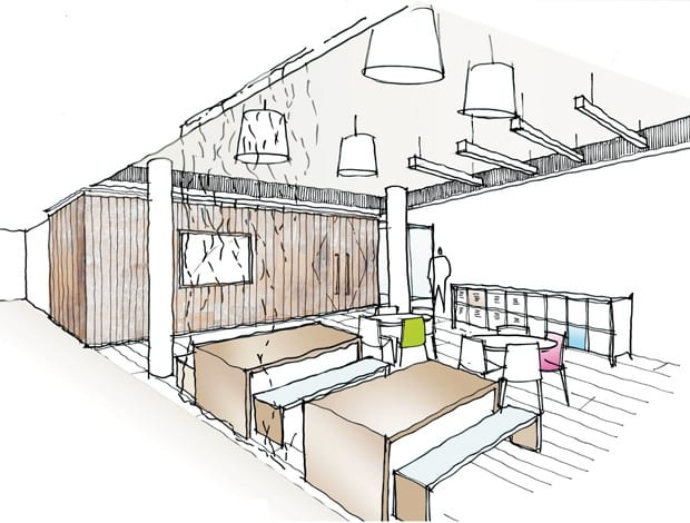
 This sketch illustrates MoreySmith’s concept for enlivening the office space|Bespoke pendant lights illuminate the main boardroom, which includes Magis Butterfly chairs|Exposed mechanicals provide a gritty quality, softened by the oak wall, and office space is shielded by a net-like hanging plastic divider|The floorplan shows the layout of the office with its eclectic desk arrangement|Each member of staff has a locker, eliminating the need for desk pedastals||
Digital media company iProspect calls on interior design consultancy MoreySmith to give its London office a much-needed makeover
Media types are generally pretty allergic to corporate office space. Position the workforce under a Cat A suspended ceiling and they are likely to break out in hives, or at the very least bemoan the stifling of their creativity.
So what to do when the company decides to move everyone to a one-size-fits-all commercial building. This was the conundrum presented by digital communications company iProspect to interior designers MoreySmith. Falling under the Aegis Media umbrella, the company was on the move from its former home in London’s Shaftesbury Avenue to the Qube in Whitfield Street.
The brief was to morph the standard office space into something a little more palatable to the 60-odd staff. MoreySmith had already swishified Vizeum (a sister company situated on the floor below) and iProspect wanted a similar treatment.
MoreySmith’s project leader Jenny Hamilton recalls them saying, “We want to have that vibe. We love it, but we want it to feel different on this floor.”
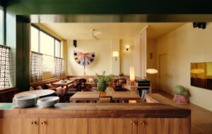
Practicalities dictated some elements – carpets, desks and chairs had to remain the same – so Hamilton turned to communal spaces outside of the main work areas to create the identity. Located on the third floor, visitors have to negotiate their way past the ground-floor reception, which also means iProspect can’t have its own reception area. Instead, staff enter the office through a cafe-type space decked out with a mixture of benches, long tables and smaller round ones. A large, knotty oak-clad wall forms a warm backdrop and conceals a brace of private meeting rooms, while the offices are arranged on opposing sides of the communal area.
“To imbue what is a run-of-the-mill corporate space with an edginess, the ceiling was ripped back to reveal the mechanicals and ductwork underneath”
To imbue what is a run-of-the-mill corporate space with an edginess, Hamilton ripped back the Cat A ceiling to reveal the mechanicals and ductwork underneath.
The floor also received attention, with the carpet running through the rest of the office usurped by a white porcelain tile.
“This is where they spent their money,” says Hamilton. “By opening up the ceiling you get a little bit of rawness back.” Bespoke oak veneer tables are fully powered so staff can work in groups away from their desks.
None of the desks feature pedestals, which have been replaced by lockers to avoid people becoming too territorial over workspace. MoreySmith shunned furniture design classics in favour of cheery Magis Butterfly chairs. “We wanted to keep the architectural base neutral. If they get fed up with the chairs they can change them and have a whole new look.”
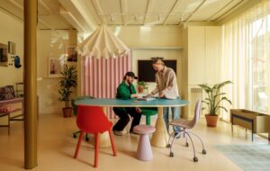
To screen the smaller workspace, the practice put together a veil of individual plastic elements that clip together. It’s both a reference to the digital nature of the company Vizeum’s fit-out and a low-cost alternative to acrylic screens.
“Most clients are now very conscious of budget and, while no one wants to scrimp, they still want offices they like. We have to work harder to make things look good. It did mean a man sitting cross-legged for about a day-and-a-half clipping them together,” says Hamilton.
The net-like fixture is personalised by a number of cuddly toys “caught” in the webbing.
The larger of the two meeting rooms has a large plasma-screen television for presentations and the like, plus a pendant light – a motif repeated in the smaller neighbouring meeting space.
This baby-brother meeting room has a glass wall decorated with pixelated images and another plasma screen, this time perched atop a credenza. Rather than just plonking down row upon row of desks, which can lead to staff popping up like meerkats above their computer monitors, MoreySmith embarked on an exhaustive trial-and-error process to determine the best layout. Rectangular and round desks are arranged in eclectic but rhythmical fashion, with managing director Ben Wood in the corner on an oval pod overlooking the majority of the workforce.
“We tried to avoid that identikit feeling. Some people like to be tucked into corners and some people liked to be on the end. We wanted to give that flexibility,” says Hamilton. Concealing a tea point and copy rooms is a pretty dramatic pink wall, snuck in by Hamilton. “Everyone was a bit surprised, but I think it needs it,” she says. “Even people at MoreySmith asked if I knew it was going to be that pink? It was a bit scary.” To dilute its potency the practice added a wire-cut stencil.
The project’s trickiest aspect, according to Hamilton, was enabling iProspect to seize its own identity. The company had undergone a recent rebrand and needed its personal stamp on the new space. The aesthetic parallels with Vizeum are apparent in the screen and the wall stencils, but the layout, tailored to iProspect’s staff, considers their day-to-day needs.
“No one wants to feel they are being morphed into something else,” says Hamilton. It was really about listening to what people want.”

