 |||
|||
Monotype is a global leader in type and has designed many of the most widely used fonts, including Times New Roman, Gill Sans and Arial. Its new 330sq m space in Shoreditch, east London, establishes the company in this hub of tech and creativity. Ben Adams Architects designed the space in collaboration with visual branding expert SEA Design and they have created an office that tells the company’s story through its architecture and design.
“Although this is one office in London, it might have projects involving people from all over the world – so it had to have a dual role,” Ben Adams explains as he shows me the space. Monotype has arms in the United States, Europe and Asia and the new office was designed for its growing London team and to welcome ongoing international collaboration.
Twelve members of staff initially moved into the office in October, but the flexible space can house a team of 35 to 40 people. A wall of bespoke plywood joinery divides the office into distinct zones for collaboration and focused solo work; glass-walled meeting rooms and phone booths cater for different work styles.
 Warm plywood and a large M logo welcome visitors to the office
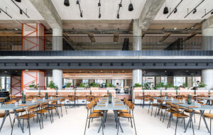
It’s a small space but feels like the opposite: it’s beautifully light and open, thanks to a combination of extensive sightlines and plentiful natural light. “We wanted to maintain a sense of depth,” says Adams, “so standing [in the centre of the space] we can see all the way through the office. We can see the external windows and the views out of Shoreditch, and through into the other areas.” Sightlines ensure that staff aren’t lost in the C-shape of the building, hidden round corners, and the complexity of the layout prevents the office from feeling stark when only the permanent staff are present.
The office is “unusually blessed with natural light” and with windows on all sides. The sunlight changes the character of the interior throughout the day and flows through its glass walls to animate the space with light and shade. This is further emphasised by a neutral material palette, calm colours and pale timber furniture.
The decorative detail within the office design is the pièce de résistance. Ben Adams Architects and SEA have crafted a celebration of type within the space – an interior full of visual treats and references to the typographic world for those with an attention to detail.
 Natural light and long sightlines create a feeling of openness
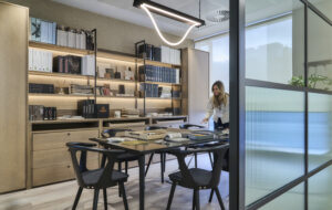
The first thing visitors might notice are the display cases, which provide a glimpse into Monotype’s impressive catalogue of fonts and historic artefacts. “The archive is never-ending and I’m sure the displays will change very frequently. It gives you lots of visual collateral; it decorates the space and makes it feel part-office but also part-gallery,” Adams reflects. “And if you’ve got that back catalogue, then why not show it off?”
Designing the office was also about attracting the best designers into “a space that was an appealing, attractive piece of design in its own right”. Adams’s firm is known for its extensive research and informed approach and it revelled in Monotype’s history and employees’ expertise: “Attention to detail characterises what the staff do and there’s a level of precision that you have to respect,” he tells me. “We felt that we had to allow that to inform the architecture and get that into the design.”
The walls, floors and ceiling of the plywood partitioning tunnel have been laser-etched with 1,500 impressions of Monotype’s M monogram in 750 typefaces – and the effect is magical. “There’s lots of plywood in this design. The reason for that is that it’s a very honest, simple, fairly cheap material that you can buy anywhere. But if you detail it correctly you can do things that are very, very precise and controlled with it, so it has that relationship with typeface.”
 Monotype’s M logo is laser-etched in 750 fonts on to plywood
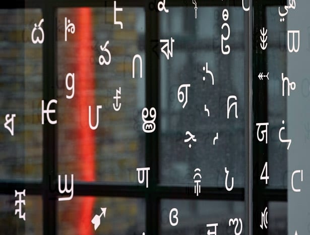
Noto, one of Monotype’s most recent typefaces, has also been honoured, ensuring that the modern successes of the brand are highlighted alongside its formidable history. The all-language font was created in collaboration with Google, to create a cohesive visual language that can be used on computers around the world, and 986 of its glyphs now adorn the glass walls above the building’s atrium.
The glass-walled meeting rooms and phone booths have their own playful details and feature lines of 474 full stops, each in a different font. Even the names of meeting rooms are inspired by type design legends. Elsewhere, storage units were laser-cut directly into the doors, shaped to represent a single bracket glyph; one feature wall includes shelving cut specifically to fit Monotype archive boxes in yet another respectful nod to its heritage.
Monotype’s London branch is now within easy reach of the many design studios, clients, and institutions that it works with, and in a space that showcases what the brand does to the utmost. The atmosphere is open and inspirational and proves that even a small office can mix function, future-proofing and personality.
 Glyphs drawn from Monotype’s Noto font decorate glass walls
“As architects, we were in quite a nice position to do something very different for Monotype… We think about space and they think about the page; it’s a very different world but we’re all creative people,” says Adams.
“It was really exciting because you look at the world differently for a period of time and you look at things through different eyes – which, for a designer, is always an important thing to do.” The architects are already talking about the next Monotype design, on a much bigger scale, for a software team in New Delhi.
Ben Adams Architects and SEA Design put their own stamp on a precisely detailed Shoreditch office that celebrates the work of international font giant Monotype

