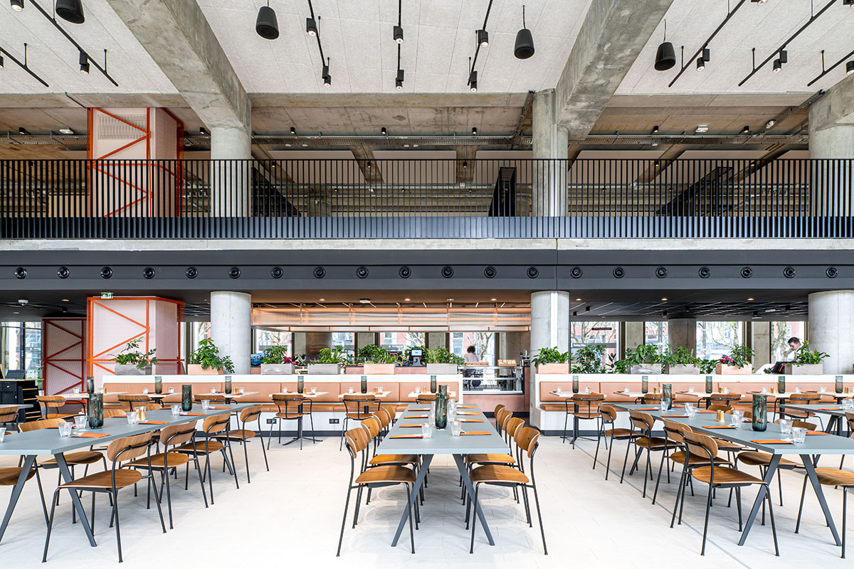
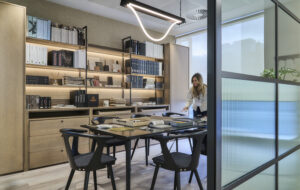
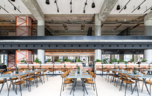
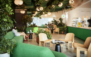
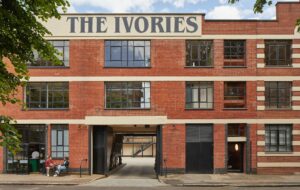
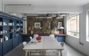
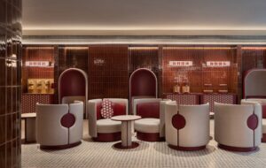
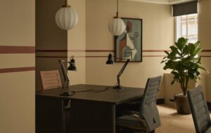
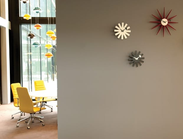
 Vintage wall clocks from Vitra are set to the local times of Microsoft offices around the world. While Vernor Panton lamps give character to ground floor meeting space|Glazed meeting pods in the central garden atrium with Lotus chairs from Cappelini|A staircase gives connection between floors. An informal area with Noughtone Pinch stools and sofa|Employees set up laptops at one of the work tables|Twiggy floorlight by Foscarini, Alcove Sofa by Vitra and Noughtone Reg chairs give a domestic feel to the reception|Employees can work and eat in the cantina|Staff lockers marked with chalk|Kvadrat felt wall panels help with acoustics on open floors|A bright cafe offers a place for visitors and employees to mingle over coffee||
Microsoft embarks on a radical no designated desk, no set working hours experiment in its new Dutch HQ
For some, the deep-rooted power of a corporation like Microsoft prompts feelings of intense irritation and mistrust. It’s the curse of providing a product that people need and that is by most standards more efficient than anything else on the market. Customers (not to mention competitors) feel disheartened by a lack of real choice and presume that they are victims of a mounting monopoly. In fact, it’s kind of like shopping at Tesco. You don’t particularly want to, but it is by far the easiest option. And that is where Microsoft’s reputation was when it decided to make a change at its Dutch headquarters.
Since heaps of design innovation can be traced back to the Netherlands, it makes sense that Microsoft’s Amsterdam office is the one to trial the new way of working – a radical experiment to show the world that the multinational beast was human, accessible and best of all, a living example of how its products can change the workplace.
In essence, we’re talking about a six storey corporate building, 950 employees and no desks. Logistically speaking, it is a recipe for disaster. But Microsoft was intent on a new way of doing things. The latest terminology is ‘non-territorial work’ or ‘activity-based working’. This project goes beyond established ideas of hot-desking because the underpinning philosophy is that employees need not show up at the office at all. Microsoft uses its digital technology so fluently that a person can do their job from home, outside of the office, or in any nook or cranny inbetween. This build project needed to provide real incentive for human interaction and collaboration. It needed to draw people to it.
We’ve heard these buzz words before – and we’ve certainly heard companies talk about flexibility and a collaborative culture replacing being glued to a desk for a specific period of time – but we don’t usually see it implemented so drastically, in a company of this scale, or with such militaristic precision.
Designer Sevil Peach was on board from the start, directing base build architects Cepezed on changes that would suit the clients’ need for transparency. Rearranging voids and introducing a central staircase made horizontal and vertical connections between the floors. A central courtyard with glazed meeting pods is visible throughout the first floor, the social heart of the building. This communal floor, with its many work and leisure spaces, introduces visitors (there are 500 – 1000 each week) to the way the company operates. Coffee bar, cantina, work carousels, relaxation zones, sleeping pods, meeting rooms, boardrooms, auditoriums and work benches are all available for employees to use.
The goal was to encourage movement and a feeling of freedom, says Peach. There is no clock-watching and people are measured by the quality of their output rather than simply showing up and sitting at their desks. If a space isn’t used for an hour, it needs to be cleared for someone else. Managers are encouraged to establish a ‘physical minimum’ with their teams – so one team may decide to work together at a particular table on Mondays, while another team might have a day-long meeting once a month in the cafe. It’s revolutionary in the sense that it demands people let go of their traditional ideas of work.
“We approached this whole change, and the building, as a journey,” says Gonnie Been, spokesperson for Microsoft and who was on the steering committee during the design process. “We take steps and then look to see if they are working.” Aside from a reputation overhaul, one of the core ideas was also to implement sustainable growth, she adds. “The move into this building was one of the biggest interventions in order to get the change going. You take people out of their normal comfort zone and put them into a new environment, and chaos is the best way to change patterns.”
“The underpinning philosophy is that employees need not show up to the office at all. The building needs to incentivise them to collaborate”
Chaos indeed – with 950 people milling around and no designated workspace (including the most senior management) – it could seriously backfire. For one, it presents specific human resources and management issues. But, Sevil points out, it’s an evolution. “You can’t just sit back and be comfortable when you’re working on such an experimental environment,” she says. It has shown positive results from anonymous surveys, which is a good thing since the flexibility is essential to sustainable growth in a company of this magnitude. It means less bulk, less furniture, less paper, less stuff. (99% of all Microsoft work processes are paperless and lockers are available if anything needs to be stored.)
Clever ways of dividing space visually, using textured panels to control acoustics and carving out a variety of mini-environments suitable to different kinds of work is what the scheme is based on. Each office floor has a designated colour to help with navigation and a series of informal meeting areas, tables and chairs, concentration rooms, booths, soft seating, couches, etc. The idea is that a Microsoft staffer need only ask him or herself what the mood calls for.
“Design isn’t a stylistic intervention,” Peach says. “It is actually an enabling process that makes things happen and brings changes to people, which is exactly what they are trying to do.”
And ultimately, it is the ideal marketing tool. “We’re not showing you the technology as a demo – you see people using it from human perspective. It’s much stronger,” says Gonnie. “That’s what we’re trying to do here – to create a showcase of how we believe the world of work is going to evolve.”

