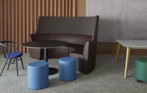
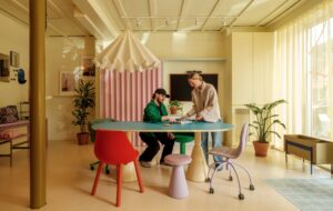
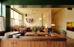
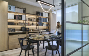
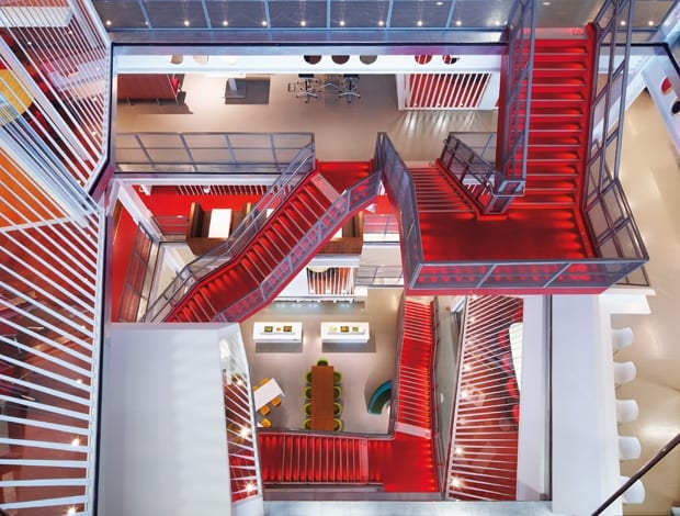
 Scarlet fever: a staircase-happy atrium is the embodiment of connectivity|Meeting rooms overhang the atrium, with a “pinstripe” motif on the glass|Closed doors were once the norm, but meeting spaces now vary in degree of privacy|Warm tones and lots of wood suggest a more friendly approach to banking||
The height of banker bashing might be over – replaced with unease over deep Government cuts and the fiscal insecurity of our European cousins – but financial institutions are still seen as secretive fortresses by a sceptical public. It was the desire to fight this impression and to promote openness and greater community within different business departments that led investment banking and financial services group Macquarie to rethink how it housed its 1,800 staff in the City of London.
The Australian company had grown organically within the capital, with different business divisions spread across numerous sites, hindering the cross-pollination of ideas and stilting a sense of community within the wider business. With this very much front of mind, Macquarie enlisted US practice Clive Wilkinson Architects to work on the 20,200sq m, six-storey space in Ropemaker Place. Architect and client were not strangers, having worked together on Macquarie Group’s Sydney HQ, a benchmark project that brought the the actvity-based workplace to the stale, secluded world of investment banking.
Clive Wilkinson Architects brought in London-based architects Pringle Brandon to execute the design. “What Macquarie urgently needed was to bring the whole community under one roof, and preferably with their own front door,” says Pringle Brandon director Richard Jordan. That really drove the brief and the design. The space is dominated by the atrium, and it’s design directive was all about collaboration and communication – it was the driving force of the whole concept.”
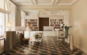
At ground level, Wilkinson designed a “shop front” for the business, with a dedicated reception, drop-in meeting rooms and link into the lift. Wooden panelling, deep plum Tom Dixon Wingback sofas and a cream stone floor keep the atmosphere of the reception professional but contemporary, and the linear ceiling treatment introduces a pinstripe motif that is repeated elsewhere in the building’s architecture and wall graphics.
Emerging from the lift of the sixth floor, employees are greeted with views of the vast atrium which has been hollowed out of the building up to the 11th floor. A vivid scarlet staircase weaves its way irregularly from floor to floor with Escher-like complexity, connecting different corporate divisions according to need.
The dominating underlit staircase has also encouraged staff to travel the length of the building on foot, leading to a 75% reduction in lift use, and, Jordan attests, greater staff wellbeing. Glass-fronted, angular meeting rooms overhang the cavity, an idea also used in Macquarie’s Sydney building. Each overhanging room is faced with pinstriped glass to reveal their inhabitants without leaving them feeling too exposed.
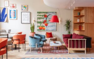
Two different messages about the brand exist side-by-side within Macquarie’s new home. Public-facing spaces – the conference rooms, events spaces and private meeting rooms – have been kept aesthetically formal, with muted colours, dusky carpets and smart but comfortable seating. On the floors mainly occupied by Macquarie employees, spaces surrounding the atrium have been dedicated to informal meeting areas, dotted with asterisk-shaped tables, sunshine-coloured chairs, high-backed sofas and cerise and mustard pinstriped screens.
“While Macquarie wanted the space to be open and collaborative, they are an investment bank and they hold very sensitive meetings, so the ground floor and the 11th floor were very client-led,” says Jordan. “The materials suggest quality and are quite measured in their colour schemes, with warm shades and lots of wood. That defines the client journey from street level through to the conference room and dining room, and that’s juxtaposed against the more open, dynamic, and colourful office space.”
Carpeted meeting rooms include sculptural ceilings, at times featuring pinstripe accenting, and at others, angular polygons studded with spotlights. Rhombic wooden conference tables have been coupled with ribbed leather desk chairs in the client-led spaces, and seating matched to the bright scarlet of the staircase is used in the more informal spaces.
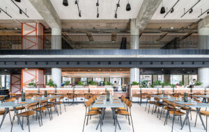
The design of the building showcases the industrial nature of the existing structural steel bays, which, when looking from the atrium, outline each floor with a ribbon of portholes. The design of the cafe and kitchen also follows this aesthetic, with strip lights, white enamelled pendant lights and muted furniture. Jordan says: “That design aesthetic runs through the building. Being honest with building while cutting the hole through forming the new atrium made that possible; it just flows together.” Round tables provide further opportunities for interdepartmental communication, alongside breakfast-bars and informal Chesterfield-style sofas, which are placed in the round to encourage more face-to-face communication.
The two lowest floors – devoted to trading rooms – feature innovative technology to cope with the unique challenges thrown up by this type of environment. Cooled desks, pumped full of circulating cold water, reduce the temperature of the equipment, as do chilled beams with integrated lighting. These systems decrease glare and drafts, and reduce energy costs. Like the kitchen, the look and feel of the trading room capitalises on the industrial rawness of the existing building.
“Trading floors typically have exaggerated ceiling height and we were able to achieve that by taking out ceilings and exposing a lot of the metal work, poles and beams,” explains Jordan. “It gave us the aesthetic look of an engine room – an industrial look – but also it enabled us to lift what would have been a very low ceiling into a much lighter space.”
Hollowing out the guts of the building has led to an altogether brighter space, where the energy of other workers is visible from any part of the building. This has led not only to better circulation between departments but has reinforced the company as an agile, collaborative and forward-thinking business, far from the vault-like seclusion of banks of yesteryear.
“Normally in workplaces, people are tucked away in back offices, stacked floors and corridors, whereas here they are put right up the front in the most visible part of the building so people can be seen,” says Jordan. “It encourages you to use the building and explore other floors in a way that another atrium wouldn’t do.”


