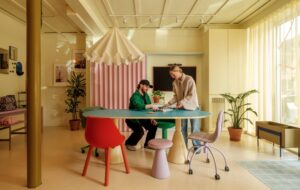
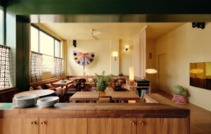
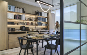
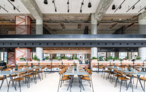
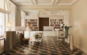
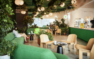
 Shipping container-like spaces are a nod to the business of e-commerce|A shop-like gallery of objects greets visitors in the reception area|Aluminium panels imitate the texture of corrugated containers|Multiple meeting spaces are screened off by timber louvres|Muuto’s Around coffee table is one of a slew of Euro products|Wide maple flooring is one of the building’s best original features|A palette of grey, white and timber lends a Scandinavian feel|||
E-commerce software firm Shopify’s Toronto HQ references its customers’ objectives – trade and shipping – and still leaves room for the fun stuff
Picture this: a well-known technology company acquires space in a 100-year-old warehouse and kits it out with open-plan seating, a games room and lots of plywood. No surprises there. But here’s the twist: its meeting rooms sit inside structures that are not real shipping containers, but are designed to look like them. Welcome to post-post-industrial office design.
The office in question is the new outpost of e-commerce giant Shopify, which in 2013 acquired part of a factory building near the garment district in downtown Toronto.
“Obviously shipping containers are pretty hip, and there was discussion with the client about getting them into the office, which didn’t interest us because it has already been done. So we settled on abstraction,” says Jonathan Sabine, half of the design duo M-S-D-S Studio.
It’s easy to poke fun at the motifs that pop up time and time again in current office design – shipping containers and sheds being two of the least original ideas going. But this particular scheme, costing CA$1.3m, seems to justify it because the design concept is based on the mechanisms of trade – acquisition, fabrication and shipping – that make up Shopify’s business.
Jessica Nakanishi, the other half of M-S-D-S, says that inspiration was found in the company’s employee handbook, which had the history of e-commerce in it. “We thought it was a good starting point for the design,” Nakanishi says.
The pair then took an overall brief on the number of conference rooms required plus the need for a flexible, multi-use space for the events that Shopify puts on at weekends. Other than that, it was an open playing field.
The office, situated on the building’s fourth floor, fits desks for 90 people plus a reception and various areas for staff activity. During the second phase of the project, which is expected to be completed by the year’s end, M-S-D-S is also fitting out the third floor, which will be able to accommodate an additional 80-100 people.
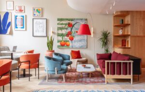
“We really wanted the front of the fourth floor to represent what the company is, so we took it very literally and created a little shop in reception that you can actually go and pick through,” says Nakanishi.
“It’s much more of a gallery than a store,” chimes in Sabine, “they change it up but I think we’d be misrepresenting it if we said it was a retail store. That hasn’t really come to life yet.”
The floorplate is broken up into two main zones; the front half holds desks, conference rooms and lavatories while the back holds a series of spaces for social interaction. Louvred panels of wood and coloured aluminium are used on the exterior of meeting rooms and to section off areas of the office while maintaining a sense of openness.
“The louvres kind of imitate the corrugated face of shipping containers, so we thought there was a nice marriage of texture and theme there,” says Sabine.
The back half of the office holds the kitchen and cafeteria, equipped to accommodate daily staff lunches, a games room, bike storage, more conference rooms and a multi-purpose gallery/events space.
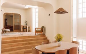
Planks of pale maple retained from the original building run diagonally across the floors. This design detail is echoed in custom-made storage units with slanted shelves as well as the chevron pattern across sections of the ceiling – including in the games room, where, along with rubber floors and soft furnishings, it helps dampen sound.
The building’s tight grid of columns made it difficult to design anything that wasn’t rectilinear, say the pair. Most of the design falls into this formation, except in an open space intended to feel like a shipping yard, where ‘parcels’ (partially enclosed breakout areas) have been dropped willy-nilly off-grid.
One of the disadvantages of working in an old building is that certain issues can’t be anticipated, says Nakanishi. In Shopify’s case it was the building’s dramatically sloping floors, which varied by up to 15cm in places, presumably where heavy machinery had once lived.
It meant that M-S-D-S had to quickly rethink layouts and work around trouble spots, “because if we’d put desks in those areas like we’d planned, employees would’ve just rolled away,” says Sabine.
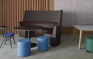
Elsewhere, a medley of European furniture and lighting (Hay, Muuto, Flos, Artemide and Moooi) was specified to suit the clean, utilitarian interior. Since Sabine’s background is in furniture design and fabrication, Shopify also has quite a few custom-made pieces, such as the semi-enclosed meeting pods, which were inspired by pieces the designers saw in the UK but couldn’t justify shipping over.
“Plus we didn’t quite love them; they didn’t work with our design. So we just did our own thing,” says Sabine. The studio also designed pendants over the kitchen and bar counter, cafeteria tables and benches, a conference room table, breakout sitting boxes on castors, bookshelves and a coffee table. Anything that isn’t bolted down gets moved around, and the designers are fine with that: “We wanted people to interact with the building and the architecture too,” says Nakanishi.
A low wall between the games room and the gallery allows people to perch between the two areas, and employees not only skateboard through the office, but have also attached gymnastic rings to the ceiling for a spot of upper body strengthening.
“It’s been pretty successful,” concludes Sabine. “It’s a very open office; it’s very young. The odd guitar jam happens. We knew there would be a degree of flexibility in the space and so we worked that into it.”

