 |||
|||
Canada’s Lift & Co, a cannabis research firm, get a new, colourful office space in a former office of the Church of Scientology
When Canada legalised marijuana in October 2018, it opened up a whole new industry – one of the firms in that space is Lift & Co, a market research company and cannabis education start-up. For its new office space, Lift & Co brought in Toronto-based architects Lebel & Bouliane, specialising in mid-sized commercial and academic projects, and tasked them with creating a flexible workspace with a suitably modern feel.
The space – in a former office of the Church of Scientology – has been designed to house the growing firm and provide for its multi-armed approach. “Beyond the need for housing a growing staff, the primary objective of the design was to support Lift & Co’s brand development and provide them with a multi-functional environment that could serve as an event space, a learning space, a collaborative space, and a place where Lift & Co can continue to build its e-platform,” explains Natasha Lebel, principal at the practice.
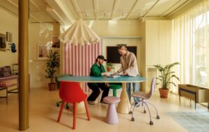
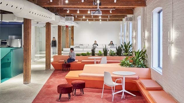
 Different colours are used to demarcate different work types. All images by Doublespace Photography
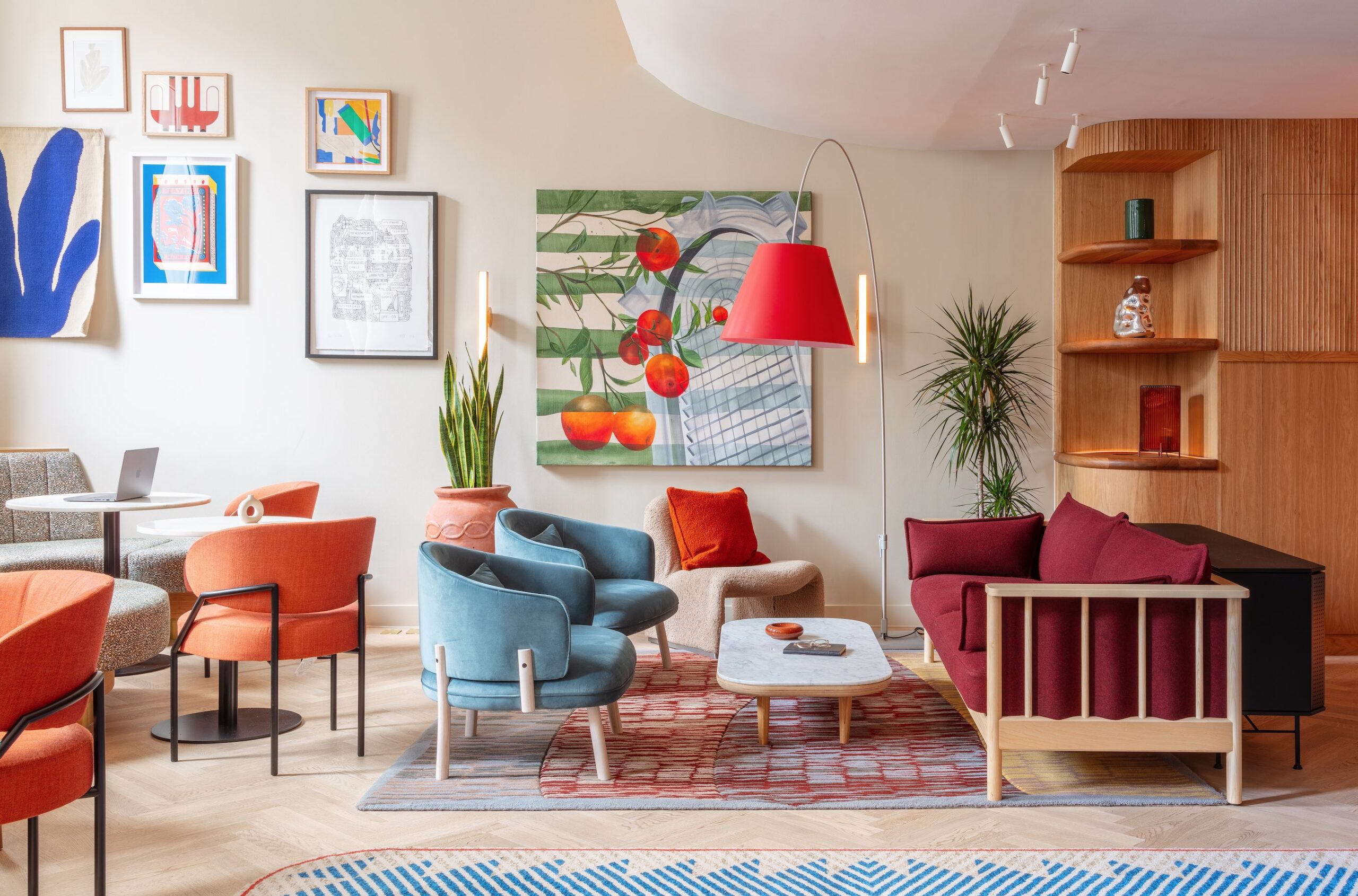
The design, featuring flexible workspaces with a mix of open and private areas, was zoned using the brand’s chosen colours – coral, emerald and navy. “The space is very ‘instagrammable’,” Lebel tells OnOffice.
Inside the former office, the main challenge was the narrowness of the building, which made it difficult to separate with new screens or walls – the designers worked around the constraint by using “undulating millwork that moves in and out to delineate different areas and create visual interest,” Lebel says.
 Multi tonal floors and ceilings help designate workspaces
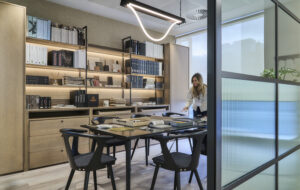
Work zones are differentiated through use of the brand colours, with individual office spaces remaining white, active collaboration zones designated in coral, spaces for circulation emerald, and quieter zones in navy. Stained concrete floors in hot and cool tones in the same colour family demarcate different zones within the space.
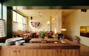
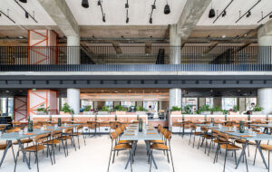
A mix of bleacher seating and custom built banquettes create spaces for collaboration and presentations, and meeting rooms provide privacy with frosted glass. The ongoing enthusiasm in interiors for biophilic design in offices is also present, with built-in planters offering a contrast to the whitewashed, industrial-style walls.
 Couches and banquettes offer collaborative areas
The building itself, while relatively small, has a heavy timber structure and exposed brick walls that offered a blank canvas for Lift & Co’s branding and Lebel & Bouliane’s designs to shine. As for its previous uses? “Most of the interior was removed prior to possession, with the exception of one small room, gridded with lightbulbs in the walls and ceiling. We never found out the purpose of the room, but we took many wild guesses,” Lebel says.

