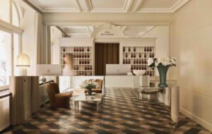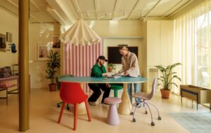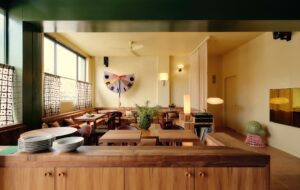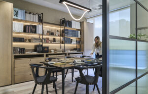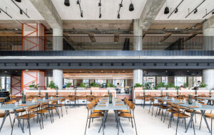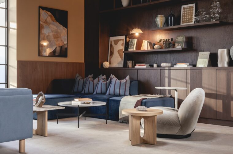
Tasked with turning a five-storey office block in Manchester’s city centre into new workspaces, Jolie approached the interior design with the same sensibilities as it would a residential project. At 60 Fountain Street, materials convey luxury and purpose; sound quality and tactile surfaces create atmosphere. The result is a deceptively simple space that entices staff to spend more time at the office
The team at interior design studio Jolie is well versed in the fine art of creating inviting workspaces. Last year they were hailed as setting a new standard for office luxury in Manchester with their concept for Clarence House, and the recent unveiling of new downtown workspace 60 Fountain Street sees them raise the bar once again. The key to success, according to Jolie’s creative director Sarah Wakefield, is acknowledging that in a post-pandemic world offices have to go above and beyond to draw people away from their homes.
“Our redesign of 60 Fountain Street is a testament to our commitment to creating a workspace that transcends the ordinary,” she says. “Every step through the building was considered, from tenants’ morning workouts to their journey up the stairs or in the lift to the office, to the lounge areas where they can relax and recharge.”
Jolie was founded in Manchester in 2017 by designer Franky Rousell, who has since undertaken a wide range of residential, workplace and hospitality projects in and around the north of England. The studio has become known for its multi-sensory approach that incorporates fragrances and sounds at the heart of each design project to create unique, multi-layered experiences. Today Jolie is based between London and Manchester and has undertaken projects as far afield as Lausanne and Denver.
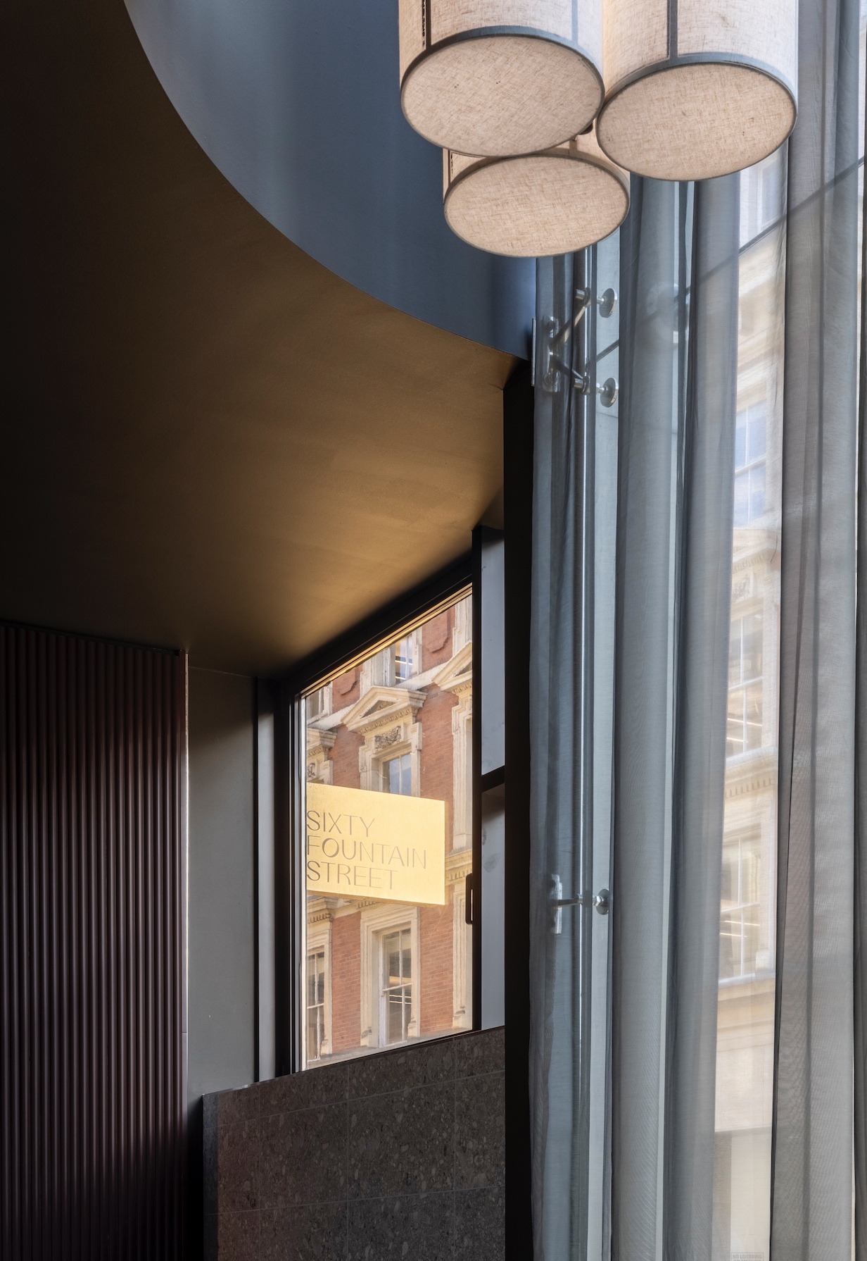
The studio’s latest project is a comprehensive remodelling of the five-storey office block at 60 Fountain Street in Manchester’s city centre. The aim was to transform the building, which was constructed in 1991, into a series of stylish workspaces that could be taken on by small and medium-sized Mancunian enterprises or become satellite offices for larger businesses based outside the city. The result is a slick collection of spaces designed to give the feel of an exclusive members’ club.
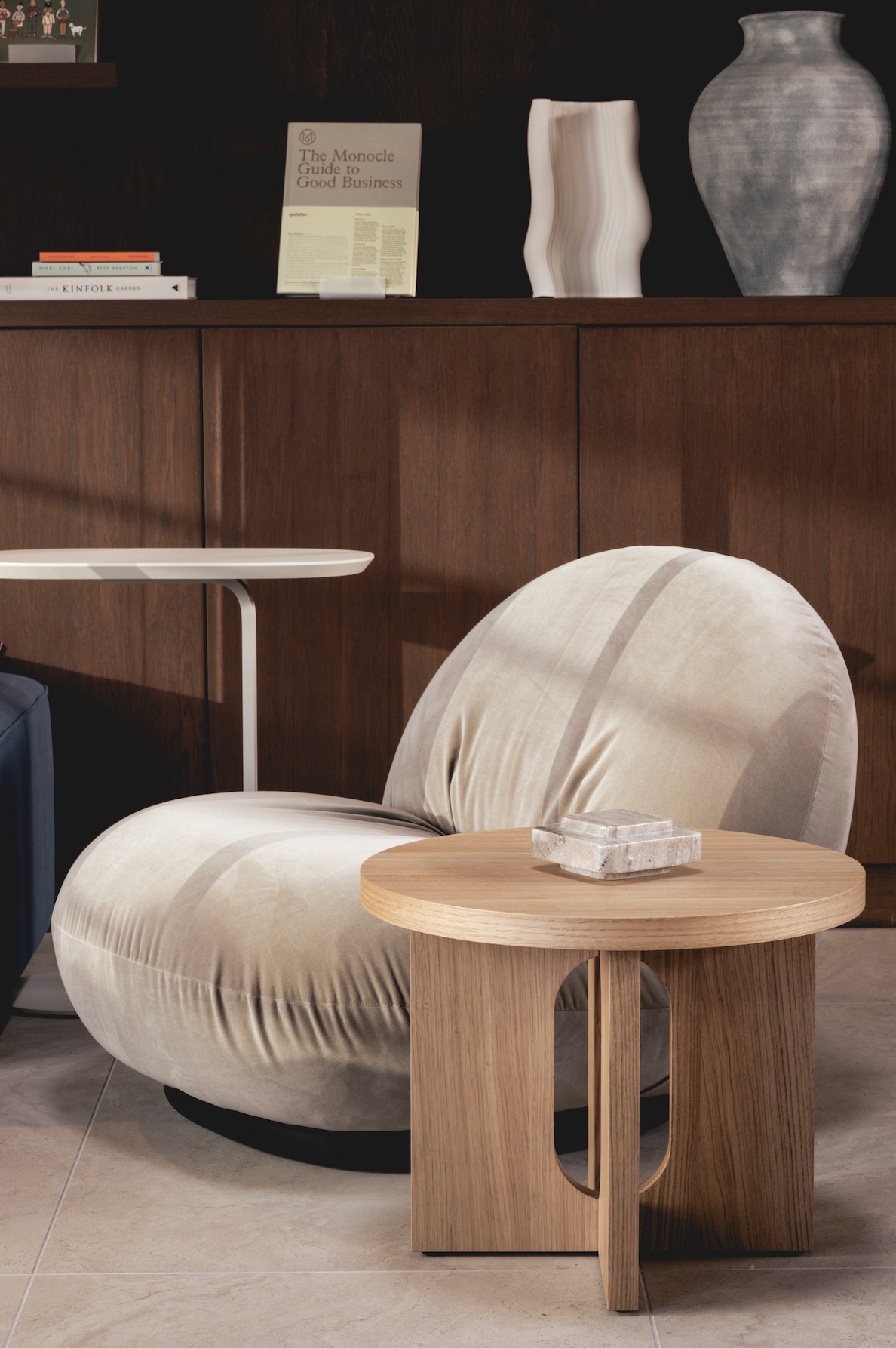
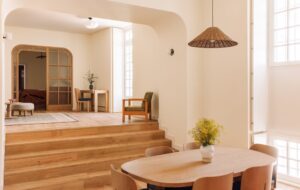
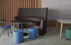
An important part of this was the use of colour theory to shape and invigorate the environment. “We sought to deliver a sense of comfort and clarity through the use of muted yellows, calming blues and deep browns across the material palette,” says Wakefield. It’s a collage of textures, too, with pockets of warm timber combining with cool limestone flooring and plenty of tactile soft furnishings.
This attention to detail even extends to the soundscape of the building, something the team believe is often overlooked in interior design. “We considered how to create transient sounds that are complementary and subtle rather than overpowering or distracting,” says Wakefield. The reception and stairwell areas feature a soundtrack inspired by mellow electronica of British musical duo Maribou State, while the sixth floor Loft Space offers a more ethereal and cinematic soundscape.
The Jolie team put great emphasis on maximising the potential of the existing space when coming up with their design strategy. A key part of this was repurposing a redundant plant room on the top floor to create a glazed loft extension; an area envisioned as a place to relax or host informal meetings. There’s also the potential for outdoor cinema screenings on the terrace over the summer months. “It’s a sunny oasis away from the desk and the bustling city centre,” says Amelia Barratt, Jolie’s business director.
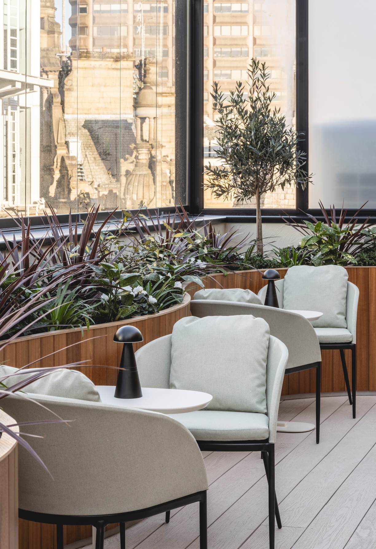
And even when the mercury drops, the space remains a tempting spot to unwind in. “There’s a cosy lounge area where you can enjoy a good book with a coffee in the winter. It really has a home-from-home feeling. There is no other workspace quite like it in Manchester.” And while the end result might appear seamless, the project wasn’t without its practical challenges. The most significant of these was the introduction of a new extractor system running between the basement and roof space.
“The ducting required was sizable, as was the cost, but we knew the new space the building would allow us to create would be truly unique, so we worked out a strategy to incorporate the extractor into the design without it impacting the aesthetic,” adds Barratt. “The end result was definitely worth it.”
Images by Billy Bolton
Enjoyed this article? Subscribe to our weekly newsletter here


