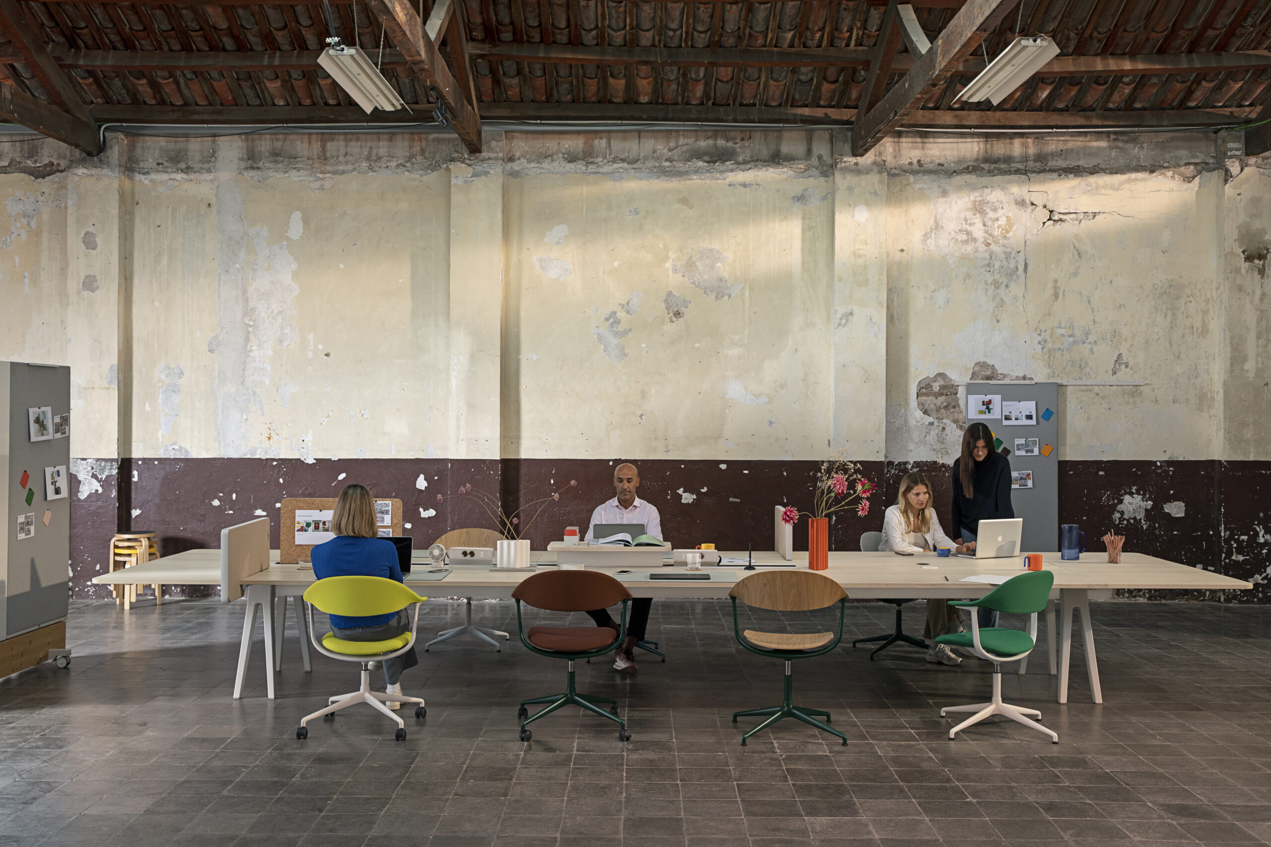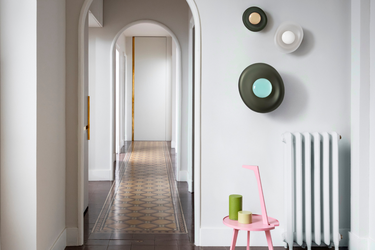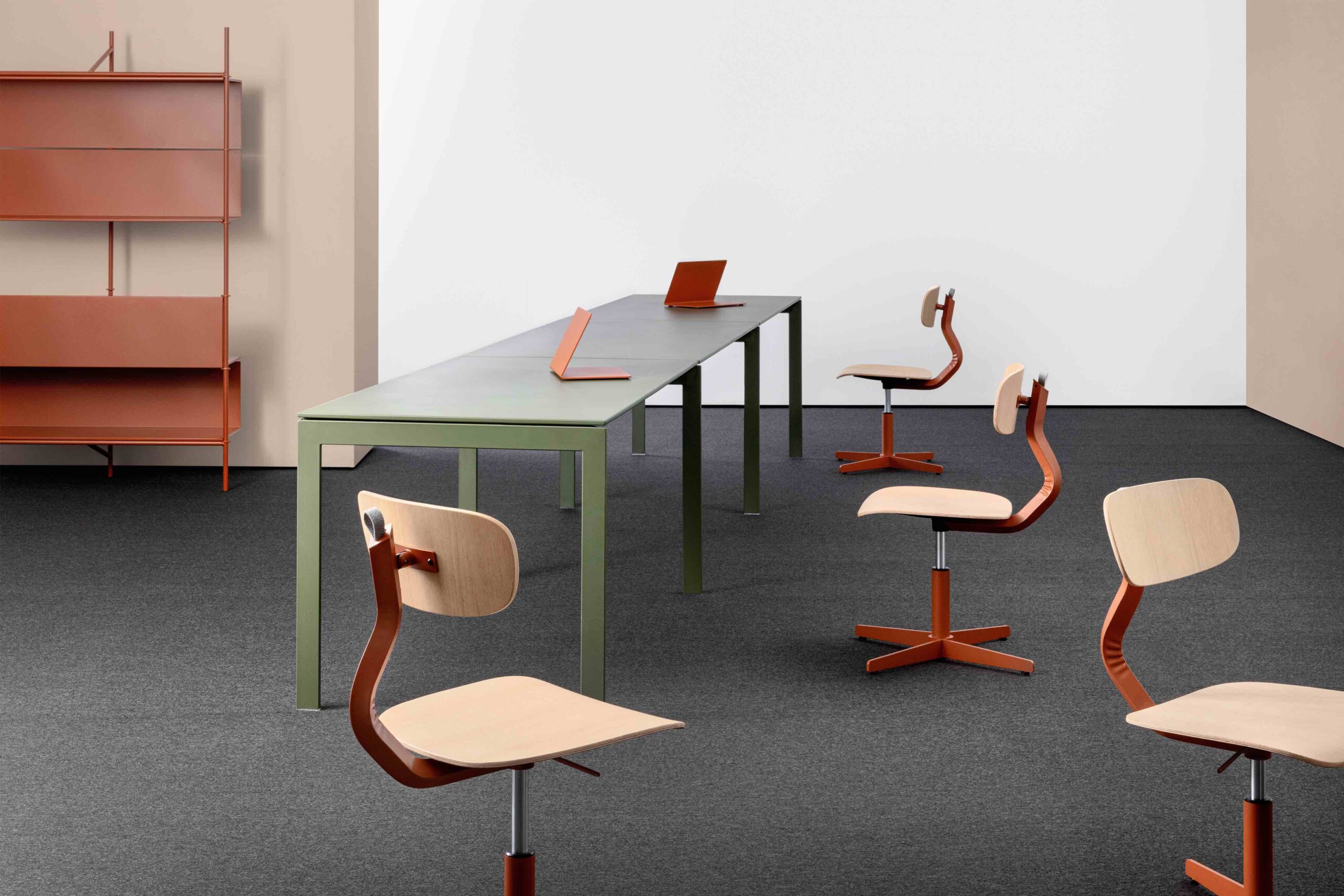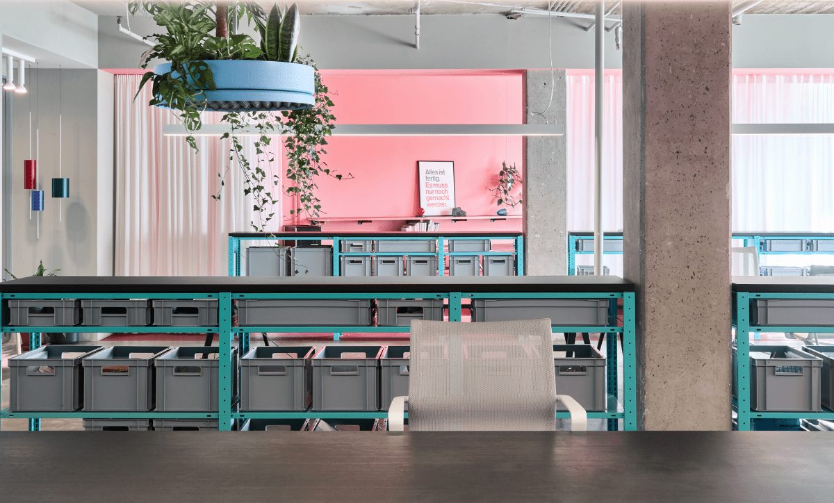
Located in a former 1970s furniture warehouse, design studio Coordination took a fearless approach to colour when designing their Berlin workspace
While Berlin may be renowned for its industrial and Brutalist architecture, in designing its offices in the German capital, architecture, interiors and retail studio Coordination has created joyful, colourful interventions in an otherwise severe, concrete environment.
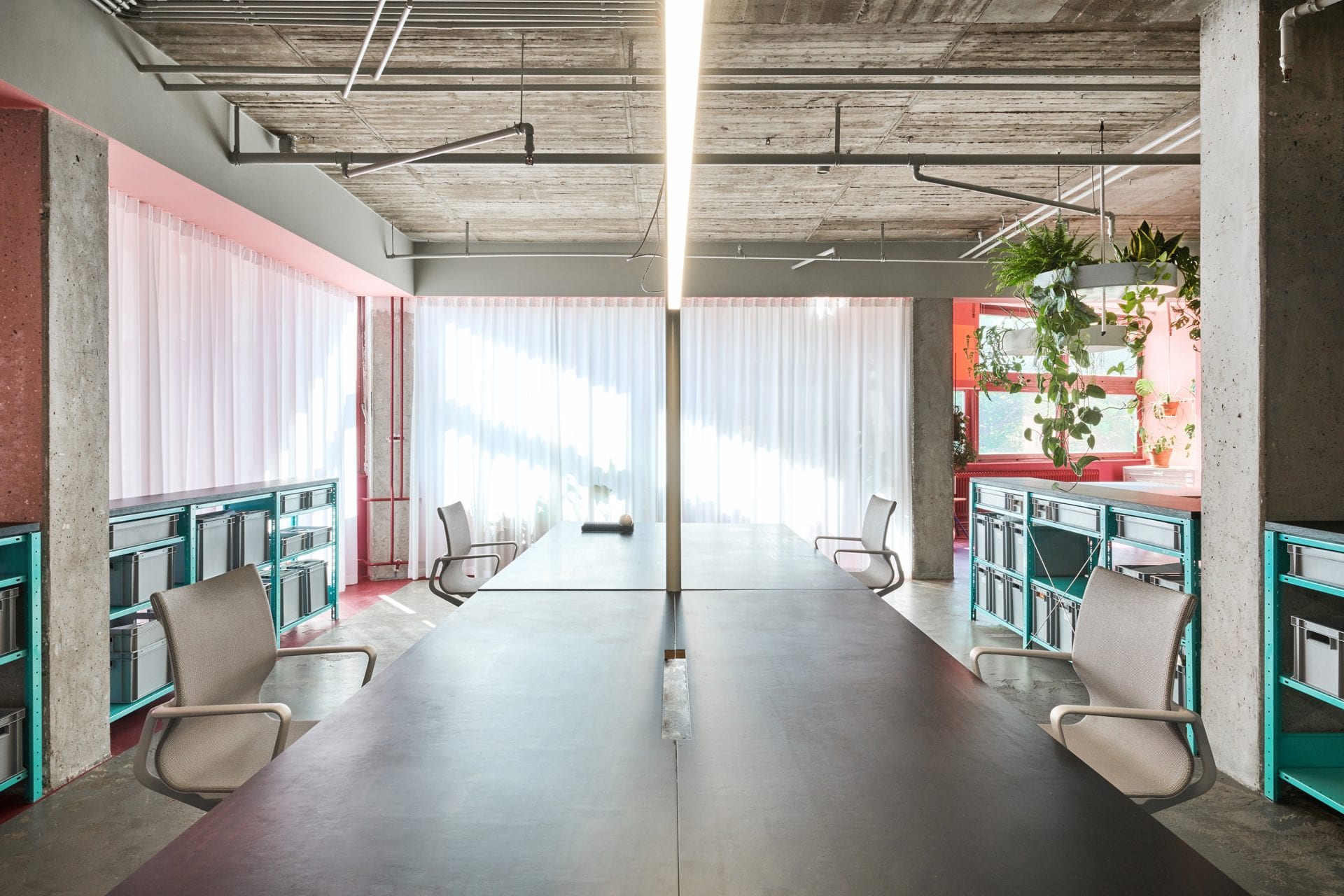
That’s not to say that Coordination hasn’t honoured the history of this building – Pirol Office’s previous use as a furniture warehouse has been exposed and preserved in the renovation process.
Storage bay numberings, pipes and glue marks have been left unveiled in the most part, the exposed overhead sprinkler system contributing to not only the roof height, but the industrial feel of the office.
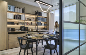
Utilitarian design choices have also been made in the style of the furnishings, from the large linoleum desk and uniform archive boxes to the stylised strip lighting overhead, even if not so much in colour.
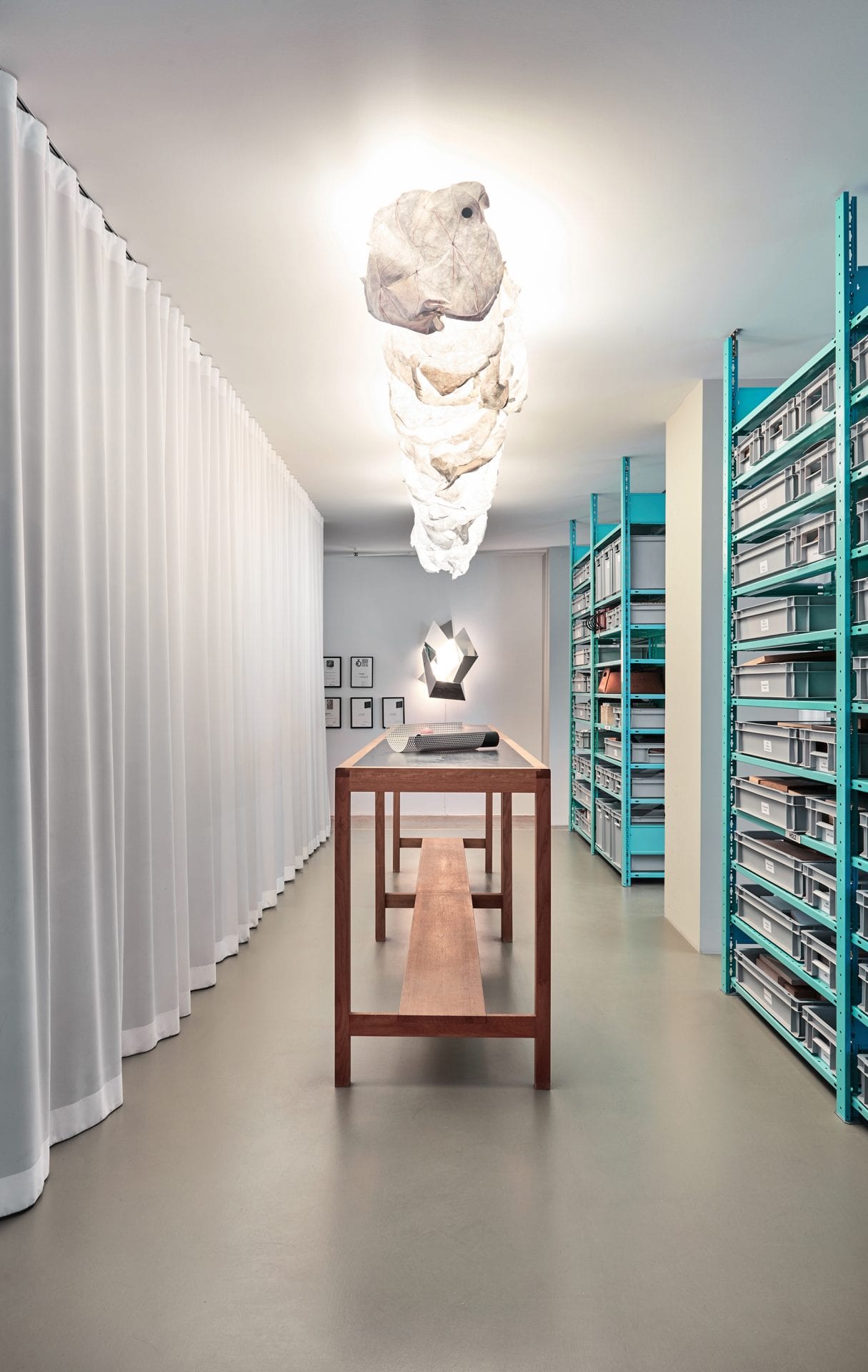
The guiding principle of the design was to form a space that allowed for cohesive teamwork, creating a variety of equal workspaces that functioned for varying purposes – break out areas, material archives and libraries, for example.
Its open-plan nature permits a transparency of information flow, with only separate workspaces for PR, office management and MDs, as well as a conference room, inferring any sort of hierarchy. The space has been designed for up to 16 people to work in.
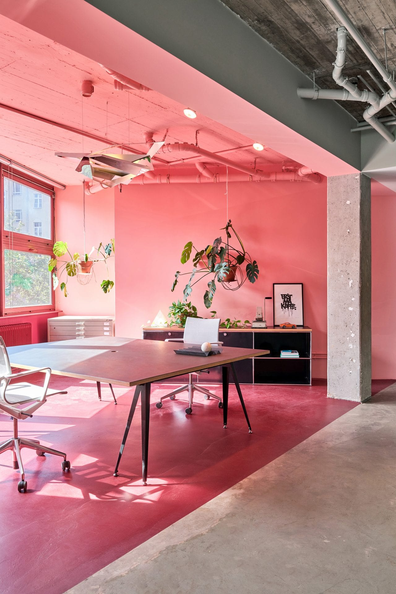
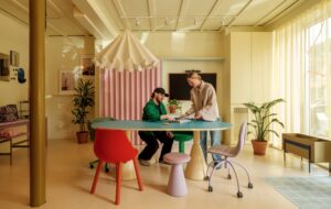
In spite of this openness, vibrant pinks and turquoises have been used to emphasise the natural geometry of the building to demarcate standalone spaces, while retaining the building’s industrial heritage – rosy concrete floors and electric blue racking offering an invigorating update to the traditional urban aesthetic.
Soft textiles also add a welcome contradiction to the office’s exposed industrial features, with light voile curtains on recessed tracks able to segment the office into temporarily individual workspaces.
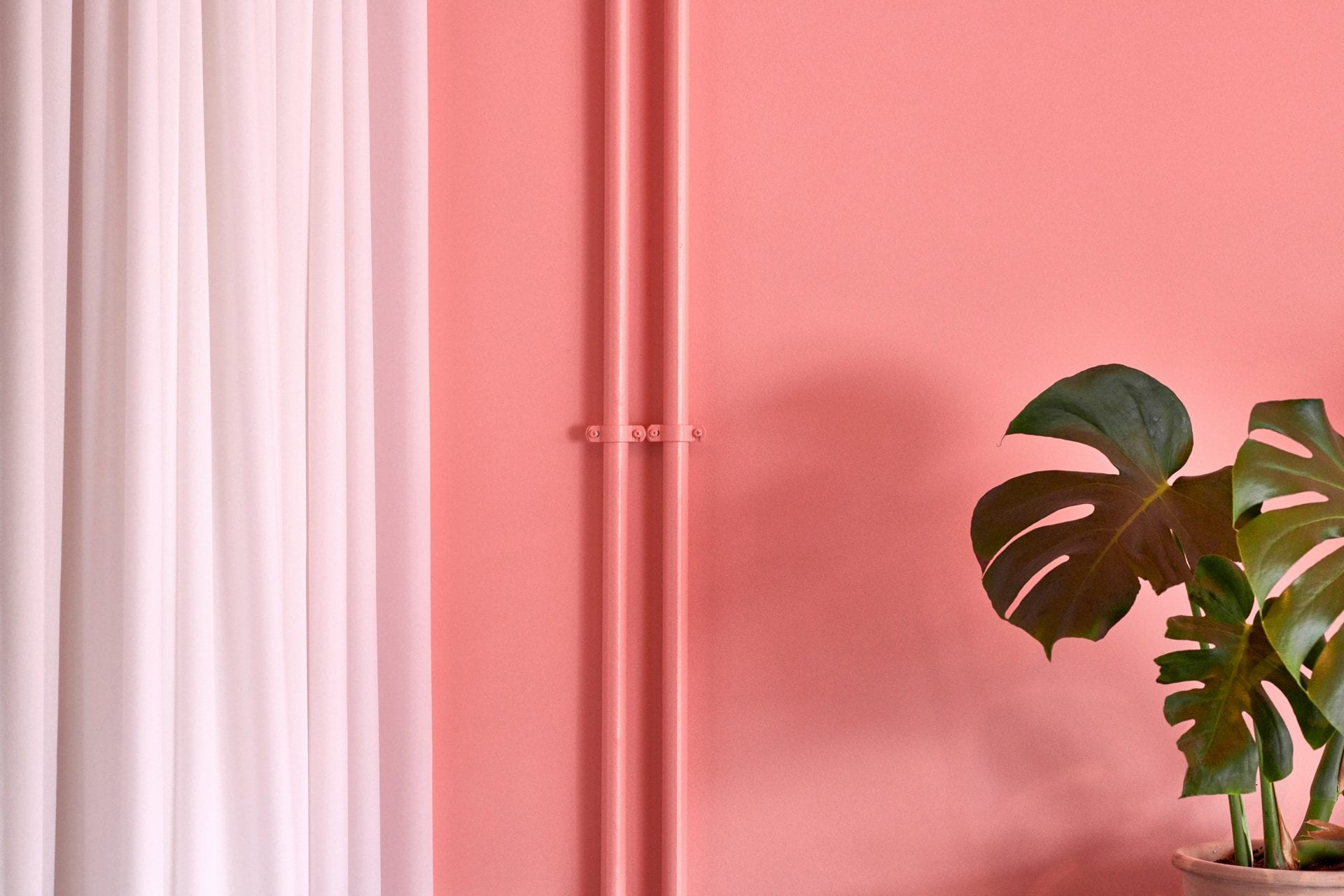
If one vignette of this design epitomises it, it’s where exposed pipes fall into the candy-coloured, segmented break out areas. Lacquered to match the wall colour of the space, they depict an honest handling of the nature of this building, seeking to not overwrite its pre-existing character, but create the next chapter of its use.
Photography by Stefan Hoederath

