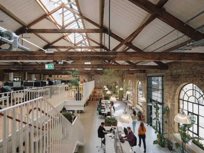
The space, a Victorian warehouse dating from 1868, is the studio’s new permanent home
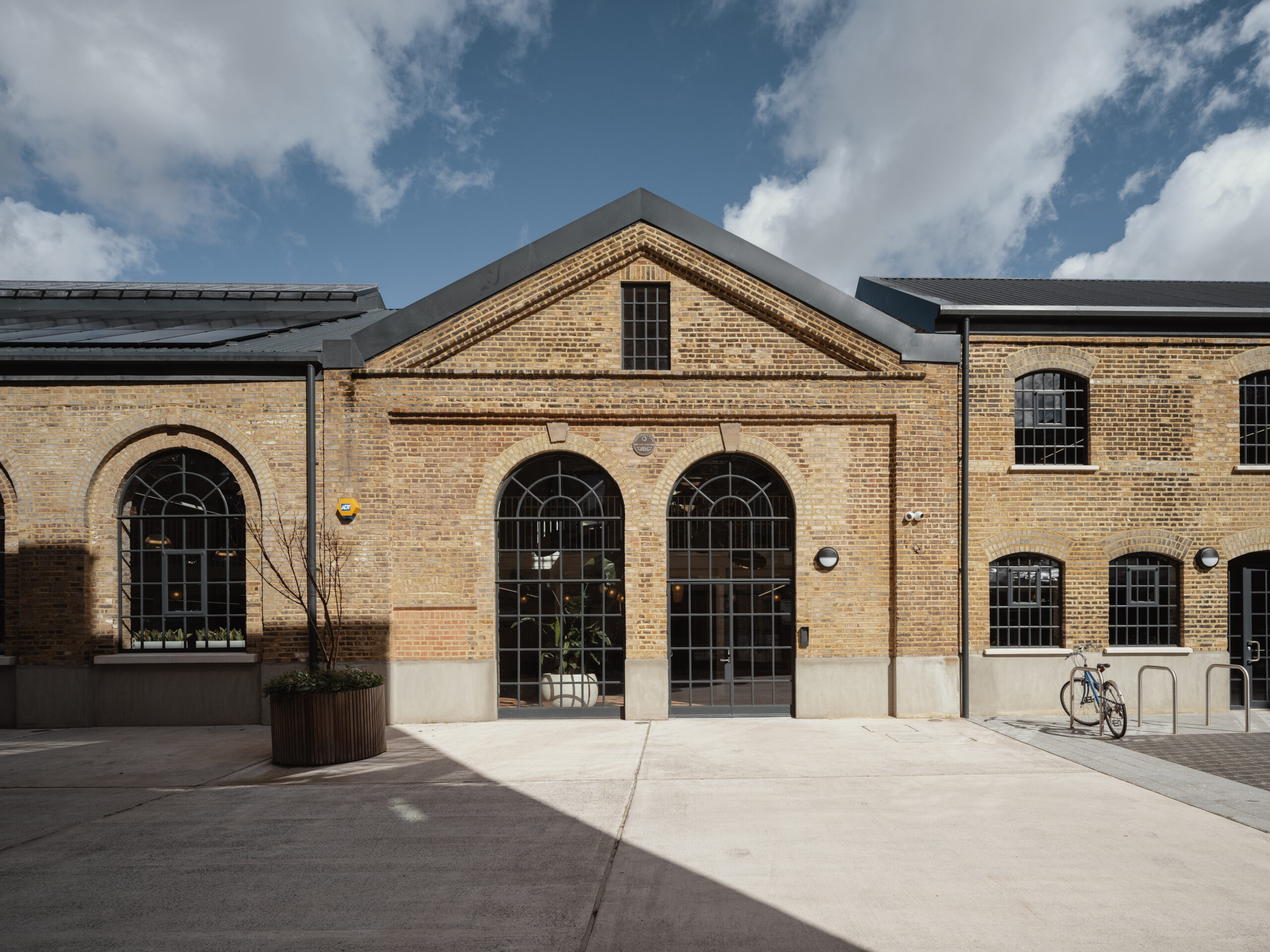
Long before Hackney Wick became one of London’s buzziest neighbourhoods, it was a hotbed of industrial innovation, manufacturing the likes of petroleum and the world’s first synthetic plastic in the second half of the 19th century. The factory responsible for producing the latter, a Victorian warehouse dating from 1868, now lives in on as HTA Design’s expansive London headquarters.
“We’ve only ever been based in old buildings—first in Camden, then in Aldgate— before moving here,” says Sandy Morrison, partner at the firm centred on housing design. Those offices, he acknowledges, were indeed characterful, yet “lacked aspects of the environmental comfort associated with more modern spaces.” In contrast, the current-day home at 75 Wallis Road “takes an existing structure with a fascinating history and a lot of embodied carbon, and fills it with light, air, and plants, surrounded by natural materials.”
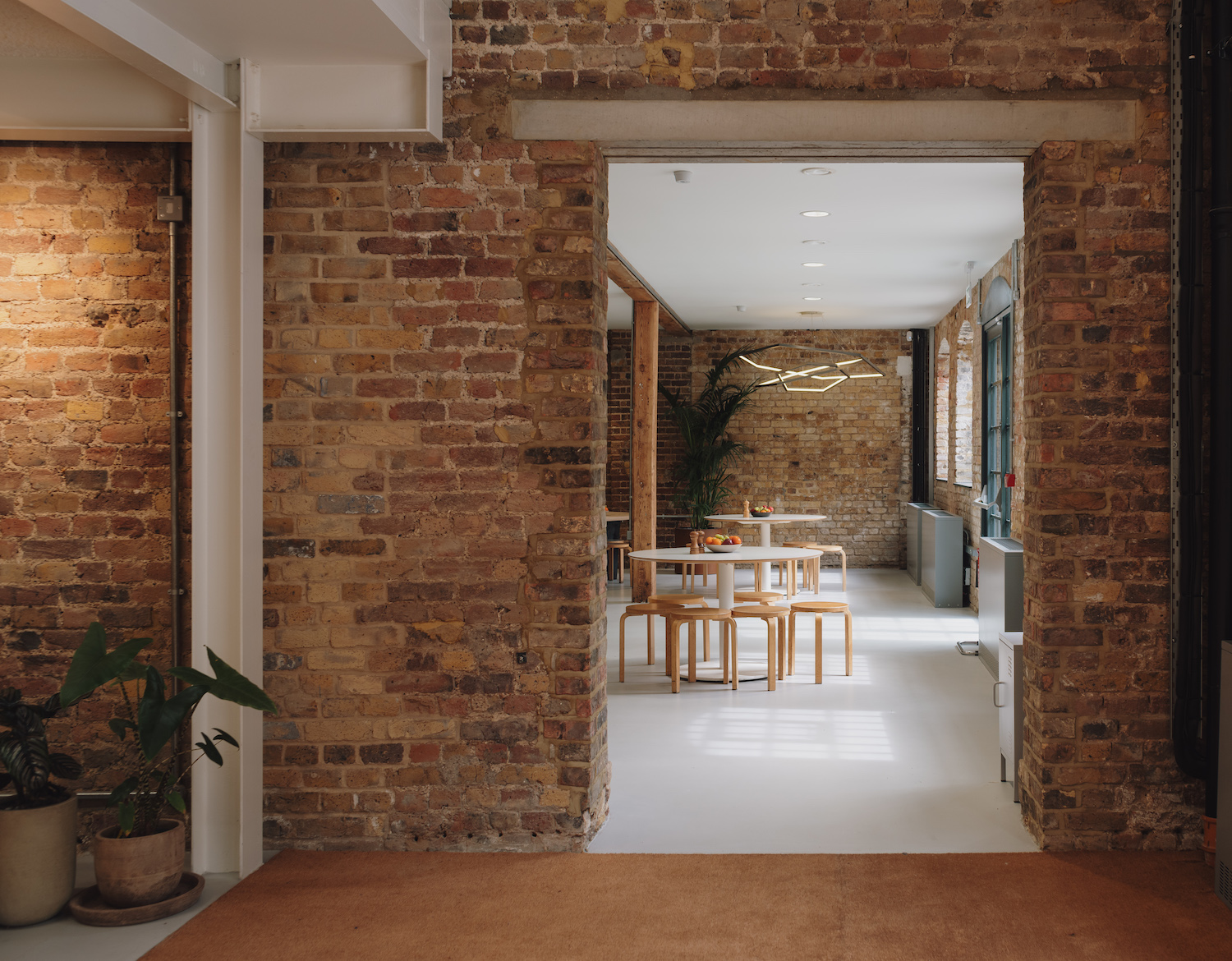
As the owners, tenants, and designers of 75 Wallis Road, HTA Design is in a privileged position, allowing for the implementation of sustainable measures that can be monitored over time. A massive photovoltaic array on the roof and air-source heat pumps, for example, generate renewable energy, while exposed brickwork provides a substantial thermal mass. Measurements are logged daily, and the kit may be turned off at any time so that the building, comprised of four volumes HTA Design stitched together as an organic whole, can “breathe naturally through the windows and newly installed roof lights,” points out Morrison.
An eco-conscious mindset is also reflected in the embrace and restoration of original features that are balanced with contemporary mezzanines and staircases. “The many layers of brickwork, which have been patched, infilled, and altered over time, required a simple approach to our interventions, hence the resin floor and the white soffit to the pitched roofs revealing the impressive trusses,” explains Morrison.
Illuminating those dramatic timber and iron trusses initially proved challenging, with contractor proposals calling for hanging elements that would have cluttered the ceiling and obscured them. But a team member found a clever solution: sprayed paper insulation, which proved to be quite an operation affixing to the soffit. “Every surface that wasn’t to receive the coating needed to be wrapped, a job carried out carefully,” Morrison elaborates. “The result is a neat finish that delivers a calm and quiet space. The acoustics are one of the best qualities of the building.”
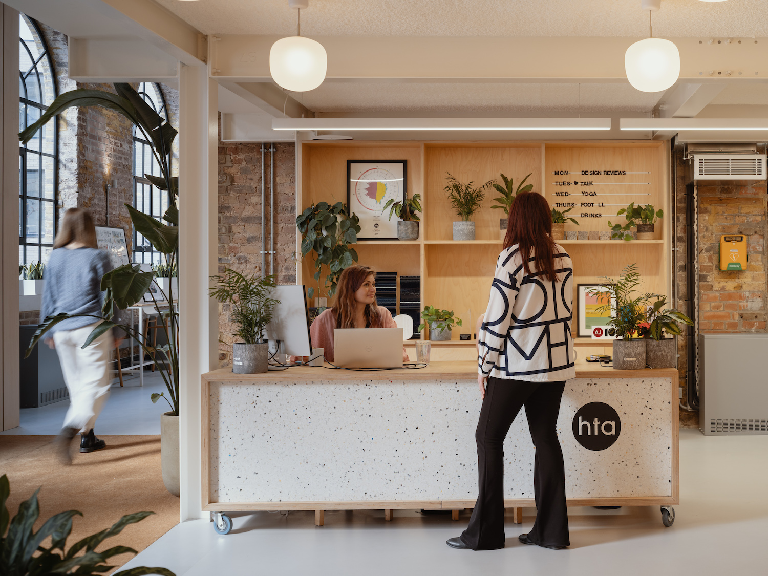
Cork salvaged from the house of a colleague’s grandmother was transformed into flooring, joinery and furniture from HTA Design’s former workspace was woven in, and additions like the terracotta kitchen counter were thoughtfully chosen to meld with the abundance of bricks.
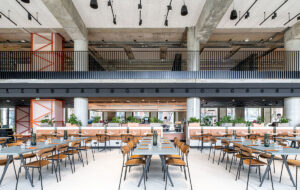
Most importantly, the set-up engenders a sense of community that is felt most prominently in the open-plan kitchen and dining area, where staff gather daily for freshly whipped-up lunches. Linked by new openings, the interconnected buildings, adds Morrison, “let you see all these people working, chatting, or eating in a busy and vibrant office.”
Photography by Tim Crocker

