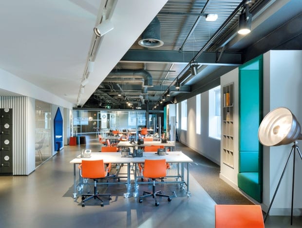
 This dynamic space has been carved out of a bland spec office|This dynamic space has been carved out of a bland spec office|In bright orange, a rounded pod acts as a mini-auditorium|The office is split into two, with features such as meeting booths accessible by both sides|A wall of custom-designed acoustic panels by Baux hangs in the execs’ office|The office is split into two, with features such as meeting booths|When you come into the space, you are hit immediately with a very exaggerated view||
Elevator, a lively hub for business enterprise in Scotland’s north east, plays host to both permanent staff and budding entrepreneurs finding their way
“I am in two minds as to whether Google has done any good for workplace design,” ponders Ross Hunter, director and founder of Glasgow-based design studio Graven.
His firm has just completed Elevator, a space for Enterprise North East Trust that is half office, half incubator space for small businesses, supported by the government-funded Business Gateway programme. But while other designers might have succumbed to the workplace design truisms that have stemmed from Silicon Valley start-ups, Hunter sought to avoid them.
“Some [Google offices] are very good, but some are horrible,” he says. “I hate those projects with the gratuitous table football, or the caravan in reception. There’s this sense that if you use Astroturf or one of those clichés, it is in some way going to improve your working environment, but actually it doesn’t. The danger is you create a gimmick rather than something with real longevity.”
For this project, says Hunter, Graven instead drew from accelerator spaces in academia and decent art school studios, setting out to create a fresh and exciting, yet mature and enduring environment that supports its two distinct types of worker. One side was to be permanent offices for Enterprise staff, which is therefore calmer, with a more restrained aesthetic; and the other would be a temporary workspace for small businesses of all types, designed to feel dynamic and fast-paced.
The two sides would also often interlink and share areas, so had to be flexible and collaborative. All this in a single-storey, generic speculative Aberdeen office floor – a canvas that initially proved uninspiring.
“It was a shoebox, typical of what corporate architecture delivers to the market, with bluey-grey carpet, cheap suspended ceiling, fluorescent lights and white walls,” says Hunter. “It’s mind-numbing. But it’s a blank piece of paper.”
Lacking any inspiring architecture to respond to, Graven introduced its own: a wedge-shaped structure darting through the centre of the floorplate. It was envisaged as a way to divide the two parts of the business, meanwhile expressing its dynamism.
The wedge’s slim end starts at the office entrance, and increases in width towards the far end, with the wall slanting inwards on the incubator side of the office, creating a forced perspective. “The idea was that when you come into the space, you are hit immediately with a very exaggerated view, and as you moved through, you felt like you were going faster,” says Hunter.
Practically, the wedge is also a block into which niches could be carved, such as cellular and open meeting space, nooks for quieter working and places to tuck away utilities such as lockers and printers. For Hunter, it was important that the space was not deterministic; rather that there should be “places where we have speculated on the kinds of things that people might do, but then it’s up to them to decide.”
One such space is a vivid blue pentagonal cushioned booth, which is accessible from both sides of the office. “This isn’t the Gaza Strip,” jokes Hunter, “the idea is that people cross over and talk to one another.”
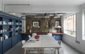
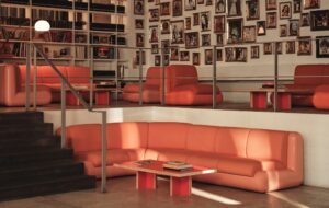
There are also glass-box meeting rooms bordering the Enterprise side, and on the incubator side, wall space for a whiteboard, and a colourful, picture-frame seating booth. Where the two sides finally converge at the end, a large circular, multi-level pod takes the form of a mini auditorium for larger meetings and presentations, or a lounge.
In open-plan offices like this, says Hunter, the difference between a regimented environment like a call centre and a genuinely flexible, useful workplace lies in the social areas, which is why the practice has built in these “little micro spaces” wherever possible.
On the incubator side, Graven has also added protrusions to the outer wall to “break up that shoebox perimeter”, incorporating seating booths and bookcases – providing yet more location choices for the restless entrepreneurs.
Once the internal architecture was established, Graven started to bring in layers of finish, material and colour. Two identities had to be considered, without making the two sides disparate. The base colour palette is congruent across both sides, with pops of colour on the incubator side to “electrify” the surroundings, such as the orange chairs and colourful booths.
Ceilings have been stripped away to add height, and what was exposed has been coated in charcoal grey, including beams and columns. A new ceiling has been installed over the wedge to create a more intimate atmosphere in those central spaces. In the entrance, a metal mesh canopy finds a middle ground between the two, continuing the scale of the lower ceiling while allowing a view to the revealed ceiling above.
In keeping with this subtle industrial theme (though careful not to stray into “Pinterest-board-type, over-stylised industrial cliché”) sections of wall are made from folded and perforated aluminium panels. It is one of many design decisions, like the pentagon-shaped booth and geometric patterns, that is intended to add a graphical edge to the interior, demonstrating the other side of Graven’s design sensibilities as a branding and graphic design studio.
The auditorium is wrapped in a similar texture, this time made from sections of anechoic foam, while the inside bursts with a rich orange colour, a focal point for both sides of the office floor.
Instead of raised access floors, Graven has used a workshop-style cabling system that gives access to power from above, via a pull-down cable. On the incubator side this allows plenty of flexibility for the desks, designed by Graven, which are on castors, so can be quickly rearranged to adapt to the users’ changing needs.
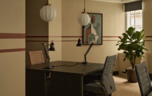
On the Enterprise side, more traditional bench desk systems are used, and the dominating vinyl flooring is broken up by carpet, creating a quieter atmosphere in the working areas. A glazed office space for the four-strong executive team is also carpeted and features a strawboard acoustic panel/artwork, another nod to Graven’s graphic side.
The firm was also tasked with completely rebranding Enterprise North East Trust, but unlike most projects like this, the interiors came first. Hunter says the process of designing the workspace helped his firm understand its client completely, and eventually fed into its visual identity, its new Elevator name and even how the business was structured.
Hence its new identity “is not just a sticker” he says, but an intrinsic design DNA. If interior design and branding were considered more closely, he continues, “we might not get so many of those table football clichés.”

