 Polish bank PKO’s bling is a (golden) mile away from any British equivalent|The bank’s black, white and gold VIP banking logo inspired the project|The all-black meeting room concept was initially a challenge for banking types|Grid lines were projected onto the interior, giving the illusion of a 3D net||
The post-boom backlash against bankers means we are unlikely to see any financial institutes shouting about their chic new interior design scheme for some time yet. Which is why it can sometimes pay dividends to look to countries with less austere economic climates to find projects that offer up a bit more glitz. But even in an economy that is faring better than our own, striking the right measure between promoting prestige and demonstrating discretion is essential. Robert Majkut Design studio has just completed the interior fit out of the private banking arm of PKO Bank Polski, the biggest Polish high-street bank.
“The bank was in the process of refreshing its identity,” designer Robert Majkut explains. “It needed a high-quality interior, to show the new face of the bank to its VIP client base.” The new corporate identity included a modernised logo for everyday high-street branches, with a version for the private banking sector in black, white and gold. “This colour trio provided the starting point and the palette for the project,” says Majkut.
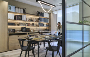
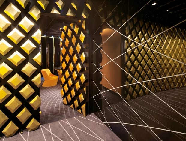
The scheme has been applied to full dramatic effect; while one of the meeting rooms is entirely black, in other meeting rooms walls are painted floor-to-ceiling gold. “It is radical to have a room totally black, and it was hard to explain [to the client] at the outset,” Majkut explains, “but it works well; it’s very elegant.
“After the black reception hall and corridor, the gold symbolises getting to the heart, or the essence, of the project. As well as balancing the strong graphic contrast between the black and the white, and adding some warmth, gold gives reference to values such as prestige, stability and prosperity.”
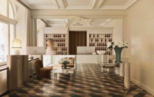
The branch of the bank is clearly divided into two functional areas – a customer-facing service area and a back office area. The customer space opens with a reception room, which connects with a customer lounge and waiting area. This leads to a conference room, and further along the corridor, to carefully furnished meeting rooms and the director’s office. The back office is opened out with the use of glass walls and light colours, and whereas the customer service area is dominated by black and gold, the office space is predominantly white.
“The selection of finishing materials was governed by the desire to create a visibly high-calibre interior,” says Majkut. “It was very satisfying to work with quality materials. The wallpapers and wall coverings are decorative and decadent, and there is real gold used in the project – but there’s also a balance to be struck for the client, between luxury and elegance and a high-quality finish, and judgement and reserve. Luxury with a big ‘L’ doesn’t work well in a bank.”
There was another element of the corporate identity, in addition to the colours in the logo that Majkut wanted to utilise for the interior; a grid-like graphic made of a succession of fine waves.
“We incorporated the graphic spatially, by projecting it onto the three-dimensional interior of the reception area, using special software,” Majkut explains. “We used the technique to create the illusion that the grid lines all converge in one abstract point.” The grid is repeated in a modified form on floors and on ceilings, and reoccurs on upholstery and in wall coverings. It’s also sandblasted subtly onto glass walls. A feature wall in the reception appears to have the motif impressed onto it, leaving a grid-like relief of gold diamonds.
“The effect of using this motif throughout is to create a balance between aesthetics and mathematical order,” says Majkut. “It is a kind of metaphorical code that presents the character of the institution and its services, being a mix of scientific analysis and the human element of experience, knowledge, and decision making. When you think about a bank, it is both a traditional institution and an innovative one.”
The project is the third that Robert Majkut Design has completed in the private banking sector; it has previously worked on the interiors for Expander, a network of financial advisors in Poland, and a private banking network, Noble Bank. It has also fitted out high street spaces for well-known brands such as Orange and ING, and has recently been creating interiors for the luxury goods sector, working with fashion and watch brands, which may have helped inform the exclusive feel behind the gold and black luxury of PKO Bank Polski’s private division. More tellingly, it also works for foreign clients in China and in Russia – markets that are equally unafraid of the Midas touch.

