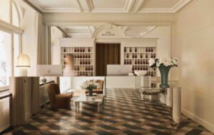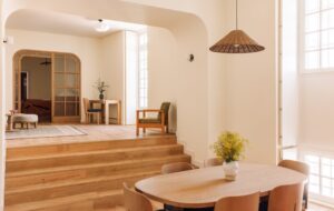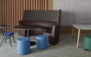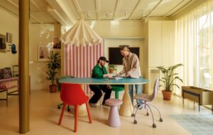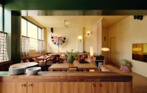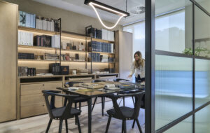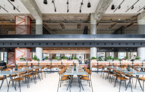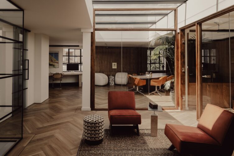
Using a palette of richly grained woods and natural textures, Miminat Shodeinde’s first commercial project, the London offices of Giant Ventures, achieves its goal of being “homely with a boutique-hotel edge”
Giant Ventures is hardly a traditional multi-stage venture capital firm. Founders Tommy Stadlen and Cameron McLain are dedicated to investing $1 billion this decade alone in companies propelled by technology that is designed to address such monumental issues as climate change, mental health and inclusive capitalism. Stadlen and McLain only collaborate with purpose-driven leaders who advocate for sustainability and equity, so their London headquarters (there are also outposts in Copenhagen and Los Angeles) needed to be soulful and upbeat, reflecting Giant’s progressive values.
When British-Nigerian artist and designer Miminat Shodeinde, founder of local practice Miminat Designs, was introduced to the Giant team, she immediately realised that a conventionally corporate layout would not suffice. Although she is regularly called on to conceptualise sleek, modern homes, sculptural furniture, lighting and objects, Shodeinde had not yet ventured into the commercial realm (she’s since received a second commission in this sphere, for a store in Mayfair) so “it was completely new and exciting to me”, as she puts it.
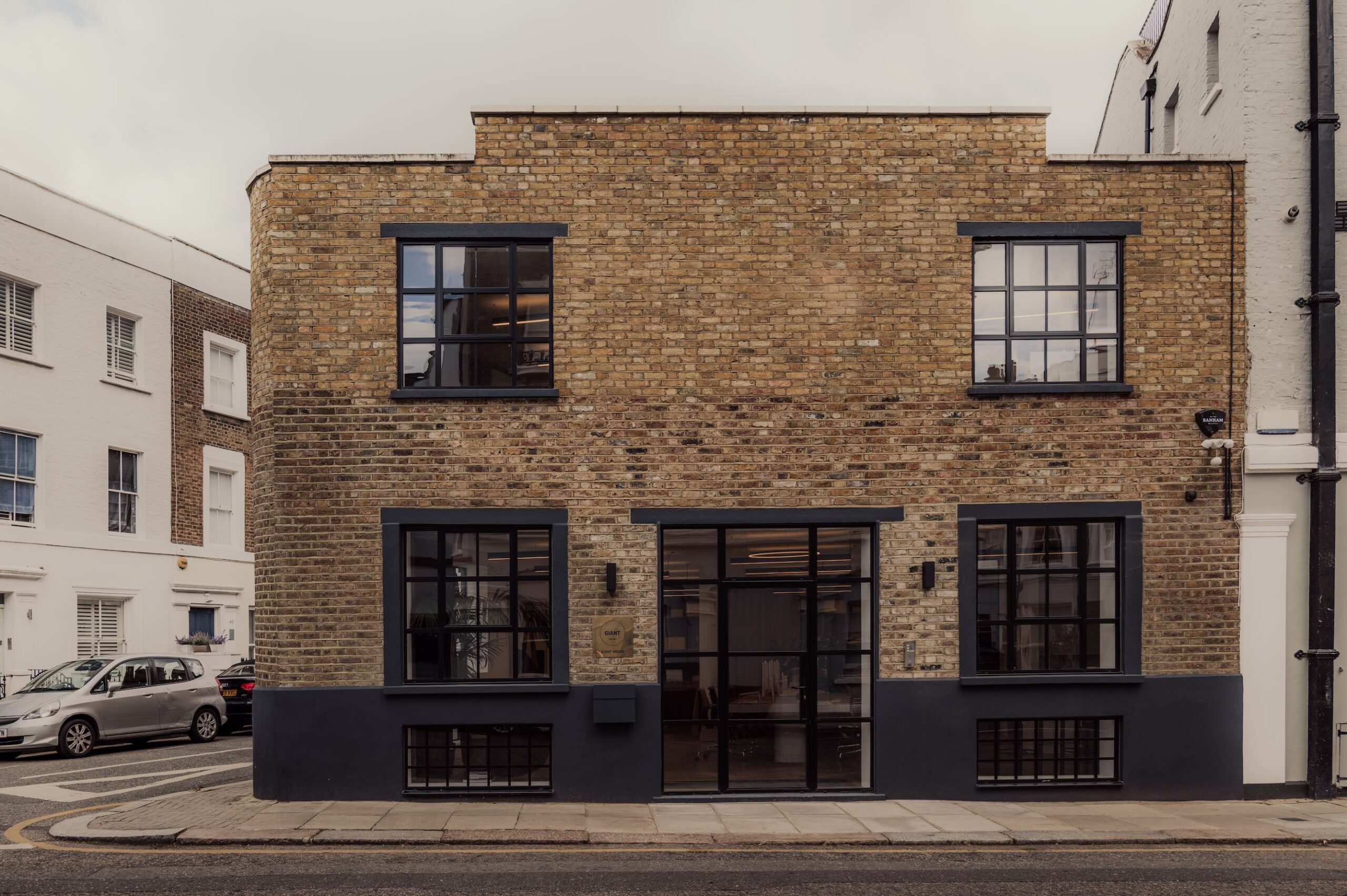
Other than her surprise at the project’s fast pace, an aspect that appealed to the restless Shodeinde, there was little that differed from her usual approach. From the outset she determined just the right fusion of sophistication and practicality, as she normally does, shaping a design narrative that responded to the brief, “How do we make something feel homely with a boutique-hotel edge that will still function as an office,” she recalls. “That’s what the client wanted, and I think we achieved it.”
Given that the space is housed in a former pottery studio in the hushed Holland Park neighbourhood – both Stadlen and McLain conveniently live in the same area – Shodeinde had a rich starting point to draw from. Far from the city’s typical urban bustle, the building organically invited a welcoming, residential air. “That context played a big role,” she points out. “It is situated on a stunning curved corner, and has so much character from the way all that light comes in.” At the entrance, Shodeinde set a polished tone by punctuating the brick façade with steel doors and splashes of black.
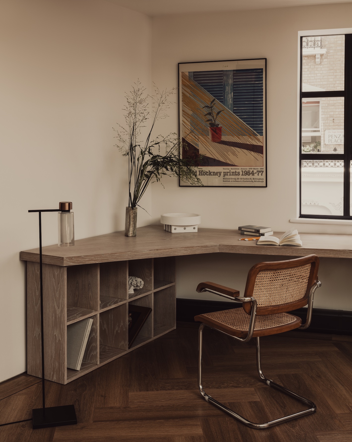
Inside, “we wanted everything to be warm”, she adds. This was largely accomplished by melding various woods, including British oak, ash, wenge, and walnut. It was a tight budget, so Shodeinde was unable to show off her flair for incorporating stones in this instance, but by layering the different woods she was able to achieve the sense of luxury she desired. She then paired them with soft textures like jute and velvet and juxtaposed the limed desks and verdant greenery with a moody palette of mustard, ochre and cognac that is in dialogue with the delightfully shifting tones of sunlight throughout the day.
There is plenty of furniture that has been dreamed up by Shodeinde, too. The boardroom, beckoning behind glass, marries a rounded mahogany table with one of her imposing low Rina cabinets crafted from yet more mahogany, zebrano, Corten steel, and brushed brass. “I’m stubborn like that, creating what I want,” she explains. “It’s rare I see things that fit a project, so nine times out of 10, I just decide to design these pieces myself.”
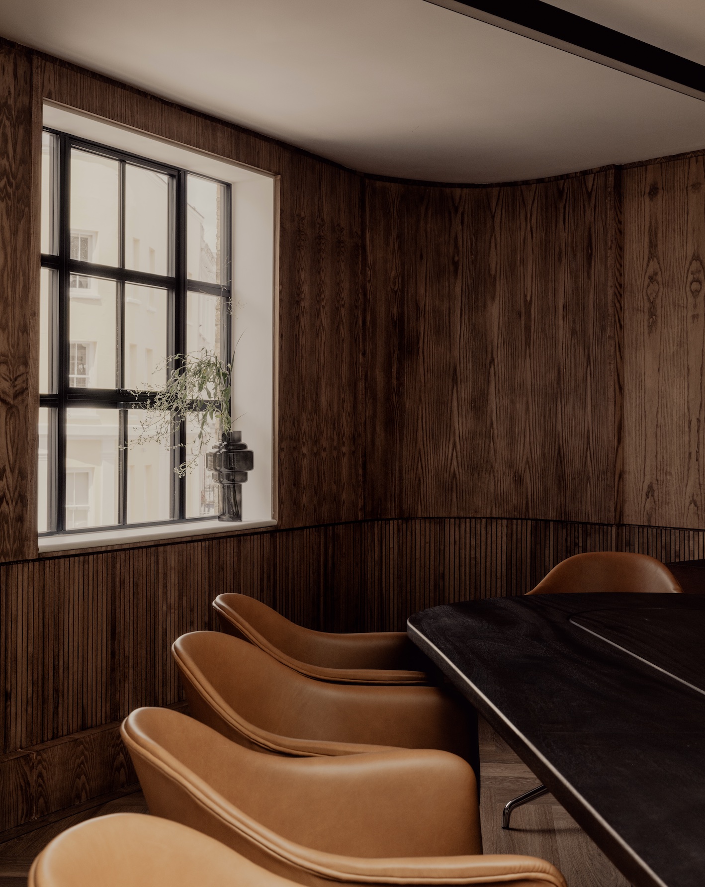
Other than Giant’s directive to weave the centrepiece boardroom along with a quartet of meeting spaces into the design, Shodeinde had free rein over the office, and was only slightly stymied when it came to executing the large amount of bespoke joinery she wanted to include. “There were a lot of restrictions in the building. The owners cherished it and didn’t want us to do too much to it, so persuading them was the biggest challenge,” she remembers.
Across three floors, the small staff of Giant roves from one open, transparent environment to another, whether it’s to perch behind a computer at a long, communal desk or sit in a cocooning chair backdropped by object-lined shelves. “They are always moving around. The founders don’t even have their own spaces; they all work together,” Miminat notes. Throughout the design process, Shodeinde was conscious of the atmosphere she was eliciting. “We tried to stay away from the Soho House and WeWork vibes,” as she puts it. “Creating relaxed spaces that are also elegant is something that follows me throughout all I do. I wanted something fresh and young that represents myself as a designer as well as the clients.”
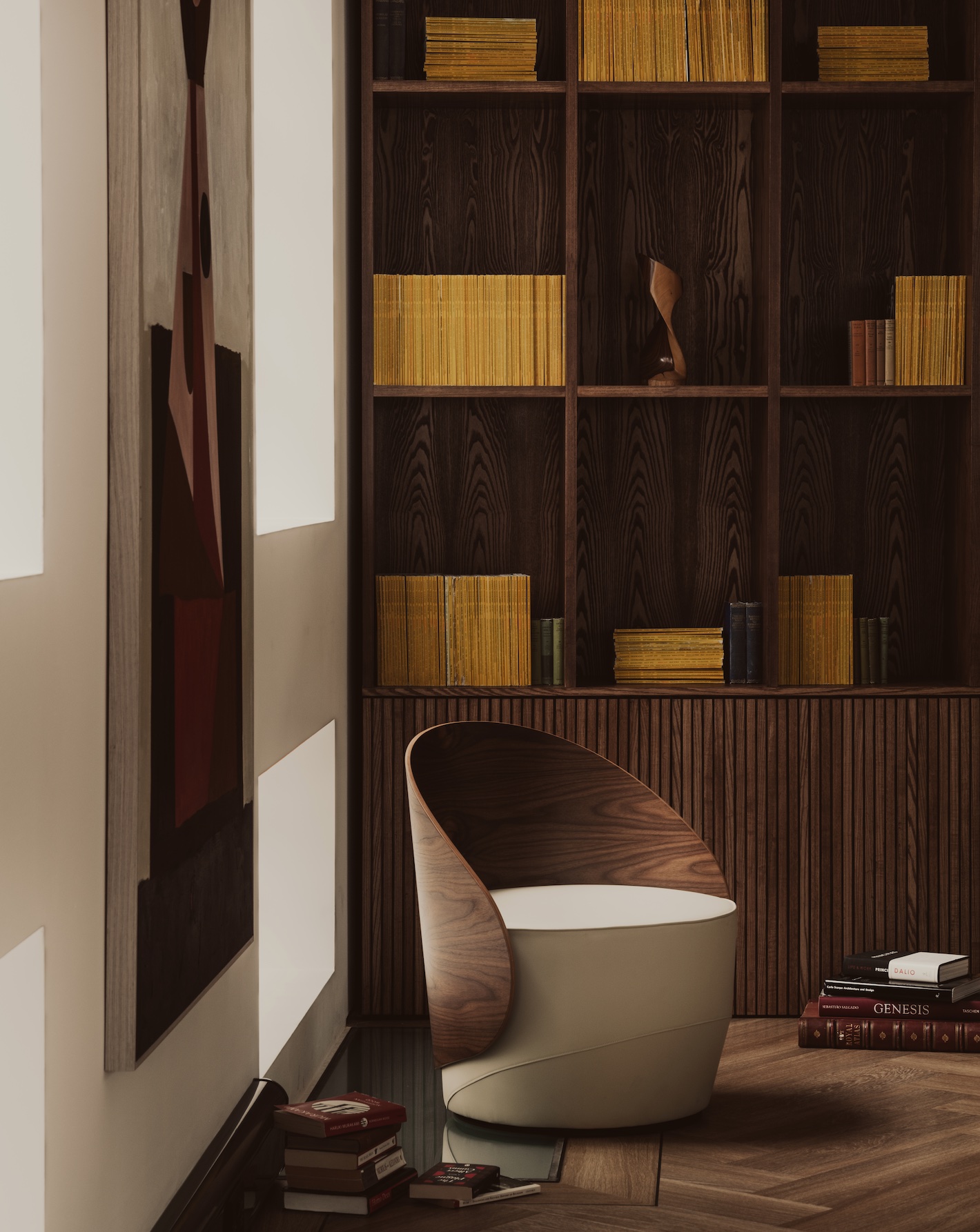
Brightening the office are artworks – some of them Shodeinde’s own, others by David Hockney, Bridget Riley, Sebastião Salgado and Mattea Perrotta. But the standout is the back wall, dominated by 3,000 vintage issues of National Geographic dating to 1892. Usually, when her projects call for a feature wall, Shodeinde will choose a striking material like travertine to make an impression.
But Giant is passionate about climate action, and when Stadlen and McLain mentioned their love for the iconic magazine’s insights on the natural world, Shodeinde knew an ambitious installation of National Geographic “would be in line with their ethos. But how was I going to find enough of these magazines to fill a five-metre wall?”
Tracking them down was arduous, but possible through such platforms as Etsy, Gumtree, Instagram, and Facebook Marketplace. “I had random people delivering National Geographic to me for three weeks,” Shodeinde muses. Luckily, her determination paid off. She let the old periodicals, arranged in a mix of horizontal and vertical configurations, quietly shine against swaths of dark wood with their signature lemon yellow hue. “The fact that it was so raw and simple – just timber and stacks of National Geographic,” she says. “It’s so beautiful and timeless.”
Images by Alixe Lay


