 ||
||

When a historic factory is converted into offices, you expect a building stripped back to the bare bones. Exposed brick, metal trusses and atmospheric factory windows are the name of the game. But exactly the opposite had been done to a heritage woolstore in Sydney, now the home of global communications agency, JWT.
Bizarrely, it had been given the Australian equivalent of a Cat A fit-out with suspended ceilings and walls that covered up every inch of the building’s character. When design firm Geyer was brought in to create a dynamic workspace for JWT’s 95 staff, the first point on the agenda was to get rid of all that unnecessary plasterboard and let the building come back to life.
“We’d worked on another project downstairs in the same building, so we knew what we could expect to find,” says project designer Iva Durakovic. Specifically she knew that a gaping triple-height void was lurking above that gridded ceiling, and it gave Geyer the starting point for JWT’s fresh new space.
As with most creative businesses, increasing staff interaction was high on the list for JWT. Its previous HQ was set up in a way that meant people from certain teams could go for months without crossing paths – not good for morale or business. “It just wasn’t working for them at all,” says Durakovic. “Their staff were really struggling to make it feel like a creative studio when it just wasn’t.”

The firm’s somewhat cloying work mantra – Be the Antidote to Indifference – was the inspiration for the overarching design concept, but really the company just wanted an office that would make staff excited to come to work and wow clients – not just as part of a massive global brand but as the trendy Sydney outpost of JWT.
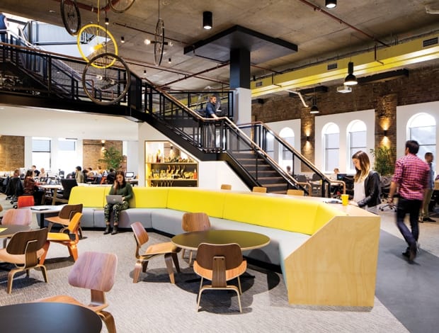
The office is comprised of 1,400sq m over the woolstore’s seventh and eighth floors, but the newly discovered ceiling space allowed Geyer to add a whole new mezzanine level. A sculptural staircase with a steel mesh balustrade now wraps around a central hub and connects all the floors, with a casual meeting area for staff and clients parked at the bottom. The seventh floor layout contains the nuts and bolts of the business: editing suites, private meeting rooms and most of the workstations.


About 70% of staff are now hot-desking too, which was another of JWT’s big objectives. Employees were brought round to the idea through a series of workshops led by Geyer, Durakovic explains, and there was a slow build-up to using lockers and having a company-wide clean desk policy.
Initially the plans called for a much larger mezzanine but budget restrictions kept it to its current size – a little less than a quarter of the floor plate. The new level is now home to JWT’s resource library, client meeting space and, most crucially, allows for “town hall” moments where directors can address staff assembled below.
The project’s budget limited design decisions from start to finish, and clearly certain solutions have been more successful than others. Entering the office by the seventh floor, visitors are greeted by a bike store and a reception clad with reclaimed timber. Behind the welcome desk, suspended pieces of rope have been spray-painted with the company’s logo, but also act as a kind of screen between reception and the main building.

Elsewhere design details and reusing old furniture have saved the client money, explains Durakovic. Peeling back to the brick walls left patchy, damaged areas around the windows, for example, so Geyer designed plasterboard frames to cover problem spots – though they also give a sense of cohesion to the seventh floor, which now, as it happens, has natural light flooding in.
Exposed ceiling ducts were given a lick of bright yellow paint, coordinating with the customised joinery in the breakout area at the bottom of the stairs. “We decided that if we’re stuck with ceiling ducts – let’s celebrate them,” says Durakovic.
Further cost saving was made with a statement chandelier made out of bicycle wheels in the central void. “That came about because budget didn’t stretch to commissioning a piece of art, so we improvised with reused materials to give that space something with impact,” says the designer. Beam system workstations are all new, but task chairs and walnut shelving units were transplanted from the firm’s previous space.

The eighth floor is arguably the most successful part of the project – it certainly is the most handsome. Perforated chipboard ceiling tiles make a sleek impression above the polished concrete and plywood floors and show a clever use of a material that is cheap as chips.
On a practical level, Geyer had to raise the floors so that they would provide a level plain to install glazed, bi-fold doors to an outside terrace. A trio of small meeting spaces, or “nooks” on opposite ends keep foot traffic flowing, and boardroom, kitchen and seating areas with sweeping Sydney views are a particular triumph.

“We had to be quite creative with resources so it was about thinking in quirky ways and doing unexpected things,” says Durakovic. “It all tied in really well with JWT’s philosophy of being the antidote to indifference. The brand is quite punchy and we thought: let’s spin this on its head and see what happens.”


