 |||
|||
Following the fit out for the Shoreditch flagship home for its EMEA staff in London, softwaare giant Adobe has once again teamed up with architect Gensler to update its smaller but perfectly formed Dublin customer care centre. Though on paper it is not so all-singing all-dancing – it doesn’t have the cachet or edgy postcode and has been bestowed with a more modest budget – the project is representative of the brand’s core values in a different way. For a brand started in founder John Warnock’s California garage in 1982, with a logo designed by his graphic designer wife, Adobe holds the idea of humble beginnings close to its heart and this refreshed fit out for the Dublin office brings those homely, grassroots values back.
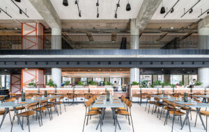
 Plywood diner booths are upholstered in orange Kvadrat fabric. Photograph: Mark Cocksedge
“Dublin had always been a challenge for Adobe, in terms of aligning it with the much celebrated culture of the brand,” explains Becky Spenceley, associate at Gensler, citing its open workspaces that facilitate community, innovation, wellbeing and playfulness.
“At the end of the day, this is the company’s call centre: people are sitting at their desks, only speaking to the person on the other end of the phone or email chat for the most part. It had more of an old-school office vibe, in terms of how people interacted with both each other and their employer, as well the interior design.We’ve been back a few times since completion and on speaking to the management team there it really has been a surprise success story for Adobe, that has facilitated a very real and significant, improved shift in culture for the office.”
Adobe bought the new 1,400sq m space to expand its growing team of over 100 customer care staff and saw this as a chance to create a workspace more in line with the benchmark set by its collaborations with Gensler.
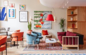
 The office deploys a bright, variegated colour scheme. Photograph: Mark Cocksedge.
Carmel Martin, Adobe customer care manager at Dublin, confirmed the specific needs of this location: “The organisation is made up of a young population from diverse cultures and backgrounds and our work involves assisting customers – mostly by email and chat, some phone contact,” she explains. “It is very easy to spend the entire day at the desk, head down and working, completely engrossed in our own worlds. It is particularly important that we have attractive and engaging collaborative areas and break areas that encourage us to get up from our desks and chat to each other. A great deal of my own learning since joining Adobe has been through informal chats in our break areas with fellow employees.”
So the blank canvas it was presented with has been split into two main open-plan working zones, or “neighbourhoods”. Dividers on the spines of the workstations help with acoustics but the workstations are not enclosed, with Gensler keen to avoid booths and partitions.
“We wanted to promote interaction between the staff because to date there was little communication between people in different teams, let alone different departments, which was something Adobe wanted to work on, as the idea of the ‘Adobe family’ is a crucial brand value,” says Spenceley. “Of course on a practical level, this is a call centre though, so we had to be careful with the noise aspect, adding acoustic Filzfelt buffers between desks as well as giving the ceiling acoustic treatment.”
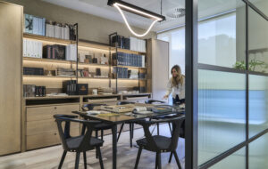
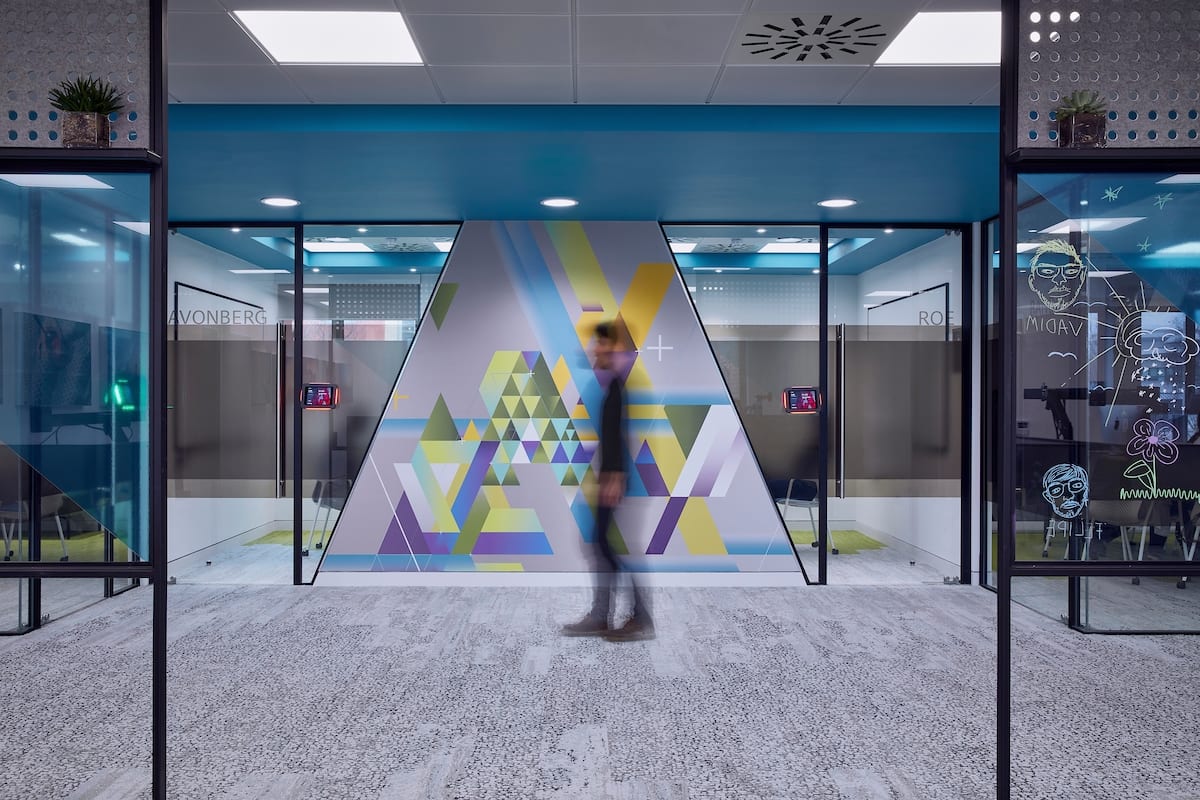
On the axis where the departments meet, Gensler added a tunnel of glazed meeting and focus rooms for extra privacy and also to break up the traditional idea of a call centre as a sea of desks. Here the walls carry on the design “story” created for the London office, which references the now iconic functions – vectors, gradients and opacity – that Adobe made famous through its creative suites such as Photoshop and Illustrator.
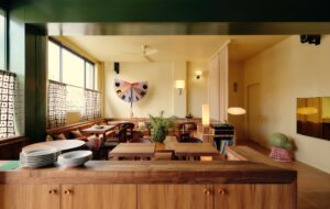
 The bar provides a place for employees to connect between calls. Photograph: Mark Cocksedge.
It also takes its cues from the concept of art meeting science/technology, on which Adobe is founded. In Shoreditch its panels are feats of joinery, but here coloured glass and vinyls form the same pattern and shapes, an example of the modifications for the lower spend. Artworks created with Adobe software are seen throughout and there is writable glass for team notes.
At the forefront of the project though, both in ethos and layout, is the family-style bar. “It is the first thing you come to at the very entrance of the office,” says Spenceley, “and we wanted to give it that prominence and importance to set the tone of the space. It was a key driver to create an area for the whole office to connect as one big team, something they didn’t have before.We worked with Adobe’s idea of creating a sense of home in the workspace, so here people can gather round the Silestone concrete island unit, catch up or get to know each other over coffee and generally connect in the breaks between their calls.”
Residential-style tiles from Domus, blue wood laminate on the cupboards from Egger and barstools from Naughtone complete the inviting look.To accompany the kitchen diner, purpose-built booths have been created in plywood with panels using fumed oak laminate and chunky seating upholstered in punchy orange fabric by Maharam at Kvadrat.
“Here employees can have meetings, have an alternative work setting or just sit together to eat, which we hear they never, ever did before – as soon as lunch came people would just get up and go and get their food outside. Now they are using these spaces at points all through the day,” says Spenceley.
 Artwork created with Adobe software is seen throughout the space. Photograph: Mark Cocksedge
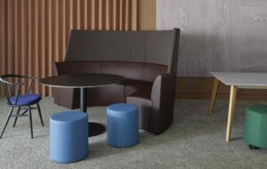
To continue the domestic feel there is a “living room” space with big sofas by Hay and tub chairs from Deadgood, cubes from BuzziSpace that resemble pixels, and a games room – reflecting Adobe’s values of playfulness and wellbeing.
The team exposed all services, removed the Cat A ceiling and painted it dark to create a moodier atmosphere which would be more cosy and comfortable.The rug is a bespoke design by Gensler, made by Clerkenwell Rug Studio, and a playful neon light show against the real brick slip walls displays Adobe’s four core values: genuine, exceptional, innovative, involved.
“We love our collaborative areas,” says Martin. “It gives me a sense of pride in the company I work for. In particular our employees in the office enjoy the break room and games areas. Any role in customer care can be challenging and it’s important that we inject fun and downtime into the workday.”
The colourful carpet is from Interface and has that modular, pixelated feel in the brand story colours. Interface is on the list of companies Adobe prefers to work with because of its strict sustainability credentials.
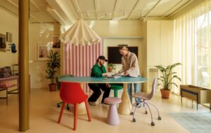
 Colourful break-out space provides room for eating and socialising. Photograph: Mark Cocksedge.
“Adobe are a great partner to work with as they do have these well thought-out guidelines, such as with the sustainability, but also with things like the number of work stations per sq ft and the type of work space they want, but they are not so precious about it that you end up simply rolling out the same schemes,” Spenceley explains. “They are quite free thinking design-wise and they are mindful of local, individual culture too. They know that the UK is going to be different from the US. And in turn Dublin is going to be different to London too and they embrace that.”
And what corporate but creative giant is complete without its own hashtag? As part of the brief, #adobelife was something the brand wanted Gensler to tease out of the Dublin location. So of course this called for a selfie wall, formed from a “remix” of the A logo. More Instaworthy moments are made, with Adobe often providing breakfasts and branded cakes, all adding to the sense of community.
“We’ve loved seeing the Dublin office come to life and have a true, positive move in its day-to-day culture,” says Spenceley. “We provided these spaces with the desire for them to promote that connection and community and a sense of identity for this location that Adobe so wanted to see. But you can’t force it. So to watch it take off like it has and the elements being enjoyed and used as we wished is such a positive thing. A real correlation between good design and the successful corporate culture within the DNA of the brand.”
Gensler’s playful offices for Adobe in Dublin reflect the collaborative, down-to-earth spirit of the US software giant

