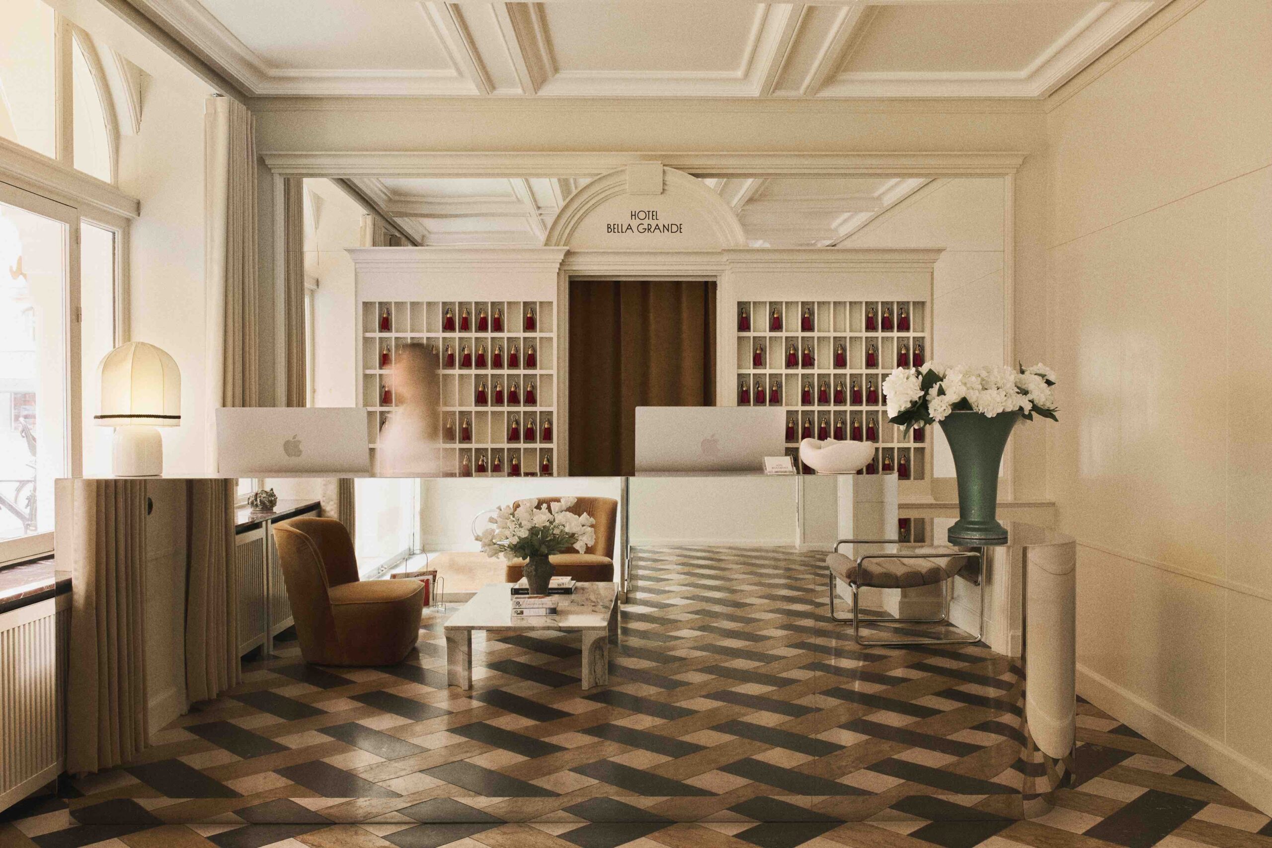
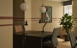
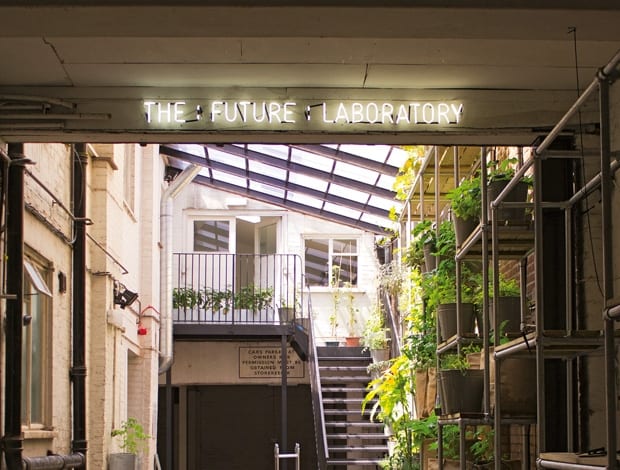
 The old goods yard, now the hub of the building|Elder Street, Spitalfields: home to weavers, cow-keepers –and now The Future Laboratory|Trend forecasters perform their alchemy in this cork-walled working space|The vertical vegetable garden, lovingly tended by members of staff|Striving for a more homely feel, the cosy canteen is a favourite spot|Open-plan space is complemented by plenty of quieter, enclosed areas|The library, in one of the older parts of the building|Mass gatherings take place on old school chairs in the seminar room|Old maps and hessian walls for the sunlit quiet room|A mid-century vibe for the meeting room, with furniture courtesy of eBay||
The first commandment of any creative company these days seems to be “Thou shalt inhabit a post-industrial building with lots of exposed ductwork.” So at first, it may seem peculiar that a trend-forecasting consultancy should want to move from a converted warehouse to a row of Georgian townhouses in a conservation area – but as a workplace concept, the warehouse has been done to death, and in some cases it doesn’t yield the best results for an organisation. (We at onoffice are slightly bored of reporting on it.) London-based group The Future Laboratory, ever ahead of the curve, bucked the trend back in January, abandoning the tin-roofed, open-plan shed it previously occupied in Shadwell for a row of 18th-century houses tucked away in a quiet cobbled lane near Spitalfields Market. It wasn’t the obvious step, but then, that’s what this company is supposedly all about.
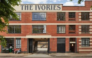
Elder Street, a few steps away from the hustle and bustle of Commercial Street, is a spectacularly preserved piece of Georgian London. The Future Laboratory has taken hold of numbers 24-28, which sits atop a Roman cemetery. Rumour has it that since 1722 the buildings’ occupants have included a silk thrower, a worsted stuff weaver and, in 1857, Mrs Kivor Thomas, a cow-keeper (our favourite). Numbers 24 and 26 are the company’s main premises, with plans for 28 to be added later.
As it turns out, the shift to a higgledy-piggledy series of townhouses made a lot of sense. The company has three distinct arms: a trend-forecasting portal, a bespoke research division and a brand innovation team. These services had been incrementally introduced since the company launched ten years ago, and its office in Shadwell no longer supported the way staff worked together. Staff needed private rooms for work and meetings, client-facing spaces, workshop and seminar rooms and social areas. So, instead of a couple of gaping open-plan spaces, as before, The Future Laboratory envisioned Elder Street as a maison –
a home instead of a headquarters, so to speak. “One of the reasons we came to these buildings is that we were looking for a space that would reflect the way we work as a business, which is unconventional,” says Tiffany Arntson, who heads up the research division.
So, even though the intention was to pave the way for change, the new digs needed to stay true to the carefully engineered image and work ethos of The Future Laboratory, which, as Arntson suggests, is different from the average company with 40 staff. This is clear from the minute one steps through the wooden gate into the old goods yard, which has now become the central hub of the building. The interior had been pretty drastically altered over the years, with a substantial 1950s extension to the rear. The effect it currently gives is a bit like an enchanted factory. To the left, a reception/gallery area is dotted with art pieces from the founders’ own collection. At the other end, sunlight streams into the courtyard through a glass ceiling: here, a tiered vertical garden, its shelving system created by retail designers Campaign, contains vegetables and herbs that are tended by staff. “You need to be able to take people away from their desks and break up their day,” says Arntson. “Culturally, that development has been a very important thing for us to manage and it’s something we’re very aware of. So things like the vegetable garden are a good way to bring in that dynamic.”
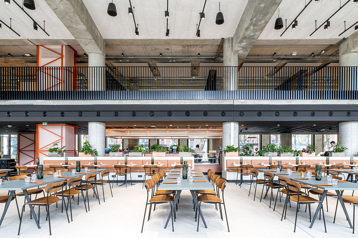
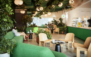
Lovely as the garden is, the best bit of the ground floor is the new canteen situated just off the courtyard. Intended to function as a staff lunchroom as well as a client event space, it’s where the “heart of the home” message really comes into its own. (A member of the production team, who incidentally also coordinates care of the garden, was baking a delicious-smelling chilli and chocolate cake when onoffice swung by.)White tiles against blue-grey walls, black and white framed photography and a hodge-podge of school furniture purchased from eBay are all in line with The Future Laboratory’s “aesthetic DNA”, as Arntson calls it (an internal design team orchestrated the look and feel of the whole project).
“We love the canteen, it’s our favourite room,” Arntson declares. The charm and cosiness helps to draw people away from their desks, she adds. “You have to give people room to approach things from a different direction by slightly messing around with their senses. That is how we’d like to interact within the business and with our clients. It’s more pleasurable and it tends to spark people’s creativity.” If that’s not enough, toward the back of the courtyard is the “undercroft” space for art installations – the latest being a sculpture by Sam Spencer, sitting next to the bike storage.
The main work happens in a series of rooms on the first floor, reached via an industrial staircase, and also by another staircase next to the reception in the original part of the building. Moving through a small lounge area into a substantial seminar room for client workshops, the styling has been kept simple with the same sort of school furniture used in the canteen. The sizeable room just beyond has been stripped back from an ancient fit out when the building was extended, so it now has lots of light and exposed beams (post-industrial motif prevails!). The research and brand innovation teams sit here, and the massive cork walls are used for collaborative work sessions.
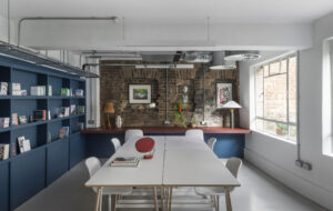
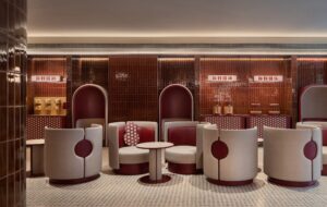
Up a few stairs and down a hallway, in the older part of the building (past a rather spiffing toilet, replete with Aesop soap and Dyson hand dryers, take note), is a smallish room where the trend-forecasting team sits. A research library and meeting table off to the side of the desks is perhaps the reason why it feels vaguely cramped – but the good thing is there is a small, rather adorable meeting room right next door and another quiet work room on the top level in case someone needs it. Up the original staircase to the second level are dedicated rooms for sales, the design team and finance. Further up still is a quiet room, administration office and a roof terrace (IT man Martin will be the volunteer beekeeper this summer). Add to this the basement bar (which onoffice didn’t see) and the canteen, both of which can be used for working, and there are plenty of options for flexibility. “We never had enclosed space like this before,” says Arntson. “In our old office there would have been a bunch of people in the middle of the room with desks either side.” In other words, it was doable, but it wasn’t ideal. “This project was about being smart,” Arntson concludes. “It wasn’t about us throwing money at a new building; it was about evolving our business into this space and creating a place we can grow and extend the different things we can do.”

