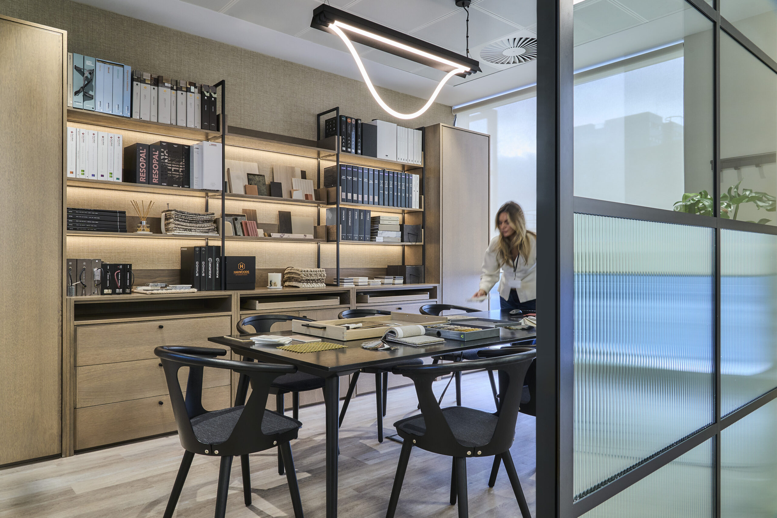
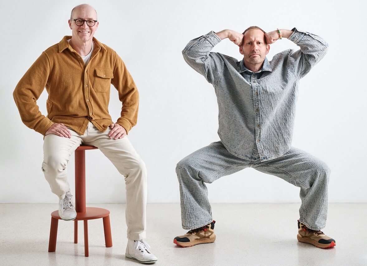
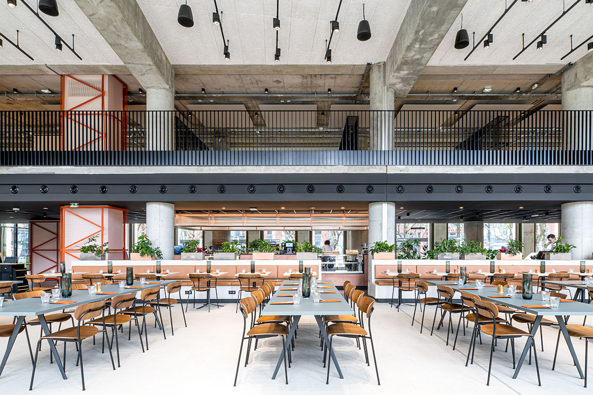
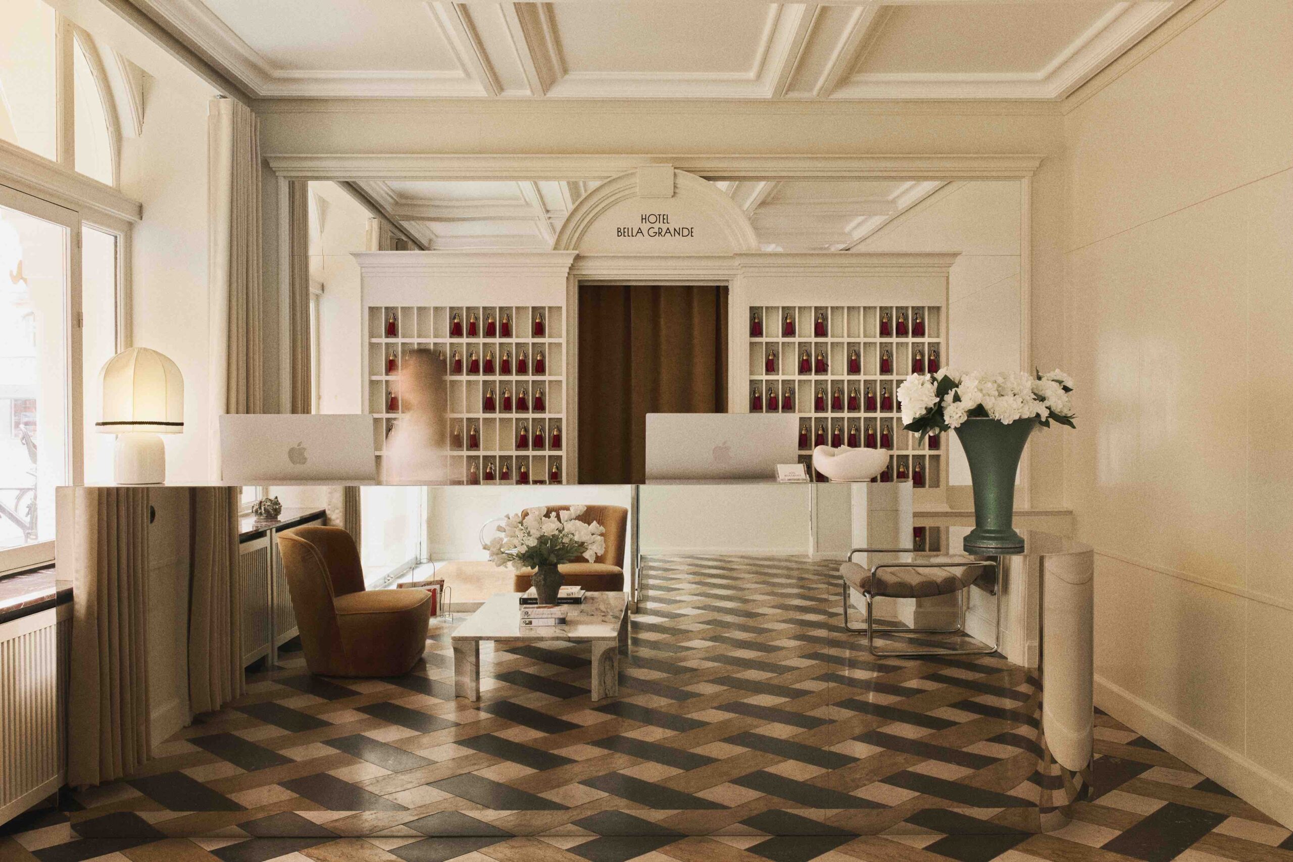
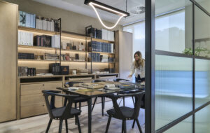
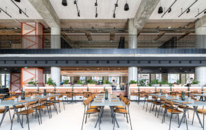
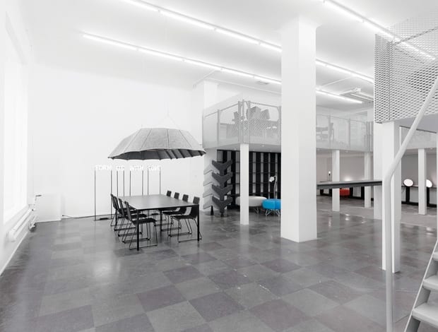
 A new mezzanine level houses the desks, leaving the rest of the studio as flexible space for community events|Form Us With Love’s (l-r) Jonas Pettersson, Petrus Palmér and John Löfgren stay in-keeping with the monochrome theme of their studio|FUWL’s pressed-felt lampshade above the conference table is meant to soften the look and improve acoustics|Fluorescent strip lighting runs the length of the ceilings – dimmable for a more or less cosy atmosphere|Original features that fit in with the industrial aesthetic, such as the radiators, have been retained|The ghostly white kitchen is barely visible in its spot under the staircase|||
Another day, another curious office scheme from Stockholm. Form Us With Love (FUWL), a small design company made up of three Swedish blokes, has moved into a bright, monochrome space in the city’s Sankt Eriksgatan district. The new outpost resides in a building dating back to the early 20th century, though you wouldn’t know from the inside, and is split over three levels: workshop, studio and office. The intriguing company statement about the space says that it’s “inspired by the gallery world, mixed with industrial facilities and Lego.”
One of FUWL’s partners, Petrus Palmér, says that it took two years and more than 50 viewings to find the perfect home for their five-year-old operation. “It’s hard to secure good spaces in Stockholm – so when we found this we were very happy,” he explains. Large windows on the ground floor look into the gaping studio, which sits beneath five storeys of residential units. The real draw, however, was that FUWL could maximise the floor area by creating a new mezzanine and making use of the basement. “This added another 100sq m to the 120sq m accounted for in the rent, so we got a lot extra,” says Palmér.
It worked out well, because part of the company’s quest was to find enough space for its five staff to work on design projects, with enough left over for separate offices and a gallery. “We only make lighter prototypes with cardboard and wood but we still needed somewhere to keep our tools and carry out the work.” In that sense, the basement was a bonus because it freed up the studio level to be flexible for activities involving the community: “Our thought was to have a space that we could use for exhibitions with the furniture or a pop-up shop, lectures or show art. It’s very adaptable,” Palmér says. The mezzanine office – “an extra room within the room” – means that these activities can happen without constantly having to shift desks around. “It’s good because we can have our work area but if we want to have an exhibition, we can do it in our really nice gallery,” he adds.
After gutting the room completely, FUWL painted the ceiling and walls white and customised a gradient fence in flex metal to run along the periphery of the new loft area, where the desks reside. “We really like the industrial feel of the metal of the staircase and the railing,” says Palmér. “It’s really functional and it gives the space a kind of factory feeling, which is quite nice and appropriate because we make a lot of products here.”
Wooden flooring was pulled up to reveal the grey and black slate tiles, which suits the (non) colour scheme, as do the white fittings in the new kitchen tucked beneath the staircase. Dimmable fluorescent light tubes run lengthwise across the ceiling, adding further to the factory-like character of the place and complementing the fluorescent light sculpture of the company logo in the studio. “You can turn them up on super bright for working or you can turn them down for a cosy atmosphere,” he adds. All of the existing services were kept, including the old radiators that sit nicely beside the sharp edges of some of the new elements. The central focus of FUWL’s new studio and perhaps the best part is the boardroom table. It sits near the window and underneath a custom-made pressed-felt lampshade that the company intends to put into production this year. “One of the downsides of having this open space is that there is a lot of echo and the noise travels, so we needed something above the conference table to absorb sound, but also to give the feeling of a secluded room,” says Palmér.Whether or not the fluorescent lighting is cosy or the lampshade gives a feeling of seclusion is up for debate. There is no doubt that the aesthetic of the project has divided opinion, mainly because of the use of materials and the fact that everything comes in a shade of grey, white or black. When it was featured on design blog Contemporist, comments ranged from “pretty cool” to “dismal” to “the most depressing environment any human has intentionally created.”
“We thought that one was quite funny,” says Palmér. “The lack of colour is about the gallery thing. If we made the staircase or the railing yellow, that would be the focus of the space. It’s a way of saying something – I never thought white and grey would upset people and make them react so much. Even though it’s so plain, it’s something people react to and that’s fun.”

