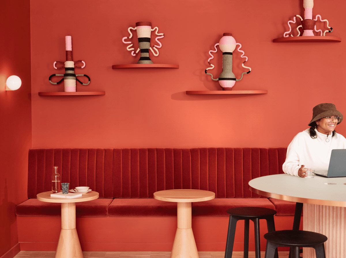
The Office Group launches fashion-forward flex space in London’s West End
For almost 150 years, luxury department store Liberty London has been celebrated for its strong connection to the arts and its bold floral-patterned fabrics.
Since the 1920s, it has been located in an iconic Tudor revival building on Great Marlborough Street, but it was actually founded in the neighbouring Liberty House, a prestigious Grade II listed building.
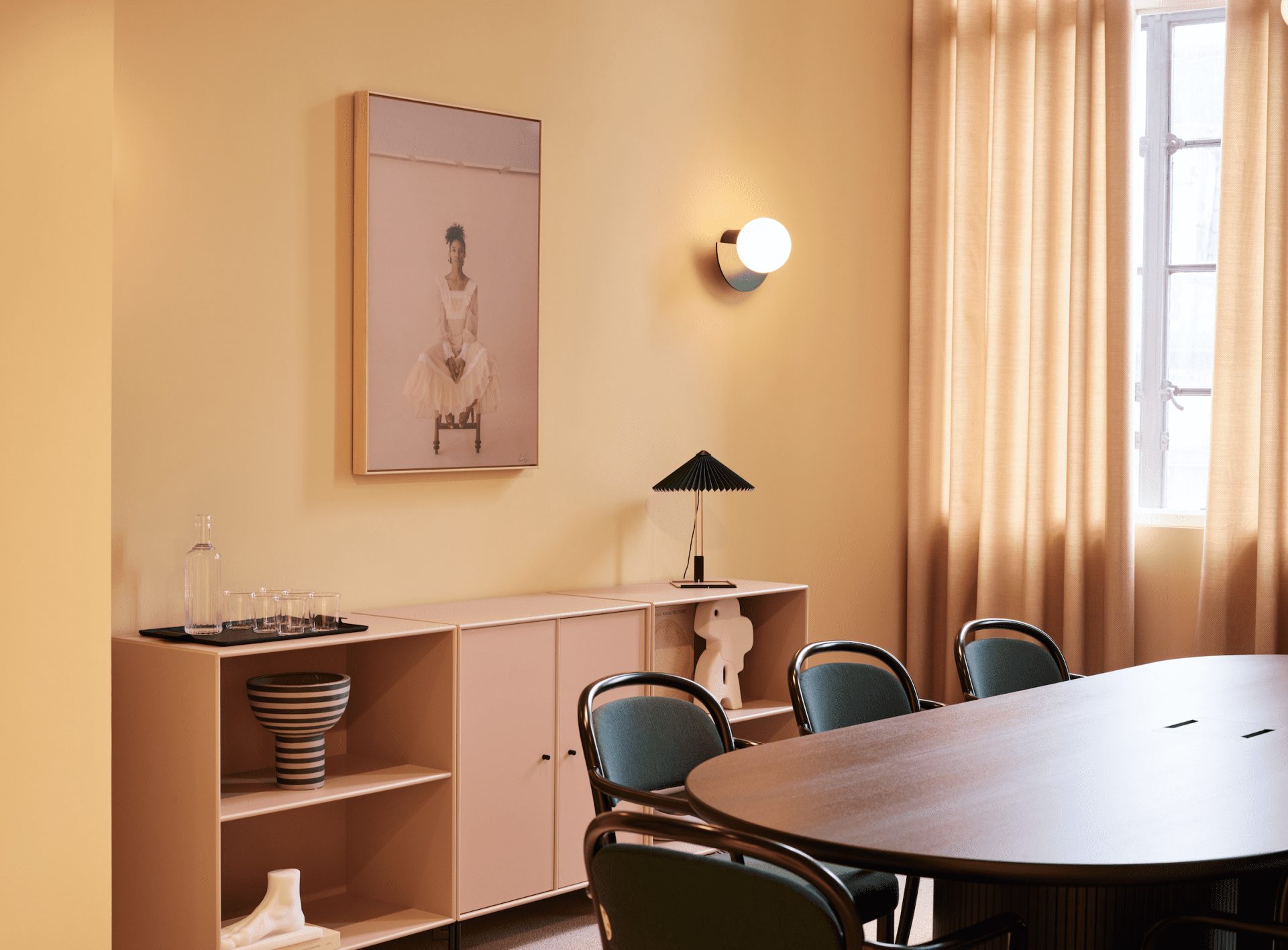
When The Office Group (TOG) recently collaborated with SODA Studio to create a new flexible workspace in Liberty House it only made sense that they took inspiration from the celebrated department store.
“We wanted to design a work space where someone could come to work and be inspired by vibrant colours, bold palettes and playful motifs,” says Nasim Köerting, Head of Design at TOG. “With isolated home working generally being the antithesis to collaboration and co-creation, Liberty House’s amenities, bold colours and forward-thinking design features enable workers to feel truly productive.”
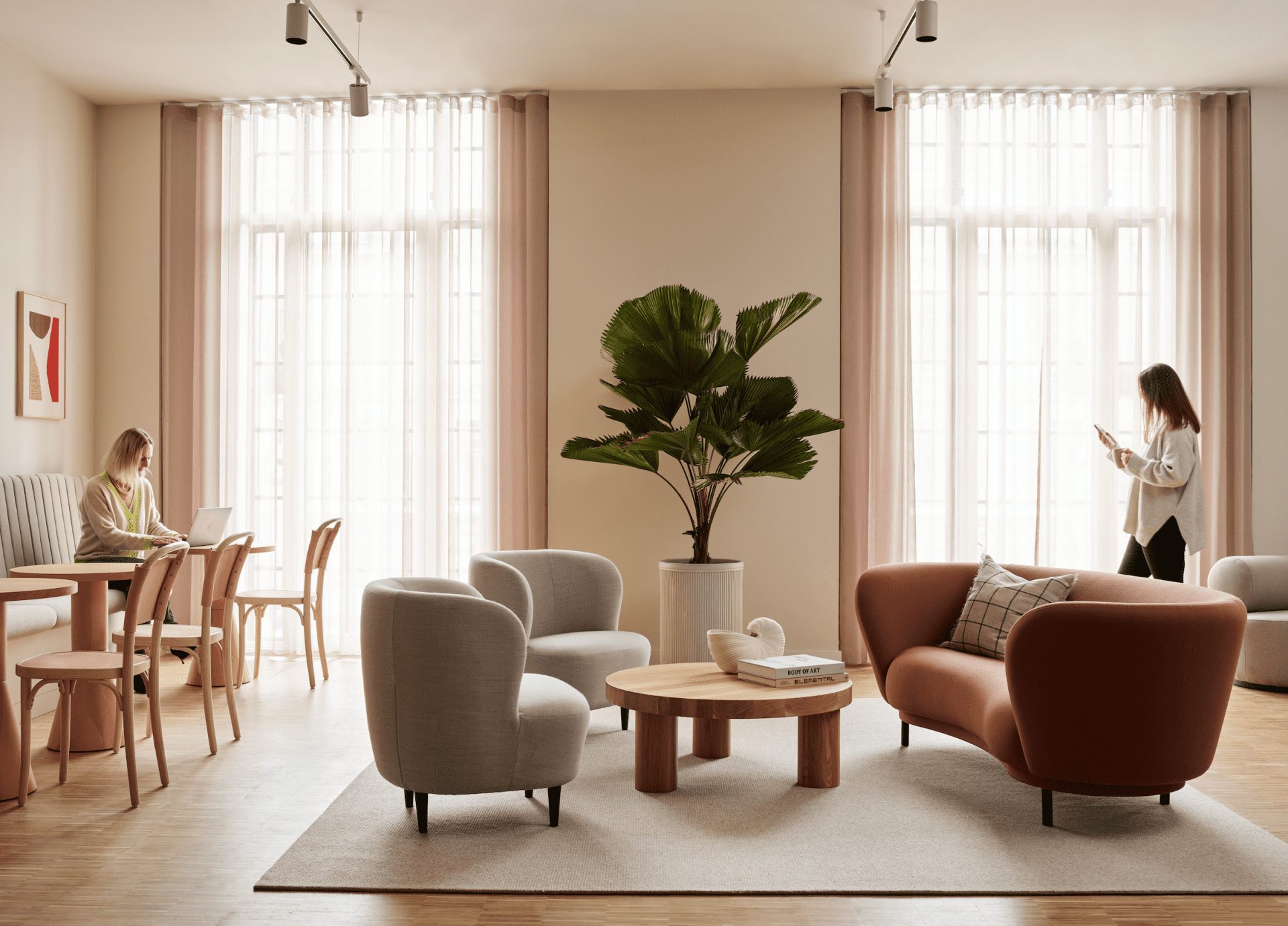
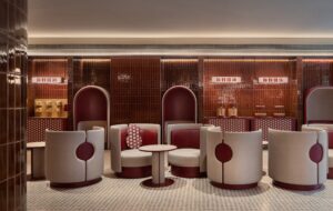
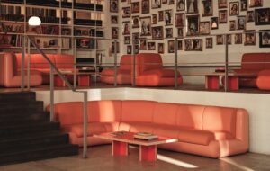
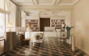
Liberty House is arranged over five floors, above the ground and first floor retail spaces, with a bright reception on the 2nd floor that is accessed via a refurbished original stair and leads to a lounge.
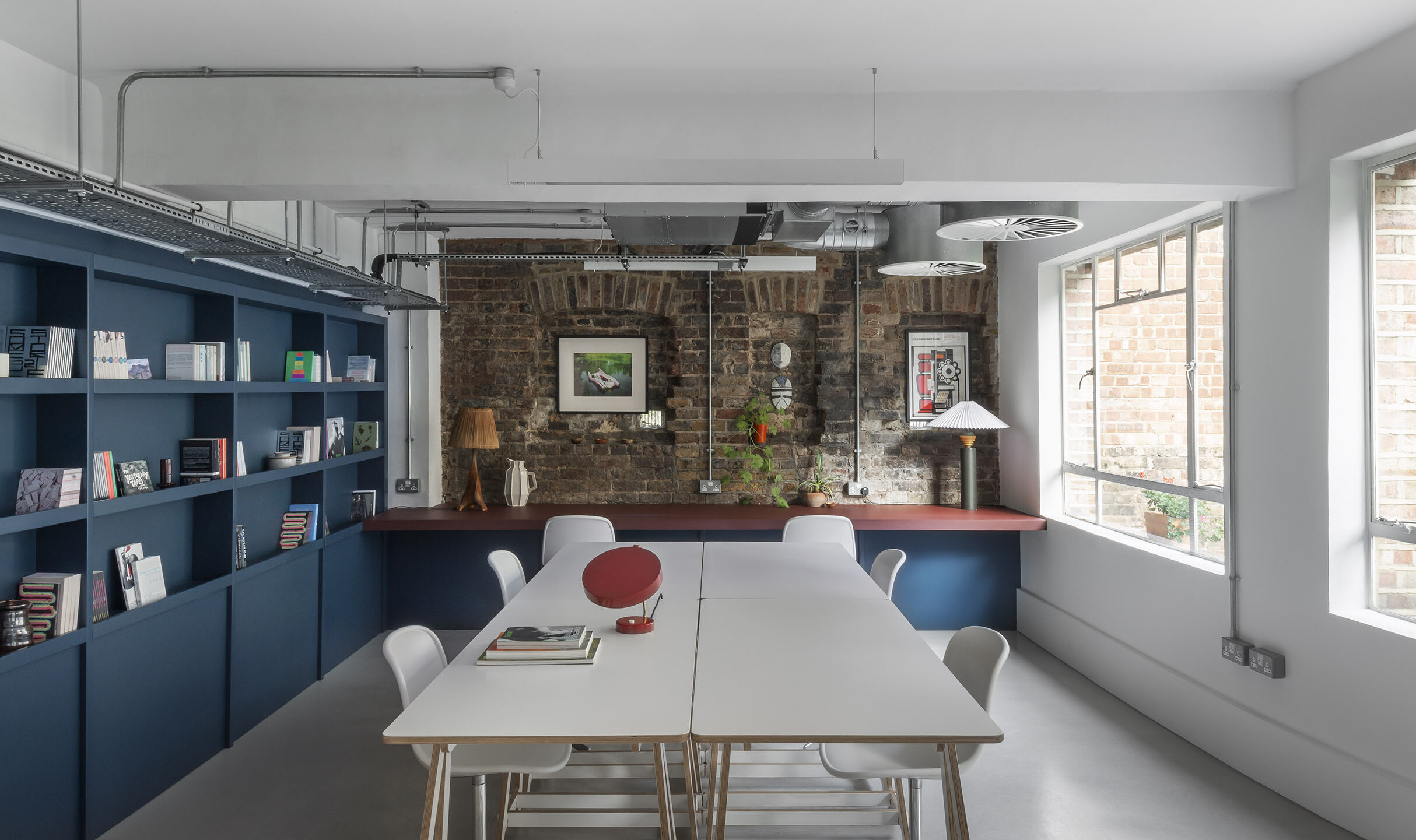
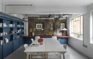
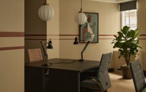
The upper floor offices are arranged along the perimeter of the building to benefit from natural light, with break-out spaces and tea points on the Kingly Street side with views to Liberty London. The Liberty Rooms is accessed via a separate entrance on Foubert’s Place and offers a more intimate reception and a variety of break-out spaces and meeting rooms, ranging from informal three-person rooms to larger 12-person conference spaces.
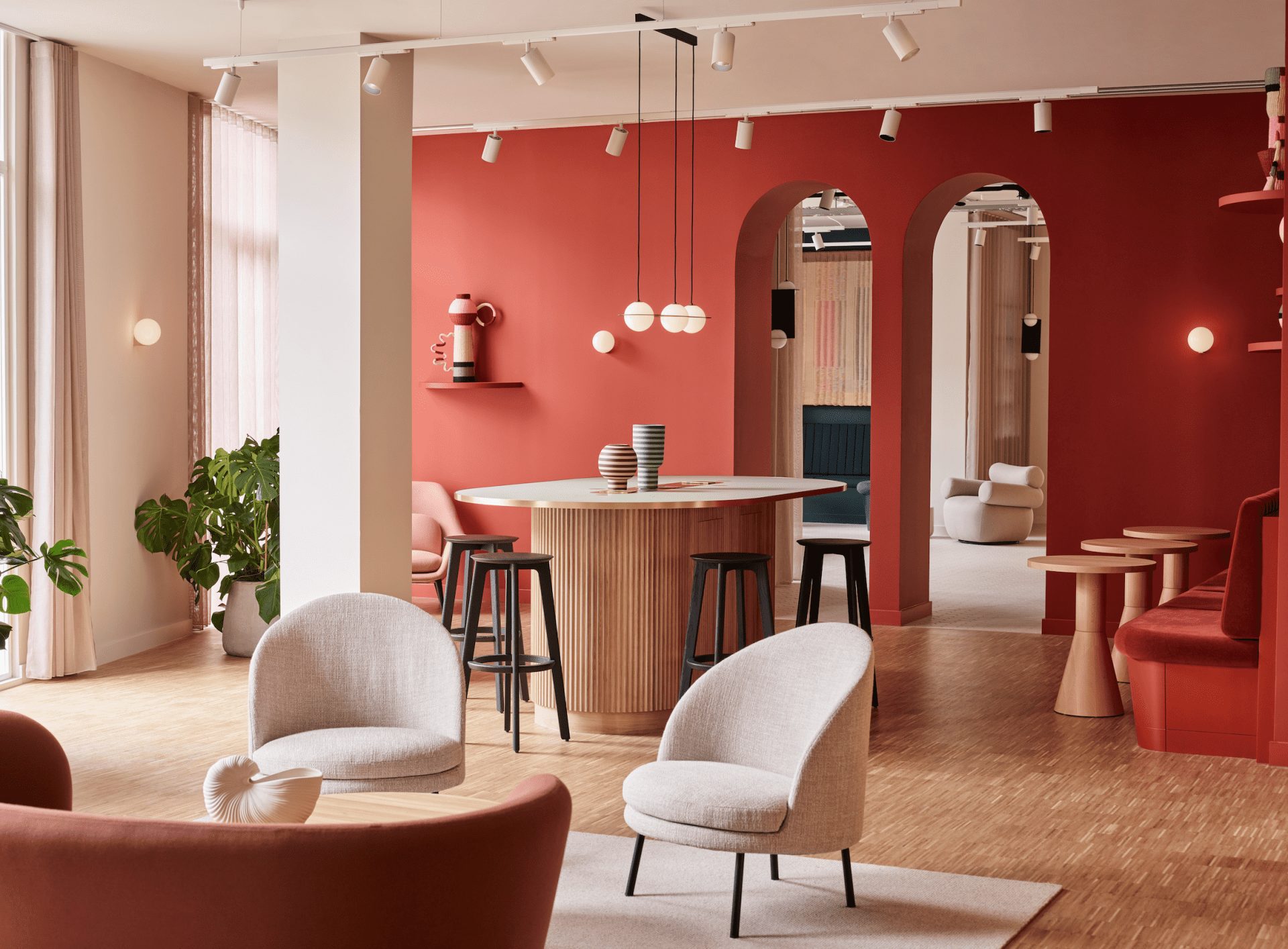
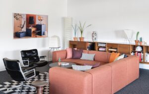
Throughout, the bright colour palette is inspired by the iconic Liberty prints, while the luxury goods stocked by Liberty London inspired the high-end retail aesthetic and the crafted objets d’art.
Even the branding of Liberty House – also developed by SODA Studio – is a play on the Liberty London typeface and patternmaking. Liberty House itself was also an inspiration, with the curved facade informing the rounded joinery, doors and handles.
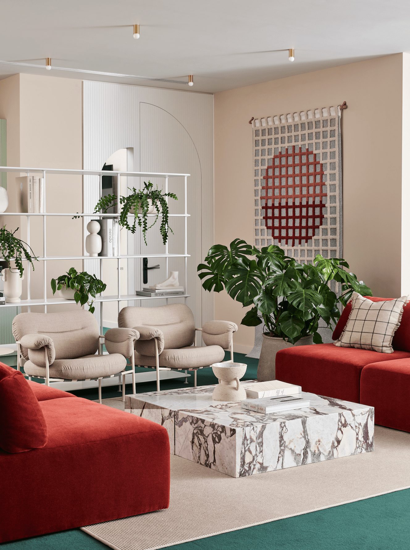
“Colour was the most important material in our palette, drawing inspiration from the iconic Liberty prints and the building’s location,” says Parvathy Vipulendran, Architect at SODA Studio.
“As Liberty House sits between Regent St and Carnaby St, we used colour and form to play with the relationship between the two contrasting areas. For example, warmer tones inspired by the fabric of the building allowed for bold colour pops and moments of excitement in the phone, focus and meeting booths, creating interest along an otherwise monotonous office corridor.”
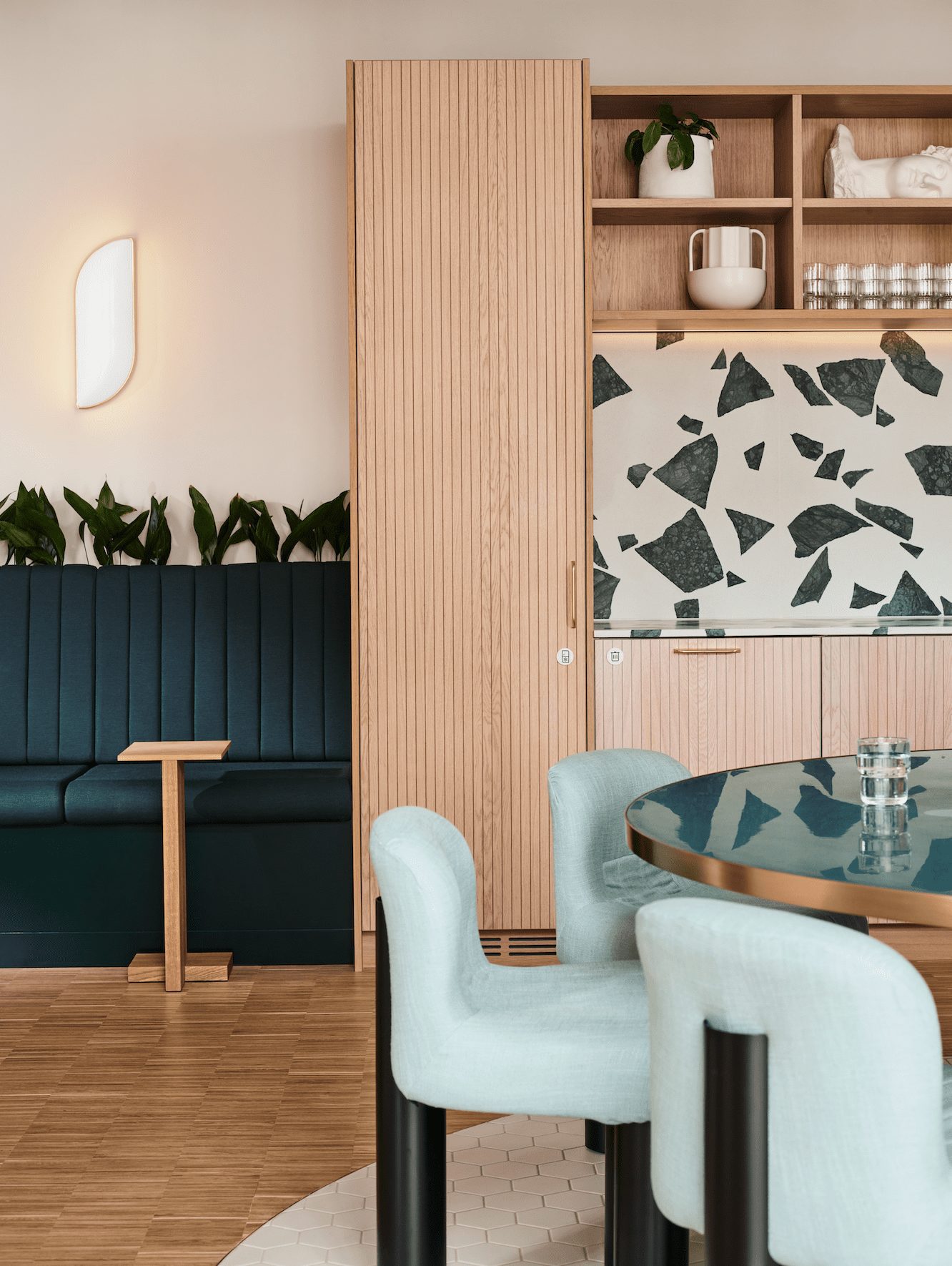
The material palette also takes inspiration from Liberty London and Liberty House. The scalloped panelling, for example, echoes the scalloped facade, bringing the exterior design language into the interior; while the routing on the upper floor tea points and doors has the same rhythm as the scallop.
“We wanted to provide an inspirational experience, drawing from Liberty House’s history and immediate vibrant surroundings,” says Köerting. “People can immediately see the patterns of Liberty London and colour of Carnaby Street reflected in our work spaces, meeting rooms and relaxation areas.”
Images by Jake Curtis

