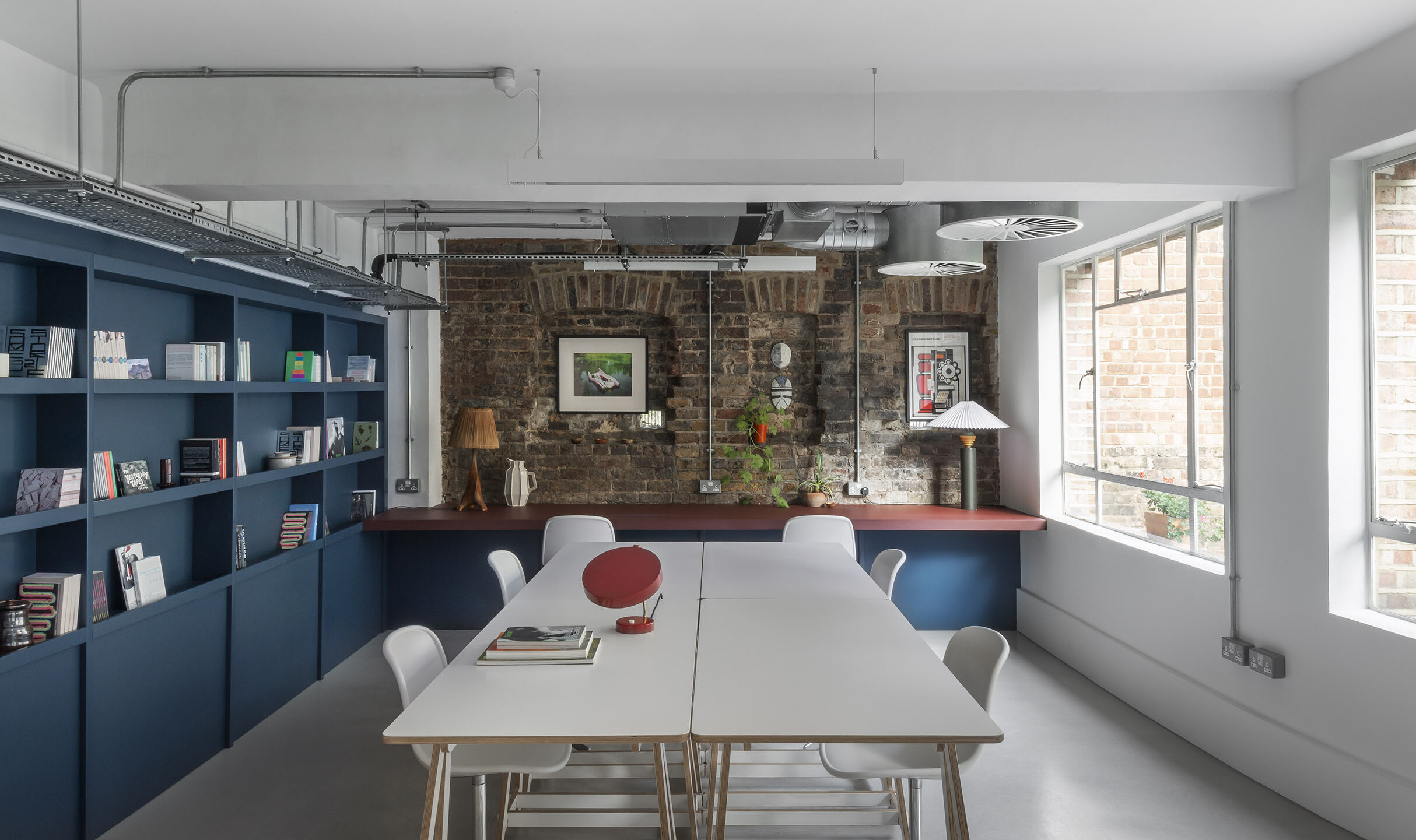
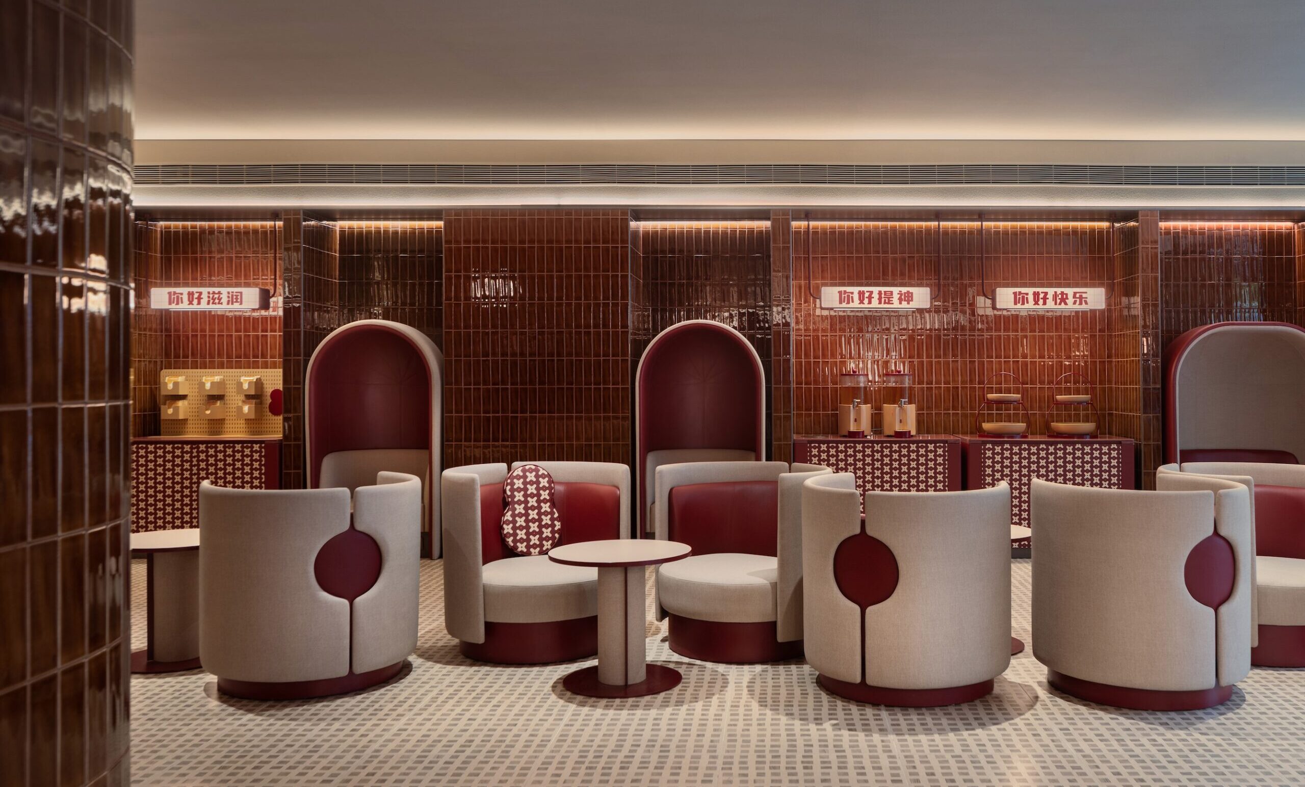
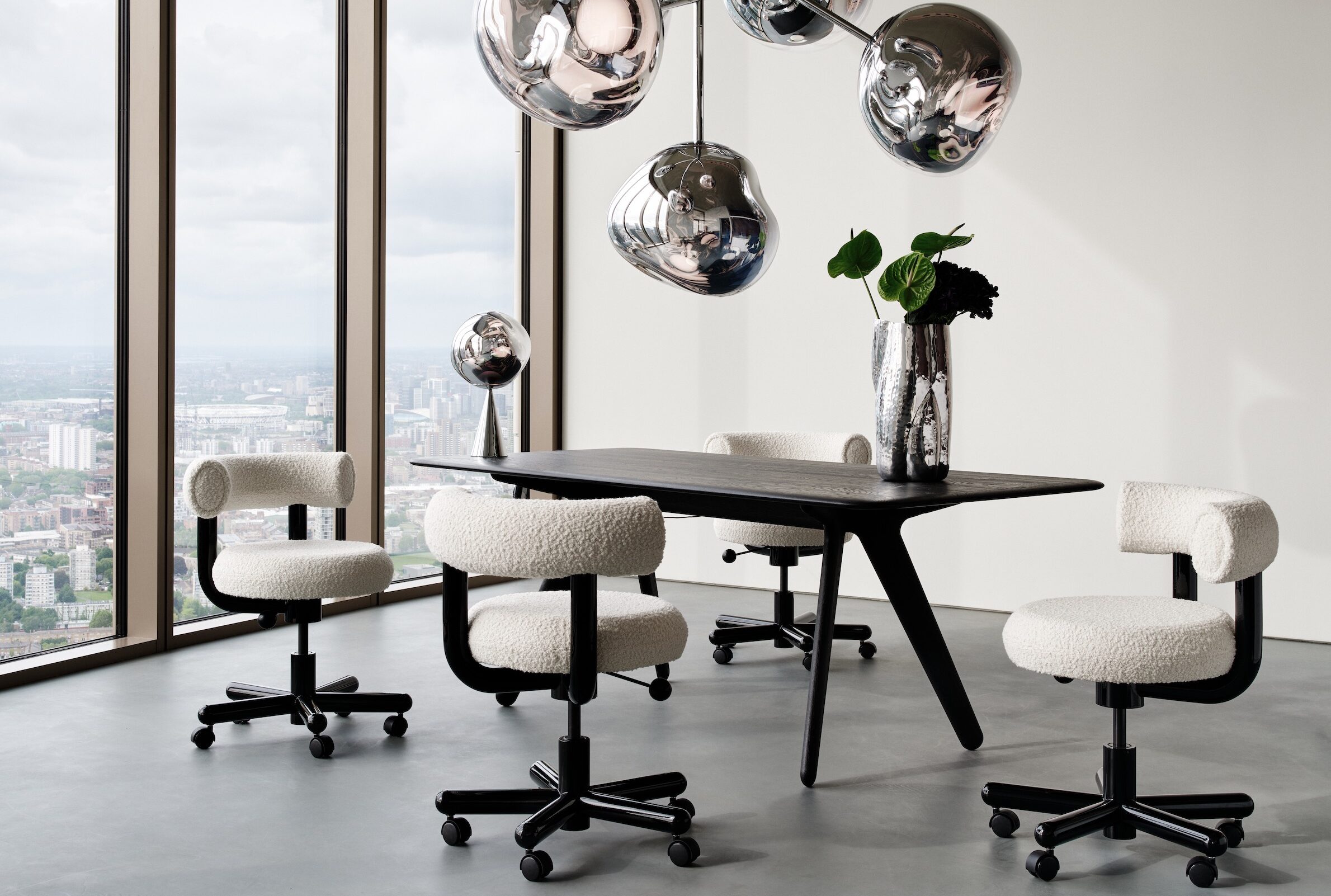
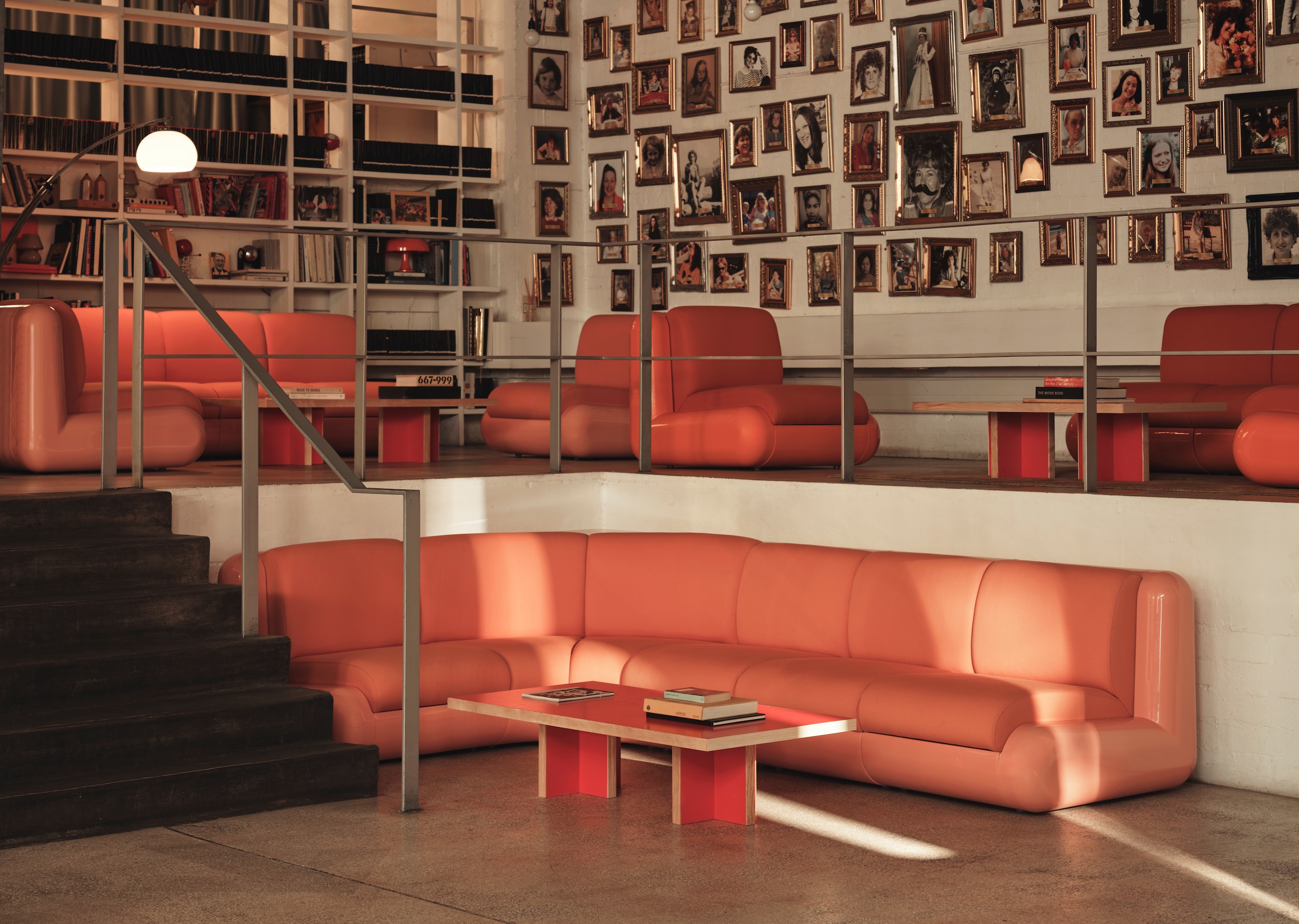
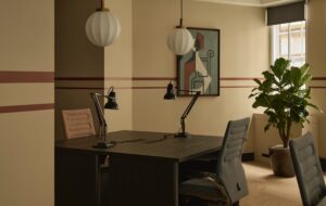
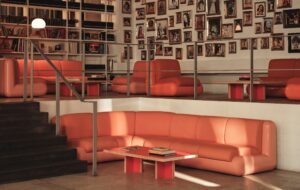
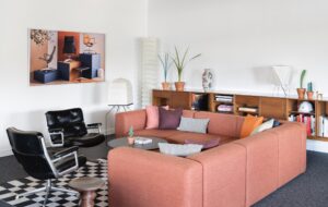
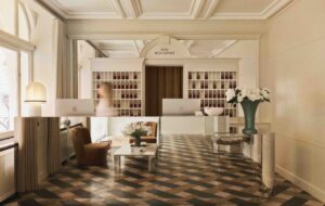
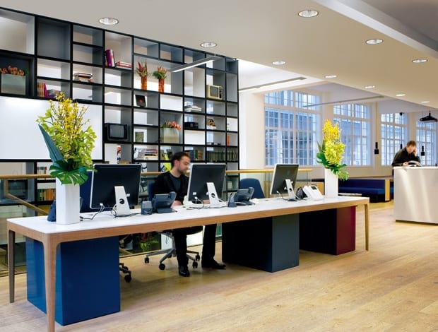
 The Barber Osgerby Home table with Corian top serves as a reception desk|A bespoke bookcase filled with trinkets links the ground floor and basement|Low booths look elegant and provide an ideal space for staff and guests to sit down together|Meeting rooms are kept warm with earthy tones like mustard, grey and timber||
Universal Design Studio gives coherence to an old rag trade building for London-based agency, Fallon
Getting it right for the Soho headquarters of creative agency Fallon required some manoeuvring architecturally, but in the end, the fluidity of this workspace is down to the strategic placement of communal areas and free coffee.
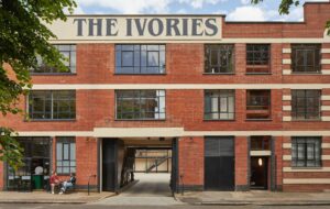
The orientation of the 1930s Art Deco building on Great Titchmarsh Street is slightly awkward in that Fallon’s private entrance, basement and ground floor canteen are set toward the back and cut off from the rest of the company’s work floors by two storeys (occupied by other tenants).
The challenge for Universal Design Studio, which has generally focused on high end retail, leisure and exhibition spaces, was to create an office that didn’t feel disjointed and that would draw 230 staff down from work floors 3, 4 and 5, which are toward the front of the building, and into the communal hub of the ground floor canteen that doubles up as client reception and an informal meeting space. It’s a bit of a faff to move between these two zones, there isn’t a clear link, so Universal needed to build in incentives for staff to circulate the building.
The ground floor does have lovely blue upholstered solid oak booths and tonnes of natural light but the real draw, suggests Universal project leader, Jane Pinfold, is the central coffee bar that offers free drinks to staff and visitors. The effect is that clients mix with staff, who tend to use the area for work, and it all feels very homey and vibrant. “We are Fallon”, says the sign at the door, and it’s fair to say that this transparency and openness is captured.
“It’s a triple function space,” says Pinfold. “The idea was for clients to feel part of Fallon when coming through the door. It breaks down the formalities and makes people feel like they are part of something.” In this vein, Universal placed a series of visible meeting rooms on the periphery of the canteen, which at first seems a strange place for them but actually makes a lot of sense if the goal is to bring clients into the heart of the business without traipsing them down halls and up several floors to the rest of the offices.
“Fallon is not precious about things and we wanted that to come across”
Despite how much Universal has managed to cram into one area, the ground floor still retains a sense of calm, which is probably in part to do with the choice of stationary booths instead of movable tables and chairs that can look sloppy and make a lot of noise. But while elegant, the space comes across as lived in and unprissy. Aside from the smattering of Artek light pendants, the existing light fixtures have remained.
“It’s got a utilitarian feel,” Pinfold says. “Fallon is not precious about things and we wanted that to come across.”
Though, it must be pointed out, this does not come at the cost of including a show-stopping feature. Behind the reception desk (a home table by Barber Osgerby, who also happen to be Universal’s sister design studio) is a bespoke book cabinet made of MDF boxes laminated on the inside with varying shades of grey, giving a pixelated wall effect. The bookcase is ‘curatable’ and was designed to show off the collection of stuff Fallon has accumulated over the years, with plans in the works for it to become an ever changing page of the company’s website. On the day of viewing, a delightful array of vintage books, curiosities and ancient TV sets decorated the shelves.
The bookcase feature extends down into the basement alongside a newly created staircase with two heights on each stair to encourage sitting and chatting. Appropriately placed in the basement are the edit suites, a more private meeting room and admin support.
The upper floors have each been designed to accommodate specific ways of working throughout the company, though all stick to some variation of open plan format. On the fourth floor, creative teams of two are separated by plywood joinery units that give a degree of privacy, which is needed for working on pitches, as well as storage and an ideas board. The fifth floor holds account management and the partners and is the most densely packed with work benches, but is compensated with a flood of light from the roof.
All the offices have wood floors and original windows (if not bizarrely ‘double glazed’ by the base build architects) and particular bits of storage and cabinetry of black stained MDF suitable to the needs of each department. A central hub holds a reference library, plus vintage tables and chairs are dotted through the spaces for relaxing and small meetings. Tea points are kept basic.
Pinfold points out that the cabinets have been moved around since the company first moved in and a haphazard design has taken shape, which was all part of the plan. It does seem slightly chaotic in certain zones, but the raw material of lovely floors, floods of light and open space mean that these offices would struggle to look or feel bad. In a creative agency, it works, and how refreshing to see people actually moving furniture around in an office. It rarely happens.
“Fallon want to hold on to their people by giving them what they need,” says Pinfold. It seems appropriate, then, that the company also offers ice cold beers to staff in the evenings. Pinfold agrees: “When it comes down to it, the money you spend comes back to you – some companies understand that and some don’t.”

